AP Physics 1: Introduction 7: Basic Graphing
Summary
TLDRThis video discusses the importance of graphing data, focusing on why and how we graph to understand relationships between variables. Using an example from a classroom lab, it walks through graphing diameter vs. circumference of round objects, explaining key graphing principles like independent and dependent variables, scaling axes, scatter plots, and finding the line of best fit. The presenter also demonstrates how to calculate slope and derive a mathematical model, emphasizing the connection between the graph and the well-known formula for circumference, C = πD.
Takeaways
- 📊 Graphing data helps identify the relationship between two quantities.
- 📚 In high school, graphing was often done for grades, but the real purpose is understanding relationships in data.
- 🧮 In physics, the goal of graphing is to see how two quantities are related, such as diameter and circumference.
- 🔎 The independent variable (like diameter) is plotted on the x-axis, while the dependent variable (like circumference) is plotted on the y-axis.
- 📈 Proper scaling of axes is essential for accurate graph representation, ensuring data points use at least 75% of the graph space.
- ✨ A scatter plot shows data points but doesn't require connecting dots—it's the trend we're interested in.
- 📏 The line of best fit helps visualize a potential linear relationship in the data, modeled by y = mx + b.
- 🧑🏫 The slope (m) is the change in the dependent variable over the independent variable, here calculated as 3.
- 🟢 In this example, the relationship between circumference and diameter follows the equation C = 3D, which aligns with the formula C = πD.
- 💡 This graphing exercise illustrates basic principles of data visualization, important for physics studies throughout the year.
Q & A
Why do we graph data in physics?
-In physics, we graph data to find the relationship between two quantities. It helps us understand how changes in one variable affect another.
What is the independent variable in the given lab example?
-The independent variable in the example is the diameter of the round objects, measured in centimeters. It is placed on the x-axis of the graph.
What is the dependent variable in the given lab example?
-The dependent variable is the circumference of the round objects, measured in centimeters, and it is placed on the y-axis of the graph.
What should the title of the graph in physics look like?
-The title of the graph in physics should follow the format 'y versus x,' indicating the relationship between the two variables. In this case, the title is 'Circumference versus Diameter.'
How should the axes be labeled on a graph?
-The axes should be labeled with the physical quantity (like diameter or circumference) followed by the unit of measurement in parentheses, such as 'Diameter (cm)' and 'Circumference (cm)'.
What is the general rule for scaling a graph?
-A good rule of thumb is that the graph should take up at least 75% of the available space. If it doesn’t, you should reconsider the scaling.
Why should you not connect the dots in a scatter plot?
-In a scatter plot, you should not connect the dots because you are looking for a trend rather than exact connections between the data points. There may be experimental uncertainty, so a line of best fit is preferred.
What is the significance of a linear relationship in physics?
-A linear relationship in physics indicates that the data can be modeled using the equation y = mx + b, making the relationship between the variables straightforward and easy to analyze.
How do you calculate the slope of a graph?
-To calculate the slope, take two points from the line of best fit and use the formula: slope = (change in y) / (change in x). In this case, it’s the change in circumference divided by the change in diameter.
What was the slope found in this example, and why is it significant?
-The slope calculated was approximately 3, which is significant because it is close to the value of pi (3.14). This aligns with the known mathematical relationship between circumference and diameter, where C = πD.
Outlines

Cette section est réservée aux utilisateurs payants. Améliorez votre compte pour accéder à cette section.
Améliorer maintenantMindmap

Cette section est réservée aux utilisateurs payants. Améliorez votre compte pour accéder à cette section.
Améliorer maintenantKeywords

Cette section est réservée aux utilisateurs payants. Améliorez votre compte pour accéder à cette section.
Améliorer maintenantHighlights

Cette section est réservée aux utilisateurs payants. Améliorez votre compte pour accéder à cette section.
Améliorer maintenantTranscripts

Cette section est réservée aux utilisateurs payants. Améliorez votre compte pour accéder à cette section.
Améliorer maintenantVoir Plus de Vidéos Connexes
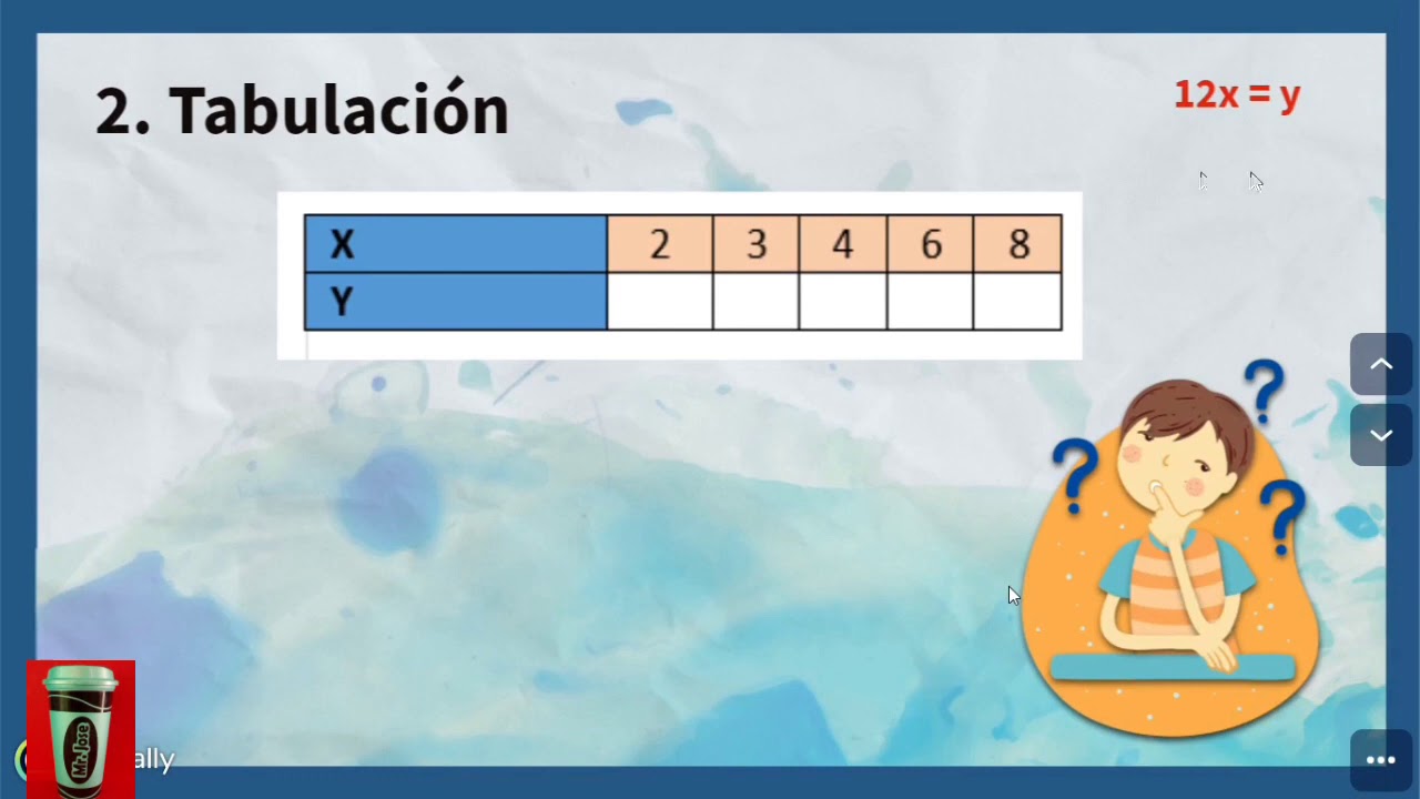
Variación lineal: expresión algebraica, tabulación y gráfica.

Theory: What it is, How to Search and Where to Write about the Theory?
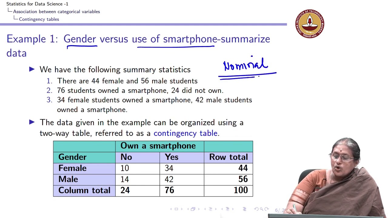
Lecture 4.2 - Association between two categorical variables - Introduction
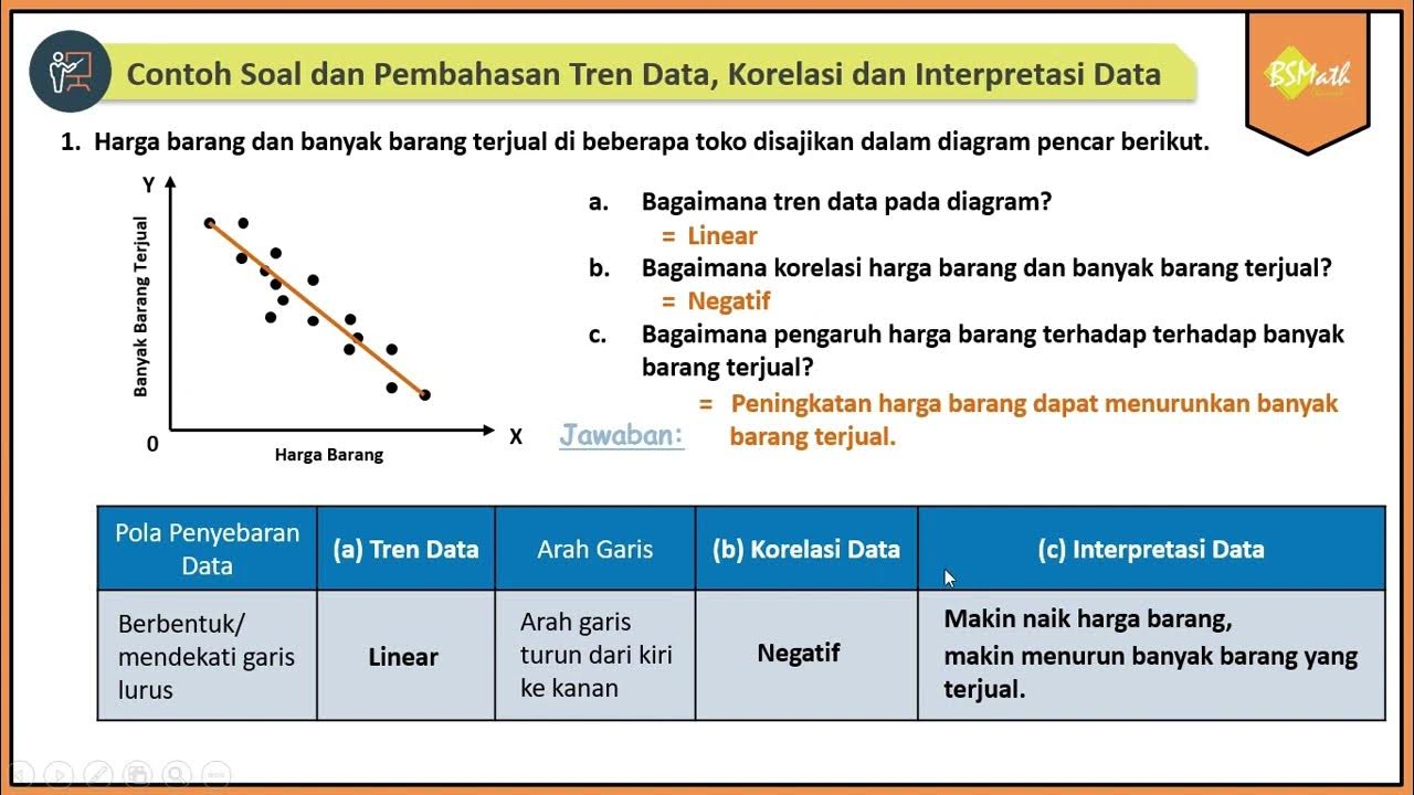
Contoh Soal dan Pembahasan Tren Data, Korelasi dan Interpretasi Data Bivariat Diagram Pencar
Pertidaksamaan linear dua variabel kelas X. SOAL DAN PEMBAHASAN TRIK CEPAT. Part #1
SPtDV Matematika Kelas 10 • Part 1: Pertidaksamaan Linear & Kuadrat Dua Variabel
5.0 / 5 (0 votes)
