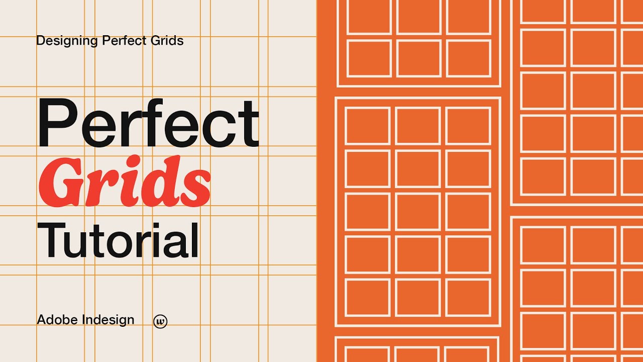
Responsive Grid Systems In Web & UI Design
Summary
TLDRThis video tutorial, hosted by Ali Hasan, delves into the intricacies of grid systems in web design. It explains how designers can achieve a clean, professional look by using grids to align and organize website elements. The video covers various types of grids, including menu, column, baseline, modular, and recursive grids, and their applications. It also instructs viewers on setting up grids for different devices like mobiles, tablets, and desktops, emphasizing the flexibility of margins and gutters. Practical examples and tips are provided to help viewers understand how to implement grid systems effectively in their designs.
Takeaways
- 🌐 Grid systems are essential for creating well-organized and aligned web and mobile designs.
- 📏 The term 'gutter' refers to the space between columns within the grid, while 'margin' is the space on the sides of the design.
- 🎨 Grid systems help in arranging data properly, ensuring designs are clear and organized, and allowing key points to be highlighted effectively.
- 📱 Understanding and using grid systems is crucial for designers to maintain consistency and professionalism across different devices.
- 👨🏫 The video tutorial guides viewers on how to set up and use grid systems, emphasizing their importance in web and app design.
- 🔲 There are five types of grids mentioned: Menu Script Grid, Column Grid, Baseline Grid, Modular Grid, and Requal Grid.
- 📊 The Column Grid is particularly useful for organizing content within columns, ensuring a structured layout.
- 📐 The Baseline Grid is important for aligning typography and maintaining consistent spacing between text elements.
- 🧩 Modular Grid is used for defining areas within rows and columns, allowing for a more flexible design approach.
- 📝 The Requal Grid is about organizing content in a way that important parts of the website stand out and are visually appealing.
- 🛠️ The tutorial also covers how to adjust grid settings such as margins, gutters, and column counts based on different device breakpoints.
Q & A
What is the primary purpose of using a grid system in web design?
-The primary purpose of using a grid system in web design is to ensure that the content is properly arranged, organized, and aligned, giving the design a clean and professional look.
What are the main components of a grid system?
-The main components of a grid system are rows, columns, and the spaces between them, known as gutters, as well as the margin areas on the sides.
How does a grid system help in organizing text and images on a website?
-A grid system helps in organizing text and images by creating specific spaces between them, ensuring that the design has a proper clear and professional look.
What are the different types of grids mentioned in the script?
-The script mentions five types of grids: Menu Script Grid, Column Grid, Baseline Grid, Modular Grid, and Requal Grids.
How does the Menu Script Grid help in document design?
-The Menu Script Grid is used to properly arrange the text in a document, ensuring that the text is well-organized and aligned.
What is the role of Column Grid in content organization?
-The Column Grid is used to organize the content into columns, which helps in creating a structured layout for the website's content.
Why is the Baseline Grid important for typography alignment?
-The Baseline Grid is important for typography alignment because it ensures that the typography is properly aligned, creating a clean and organized look for the text elements on the page.
Can you explain the concept of Modular Grid as discussed in the script?
-The Modular Grid is used to define the center point between rows and columns where you can place elements, creating a structured and organized layout for the design.
How do Requal Grids help in organizing content on a website?
-Requal Grids help in organizing content by assigning more importance to certain elements by giving them more grid space, while less important elements are assigned less grid space.
What is the significance of margins and gutters in a grid system?
-Margins and gutters in a grid system are significant as they define the space on the sides and between the columns, respectively, which contributes to the overall organization and aesthetics of the design.
How can grid systems be adapted for different device breakpoints like mobile, tablet, and desktop?
-Grid systems can be adapted for different device breakpoints by defining the number of columns, margins, and gutters based on the screen size of the device, ensuring a responsive and organized design.
Outlines

Cette section est réservée aux utilisateurs payants. Améliorez votre compte pour accéder à cette section.
Améliorer maintenantMindmap

Cette section est réservée aux utilisateurs payants. Améliorez votre compte pour accéder à cette section.
Améliorer maintenantKeywords

Cette section est réservée aux utilisateurs payants. Améliorez votre compte pour accéder à cette section.
Améliorer maintenantHighlights

Cette section est réservée aux utilisateurs payants. Améliorez votre compte pour accéder à cette section.
Améliorer maintenantTranscripts

Cette section est réservée aux utilisateurs payants. Améliorez votre compte pour accéder à cette section.
Améliorer maintenant5.0 / 5 (0 votes)


