Why use REM Typography in Webflow

Flux Academy
24 Jan 202217:11

Summary

TLDRThis tutorial delves into the intricacies of typography units in web design, contrasting pixels, 'ems', and 'rems'. Pixels are absolute, but 'ems' and 'rems' offer scalability and responsiveness, with 'ems' compounding based on parent elements and 'rems' scaling relative to the root element. The video introduces methods like 'Wizardry' for fluid typography and Finnsuite's fluid design tool, emphasizing the importance of 'rems' for accessibility and responsive design. It concludes with practical advice on converting pixel measurements to 'rems' using Webflow's built-in calculator.

Takeaways

  • 😀 Pixels are absolute units in web design, meaning they have a fixed size regardless of the viewport or parent elements.
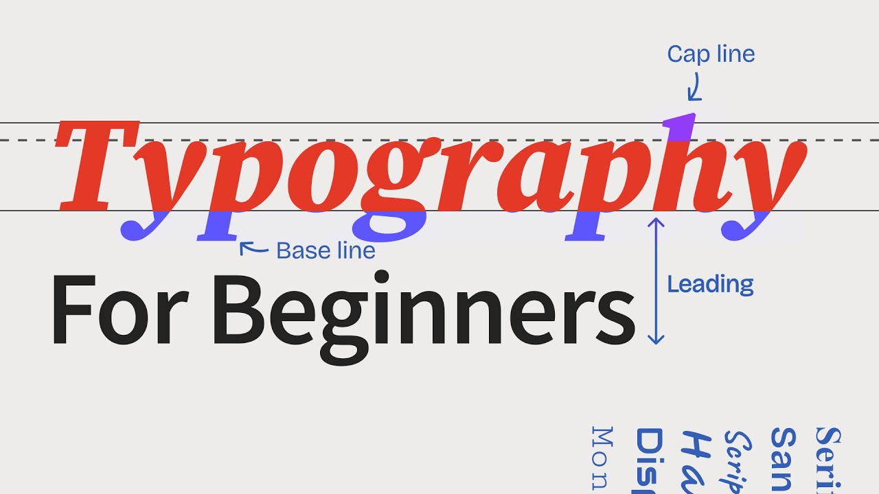
  • 🔍 The 'm' unit is derived from print design, where it represented the width of the capital letter M. On the web, 'm' values are relative to the font size of their parent element, compounding with changes in the parent's size.
  • 🔄 'ms' compound, which means that changes in the parent element's font size will affect all child elements that use 'm' units, making it difficult to maintain consistent sizing.
  • 📏 'rem' units are relative to the root HTML element, making them independent of direct parent sizes, which simplifies design and improves accessibility.
  • 🌐 Using 'rem' units allows for better accessibility, as users can change their browser's font size settings, affecting the entire page layout without needing to alter 'px' or 'm' values.
  • 🛠️ The 'wizardry' method by Timothy is introduced as a way to scale typography and design elements based on the viewport width, using 'm' units to maintain proportional design across different screen sizes.
  • 💧 The 'fluid responsive' method by Finnsuite is a new approach that allows for fluid scaling of design elements without the need for custom coding, by adjusting breakpoints and using a provided code snippet.
  • 🔄 When using 'm' units, changing the body's font size to one viewport width (vw) can create a responsive design that scales with the screen size.
  • 📐 The 'fin suite' method maintains accessibility by allowing users to zoom in and out, even when design elements are set to scale with the viewport.
  • 📝 Webflow provides a built-in feature to convert pixel values to 'rem' units, simplifying the process and reducing the need for manual calculations.
  • 🚀 The presenter recommends using 'rem' units more frequently for better user accessibility and design control, suggesting a shift away from traditional 'px' units.

Q & A

  • What is the main topic of the video?

    -The main topic of the video is typography in Webflow, specifically discussing CSS units like pixels, ems, and rems, and how they differ from one another.

  • Why are pixels considered absolute units in CSS?

    -Pixels are considered absolute units because they have a fixed size that does not change based on other elements in the design or the viewport size.

  • What is the historical significance of 'ems' in typography?

    -Historically, 'ems' were used in print to represent the width of the capital letter 'M'. However, on the web, they are defined differently and are relative to the font size of their parent element.

  • How do 'ems' compound in CSS?

    -Ems compound by multiplying the size by the font size of their parent element. This compounding effect can be seen when the parent's font size is changed, affecting all child elements that use ems.

  • What is the main advantage of using 'rems' over 'ems'?

    -The main advantage of using 'rems' is that they are based on the root element's font size, not the direct parent's. This makes them more predictable and less prone to the compounding effect seen with ems.

  • Why are 'rems' beneficial for user accessibility?

    -Rems are beneficial for user accessibility because they allow users to change the browser's default font size, which scales all elements using rems accordingly, without affecting elements using pixels or ems.

  • What is the 'Wizardry' method mentioned in the video?

    -The 'Wizardry' method is a design approach that uses viewport units (vw) to scale typography and layout elements proportionally to the screen size, providing a fluid and responsive design.

  • What is the difference between the 'Wizardry' method and the 'Fluid Responsive' method by Finnsuite?

    -The 'Fluid Responsive' method by Finnsuite allows for fluid and scalable designs by using custom breakpoints and a tool that generates code to make elements based on rems scalable with the viewport, without requiring manual calculations.

  • How can Webflow be used as a calculator to convert pixels to rems?

    -Webflow can be used as a calculator by dividing the pixel value by the default font size (usually 16 pixels) and then appending 'rem' to the result, allowing for easy conversion without a separate calculator.

  • What is the presenter's recommendation for using typography units in web design?

    -The presenter recommends using rems more and more in web design, moving away from pixels for better user accessibility and responsive design.

Outlines

00:00

🔲 Understanding CSS Units: Pixels,ems, and rems

This paragraph introduces the topic of typography in web design, focusing on CSS units such as pixels, ems, and rems. It explains that pixels are absolute units, meaning their size remains constant regardless of the viewport size. The paragraph also delves into the origins of ems, traditionally used in print to denote the width of the letter 'M', and how they function differently on the web, being relative to their parent element's size. The concept of compounding effect in ems is introduced, demonstrating how changing the parent element's size affects all child elements set in ems. The paragraph concludes with an introduction to rems, which are based on the root HTML element's size, providing a more accessible and simplified approach to typography that doesn't change with parent elements.

05:03

🔄 The Power of rem for Accessibility and Fluid Design

This section discusses the advantages of using rem units for web typography, emphasizing their role in enhancing user accessibility. By changing the browser's default font size, all elements set in rem units scale accordingly, allowing users to customize their reading experience without affecting elements set in pixels or ems. The paragraph also touches on the importance of maintaining design proportions and introduces the 'Wizardry Method' by Timothy, which uses viewport widths and ems to create fluid, responsive designs that adjust according to the screen size. An example is given to illustrate how text and elements can grow or shrink relative to the viewport, maintaining design integrity across different devices.

10:05

📏 Exploring the Wizardry Method and Finnsuite's Fluid Design

The paragraph explores advanced techniques for responsive design, such as the Wizardry Method, which involves setting the body font size to one viewport width and using ems for other elements to create a design that scales with the screen size. It also introduces Finnsuite's fluid design approach, which allows for dynamic scaling of elements based on custom breakpoints. The paragraph explains how these methods enable designers to create accessible and fluid designs that adapt to various screen sizes and user preferences, while maintaining design control and preventing users from significantly altering the layout to the point of disruption.

15:06

📝 Transitioning to rem for Better User Experience

In the final paragraph, the speaker shares personal insights on the increasing use of rem units in web design, advocating for their adoption over pixels for improved user accessibility. The speaker also addresses the challenge of converting pixel-based designs to rem, demonstrating a simple method within Webflow that eliminates the need for manual calculation. The paragraph concludes with an encouragement for viewers to subscribe for more content and to engage with the video by asking questions and sharing comments.

Mindmap

Keywords

💡Typography

Typography refers to the art and technique of arranging type to make written language legible, readable, and appealing when displayed. In the video, typography is the central theme, with a focus on how different CSS units affect the presentation and responsiveness of text on the web. The script discusses how using pixels, ems, and rems can impact the design and accessibility of web typography.

💡Pixels

Pixels are absolute units in CSS used to define the size of elements on a webpage. The video explains that pixels maintain a consistent size regardless of the viewport or other elements' sizes. For example, a measurement of 50 pixels will always display as 50 pixels, making it simple but inflexible for responsive design.

💡ems

Ems are relative units in CSS that scale based on the font size of the element's parent. The script clarifies that ems compound, meaning that if an element's font size is set in ems, it will scale relative to its parent's font size, which can lead to complex calculations and nested scaling effects.

💡rems

Rems, or root ems, are similar to ems but are based on the root HTML element's font size, typically 16 pixels. The video demonstrates that rems provide a more accessible and scalable approach to typography, as they do not compound like ems and allow users to adjust the browser's font size without affecting the layout.

💡Accessibility

Accessibility in web design refers to the practice of making websites usable for people with disabilities. The video emphasizes the importance of using rems for font sizes and other elements to allow users to resize text according to their needs, thus improving the site's accessibility.

💡Viewport

The viewport is the visible area of a web page. The script introduces the concept of using viewport width as a unit to scale typography and other elements proportionately with the screen size, which is part of the Wizardry method discussed in the video.

💡Wizardry Method

The Wizardry method is a design approach that uses viewport units to create fluid and responsive typography. The video explains that by setting the body font size to one viewport width and using ems for other elements, designers can create a layout that scales with the viewport, maintaining proportions across different devices.

💡Fluid Design

Fluid design is a layout approach that allows elements to resize and adapt to different screen sizes. The video mentions Finnsuits' Fluid Responsive method, which involves using custom breakpoints and a tool to generate CSS that makes elements scale fluidly without manual coding.

💡Compounding Effect

The compounding effect in the context of ems refers to how the scaling of one element affects the scaling of its child elements. The video uses this term to explain why ems can be complex, as changes to a parent element's font size will affect all child elements set in ems, leading to a cascading scale.

💡Unitless

Unitless values in CSS are numerical values without a unit, such as line-height in the video. The script mentions setting line-height to a unitless value, which scales proportionally with the font size of the element, providing a way to adjust spacing without fixed units.

💡Cognitive Load

Cognitive load refers to the mental effort required to process information. The video praises Webflow for allowing designers to convert pixel values to rems directly in the workflow, reducing the need for manual calculations and thus reducing the cognitive load on designers.

Highlights

Introduction to CSS units: pixels, ems, and rems, and their differences.

Pixels are absolute units, maintaining a constant size regardless of the viewport.

Ems originated from print and are now defined by the size of their parent element in web design.

Ems compound, meaning their size is multiplied by the parent's size, affecting nested elements.

Rems, or root ems, are based on the root HTML element's font size, not affected by parent elements.

Rems provide better accessibility by allowing users to change the browser's font size, affecting the design.

Demonstration of how changing the browser's font size impacts rem-based design but not pixels or ems.

The Wizardry method by Timothy is introduced for fluid typography based on viewport width.

Fluid Responsive by Finnsuite allows for creating scalable designs without custom code.

The importance of line-height in design and how it can be adjusted using unitless values.

How to maintain design proportions by scaling elements based on the viewport using ems.

The potential issues with ems when it comes to user accessibility and zoom functionality.

Transitioning from pixels to rems for better user accessibility and design control.

A practical tip on converting pixel values to rems using Webflow's interface.

The presenter's personal preference for using rems over pixels for improved accessibility.

Encouragement for viewers to experiment with fluid typography methods for responsive design.

Invitation for viewers to subscribe and engage with the content for further questions and support.

Transcripts

play00:00

in this video we are going to talk about

play00:01

typography in webflow pixels and why you

play00:04

probably shouldn't use them everywhere m

play00:07

and rams what are they and how they work

play00:09

let's get started

play00:10

[Music]

play00:14

hey friends this is kawarza again with

play00:16

another webflow tutorial so for today

play00:19

we'll be talking about css units pixels

play00:21

amps and rams what makes them different

play00:23

from one another and also this video can

play00:26

be an introduction to learning wizardry

play00:28

method by timothy or fluid responsive by

play00:31

finnsuite if you don't know any of those

play00:33

don't worry we'll touch on them in a bit

play00:36

but let's start with pixels

play00:38

the unit that we all know and familiar

play00:40

with for the matter of this tutorial we

play00:42

have this design here ready

play00:45

the first section being in pixel so

play00:47

pixels are absolute units um very simple

play00:51

it means 50 pixels stays 50 pixels

play00:55

and it doesn't depend on other elements

play00:58

in the design or on the viewport so if i

play01:00

change

play01:01

the size

play01:04

it won't change the size of the button

play01:05

if i change

play01:07

the size of the window right so we know

play01:09

pixel is pretty simple though m's uh

play01:13

what is an m

play01:14

these are actually from the print time

play01:17

and one m

play01:19

meant the width of the letter the

play01:21

capital letter m

play01:23

but now on the web they are defined

play01:25

completely differently so the size of um

play01:28

the unit m is defined by its parent and

play01:31

um defined by its parent it

play01:34

it actually means it's

play01:36

multiplied by the size of its parent so

play01:38

to put it in practice here uh we have

play01:41

this h2 heading at 3.5 m and this size

play01:45

is actually multiplied by 16 pixels

play01:48

because the the size of the the parent

play01:51

the the font size is 16 so 16 multiplied

play01:54

by 3.5 we have 56 pixels that's why

play01:58

these two look identical uh the browser

play02:01

at the end of the day uh

play02:04

renders this as 56 pixels um but what's

play02:08

really special about ms

play02:11

is that they compound just this uh

play02:14

multiplication that i mentioned it

play02:16

compounds that means uh if we have

play02:18

another parent uh set in a different set

play02:22

differently

play02:23

it will

play02:24

multiply it but now let's uh choose this

play02:27

grid and

play02:29

change this from change the font size

play02:32

from 16 to be

play02:34

1.2 m's

play02:36

and what it does is

play02:39

now everything inside

play02:41

here we had 3.5 is now multiplied by 1.2

play02:47

and then multiplied by its parent 16

play02:50

pixels and if we change this from 16 to

play02:53

be 18

play02:55

everything gets even much bigger because

play02:58

now it's 18 pixels from here

play03:02

multiplying by 1.2 and then here for

play03:06

example we have 3.5 multiplied by 3.5

play03:09

and it

play03:11

then renders at this size the same goes

play03:13

for here the paragraph and even

play03:16

the bottom margin even uh the padding

play03:19

everything is in m and everything

play03:21

compounds i know it gets a bit difficult

play03:24

to

play03:25

to keep track on this um and

play03:28

indeed that's the reason why a ram was

play03:31

invented so

play03:33

ms can be really handy if you need

play03:37

if you really know and

play03:38

need this compounding effect

play03:41

which we'll get into in a second but for

play03:44

the most part

play03:46

we use rams because they are simplified

play03:49

and they are more accessible so what

play03:51

does that mean

play03:52

so one ram is

play03:55

it's actually root m so

play03:58

uh the root is for the html root element

play04:02

that means

play04:03

the size of one rem is not coming from

play04:07

the parent but it's coming from the root

play04:10

html file

play04:12

which is by default 16 pixels so

play04:15

basically we can say if i change

play04:17

the parent here so this is

play04:20

3.5 ram again

play04:23

but if i change the parent from 16

play04:25

pixels to

play04:26

20 nothing changes because

play04:30

the the direct parent uh is not

play04:33

affecting the text in which is in ram

play04:37

only the html root element is affecting

play04:40

this but where would you change this so

play04:44

if we publish these changes now

play04:47

note that the pixels and the rams are

play04:50

equal and we change the m um

play04:53

section and this is bigger so

play04:56

why should we use ram

play04:59

if i go to the browser setting here and

play05:02

search for font settings or just font

play05:05

size

play05:06

just search size

play05:09

here we have font size

play05:12

and i can change it from medium

play05:14

recommended which is 16 pixels uh to

play05:17

very large this changes the whole

play05:20

browser setting and the html uh root

play05:23

file and if we go back to the site now

play05:26

we see

play05:27

that this section

play05:29

has scaled up

play05:31

quite a lot

play05:32

even more than the m and the pixel

play05:35

section stays the same

play05:37

so if a user decides this is a

play05:40

this is an accessibility thing if a user

play05:42

wants to make the font bigger

play05:45

if we use rem for everything including

play05:48

the the padding and the

play05:50

um

play05:52

including the padding and the margin

play05:54

everything we allow

play05:56

users to you know have the option uh to

play05:59

make the font bigger or smaller

play06:02

this won't affect ms and won't affect

play06:05

pixels that's why we are giving users

play06:07

the freedom um to choose

play06:10

the font size that they want the default

play06:13

font size that they want uh you note

play06:15

that here the height gets messy and

play06:19

there is also a nice trick here about it

play06:22

or something that you should all

play06:24

consider doing

play06:26

if we go to the body

play06:28

all pages we can here change the font

play06:31

height

play06:33

for this one it's not affecting

play06:36

this exact element but nevertheless i'll

play06:39

change this to be 1.2

play06:43

and then dash this is a unitless

play06:47

it's not a unit and it's just multiplies

play06:50

by

play06:52

the size so 16 multiplied by 1.2 we

play06:55

don't know we don't need to know the

play06:57

answer uh to this it's just

play07:00

that we can set it to be something more

play07:02

than one point one or one point two

play07:05

depending on the font uh

play07:07

for this one it's because because it's a

play07:09

heading we can change it from the all h2

play07:12

uh

play07:13

if we set it uh we change it back 1.3

play07:18

we need to set it um

play07:20

exactly on it to specify it and then 1.2

play07:23

it affects it and now we see it's uh

play07:26

changed everywhere so published again

play07:30

and

play07:31

we can come back to the browser setting

play07:34

change it back

play07:37

once

play07:39

maybe

play07:40

even to try very small it's for me

play07:42

really difficult to read now uh but if

play07:45

somebody for whatever reason wants to

play07:48

make uh the font really small they can

play07:51

do it we are giving this freedom

play07:53

uh but does that mean that

play07:56

we have

play07:57

we don't have more

play07:59

design control does that mean that users

play08:01

can

play08:02

uh basically mess up with our design

play08:05

somehow yes um in a sense they can but

play08:08

if they really want to go out of their

play08:11

way and go to the browser setting and

play08:13

change it they probably have a reason

play08:15

and we better

play08:17

allow them to do it but if you want to

play08:20

develop your design

play08:22

the way you want it and in proportion to

play08:25

to the screen size of the user so

play08:27

basically the typography the the spacing

play08:30

the sizing everything stays fluid so if

play08:32

the screen size gets smaller the type

play08:35

also gets smaller we can scale things

play08:38

based on m and multiplying them by the

play08:41

viewport this is basically the wizardry

play08:44

method um in theory and i'll just show

play08:47

you an example and

play08:49

i'll show you how to do it so

play08:51

taking the

play08:53

uh flux black friday page uh as an

play08:57

example

play08:58

uh by making this section smaller and

play09:00

bigger you see that the text and

play09:02

everything even uh the the images

play09:05

everything gets smaller and bigger so

play09:08

it stays proportion to the viewport

play09:12

and changes based on that if you

play09:15

notice that here the the text actually

play09:18

stays the same because

play09:20

and also the button because i didn't

play09:22

want these to change i just wanted uh

play09:25

the

play09:26

the big heading to take almost the whole

play09:28

space and at the point uh

play09:31

for example here

play09:33

exactly here it stops growing so if we

play09:36

have a huge monitor or the the user is

play09:39

um looking at this site on a big uh

play09:42

weather very high density uh high

play09:45

resolution screen they won't see like a

play09:48

too too big of a text

play09:50

it stops growing somewhere so to do that

play09:54

um we have the m's here just the way it

play09:57

was

play09:58

and

play09:59

as we talked about it it's multiplied by

play10:01

its parent so for the parent we can say

play10:04

instead of 18 pixels for example we can

play10:08

set it to be one viewport width

play10:11

and now it's

play10:13

everything is multiplied by one viewport

play10:16

width and basically

play10:18

scaling with that that means if i make

play10:21

my screen smaller you see that the text

play10:23

gets smaller here too and everything

play10:25

everything that is based on m gets

play10:28

smaller and on a much bigger screen it

play10:32

gets even bigger

play10:34

in order to stop that we can add a

play10:38

little bit of custom code so again

play10:40

wizardry and just with a little bit of

play10:42

custom code we can

play10:44

stop it from growing here but it's

play10:46

probably too much for this video to

play10:48

discuss that but just you know that you

play10:50

can have the whole section set to be uh

play10:54

one view w the font size and then

play10:56

everything inside of it to be one uh to

play10:59

be

play11:00

in m

play11:02

now this is just for one section and if

play11:04

you want to develop the entire website

play11:07

based on wizardry

play11:09

method uh by the way i'll make sure to

play11:12

link the video the main video in the

play11:14

description

play11:15

uh you can set body all pages to one

play11:18

view w

play11:19

and

play11:20

then use every uh use uh ms for

play11:24

everything so for the paddings for the

play11:28

type uh even the size so here the width

play11:31

and the height you could use ms and

play11:34

scale everything based on that

play11:37

so this is

play11:39

wizardry method

play11:41

but just the starting point of it and

play11:44

you can watch the video in detail i

play11:46

mentioned in the description

play11:49

but there is also another

play11:51

method developed by finsweed uh i'm not

play11:54

really fluent with this one no pun

play11:58

intended this is a fluid design and

play12:02

it's it's super new there are not many

play12:05

videos about it but

play12:06

what you do here is you play around with

play12:09

these custom break points

play12:12

so for example this is desktop then

play12:15

tablet and the two mobile break points

play12:17

and you can play around with how much

play12:19

things uh scale and then you get this

play12:22

code you don't have to write any code

play12:25

you just play around with these sliders

play12:27

you copy the code and you go back to the

play12:30

design i already have this html embed

play12:33

element you can just paste in the code i

play12:36

already have the code here as comment so

play12:39

this is the code you paste it in and now

play12:42

suddenly

play12:44

everything that you had based on ram

play12:47

becomes

play12:48

scalable and fluid

play12:50

the way it works is this code is

play12:52

calculating the ram and adding it to

play12:55

viewport that's how i understand it

play12:58

adding it with viewport uh

play13:00

unit

play13:01

and in different

play13:03

media query so these are essentially our

play13:05

break points just like these and the way

play13:08

i showed it you play with them here and

play13:11

you just change them here

play13:12

this one probably needs a little bit of

play13:14

playing around with but it's very

play13:17

promising uh and i'm actually i want to

play13:20

try this uh a bit more but again this is

play13:23

something really new so what we have

play13:26

discussed here

play13:27

uh pixels as i mentioned they stay the

play13:30

same um they are the same everywhere m's

play13:34

they they are basically

play13:37

multiplying by their direct parent and

play13:39

they compound and we use that

play13:41

compounding effect by setting our body

play13:45

font size to one view to create wizardry

play13:48

method and you know scale everything

play13:51

based on viewport

play13:53

and rams and

play13:56

you know finnsuite clientfirst uses ram

play13:59

for everything and with the new tool

play14:01

that they have you just basically turn

play14:03

on a button you just copy the the text

play14:06

uh the the code paste it in and now

play14:10

everything is fluid

play14:11

uh i have to try this a little bit more

play14:13

but i will also mention this in the

play14:16

description so you can try it for

play14:18

yourself

play14:19

uh one last thing for um to mention here

play14:22

if i come to here the content um section

play14:26

in the for the m version

play14:29

and change the max with

play14:31

you know from pixel being pixel to be

play14:33

something like 90 m's

play14:37

and if i publish again you see something

play14:40

interesting happens

play14:42

with m something that is not

play14:44

really um

play14:46

user accessible

play14:48

so reloading here you see this gets

play14:50

really big and if i zoom in and out the

play14:53

design stays the same this is

play14:55

this is exactly that

play14:58

disabling zoom function but here with

play15:00

the

play15:02

fin suite method we still can zoom in

play15:05

and out and make the text smaller and

play15:08

bigger which is super accessible so i'm

play15:10

actually looking forward to using this a

play15:14

bit more

play15:15

but i found i still find this method the

play15:18

visibly one a bit easier maybe because

play15:20

i'm more experienced with it okay so one

play15:23

last thing here

play15:24

i'm personally using rams more and more

play15:27

every day

play15:28

moving away from pixels as much as i can

play15:31

to use ram and adopt it for good forever

play15:34

for user accessibility

play15:37

and i would say you should too i know

play15:40

you might be saying it's a bit difficult

play15:43

how do i convert the these numbers i

play15:46

have it in figma in pixels true so for

play15:49

example here we have this tag this uh

play15:51

text headline

play15:53

at 72 pixels how do i know how do i

play15:55

calculate do i need an uh calculator all

play15:58

the time with me no actually you don't

play16:00

you can use uh workflow as a calculator

play16:03

so here um i'm just changing that to the

play16:06

default again

play16:08

we have 72 pixels so we can say 7d2

play16:12

divided by 16 y16 because the ram uh

play16:15

assuming that the browser setting is 16

play16:18

by default we divided by 16 pixels and

play16:22

we just type rem after it so webflow

play16:25

does the calculation and enters it in

play16:28

ram so 4.5 here you go you get it and

play16:31

you don't need a calculator my math

play16:33

teacher wouldn't probably approve it

play16:35

what but we designer we call it reducing

play16:38

the cognitive load so thank you webflow

play16:40

for putting that there all right guys

play16:42

that's it uh thank you for watching guys

play16:44

uh please consider subscribing if you

play16:46

haven't already if you have a question

play16:48

comment them below i'll be there

play16:50

answering them until next video peace

play16:53

[Music]

play17:10

you

Rate This

5.0 / 5 (0 votes)

Related Tags
TypographyWebflowPixelsEmRemResponsiveAccessibleCSS UnitsWizardry MethodFluid Design