Figma To Real Website | Responsive Homepage | HTML, CSS & JavaScript | Part 9
Summary
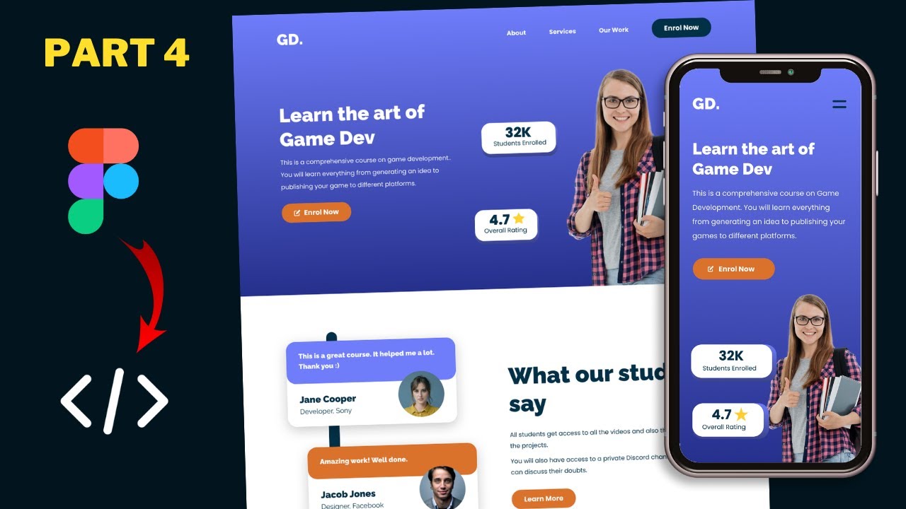
TLDRThis tutorial series focuses on converting a sigma design into a responsive website using HTML, CSS, and JavaScript. The instructor demonstrates the process of adapting the desktop version for tablet screens, starting with styling the hero section and moving on to the testimonial, courses, get our app, and footer sections. Techniques like flexbox, media queries, and CSS selectors are used to ensure the design is mobile-friendly, with detailed steps provided for adjusting layout, font sizes, and spacing.
Takeaways
- 🌐 The tutorial series is focused on converting a sigma design into a responsive website using HTML, CSS, and JavaScript.
- 🖥️ The desktop version of the website has already been designed, and the current focus is on coding for the tablet version.
- 🎨 The hero section of the tablet version has been designed, and the video will cover the design of the remaining sections.
- 🔍 The process involves using Figma to inspect design elements and then applying corresponding styles in CSS.
- 📝 CSS properties such as font size, flex direction, and margins are adjusted to fit the tablet layout.
- 🔄 Flexbox is utilized to rearrange elements for the tablet version, changing from a row to a column layout where necessary.
- 🖼️ Image sizes and object fit properties are set to ensure that images display correctly within their containers.
- 🔢 Specific measurements, such as font sizes and margins, are taken from the Figma design and implemented in the CSS.
- 🔄 The order of elements in the HTML structure is adjusted to match the tablet design layout.
- 🔗 The visibility of desktop and mobile buttons is controlled with CSS to ensure the correct button is displayed for the tablet version.
- 📚 The tutorial concludes with the completion of the tablet version design, including sections like hero, testimonials, courses, get our app, and footer.
Q & A
What is the main focus of this tutorial series?
-The main focus of this tutorial series is to convert a sigma design into a real website using HTML, CSS, and JavaScript, with the current stage being the development of the tablet version of the website.
What section of the website is being styled in the script?
-The script discusses styling the hero section, testimonial section, courses section, get our app section, and the footer for the tablet version of the website.
What changes are made to the testimonial section for the tablet version compared to the desktop version?
-For the tablet version, the testimonial section changes from a flex display with left and right sections side by side to a column flex direction with all elements stacked vertically. The testimonial cards are also adjusted to have full width and a margin bottom of 40 pixels.
How is the 'h2' heading styled in the tablet version according to the script?
-The 'h2' heading is styled with a font size of 40 pixels, as taken from the Figma design file for the tablet version.
What adjustments are made to the course cards in the 'Our Courses' section for the tablet version?
-The course cards are adjusted to have a flex direction of column, with each course on separate lines. The image within the course card is set to a height of 260 pixels and object fit is set to 'cover' to ensure the image covers the area without distortion.
What is the purpose of changing the 'flex-direction' property in the CSS for the tablet version?
-Changing the 'flex-direction' property to 'column' is necessary to stack elements vertically on the tablet version, as opposed to the horizontal layout used in the desktop version.
How does the script address the issue of aligning the background element in the testimonial section?
-The script addresses the alignment issue by adjusting the 'top' value of the ':before' pseudo-element to '-40 pixels' and changing the 'left' value to '60 pixels' to match the movement of the testimonial card.
What is the strategy for handling the button display in the testimonial section for the tablet version?
-The strategy involves hiding the desktop button by setting its display to 'none' and showing the mobile button by setting its display to 'block'. The mobile button's width is set to 100%, and its order in the layout is adjusted.
How is the footer layout adjusted for the tablet version in the script?
-The footer layout is adjusted from a three-column grid to a two-column grid by setting 'grid-template-columns' to '1fr 1fr'. The last 'links' division is set to span two columns to take up the full width for the third section.
What is the final step mentioned in the script for adjusting the 'Get Our App' section?
-The final step mentioned in the script for adjusting the 'Get Our App' section is to ensure that the button is moved to the left with a gap of 100 pixels from the footer, which involves adjusting the 'write' (likely a typo for 'left') CSS property.
Outlines
📱 Tablet Version Design Process
The script begins with an introduction to the tutorial series focused on converting a sigma design into a functional website using HTML, CSS, and JavaScript. The team has completed the desktop version and is now adapting the design for tablet users. The video showcases the hero section of the tablet version and outlines the steps to style the rest of the website sections, starting with the heading and adjusting the testimonial section to a column layout to fit the screen size.
🎨 Adjusting Testimonial and Courses Sections
This paragraph details the process of adjusting the testimonial section for tablet view, including modifying the flex direction to a column layout, setting full width for elements, and adjusting margins and paddings to match the design specifications from the Figma file. It also covers the reordering of elements in the HTML structure to match the tablet design, hiding the desktop button and displaying the mobile button, and changing the layout of paragraphs to appear as a single block of text.
🖼️ Fine-Tuning the Courses Section and Footer
The script continues with the styling of the 'Our Courses' section, adjusting the layout to a columnar format suitable for tablet screens, setting image dimensions, and ensuring proper object fit. It also touches on adjusting the gap between course cards and modifying the footer to a two-column layout from a three-column layout originally designed for desktop, including making the last column span two grid columns to fill the width.
👋 Wrapping Up the Tablet Version Design
The final paragraph concludes the tutorial by reviewing the completed tablet version of the website, which includes the hero section, testimonials, courses, 'Get Our App' section, and the footer. The speaker invites viewers to ask questions in the comments, encourages liking and subscribing for updates, and thanks the audience for watching, ending the video on a friendly note.
Mindmap
Keywords
💡HTML
💡CSS
💡JavaScript
💡Responsive Design
💡Figma
💡Flexbox
💡Media Queries
💡Object Fit
💡Grid Layout
💡Pseudo-classes
💡Display Property
Highlights
Introduction to the tutorial series on converting a sigma design into a real website using HTML, CSS, and JavaScript.
Designing the tablet version of the website, starting with the hero section.
Styling the heading for the tablet version with a font size of 40 pixels.
Adjusting the testimonial section layout for tablet view by setting flex direction to column.
Ensuring testimonial cards have a full width display on tablet screens.
Setting the margin bottom for elements in the testimonial section to 40 pixels.
Adjusting the positioning of the second testimonial card and its background element for alignment.
Modifying the height of the background element in the testimonial section for tablet view.
Changing the order of elements in the design to prioritize the heading and paragraph on tablet screens.
Hiding the desktop button and displaying the mobile button in the testimonial section for tablet users.
Adjusting the ordering of elements within the testimonial section for a better tablet layout.
Merging two paragraphs into a single paragraph for better readability on tablet screens.
Styling the 'Our Courses' section with a column flex direction for tablet layout.
Setting the image height in the course cards to 260 pixels for tablet screens.
Adjusting the font size of the course card headings to fit the tablet screen.
Adding a gap of 80 pixels between course cards for better spacing on tablet screens.
Repositioning the button in the 'Our Courses' section to align with the tablet layout.
Adjusting the footer layout to a two-column grid for tablet screens.
Ensuring the last column in the footer spans two grid columns for full-width display on tablets.
Completion of the tablet version design with a review of all sections.
Transcripts
hi everybody welcome to gt coding in
this tutorial series we are converting
this sigma design into a real website
using html css and javascript and we
have already designed the desktop
version now we are in the process of
writing the code for the tablet version
and if you go to the browser here we can
see we have designed the hero section of
our tablet version so this is how it
looks now in this video we will start
designing the rest of the sections so
let's get started
[Music]
all right here's our source code so the
first thing we will do is we will style
this
heading over here so let's go to our
figma file and let's double click over
here on this heading for the tablet
version
and let's see what is the font size so
let's go to inspect and let's scroll
down
and here we can see we have a font size
of 40 pixels
so let's copy this from here and
let's go to our css and here i'll just
type h2
because if you go to the html file we
can see for
the sections we have an h2 so if we
scroll down we can see that we have the
h2 over here
and for all the sections we have an h2
for the heading
so let's style the s2 here i'll just
paste the code
so we have a font size of 40 pixels so
let's go back to our
browser
and now you can see we have the correct
font size for our heading now let's go
back to our figma file and here we can
see we have all these elements one below
the other now for this testimonial
section we have set a display of flex so
if you go to the desktop version here we
can see both these uh left and right
sections are one next to the other but
here in the tablet version we have to
position all of them one below the other
so let's go back to our css
and if we scroll up and let's go to the
testimonials section css
and here you can see for the testimonial
section we have set a display of flex
now for the tablet version we have to
set the flex direction to column so
let's go over here to the tablet version
and here i'll just type testimonials
section
and i'll just set the flex direction to
column
and now we can see that the elements are
one below the other now we also want all
these elements to have full width so
here we'll just type align items and set
it to stretch now if we add a background
color over here we can see that we have
full width for this section but we have
added some fixed width to these
testimonial cards so let's go back to
our html and let's scroll up and let's
go to the testimonials section
and here we can see we have this
division with the class of testimonial
card so let's select this let's go back
and
let's remove this background color
and here let's type testimonials section
and testimonial card and let's set the
width to 100 percent all right now let's
go back to our sigma file and let's see
what is the distance between these two
elements so let's double click over here
and here we can see we have a margin
bottom of 40 pixels
so let's go back to our css and here
we'll just type margin bottom
and let's set it to 40 pixels
now here we can see for this background
element we have added an after selector
now if you scroll down and go to the
testimonials section for the desktop
version here we can see we have added a
before selector and we have a margin
bottom of 50 pixels over here so that's
why we had added a top value of negative
50 pixels but in our tablet version we
have set the margin bottom to 40 pixels
so we have to set the top value to
negative 40 pixels so let's type
testimonials section
testimonial card and we are selecting
the second testimonial card so let's
type last child
and here we'll just type colon column
before
right now we can see that this
background element is on top of the
first testimonial card
so let's add a top value of negative 40
pixels
and now we can see it looks all right
and i think we can decrease the height
of this background element a little bit
so if you go back to the desktop version
here we can see we have set a height of
100 of the element plus 90 pixels so for
the tablet version we will have a height
of 100
plus 80 pixels so i'll just paste it
over here
and here i'll just type 80 pixels
and i think that looks alright and now
the next thing we will do is we will
move this second testimonial card to the
left a little bit
so for the desktop version we have moved
it to the right so if you right click
over here and go to inspect
and let's select the second testimonial
card and here we can see we have a
transform translate x of 20 pixels
so let's copy this
let's copy this selector as well
and
let's go back to our css
and i'll just paste it over here
and here i'll just set it back to zero
and now we can see that this background
element is not aligned correctly so here
we can see this is on the right a little
bit and that's because we have moved the
second testimonial card to the left 20
pixels so we have to move this before
selector to the right 20 pixels so let's
right click over here
and let's click on inspect
and let's select the before selector
and here we can see for the before
selector we have a left value of 40
pixels
so we have to add 20 over here so it
will be
60 pixels now we can see it is aligned
correctly so let's go back and here i'll
just type
left
of 60 pixels
right now let's go back to our figma
file and here we can see we have the
heading and this paragraph at the
beginning and then we have these two
testimonial cards and then we have the
button
so we have to change the ordering in our
design so we have to move this heading
and this paragraph to the top
so let's do that if we go back to our
html file here we can see we have this
division with the class of left
and then we have a division of the class
of right and then we have this button
over here
so right now the button that is
displayed over here is the desktop
button so if you right click over here
and click on inspect here we can see we
have the desktop button selected so we
have to hide it in the tablet version
and we have to display this mobile
button
so i'll just go back to
the style.css file and here i'll just
type
testimonials section
desktop button
and i'll just set the display to none
and let's select the mobile button so
i'll just have testimonials section
mobile button
i'll just set the display to block and
right now we have a width of 100 so we
have to set the align self to flex start
and now we have the correct width right
now let's set the ordering so if you go
back to our html file here we can see we
have the left division and in that we
have the testimonial cards and then we
have the right division and in that we
have the heading and this paragraph and
then we have this button over here
so let's go back to our style.css file
and i listed the order to 1
and then we'll select the left division
so let's type testimonials section
left
and let's set the order to 2
and then we'll select this button
so the button is right here mobile
button so i'll just set the order to
three
and now we can see we have the heading
we have the paragraph and then we have
the testimonial cards and then we have
this button let's also reduce the gap a
little bit so let's go back over here
to the testimonials section
and here let's type gap and i'll just
set the gap to 50 pixels
now the next thing we have to do over
here is that we have to have a single
paragraph instead of these two
paragraphs so if you go back to our
index.html file and let's select the
right division and here we can see we
have these two paragraphs over here
and these paragraphs are inside the
right division so let's go back to our
css file
and
here i'll just type
testimonial section
right p
and i'll just set the display to inline
so that the next paragraph will start in
the same line so now we can see we have
a single paragraph right now let's add
some margin bottom for this h2
so let's type testimonial section h2 and
we will add a margin bottom of 20 pixels
now the next thing we will do is we will
remove the margin bottom for the second
testimonial card here we have the second
testimonial card so here let's type
margin bottom
and i'll just set it to zero
and i think that looks all right all
right i think that's it for the
testimonials section right now let's
scroll down and let's style this our
courses section
so let's go back to our figma file and
here we can see for the our courses
section we have
each course on separate lines so we have
to set the flex direction to column so
let's go back to our css
and let's select the course cards so if
you go back to our html file and if you
scroll down
we can see for the course cards we have
this division of the class of course
cards and in that we have these two
divisions with classes course card so
let's go back to our style.css file and
here i'll just type
courses section
course card
and let's set the flex direction to
column
and it should be course cards
right now we can see we have both the
courses on different lines right now
let's go back to our figma file and
let's see what is the size of this image
so let's double click on the image
and for the image we have a height of
260 pixels so let's go back
and let's add that here i'll just type
courses section
course card img and let's set the height
to 260
pixels
and now we can see that the image has
shrunk so for that we have to type
object fit
and set it to cover
and now everything looks all right all
right let's go back to our figma file
and let's double click on this heading
and let's see what are the styles
so if you go to inspect and if you
scroll down
we can see that we have a font size of
30 pixels let's go back to our css and
let's add it over here
so just stop courses section
course card
s3 because if you go back to the html
file we can see that we have this s3 for
the heading right now let's copy and
paste the code
and
i think it was 30 pixels already
let's decrease the font size a little
bit and let's see how it looks
and i think that looks all right
all right now let's go back to our figma
file and let's see what is the gap
between these two cards
so
we can see we have a gap of 80 pixels so
let's go back to our css and here we
will go to course cards and let's add a
gap
of 80 pixels
and i think that we already have some
default margins so let's right click
over here and click on inspect
and here we can see we have a margin of
40 pixels top and bottom so we have to
remove the margin
so here we'll just type course
section
course card
and we will set a margin of 0
and now we have the correct gap but
we need to have some margin bottom for
this heading as well so let's add that
here let's type courses section
and for the heading we have an h2
so let's tap h2
and i'll just add a margin bottom
and let's try
40 pixels
and i think that looks alright now the
last thing we will do is
bring this button over here to the left
so if you go back to our figma file and
if i click over here and hover over this
area we can see that we have
a gap of 100 pixels so let's go back
and
let's select the button so we have this
anchor tag with the class of btn so
let's go back
and here let's type courses section
btn and let's add a write value of 100
pixels
and the style is not being applied so
let's right click over here and let's
click on inspect
and let's see what's the problem now
here we can see we have added courses
section btn
and
this css over here that we just wrote
has been overwritten by this css right
here
because this selector is more specific
so we have courses section wrapper and
btn
so let's copy this selector
and let's add it over here
and now we can see that the button is
displayed correctly now let's go back to
our figma file and
from the button to this course card we
have a gap of 50 pixels so let's add
some margin bottom for the course card
so i'll just select the second course
card so i'll just have courses section
course card
colon last child to select the second
instance
and i'll just add a margin bottom of 50
pixels or that looks alright or that's
it with the courses section
now let's scroll down and then we have
the get our app section
so if you go back to our figma file
we have the same styling for the desktop
version over here as well so let's move
on to the next section which is the
footer and for the footer we have a two
column layout
so let's go back to our css right now
for the footer we have set a display of
grid
so here we can see for the footer links
container we have set a display of grid
and here we have set a grid template
columns of 2fr 2fr and 3fr so we have
three columns now for the tablet version
we need to have two columns so let's
scroll down and here we'll just type
footer
links container
and let's type grid template columns
and let's set it to 1fr 1fr for two
columns with the same width and after
the third section we need to have full
width so if you go back to our
index.html file for the footer we have
this links container and in that we have
divisions with the class of links so we
can see we have three divisions with the
class of links now for the last division
with the class of links we have to have
a width of hundred percent
so let's go back over here to stylor css
and let's type
footer links container
links
colon last child and here we just type
background and red we can see we have a
width of 50
now since we have set the display to
grid we have the first links division
over here and then we have the second
links division and then we have the
third links division over here and this
is the space for the fourth one now we
have to span this third division
for two columns so here let's type grid
column
and we have to type one forward slash
three now it will span two columns so
now we can see we have hundred percent
width
right now let's remove this background
color
and that's it with the footer of our
tablet version and with that we have
completed the design of the tablet
version
so this is how it looks we have the hero
section over here
then we have the testimonials section
and then the courses section the get our
app section and the footer so everything
looks all right all right that's it for
this video if you have any doubts you
can ask in the comments below and if you
like this video please click on the like
button and subscribe to this channel to
get the latest video updates thanks a
lot for watching have a nice day
[Music]
you
Ver Más Videos Relacionados
Figma To Real Website | Responsive Homepage | HTML, CSS & JavaScript | Part 11
Figma To Real Website | Responsive Homepage | HTML, CSS & JavaScript | Part 8
Figma To Real Website | Responsive Homepage | HTML, CSS & JavaScript | Part 7
Figma To Real Website | Responsive Homepage | HTML, CSS & JavaScript | Part 10
Figma To Real Website | Responsive Homepage | HTML, CSS & JavaScript | Part 4
Figma To Real Website | Responsive Homepage | HTML, CSS & JavaScript | Part 5
5.0 / 5 (0 votes)