Statistika - Penyajian Data ( Histogram, Poligon & Ogive )
Summary
TLDRIn this video, the presenter discusses statistical data presentation methods, focusing on frequency distribution tables, histograms, polygons, and Ogives. It covers both positive and negative Ogives, explaining how cumulative frequencies are used to create graphs. The video includes a detailed example with Korean PTS scores, showing how to calculate class boundaries, find middle values, and construct various charts. The content emphasizes the use of cumulative frequencies in creating both upward and downward graphs for data visualization, making statistical concepts more accessible and understandable.
Takeaways
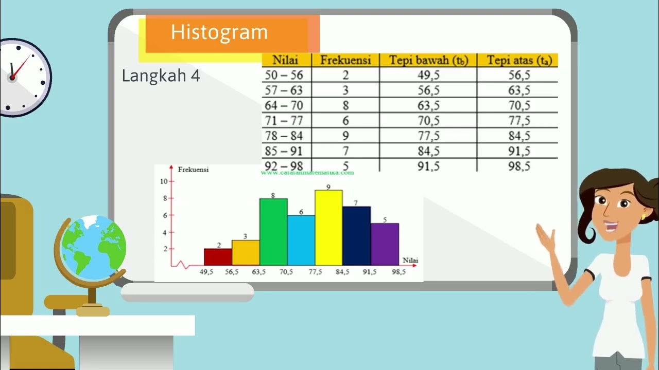
- 😀 Histograms are bar charts used to represent frequency distributions, where the bars are adjacent to each other.
- 😀 The horizontal axis of a histogram represents data values or class intervals, while the vertical axis represents frequency.
- 😀 Polygons are line graphs connecting the midpoints of the histogram bars to visualize the distribution of data.
- 😀 Midpoints for a polygon are calculated by averaging the lower and upper class boundaries of each interval.
- 😀 Ogives represent cumulative frequencies, showing the total number of data points less than (positive Ogive) or greater than (negative Ogive) specific class boundaries.
- 😀 Positive Ogives show the cumulative frequency less than the upper class boundary, and the graph usually rises.
- 😀 Negative Ogives show the cumulative frequency greater than the lower class boundary, and the graph typically declines.
- 😀 To create a positive Ogive, cumulative frequencies are added as you move to higher intervals, starting from the lowest class.
- 😀 To create a negative Ogive, cumulative frequencies are subtracted as you move from lower to higher class intervals.
- 😀 The script includes an example of calculating and presenting data for Korean PTS scores, using histograms, polygons, and Ogives to visualize the data distribution.
- 😀 The frequency distribution table, midpoints, and class boundaries are key components in constructing histograms, polygons, and Ogives effectively.
Q & A
What is a histogram and how is it represented?
-A histogram is a type of bar chart where the bars are adjacent to each other. It represents data with the horizontal axis showing data values and the vertical axis showing the frequency of those values.
What is the difference between a histogram and a polygon?
-A histogram uses bars to represent data, while a polygon uses lines to connect the midpoints of the bars from a histogram, creating a continuous curve.
What are class boundaries and how do you calculate them?
-Class boundaries are the values that define the limits of a class in a frequency distribution table. The lower class boundary is the lower limit minus 0.5, and the upper class boundary is the upper limit plus 0.5.
What is the role of the middle value in a frequency distribution?
-The middle value (also known as the class midpoint) is calculated by averaging the lower and upper limits of a class. It helps in plotting the data for polygon graphs.
How is a positive ogive constructed?
-A positive ogive is constructed by plotting the cumulative frequency less than the upper class limit. The values are connected with a line that typically rises as the cumulative frequency increases.
What is the difference between a positive ogive and a negative ogive?
-A positive ogive shows the cumulative frequency less than the upper class limits and typically rises. A negative ogive shows the cumulative frequency more than the lower class limits and typically falls.
How do you calculate the cumulative frequency for a positive ogive?
-The cumulative frequency for a positive ogive is calculated by adding the frequencies of the classes in a sequential manner. For each upper class limit, you add the frequency up to that point.
What does it mean for a negative ogive to have a decreasing graph?
-In a negative ogive, the cumulative frequency is more than the lower class limit, which means that as you move to the next class, the cumulative frequency decreases, leading to a downward graph.
How do you determine the cumulative frequency for a negative ogive?
-For a negative ogive, the cumulative frequency more than the lower class limit is calculated by subtracting the class frequencies from the total frequency.
What is the significance of the frequency distribution table in graphing?
-The frequency distribution table provides the necessary data (class limits and frequencies) that are essential for constructing histograms, polygons, and ogives. The class boundaries and midpoints derived from this table are used to plot the respective graphs.
Outlines

Esta sección está disponible solo para usuarios con suscripción. Por favor, mejora tu plan para acceder a esta parte.
Mejorar ahoraMindmap

Esta sección está disponible solo para usuarios con suscripción. Por favor, mejora tu plan para acceder a esta parte.
Mejorar ahoraKeywords

Esta sección está disponible solo para usuarios con suscripción. Por favor, mejora tu plan para acceder a esta parte.
Mejorar ahoraHighlights

Esta sección está disponible solo para usuarios con suscripción. Por favor, mejora tu plan para acceder a esta parte.
Mejorar ahoraTranscripts

Esta sección está disponible solo para usuarios con suscripción. Por favor, mejora tu plan para acceder a esta parte.
Mejorar ahoraVer Más Videos Relacionados
VIDEO ANIMASI MATEMATIKA MATERI PENYAJIAN DATA KELAS 10

4.2 | DATA COLLECTION & PRESENTATION | DATA MANAGEMENT | MATHEMATICS IN THE MODERN WORLD | ALOPOGS
Statistika - Membaca dan Menyajikan data, Poligon Histogram Ogive
Distribusi Frekuensi: Definisi, Fungsi, dan Jenis-Jenisnya
Statistika 05 | Distribusi Frekuensi dalam Statistika | Frequency Distribution | Belajar Statistika

Statistik : Penyajian Data - Part 5
5.0 / 5 (0 votes)
