Making a basic graph in Office 365 Excel
Summary
TLDR本视频教程介绍了如何在Office 365 Excel中创建基本的条形图,并复习了Excel的一些术语。首先,打开Excel并创建一个新的工作簿,然后在A列留空,B列开始输入数据,如一周的天数。接着在顶部输入行为类别,如击打、咬和逃跑,并在下方输入每天的行为频率。数据输入完成后,通过插入选项卡选择柱状图,创建一个聚集柱状图来展示数据。最后,添加图表标题和坐标轴标题,并通过复制粘贴的方式将图表导出。视频还强调了在云端工作的优势,如自动保存和随时随地访问。
Takeaways
- 🖥️ 使用Office 365 Excel创建基本条形图的快速教程。
- 🔍 教程中也复习了Excel的一些术语,确保理解一致。
- 💼 从Office 365启动器打开Excel,创建新的空白工作簿。
- 📊 在Excel中,数据通常按列和行排列,图表数据一般从第二行开始,第一行留空。
- 🗓️ 例子中使用的数据是一周的天数,从星期一到星期五。
- 📈 数据输入完成后,选择插入图表,选择柱状图的类型。
- 📋 插入图表时,可以选择数据范围,或者先选择数据再插入图表。
- 📊 可以调整图表类型,例如改为饼图,但本教程中使用柱状图。
- 📝 为图表添加标题和轴标题,明确表示图表的变量和数据。
- ⌨️ 在Windows系统中使用Ctrl+C和Ctrl+V复制粘贴图表,在Mac系统中使用Command+C和Command+V。
- ☁️ 利用Office 365的云服务优势,图表和数据可以自动保存,方便随时访问和编辑。
Q & A
如何在Office 365中打开Excel应用程序?
-在Office 365中,可以通过点击应用启动器来打开Excel。如果正在使用Word或其他Microsoft环境,Excel将以新窗口或新标签页的形式打开。
在Excel中创建图表前,数据应该如何布局?
-在Excel中创建图表前,数据通常按列和行布局。一般会留空A1单元格,使用A列来表示行序列,例如时间序列,而顶部的行则用来表示不同的类别或变量。
如何快速填充Excel中的连续数字?
-在Excel中,可以通过选择一系列单元格,然后拖动单元格右下角的小方块(填充柄)向下或向右拖动,以快速填充连续的数字。
在Excel中,如何插入一个基本的柱状图?
-在Excel中,可以通过点击'插入'选项卡,然后选择'柱状图'中的'群集柱状图'来插入一个基本的柱状图。群集柱状图会将不同的行为(如击打、咬和逃跑)并排显示,而不是堆叠在一起。
如何为Excel图表选择数据范围?
-可以通过直接选择数据区域或使用'选择数据'选项来为图表选择数据范围。在'选择数据'对话框中,需要指定数据的范围,例如从A1到C6。
如何在Excel图表中添加标题?
-在图表工具中,可以通过点击'图表工具'选项卡,然后选择'设计'或'格式'选项卡来添加图表标题。可以设置标题的位置(如在图表上方或覆盖在图表上),并输入标题文本,如'行为频率'。
如何设置Excel图表的水平轴和垂直轴标题?
-在图表工具的'格式'选项卡中,可以设置水平轴(X轴)和垂直轴(Y轴)的标题。例如,可以设置水平轴标题为'一周的日子',垂直轴标题为'频率',以清晰地表示图表的变量。
如何在Excel图表中移动图例位置?
-可以通过点击图表中的图例,然后拖动到图表的其他位置来移动图例。例如,可以将图例从默认位置移动到图表的侧面。
在Windows和Mac操作系统中,如何复制和粘贴Excel图表?
-在Windows环境中,可以使用Ctrl+C来复制图表,然后使用Ctrl+V来粘贴。而在Mac操作系统中,则使用Command+C和Command+V来执行相同的操作。
在Office 365中创建的Excel图表如何保存?
-在Office 365中,创建的Excel图表会自动保存到云端。用户可以通过重命名工作簿(如'示例图表工作表')来组织和管理图表。Excel会实时保存数据,确保用户可以随时访问最新的图表和数据。
Outlines

Esta sección está disponible solo para usuarios con suscripción. Por favor, mejora tu plan para acceder a esta parte.
Mejorar ahoraMindmap

Esta sección está disponible solo para usuarios con suscripción. Por favor, mejora tu plan para acceder a esta parte.
Mejorar ahoraKeywords

Esta sección está disponible solo para usuarios con suscripción. Por favor, mejora tu plan para acceder a esta parte.
Mejorar ahoraHighlights

Esta sección está disponible solo para usuarios con suscripción. Por favor, mejora tu plan para acceder a esta parte.
Mejorar ahoraTranscripts

Esta sección está disponible solo para usuarios con suscripción. Por favor, mejora tu plan para acceder a esta parte.
Mejorar ahoraVer Más Videos Relacionados

How To Generate Images With ChatGPT (Create AI Art with Chat GPT)

The BEST Way To Make Money With AI NOW! - Don't Miss This
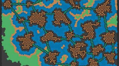
Graph Grammar based Procedural Generation for a Roguelike
Simple Inventory (PART 1: Adding Items to Player Inventory)
Unreal Engine 5 RPG Tutorial Series - #20: AI Behavior Trees Patrolling

Unreal Engine 5 RPG Tutorial Series - #2: Locomotion - Blendspace, Crouching and Procedural Leaning!
5.0 / 5 (0 votes)
