05-1 Eksplorasi Perbandingan Antar Grup
Summary
TLDRIn this session on statistical analysis and data exploration, various techniques such as histograms, boxplots, and five-number summaries are used to compare data distributions across different groups. The script provides detailed examples, including comparing male and female height distributions, sales data with YouTube and Facebook ads, and the survival rates of babies with respiratory distress syndrome. Each method is explored for its advantages in visualizing data and identifying trends or outliers. The session emphasizes how visual tools can reveal insights into data relationships and variability, making it accessible for anyone learning data analysis.
Takeaways
- 😀 Boxplots and histograms are effective methods for comparing distributions between groups, making data exploration more intuitive and visual.
- 😀 Boxplots allow for easy identification of outliers and comparison of key statistics like minimum, quartiles, and median across groups.
- 😀 Histograms can be used to visualize the frequency of observations in each group, though they may require more space when comparing multiple groups.
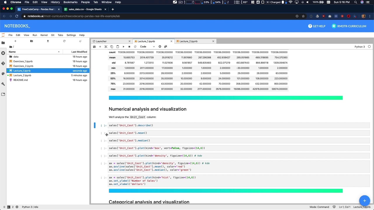
- 😀 Statistical summaries like the five-number summary (minimum, first quartile, median, third quartile, and maximum) can provide insights into the central tendency and variability of data across groups.
- 😀 When comparing distributions, boxplots provide clearer insights into the spread and symmetry of data compared to histograms, especially for detecting outliers.
- 😀 Analyzing body height data of males and females, we observe that female height distribution is right-skewed, while male height distribution tends to be more symmetric.
- 😀 A comparison of YouTube and Facebook advertising sales data using boxplots shows that YouTube has higher median sales, with a wider interquartile range indicating greater variability.
- 😀 Boxplots for birth weight data reveal a connection between birth weight and survival rate, with higher birth weights correlating with greater survival chances for babies.
- 😀 Comparison of monthly expenses between male and female students reveals that females tend to have higher median expenditures, with some outliers in both groups.
- 😀 A breakdown of COVID-19 cases across different clusters in India using boxplots reveals significant variability in recovery and mortality rates across regions.
- 😀 A comparison of income distribution in 1970 and 2010 between developing and developed countries shows a significant shift to higher incomes in developing countries, particularly in Asia East and Latin America.
Q & A
What are the main methods used for group comparison in the script?
-The script discusses three main methods for comparing groups: using histograms, boxplots, and five-number summaries. These methods allow for the visualization of data distribution and the identification of differences between groups.
How does the boxplot method help in comparing data distributions?
-The boxplot method compares the distribution of data between groups by visualizing the median, quartiles, and potential outliers. It allows for an easy comparison of the spread and symmetry of data distributions, as shown with the height data of males and females.
What key features of the boxplot can help identify outliers?
-Boxplots highlight outliers through symbols placed outside the whiskers. In the script, outliers are shown on the left and right sides of the boxplot for the height data, indicating values significantly different from the rest of the data.
What does the histogram method help visualize in group comparisons?
-Histograms show the frequency of data within certain ranges, helping to visualize the distribution and shape of the data. The script discusses using histograms to compare the heights of males and females, showing how their distributions differ.
Why is it important to choose the right statistical method for comparison?
-Choosing the right statistical method, such as histograms, boxplots, or five-number summaries, depends on the type of data and the specific comparison goals. Each method provides different insights into the data's distribution and variability, helping to clarify relationships between groups.
What does the five-number summary provide when comparing groups?
-The five-number summary provides key statistical values: the minimum, first quartile, median, third quartile, and maximum. These numbers summarize the distribution of data and help compare central tendencies and spread between groups.
What was observed when comparing the sales data from YouTube and Facebook ads using boxplots?
-The boxplot comparison showed that the median sales from YouTube ads were higher than from Facebook ads, and the interquartile range (IQR) for YouTube was wider, indicating more variability in the sales data.
What can we infer from the comparison of birth weight and survival rate using boxplots?
-The boxplot comparison revealed that babies who survived had higher median birth weights than those who did not survive. The spread of the data for survivors was also more varied compared to non-survivors.
How do the boxplots for male and female student spending compare?
-The boxplot for female students showed a higher median expenditure than male students, and the data for females had a wider range, suggesting more variability in spending. Additionally, the female data showed a rightward skew, while the male data was more symmetrical.
What is the significance of using multiple methods (like boxplots and histograms) for data comparison?
-Using multiple methods allows for a more comprehensive analysis of data. For example, histograms provide a visual overview of data distribution, while boxplots help identify outliers and summarize the data spread. Combining both methods gives a clearer understanding of the underlying patterns in the data.
Outlines

Dieser Bereich ist nur für Premium-Benutzer verfügbar. Bitte führen Sie ein Upgrade durch, um auf diesen Abschnitt zuzugreifen.
Upgrade durchführenMindmap

Dieser Bereich ist nur für Premium-Benutzer verfügbar. Bitte führen Sie ein Upgrade durch, um auf diesen Abschnitt zuzugreifen.
Upgrade durchführenKeywords

Dieser Bereich ist nur für Premium-Benutzer verfügbar. Bitte führen Sie ein Upgrade durch, um auf diesen Abschnitt zuzugreifen.
Upgrade durchführenHighlights

Dieser Bereich ist nur für Premium-Benutzer verfügbar. Bitte führen Sie ein Upgrade durch, um auf diesen Abschnitt zuzugreifen.
Upgrade durchführenTranscripts

Dieser Bereich ist nur für Premium-Benutzer verfügbar. Bitte führen Sie ein Upgrade durch, um auf diesen Abschnitt zuzugreifen.
Upgrade durchführenWeitere ähnliche Videos ansehen

04-1 Memahami Data Melalui Eksplorasi Data
Data Analysis Example A - Data Analysis with Python

UJI NORMALITAS: Kenapa & Variabel apa yang dapat Diuji Normalitas-nya?

Kruskal Wallis: Uji Non-Parametrik Komparasi Numerik Tidak Berpasangan

STATISTIKA PART 1

Understanding Prometheus Metric Types | Meaning and Usage (Gauge, Counter, Summary, Histogram)
5.0 / 5 (0 votes)
