Excel Quick and Simple Charts Tutorial
Summary
TLDRIn this beginner-friendly tutorial, viewers learn how to create visually appealing charts in Excel using sales data from board and card games. The presenter guides users through selecting data, generating a chart with a simple keyboard shortcut, and customizing it for clarity. Key features include switching rows and columns, adjusting chart styles, and inserting images for enhanced visuals. The tutorial emphasizes practical steps, including copying charts into other applications like PowerPoint and Word. With a focus on user-friendly techniques, this video is a valuable resource for teachers and students looking to enhance their Excel skills.
Takeaways
- 😀 The tutorial focuses on creating charts in Excel using a spreadsheet of board games and card games.
- 📊 To create a chart, highlight the data you want to include, excluding unnecessary information like total sales.
- ⌨️ Use the shortcut 'Alt + F1' to quickly generate a simple chart based on the selected data.
- 🔄 After generating a chart, you can move it around by clicking and dragging its edges.
- 📅 The chart initially displays sales data month by month, helping visualize trends for best-selling games.
- 🎨 You can customize the chart design by using the Design and Format tabs that appear when the chart is selected.
- 🔄 The 'Switch Row/Column' option allows you to change the chart's orientation to display different insights.
- 📈 The Design ribbon provides various chart styles and layouts to enhance the chart's appearance.
- 🖊️ Titles and axis labels can be easily edited by clicking directly on them or by using the formula bar.
- 📷 Pictures can be inserted into the chart for a more visual representation of the data.
Q & A
What is the primary focus of this Excel tutorial?
-The tutorial focuses on demonstrating how to quickly add and customize charts in Excel using a sample dataset of board and card games.
Why is it important to select specific data when creating a chart?
-Selecting specific data allows you to exclude unnecessary information, such as total sales, ensuring that the chart effectively highlights the most relevant data points.
What keyboard shortcut is used to generate a chart in Excel?
-The shortcut to automatically generate a chart is Alt + F1.
How can you reposition the chart after creating it?
-You can reposition the chart by clicking and dragging it, ideally from the edges for better control.
What options are available under the 'Design' tab after selecting a chart?
-The 'Design' tab offers options such as switching rows and columns, selecting different chart styles, and choosing quick layouts to customize the chart's appearance.
How can you change the chart title and axis labels?
-You can change the chart title and axis labels by clicking on them directly to edit, or by linking them to specific cells in the spreadsheet using the equals sign in the formula bar.
What is one way to make the chart visually more engaging?
-One way to enhance the chart visually is by inserting images of the games directly into the chart, making it more attractive and informative.
Can you export the chart to other Microsoft applications? If so, how?
-Yes, you can export the chart by right-clicking on it to copy, and then pasting it into applications like PowerPoint, Word, or Publisher.
What encouragement does the presenter offer at the end of the tutorial?
-The presenter encourages viewers to like the video, connect on social media, subscribe for more content, and considers supporting through Patreon.
What are some customization options mentioned for the chart?
-Customization options include changing chart styles, applying quick layouts, editing titles, adjusting colors and gradients, and adding images.
Outlines

Dieser Bereich ist nur für Premium-Benutzer verfügbar. Bitte führen Sie ein Upgrade durch, um auf diesen Abschnitt zuzugreifen.
Upgrade durchführenMindmap

Dieser Bereich ist nur für Premium-Benutzer verfügbar. Bitte führen Sie ein Upgrade durch, um auf diesen Abschnitt zuzugreifen.
Upgrade durchführenKeywords

Dieser Bereich ist nur für Premium-Benutzer verfügbar. Bitte führen Sie ein Upgrade durch, um auf diesen Abschnitt zuzugreifen.
Upgrade durchführenHighlights

Dieser Bereich ist nur für Premium-Benutzer verfügbar. Bitte führen Sie ein Upgrade durch, um auf diesen Abschnitt zuzugreifen.
Upgrade durchführenTranscripts

Dieser Bereich ist nur für Premium-Benutzer verfügbar. Bitte führen Sie ein Upgrade durch, um auf diesen Abschnitt zuzugreifen.
Upgrade durchführenWeitere ähnliche Videos ansehen

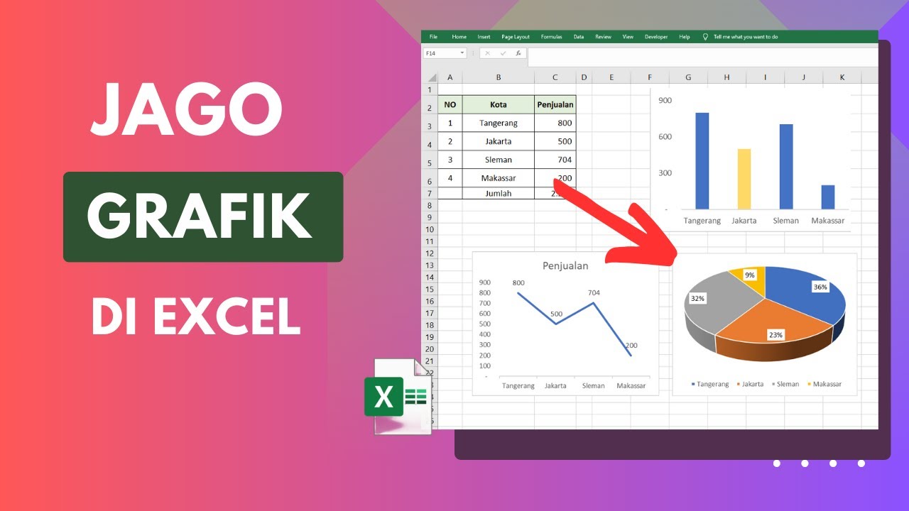
Cara Membuat Grafik di Excel Untuk Pemula

Learn Excel Pivot Tables in 10 Minutes - A complete beginner's tutorial

Como Fazer Gráficos no Excel em 2023

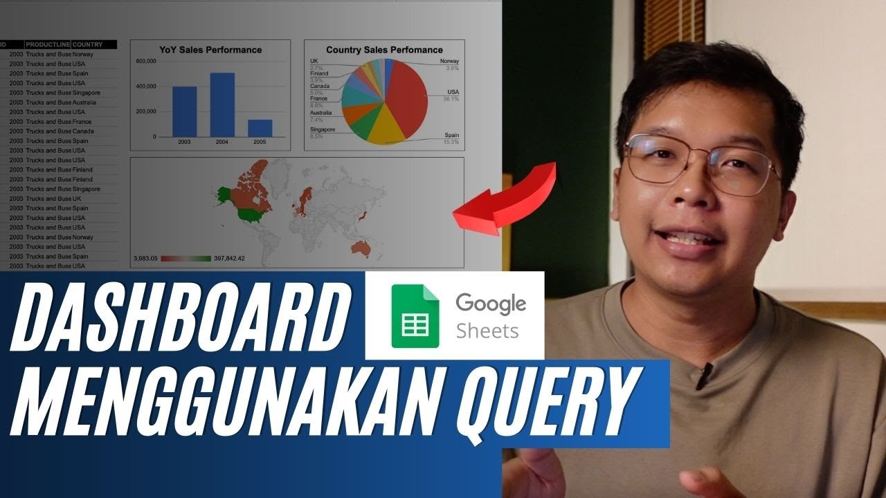
Membuat Dashboard di Google Sheet | Belajar Fungsi Query | Indonesia

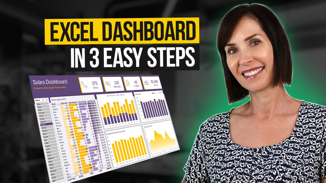
Interactive Excel Dashboard Tutorial in 3 Steps (+ FREE Template)

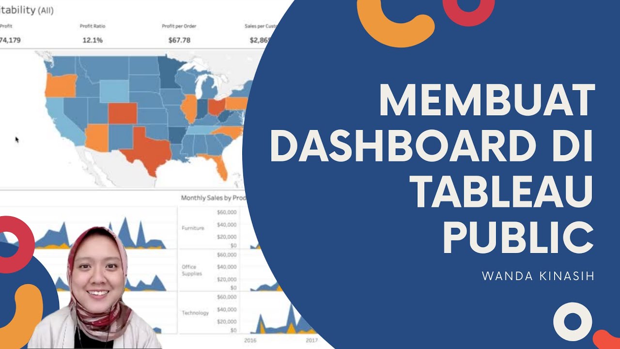
Tableau Dashboard Tutorial dalam 12 Menit | Bahasa Indonesia
5.0 / 5 (0 votes)
