Interactive Excel Dashboard Tutorial in 3 Steps (+ FREE Template)
Summary
TLDRThis tutorial video guides viewers through creating an interactive sales dashboard in Excel within 20 minutes. It covers designing cohesive elements, analyzing key metrics, and adding interactive features for data exploration. The example uses 11 months of fictional outbound sales call data, showcasing how to format, insert KPIs, pivot tables, and conditional formatting for a visually appealing and informative dashboard. The video also offers a 20% discount on Excel and Power BI courses, encouraging viewers to enhance their data analysis skills.
Takeaways
- 📊 The video demonstrates how to create an interactive dashboard in three main steps: design, data analysis and visualization, and adding interactivity.
- 🔍 The dashboard is designed to visualize key metrics from 11 months of fictional outbound sales call data, including total calls, calls reached, conversion rates, and deal values.
- 🎨 A cohesive design is established by setting a color theme and using consistent design elements such as shapes and icons to represent KPIs.
- 📈 The script guides through the process of inserting and formatting shapes, icons, and text boxes to display KPI values and labels.
- 📝 The use of Excel tables and pivot tables is emphasized for data organization and easy updating of the dashboard.
- 🔧 The tutorial includes tips on how to format data, apply number formatting, and use slicers for filtering data based on salesperson names.
- 📉 Charts are created to visualize data trends, including a column chart for calls reached and deals closed, and an area chart for the call drop rate.
- 👀 Conditional formatting is used to highlight selected salespersons in the KPI table, enhancing the dashboard's interactivity and data exploration capabilities.
- ⚙️ The dashboard is made interactive with elements like slicers that allow users to filter and explore data specific to their interests.
- 🔄 The script mentions a time-limited discount on Excel and Power BI courses, indicating a promotion to enhance data visualization skills.
- 🚀 The dashboard is designed to be easily updated with new data, showcasing the efficiency of using pivot tables in data management and visualization.
Q & A
What is the main objective of the video?
-The main objective of the video is to demonstrate how to transform a dataset into an interactive dashboard in three steps: cohesive design, data analysis and visualization, and adding interactive elements, all within 20 minutes.
What type of data is used in the video for the dashboard?
-The data used in the video is fictional outbound sales call data spanning 11 months, which includes metrics such as total calls, calls reached, average duration, deals closed, conversion rate, deal value, and dropped call rate.
How does the video suggest changing the color theme in the dashboard?
-The video suggests changing the color theme to 'aspect' on the page layout tab to quickly access a new color palette and default colors.
What is the purpose of using shapes in the dashboard design?
-Shapes are used to store KPIs (Key Performance Indicators) and provide a visual structure for organizing and displaying data in the dashboard.
How are icons used in the dashboard?
-Icons are used as visual indicators for KPIs, representing different metrics such as calls, calls reached, deals closed, and deal values.
What is the purpose of inserting a pivot table in the dashboard?
-A pivot table is inserted to analyze and summarize the data, making it easier to update the dashboard and filter data by different criteria such as salesperson's name.
How does the video suggest updating the dashboard with new data?
-The video suggests updating the dashboard by adding new data to the source table and then using the 'refresh all' feature on the data tab to update the dashboard.
What is the significance of using a slicer in the dashboard?
-A slicer provides an interactive way to filter the data displayed in the dashboard, allowing users to view data specific to a selected salesperson or other criteria.
How does the video handle the formatting of the pivot table and charts?
-The video demonstrates formatting the pivot table and charts to match the theme, including setting the vertical axis to start at zero, applying number formatting, and using conditional formatting to enhance visual interpretation of the data.
What is the final step to enhance the dashboard's visuals before completion?
-The final step is to add an outer shadow to the charts for an embellishment and to insert a shape with a title for the KPIs table to improve readability and visual appeal.
How does the video ensure the dashboard is interactive and easy to navigate?
-The video ensures interactivity by adding a slicer for data exploration and making sure the dashboard updates with a single button click, providing a user-friendly and dynamic experience.
Outlines

This section is available to paid users only. Please upgrade to access this part.
Upgrade NowMindmap

This section is available to paid users only. Please upgrade to access this part.
Upgrade NowKeywords

This section is available to paid users only. Please upgrade to access this part.
Upgrade NowHighlights

This section is available to paid users only. Please upgrade to access this part.
Upgrade NowTranscripts

This section is available to paid users only. Please upgrade to access this part.
Upgrade NowBrowse More Related Video
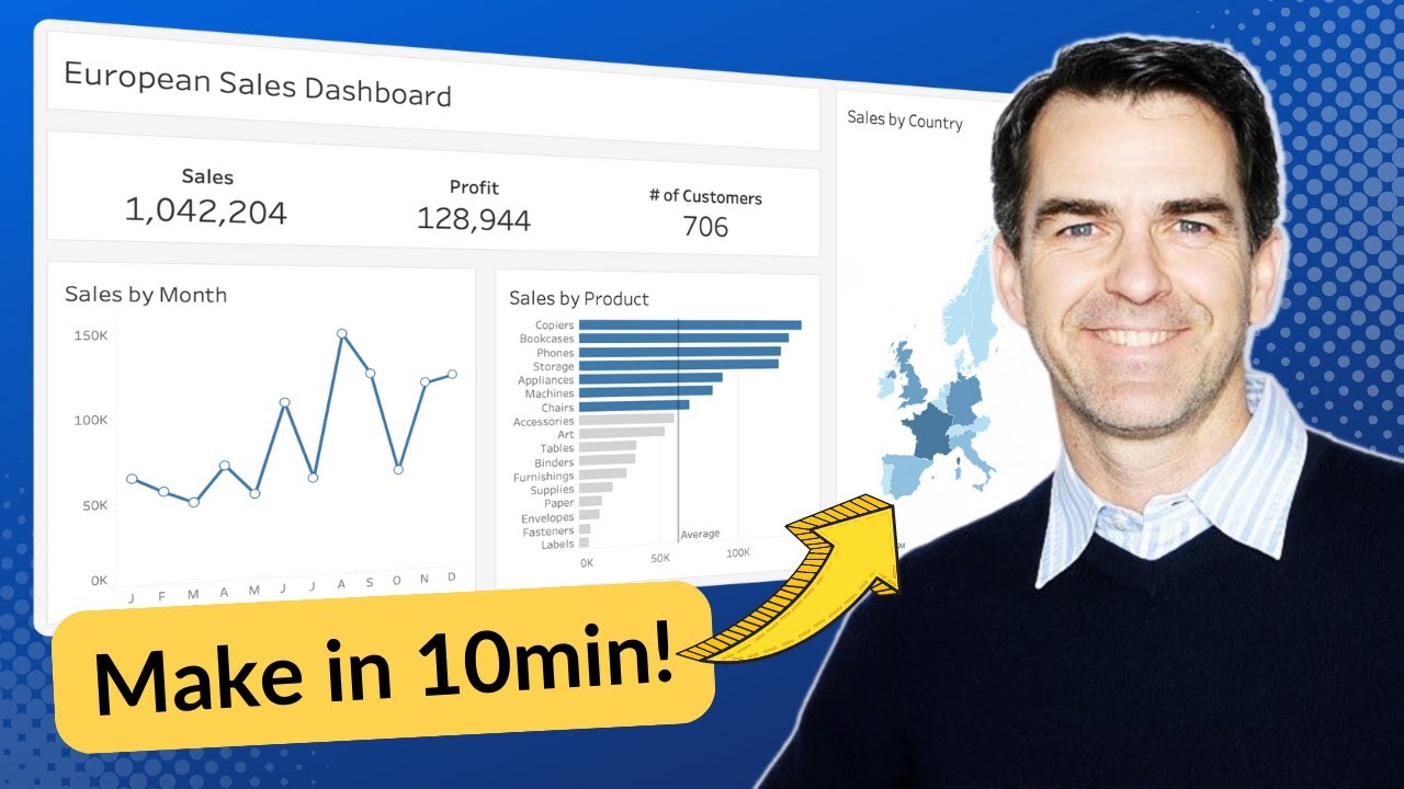
Make an AWESOME Tableau Dashboard in Only 10 Minutes

Google Sheets - Dashboard Tutorial - Dynamic QUERY Function String - Part 3
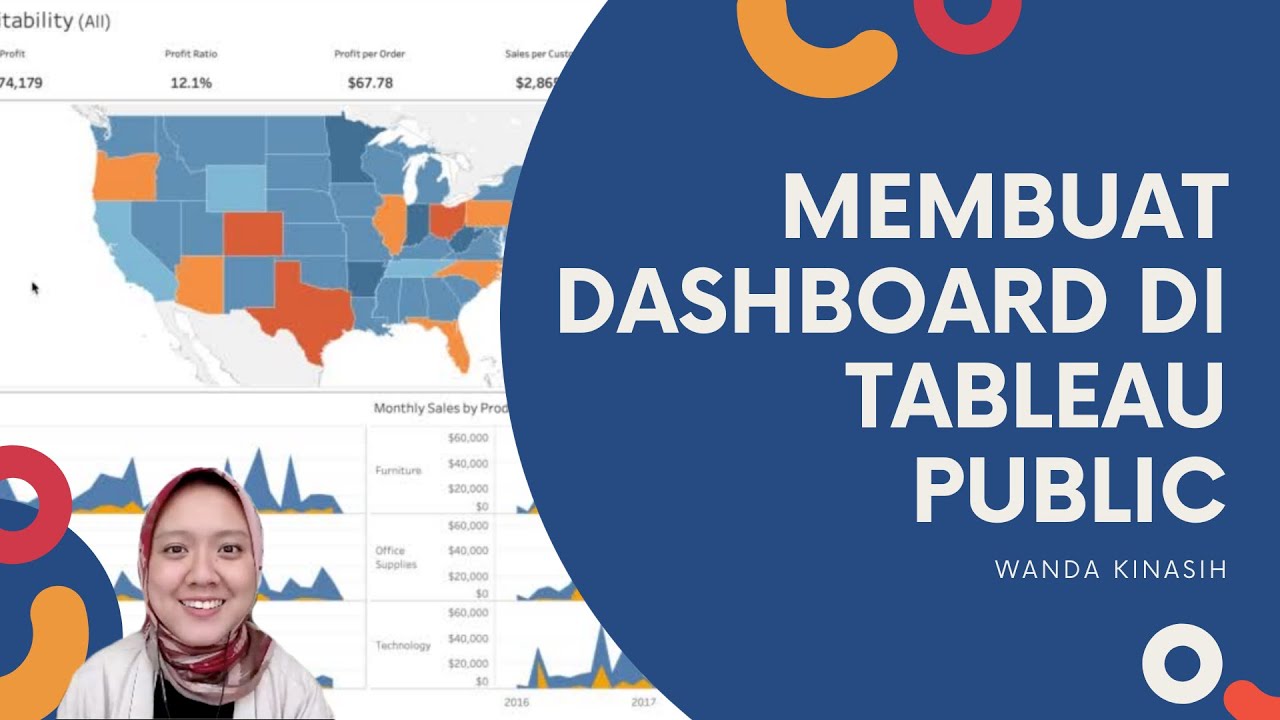
Tableau Dashboard Tutorial dalam 12 Menit | Bahasa Indonesia
📊 How to Build Excel Interactive Dashboards
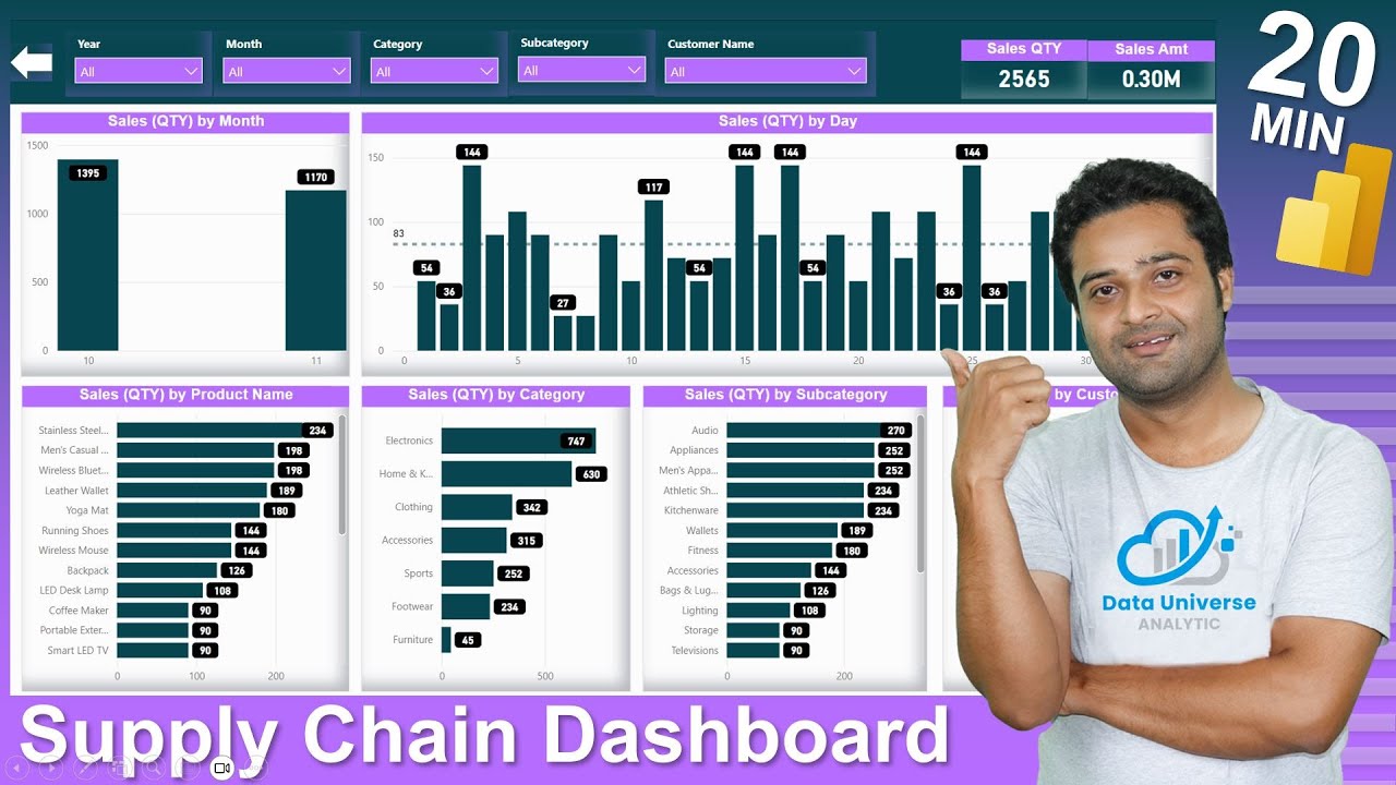
Supply Chain Dashboard In POWER BI | Inventory Management Dashboard | DAX | Data Modeling
Learn Tableau in 15 minutes and create your first report (FREE Sample Files)
5.0 / 5 (0 votes)