Como Fazer Gráficos no Excel em 2023
Summary
TLDRIn this video, Professor Michel demonstrates how to create and format charts in Excel for 2023. Starting from scratch, he explains the process of building a table with sales data and transforming it into a visually appealing column chart. The tutorial covers basic chart options, layout customization, and tips for making the charts more professional, including adjusting colors, fonts, and adding shadows. Michel also shows how to compare data between different years and regions, highlighting how beginners can use Excel's features to enhance their data presentation. The video is packed with practical tips for Excel users, especially those just starting out.
Takeaways
- 😀 The video explains how to create and format charts in Excel for 2023, focusing on the basics for beginners.
- 😀 The instructor introduces the Excel interface, specifically the 'Insert' tab where chart options are located.
- 😀 Users are guided on how to create a table with sales data and then use it to generate a chart.
- 😀 Essential Excel functions such as formatting cells, borders, and adjusting column widths are demonstrated to make the data visually appealing.
- 😀 The instructor emphasizes using a clean, minimal chart layout for clearer data visualization, recommending layouts with fewer details but essential information.
- 😀 For better presentation, the instructor shows how to format the chart design and adjust the chart's color scheme and font.
- 😀 The video highlights the importance of using the 'Chart Design' and 'Format' tabs when working with charts in Excel.
- 😀 Several steps for creating multiple charts are demonstrated, including how to compare sales data from different years (e.g., 2021 and 2022).
- 😀 It’s shown how to compare data across different regions by adjusting chart series and selecting the appropriate data for comparison.
- 😀 The instructor advises saving the file after completing the work to avoid losing progress and reinforces the importance of saving your Excel workbook properly.
- 😀 The video concludes with a promotion for an online Excel course, encouraging viewers to subscribe and access a special discount.
Q & A
What is the first step in creating a chart in Excel according to the tutorial?
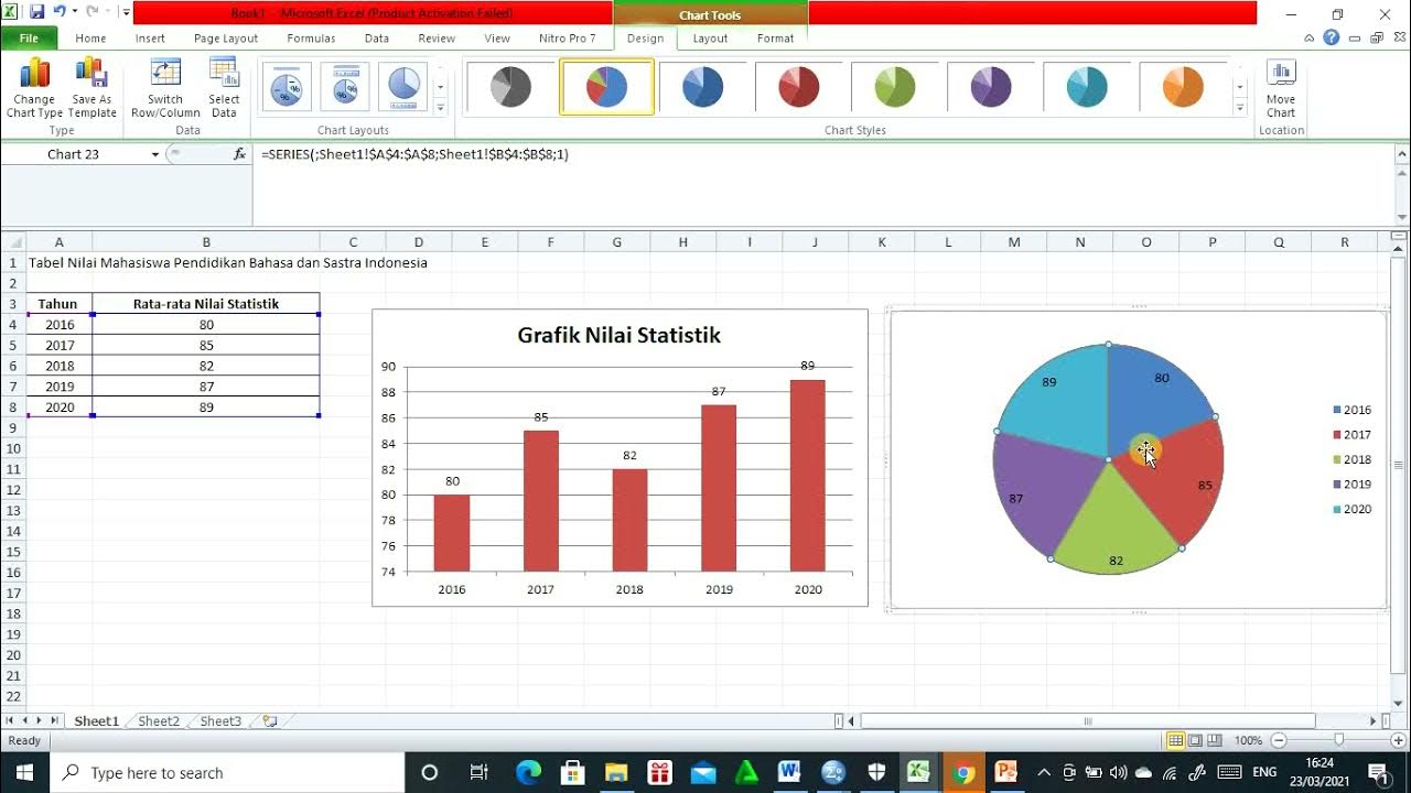
-The first step is to input data into a table, such as sales data for different collaborators, and format it appropriately, including adjusting the column widths, adding borders, and using colors to enhance visual appeal.
What does the 'Insert' tab in Excel allow you to do?
-The 'Insert' tab allows you to choose from various types of charts to visually represent your data. For example, you can insert column, line, or pie charts based on the data you have selected.
How can you adjust the appearance of a chart once it's created?
-You can adjust the appearance of a chart by selecting it and using the 'Design' tab to apply predefined layouts, alter the color scheme, and change the font style. Additionally, you can use the 'Format' tab to add effects like shadows to improve the chart's visual appeal.
What is the importance of using 'Layout 2' for charts as suggested in the tutorial?
-Using 'Layout 2' is recommended because it presents essential information in a clean and simple way, avoiding unnecessary details and improving the clarity and visual appeal of the chart.
What should you do if you need to compare data for two different years in a chart?
-To compare data for two different years, you should select the data for both years, insert a chart, and then adjust the chart to display the comparison clearly. You may need to modify the data series and edit the chart’s categories to ensure accurate comparison.
What does the 'Select Data' option in Excel do when creating a chart?
-The 'Select Data' option allows you to modify which data is included in the chart, helping you adjust the series and categories to ensure that your chart displays the correct information for comparison or visualization.
How can you improve the visual appearance of a chart’s background?
-You can improve the chart’s background by selecting the chart and applying a color to the background or using effects like shadows, which make the chart visually more appealing and stand out in reports.
Why is it suggested to remove unnecessary elements like the chart legend?
-Removing unnecessary elements like the chart legend can make the chart cleaner and more focused. For instance, if the chart is simple enough to not need a legend, eliminating it helps emphasize the data without distractions.
What should you do if a chart includes unwanted categories or data?
-If a chart includes unwanted categories or data, you can edit the data series by clicking on the chart, selecting 'Select Data', and then modifying or removing the data series that you don’t want to appear in the chart.
How can you save the Excel workbook after completing your work?
-After completing your work, you can save the Excel workbook by selecting 'File', then 'Save As'. Choose the location, provide a name for the file, and click 'Save'.
Outlines

This section is available to paid users only. Please upgrade to access this part.
Upgrade NowMindmap

This section is available to paid users only. Please upgrade to access this part.
Upgrade NowKeywords

This section is available to paid users only. Please upgrade to access this part.
Upgrade NowHighlights

This section is available to paid users only. Please upgrade to access this part.
Upgrade NowTranscripts

This section is available to paid users only. Please upgrade to access this part.
Upgrade Now


5.0 / 5 (0 votes)