Tableau Dashboard Tutorial dalam 12 Menit | Bahasa Indonesia
Summary
TLDRIn this tutorial, the presenter guides viewers through creating a simple and casual dashboard using Tableau, specifically focused on the Superstore dataset. The process begins with connecting to data sources like Excel or text files, followed by basic data manipulation and visualization techniques. The tutorial covers how to filter, categorize, and visualize sales data based on years, categories, and other metrics. The final part demonstrates creating an interactive, visually appealing dashboard with customized layouts, filters, and color schemes, providing a practical overview of using Tableau for data analysis and presentation.
Takeaways
- 😀 The tutorial is about creating a simple and casual dashboard in Tableau from a sample data source (Superstore dataset).
- 😀 Users are introduced to importing different data sources, such as local files, Excel files, and text files into Tableau.
- 😀 The 'Orders' table from the Superstore dataset is used, and data can be joined by dragging and linking related fields (e.g., region, order date).
- 😀 Tableau automatically suggests relationships between columns (e.g., region and people) when you connect the data.
- 😀 Continuous data (e.g., discount, profit, sales) is differentiated from categorical data (e.g., product categories, regions) in Tableau.
- 😀 Categorical data can be used for grouping and organizing, while continuous data is used for metrics and calculations.
- 😀 Users can create simple visualizations like bar charts by dragging fields to rows and columns in Tableau.
- 😀 It is possible to customize the time-based visualization, such as changing from year to month or day directly within Tableau without creating new columns.
- 😀 Filters can be applied in Tableau, such as selecting data for specific years or categories, to make the dashboard more interactive.
- 😀 Interactive elements, like filters and customizations, allow users to adjust the view dynamically based on selected criteria (e.g., product categories, years).
- 😀 The tutorial concludes by showing how to create a simple dashboard layout, adjust its size and position, and save the project for future use.
Q & A
What is the primary purpose of the tutorial in the transcript?
-The tutorial's primary purpose is to guide viewers through the process of creating a simple, casual dashboard using a sample data source in Tableau, specifically focusing on importing data, working with fields, and building visualizations.
What types of data sources are mentioned in the tutorial?
-The tutorial mentions several data sources, including local files, Microsoft Excel, text files, and Google Sheets. Additionally, it highlights the use of a sample Superstore dataset for the demonstration.
What does the tutorial explain about joining data in Tableau?
-The tutorial shows how to join data in Tableau by dragging and connecting fields from different data sources. It emphasizes that Tableau automatically detects and creates relationships between fields, such as matching 'region' from orders and people data.
What is the difference between categorical and continuous data in Tableau?
-Categorical data, represented by blue fields, is typically textual or involves distinct categories (e.g., product types or regions), while continuous data, shown in green, includes numerical values that can have decimal places and be continuously measured (e.g., sales or profit).
How does Tableau allow users to manipulate data types?
-Tableau allows users to change data types by right-clicking on a field and selecting the desired type. For instance, a user can modify a field's type from continuous to discrete or change its display format, such as from a year to a specific month or day.
What is the significance of the 'Filter' option in Tableau?
-The 'Filter' option in Tableau allows users to refine the data displayed in visualizations. It can be applied by dragging the filter field to the filter shelf, and it helps narrow down the analysis to specific data points, such as filtering by year or category.
How can Tableau users adjust the size of data points in visualizations?
-Users can adjust the size of data points in Tableau by dragging the 'size' field to the marks card and modifying the display according to the desired scale. This helps to visually represent data according to a specific metric or dimension.
What does the tutorial demonstrate about creating a dashboard?
-The tutorial explains how to create a dashboard by combining different visualizations into a single view. Users can choose between different layout options, such as horizontal or vertical, and can also add interactivity by using filters to allow viewers to explore the data in more detail.
What are 'labels' in Tableau, and how can they be used?
-Labels in Tableau refer to text annotations that can be added to data points in a visualization. Users can add labels to display specific information, such as sales or profit, directly on the chart, helping viewers better understand the data represented in the graph.
How does Tableau allow users to make visualizations interactive?
-Tableau makes visualizations interactive by allowing users to add filters and enable dynamic views. For example, users can apply a filter to select specific categories or years, and the dashboard will automatically update based on the chosen filter criteria, providing an engaging, interactive experience.
Outlines

This section is available to paid users only. Please upgrade to access this part.
Upgrade NowMindmap

This section is available to paid users only. Please upgrade to access this part.
Upgrade NowKeywords

This section is available to paid users only. Please upgrade to access this part.
Upgrade NowHighlights

This section is available to paid users only. Please upgrade to access this part.
Upgrade NowTranscripts

This section is available to paid users only. Please upgrade to access this part.
Upgrade NowBrowse More Related Video

Getting Started With Using Maps In Tableau | Tableau Maps For Beginners | Data Deep Dive
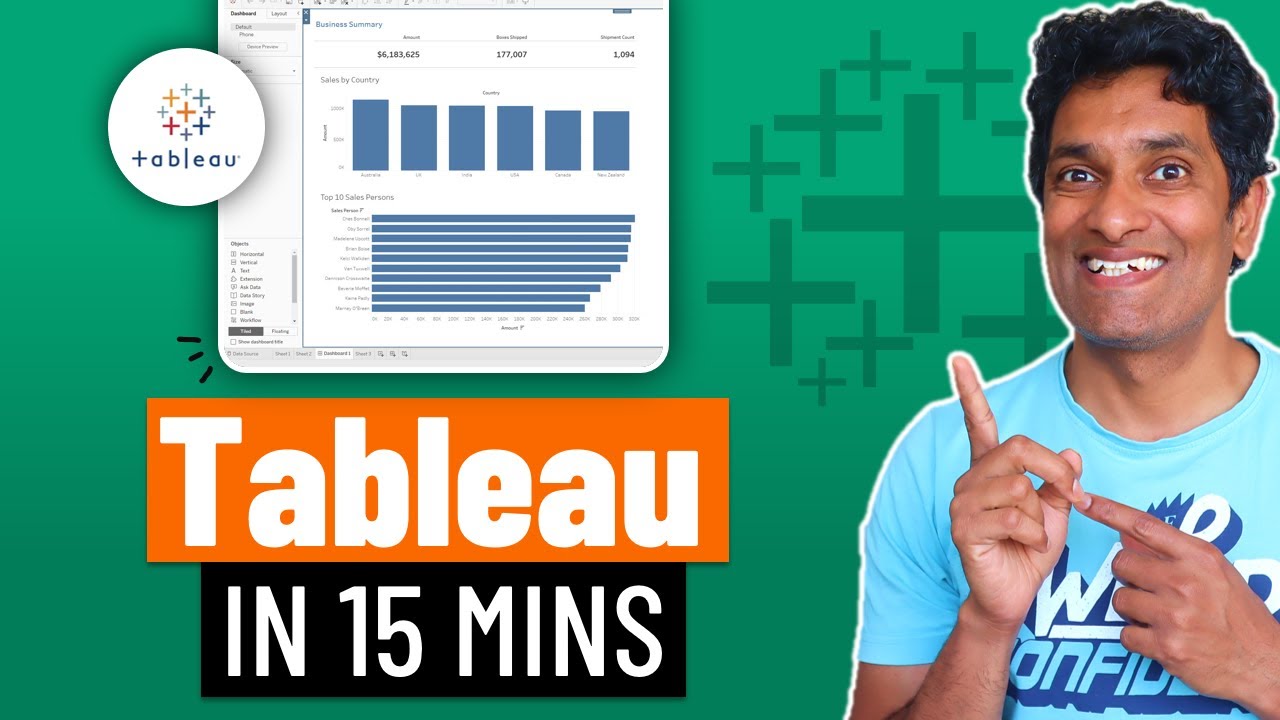
Learn Tableau in 15 minutes and create your first report (FREE Sample Files)
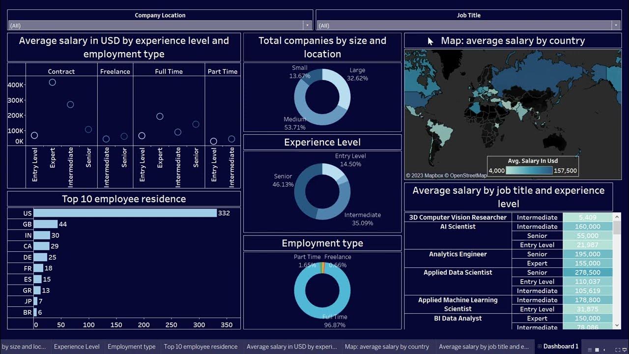
Create Data Science Jobs salaries dashboard with Tableau in 25 minutes

Tableau Tutorial for Beginners in 20 Minutes | Complete Tableau Training for Beginners | Simplilearn
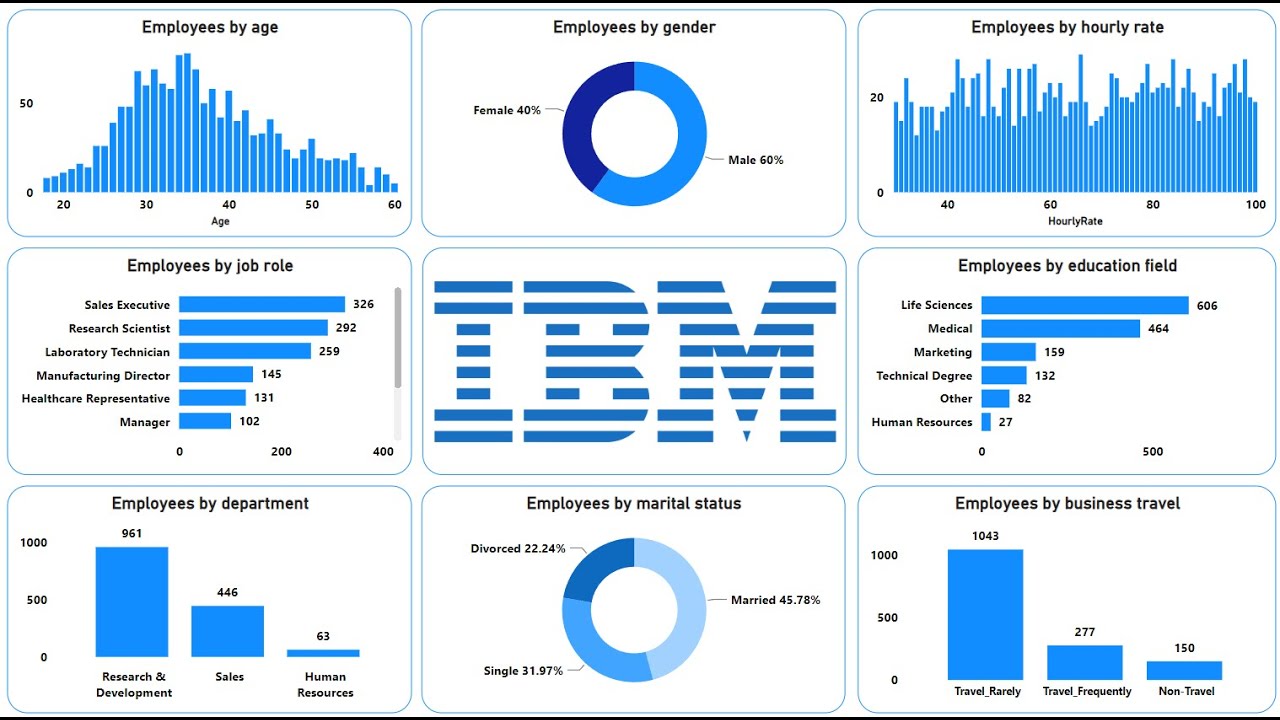
Create an Amazing Power BI Dashboard in 12 minutes | IBM HR Dataset

Tableau - Dashboard Webpage
5.0 / 5 (0 votes)