How to spot a misleading graph - Lea Gaslowitz
Summary
TLDRThis script uncovers the deceptive practices in data visualization, revealing how graphs can be manipulated through distorted scales, cherry-picked data, and omitted context. It cautions viewers to scrutinize graphs' labels, numbers, scales, and context to discern the true story behind the data, emphasizing the importance of critical analysis in interpreting visual information.
Takeaways
- 🗣️ Exaggerations are common in advertising and politics, but graphs are often perceived as objective representations of data.
- 📊 Graphs can mislead or manipulate through various techniques, despite appearing to show 'hard numbers'.
- 📉 Distorting the scale on a graph, especially on the y-axis, can exaggerate small differences between data points.
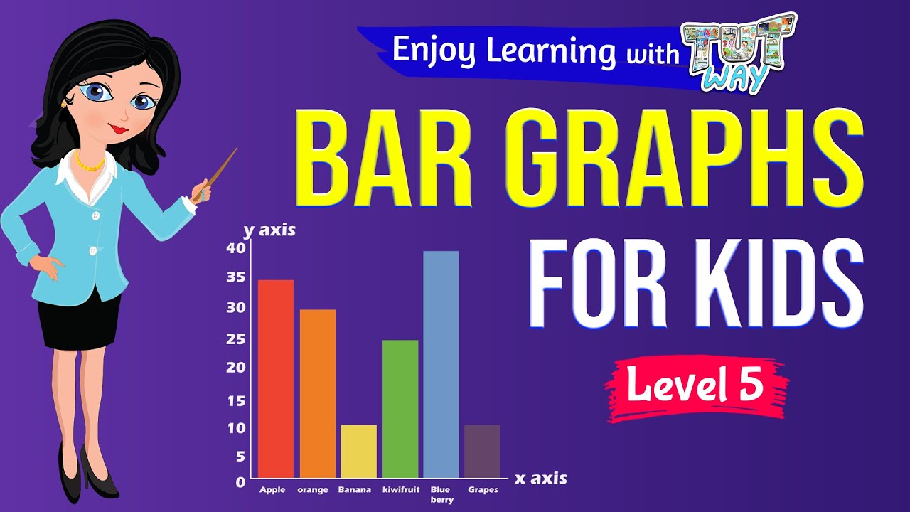
- 📈 Bar graphs are particularly susceptible to scale distortion, as the size of the bars can be misleading if not proportional to the values.
- 🕰️ Line graphs can misrepresent data by manipulating the x-axis, such as compressing time scales to alter perceptions of trends.
- 🍒 'Cherry picking' involves selecting specific time ranges or data points to exclude the impact of significant events or changes.
- 📊 Leaving out relevant data can create a misleading impression, as seen in charts that do not account for factors like population growth.
- 🌡️ The significance of data can vary greatly depending on how it's presented, as shown by graphs using the same data but giving different impressions.
- 🔍 A graph's effectiveness in conveying information depends on understanding the full context and significance of what's being shown.
- 👀 It's crucial to critically examine graphs by looking at labels, numbers, scale, and context to discern the true story they're telling.
- 🛠️ The increased use of visual software in media has made graphs more prevalent but also more susceptible to careless or dishonest use.
Q & A
What is the main issue discussed in the video script about graphs?
-The script discusses how graphs, which are often perceived as objective representations of data, can be manipulated to mislead or distort the truth.
How does the 1992 Chevy ad manipulate the perception of their trucks' reliability?
-The ad uses a graph with a distorted y-axis scale that only goes between 95% and 100%, making a barely detectable difference between Chevy and Toyota trucks appear exaggerated.
What is the problem with the scale distortion in bar graphs?
-Scale distortion in bar graphs can mislead viewers into assuming the difference in bar sizes is proportional to the values, which may not be the case if the scale is not properly adjusted.
How can the manipulation of the x-axis in line graphs misrepresent data?
-By compressing or expanding certain time periods, the x-axis can make trends appear more or less significant than they actually are, thus distorting the perception of changes over time.
What is the term used for the technique where a specific time range is chosen to exclude the impact of a major event?
-This technique is known as 'cherry picking,' where data points are selectively chosen to present a misleading narrative.
Why can a graph showing the number of Super Bowl viewers over time be misleading?
-The graph can be misleading if it does not account for population growth, which would make the viewership numbers seem inflated without considering the increase in overall viewership potential.
What are some factors to consider when evaluating the truthfulness of a graph?
-Factors to consider include the labels, numbers, scale, context, and whether the graph is presenting data in a way that accurately reflects the full significance of the information.
How can the same data set give different impressions when plotted differently?
-Different plotting methods can emphasize different aspects of the data, such as showing average annual values versus year-to-year variations, which can lead to contrasting interpretations of the data.
Why is it important to understand the full significance of the data presented in a graph?
-Understanding the full significance helps to interpret the data correctly and prevents misinterpretation due to the way the data is presented or the lack of context.
What is the potential impact of a half-degree Celsius rise in ocean temperature according to the script?
-A half-degree Celsius rise in ocean temperature can cause massive ecological disruption, highlighting the importance of accurate and meaningful data representation in graphs.
How has the advancement of visual software affected the use of graphs in media?
-The advancement of visual software has made it easier to create and use graphs more frequently in media, but it has also made it easier to use them in a careless or dishonest way, increasing the potential for misinformation.
Outlines

此内容仅限付费用户访问。 请升级后访问。
立即升级Mindmap

此内容仅限付费用户访问。 请升级后访问。
立即升级Keywords

此内容仅限付费用户访问。 请升级后访问。
立即升级Highlights

此内容仅限付费用户访问。 请升级后访问。
立即升级Transcripts

此内容仅限付费用户访问。 请升级后访问。
立即升级浏览更多相关视频

Manipulação de dados e gráficos | Unidade 3

O Novo ESQUEMA das Farmácias (Você está sendo manipulado!)

Data & Infographics: Crash Course Navigating Digital Information #8

Presentation of Data

Storytelling with Data: Infographics and data visualization | Canva for Journalists Episode 5 of 6

Bar Graphs For Kids | Math | Grade 4 & 5 | Tutway
5.0 / 5 (0 votes)
