Statistik : Penyajian Data - Part 1
Summary
TLDRThis lesson covers various data presentation methods, including bar charts, histograms, polygons, and Ogives. It explains how to display data effectively, focusing on qualitative data for bar charts and using frequency distributions for larger datasets. The lesson walks through the process of representing the number of university graduates in Jakarta from 2011 to 2016, and demonstrates how to apply intervals in bar charts. Additionally, it introduces how to visualize data with two attributes, like computer sales by brand and month, using grouped bar charts. This approach helps in clearer data analysis and comparison.
Takeaways
- 😀 Data presentation can be done through different methods like diagrams, tables, histograms, polygons, and Ogives.
- 😀 Diagrams like bar charts are ideal for displaying categorical data, making comparisons between different groups or time periods easier.
- 😀 Tables are a basic yet essential way to present data, with frequency distribution tables helping categorize and analyze data patterns.
- 😀 There are two types of frequency distribution tables: relative frequency and cumulative frequency, which help understand the data spread.
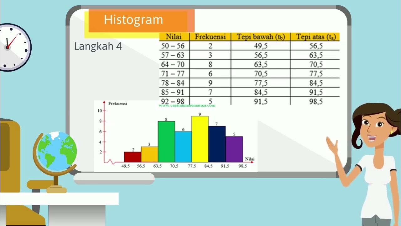
- 😀 Histograms, polygons, and Ogives are graphical methods used to show the distribution and trends within data.
- 😀 Data visualization through bar charts can help identify trends quickly, like the year with the highest or lowest number of graduates.
- 😀 When creating bar charts, it’s important to set consistent intervals for the y-axis to ensure clarity in representing data.
- 😀 Two-attribute data, like brand and month, can be shown using bar charts with different colors to represent multiple categories.
- 😀 The x-axis of a bar chart represents categories like years or months, while the y-axis represents the value or frequency of those categories.
- 😀 In the next lesson, the focus will shift from data presentation to statistical analysis, including standard deviation and central tendency measures.
Q & A
What is the focus of today's lesson in the script?
-Today's lesson focuses on presenting data and frequency distributions. It covers various methods of displaying data, including bar charts, tables, histograms, polygons, and ogives.
What are the types of diagrams discussed for presenting data?
-The types of diagrams discussed are: bar diagrams, line diagrams, symbol diagrams, and pie charts.
What is a frequency distribution table, and how is it divided?
-A frequency distribution table organizes data based on frequency. It is divided into two types: relative frequency distribution and cumulative frequency distribution.
How are bar charts used to present data?
-Bar charts are used to represent data by displaying categories on the x-axis and their corresponding values on the y-axis. Each category is represented by a bar whose height corresponds to the value it represents.
What kind of data is best represented using bar charts?
-Bar charts are typically used to represent qualitative data or categorical data, such as the number of graduates in different years or the sales of different brands.
What is the purpose of using intervals in bar charts, and how are they applied?
-Intervals in bar charts are used to group values into consistent ranges to make large datasets easier to read and analyze. For example, the number of graduates might be grouped in intervals of 100.
What are histograms, polygons, and ogives, and how do they differ from bar charts?
-Histograms display the frequency of data within intervals, while polygons connect the midpoints of each histogram bar. An ogive is a cumulative frequency graph, showing the cumulative distribution of data.
What are location measures in data analysis?
-Location measures, such as median, quartiles, deciles, and percentiles, describe the position of data points within a dataset, helping to understand the distribution.
What does central tendency refer to, and which measure is most commonly used?
-Central tendency refers to the measures that describe the center or average of a dataset. The most common measure of central tendency is the mean, or average.
Why is standard deviation important, and when will it be covered in future lessons?
-Standard deviation measures the spread or variability of data. It helps to understand how much data deviates from the mean. It will be covered in future lessons, specifically focusing on data spread and variability.
Outlines

此内容仅限付费用户访问。 请升级后访问。
立即升级Mindmap

此内容仅限付费用户访问。 请升级后访问。
立即升级Keywords

此内容仅限付费用户访问。 请升级后访问。
立即升级Highlights

此内容仅限付费用户访问。 请升级后访问。
立即升级Transcripts

此内容仅限付费用户访问。 请升级后访问。
立即升级浏览更多相关视频
VIDEO ANIMASI MATEMATIKA MATERI PENYAJIAN DATA KELAS 10
Statistika - Penyajian Data ( Histogram, Poligon & Ogive )
Distribusi Frekuensi: Definisi, Fungsi, dan Jenis-Jenisnya

Evaluasi kajian Statistika dlm masalah Kontekstual (Yunita)
Statistik#1 : Diagram | Kelas X Fase E Kurikulum Merdeka
Data Collection and Presentation | Statistics
5.0 / 5 (0 votes)
