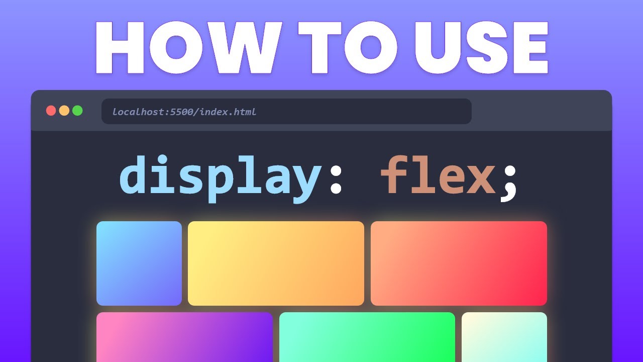
Flexbox Tutorial - 6 - Flex wrap
Summary
TLDRThe video script explains the 'Flex wrap' property in CSS Flexbox layout. By default, Flex items try to fit in a single line, but with 'Flex wrap', they can wrap into multiple lines or columns when space is insufficient. The property accepts three values: 'nowrap', 'wrap', and 'wrap-reverse', controlling how items wrap within the container. The script demonstrates horizontal and vertical wrapping, showing how items adjust to fit the container's size.
Takeaways
- 📐 The 'Flex wrap' property in CSS is used to control how flex items behave when there is not enough space in the container.
- 🔄 By default, flex items will try to fit into a single line and overflow if necessary, which is the 'nowrap' value.
- 🔄 'wrap' value allows flex items to wrap within the container, creating new rows or columns as needed.
- 🔄 'wrap-reverse' value makes flex items wrap in the opposite direction, moving items to the previous row or column instead of the next.
- 👀 When the browser width is reduced, the 'wrap' property allows items to adjust and fit within the container by moving to new rows or columns.
- 🔄 The 'wrap-reverse' property can be particularly useful for creating layouts where items should move up instead of down when space is limited.
- 📏 The 'Flex wrap' property works in conjunction with the 'display: flex' property, which should remain on the container.
- 🔄 Horizontal wrapping is the default behavior, but vertical wrapping can be achieved by changing the 'flex-direction' to 'column' and setting a height on the container.
- 📏 The 'flex-direction' property determines the direction in which items are laid out and wrapped, either as rows or columns.
- 📏 The height of the flex container affects how vertical wrapping occurs, creating new columns when there is not enough vertical space.
- 🔄 Understanding the 'Flex wrap' property is crucial for responsive design, allowing developers to create layouts that adapt to different screen sizes.
Q & A
What is the default behavior of Flex items in a container?
-By default, Flex items in a container try to fit into a single line. If there is not enough space, the items will overflow.
How can you change the default behavior of Flex items when there is not enough space?
-You can change the behavior using the Flex wrap property.
What are the three possible values for the Flex wrap property?
-The three possible values for the Flex wrap property are 'nowrap', 'wrap', and 'wrap-reverse'.
What happens when the Flex wrap property is set to 'nowrap'?
-When set to 'nowrap', Flex items will try to fit in a single line, and there will be no wrapping.
What is the effect of setting the Flex wrap property to 'wrap'?
-Setting the Flex wrap property to 'wrap' allows items to wrap within the container when there is not enough space.
How does 'wrap-reverse' differ from 'wrap' in the Flex wrap property?
-'wrap-reverse' pushes items into the previous row or column instead of the next, unlike 'wrap' which moves items to the next row or column.
What happens when you reduce the browser width with the Flex wrap property set to 'wrap'?
-When the browser width is reduced and the Flex wrap property is set to 'wrap', items will wrap into the next row or column as needed.
Can vertical wrapping be achieved with the Flex wrap property?
-Yes, vertical wrapping can be achieved by changing the Flex direction to 'column' and adding a height to the Flex container.
What is the effect of setting the Flex direction to 'column'?
-Setting the Flex direction to 'column' changes the layout from horizontal to vertical, affecting how items wrap within the container.
How does the 'wrap-reverse' value behave in a vertical layout?
-In a vertical layout, 'wrap-reverse' places items in a new column to the left of the existing column, instead of the right.
What is the purpose of the Flex wrap property in Flexbox?
-The Flex wrap property is used to control the wrapping of Flex items within the container, allowing items to wrap into the next row or column when there is not enough space.
Outlines
📏 Flex Wrap Property Overview
This paragraph introduces the 'flex-wrap' property in Flexbox, which controls how flex items behave when there isn't enough space in the container. By default, items will overflow if they can't fit in a single line, but this can be modified with 'flex-wrap'. The property accepts three values: 'nowrap' (default), 'wrap', and 'wrap-reverse'. 'No wrap' keeps items in a single line, 'wrap' allows items to move to the next line when space is insufficient, and 'wrap-reverse' pushes items to the previous line. The paragraph also discusses the application of 'flex-wrap' in both horizontal and vertical orientations, with examples of how changing the 'flex-direction' to 'column' and setting a height on the container affects the wrapping behavior.
Mindmap
Keywords
💡Flex Container
💡Flex Items
💡Flex Wrap Property
💡No Wrap
💡Wrap
💡Wrap Reverse
💡Flex Direction
💡Browser Width
💡CSS
💡Responsive Layout
💡Overflow
Highlights
Flex wrap property allows flexibility in the arrangement of Flex items within a container.
By default, Flex items try to fit into a single line and overflow if there is insufficient space.
The Flex wrap property can be modified to change the behavior of how items handle space constraints.
Three possible values for the Flex wrap property: 'nowrap', 'wrap', and 'wrap-reverse'.
'nowrap' is the default value, causing items to overflow if there's not enough space.
Setting 'wrap' allows items to wrap within the container when space is insufficient.
When 'wrap' is set, items wrap as needed, starting from the last item if there's not enough space for just one.
'wrap-reverse' makes items move to the previous row or column instead of the next when space is insufficient.
Vertical wrapping is possible by changing the Flex direction to 'column' and setting a height for the container.
With 'wrap' set in a column direction, items will fit into one column and then move to the next as needed.
Using 'wrap-reverse' in a column direction places items in a new column to the left of the existing one.
The Flex wrap property is essential for controlling the wrapping behavior of Flex items within a container.
Understanding the Flex wrap property enhances the ability to create responsive and flexible layouts.
Practical demonstration of the Flex wrap property in action, showing its effect on item arrangement.
The importance of maintaining the 'display: flex' property on the container throughout the series.
The impact of browser width reduction on the visibility and wrapping behavior of Flex items.
A step-by-step guide on how to implement and observe the effects of the Flex wrap property.
The Flex wrap property's role in creating a more adaptable and user-friendly interface design.
Transcripts
another great property on the container
is the Flex wrap property by default all
the Flex items in a container will try
to fit into a single line if there is
not enough space in the items simply
overflow so if I reduce the browser
width you can see that the items begin
to shrink and then are no longer in view
you can change this behavior using the
Flex wrap property
let's take a look can go back to the CSS
file and to the container class I'm
going to add a new property which is the
Flex wrap property now keep in mind I
haven't removed the display flex
property on the container and I never
will throughout the series
now flex wrap property can accept three
possible values the first one is no wrap
this is the default value if i refresh
the browser you can see that there is no
change if you want the items to wrap
within the container then we set a value
of wrap
now if i refresh the browser and reduce
the browser width you can see that the
items have wrapped in the container
the wrapping takes place as and when
needed if there is not enough space for
just one item item 9 for example you can
see that only item 9 moves into the next
row reduce the size further item 8 moves
to the next row and so on and the final
possible value is wrapped reverse what
wrap reverse does is instead of items
falling into the row below it climbs
into the row above let me show you that
in the browser gonna go back refresh and
if I reduce the browser red you can see
that item 9 instead of moving to the row
below moves to the row above do not get
confused that wrap reverse wraps in the
reverse order of the items so item 1
does not move to the next row if there
is no sufficient space wrapping always
occurs from the last item wrap reverse
just pushes the last item above instead
of below now similar to horizontal
wrapping vertical wrapping is also
possible and for that we need to change
the Flex direction to column and add a
height to the Flex container so let's
remove this for now and add a Flex
direction of column and set a height of
400 pixels
now if you observe very closely the
border ends at item 7 and the rest of
the items are overflowing the container
if I add flex wrap and set it to a value
of wrap you can see that the items are
now trapped within the container item 1
2/6 fit in one column and then the rest
of the items have to move on to the next
column so a column is created to the
right and items are placed in that
column and if I change the value to wrap
reverse the items are placed in a new
column to the left of the existing
column that's pretty much the Flex wrap
property so the Flex wrap property is
used to control the wrapping of Flex
items within the container the possible
values are nowrap which is default wrap
which wraps the content into the next
row or next column and wrap reverse
which wraps the content into the
previous row or previous column
Browse More Related Video
Learn Flexbox CSS in 8 minutes
CSS Course | Flexbox in CSS in One Video | Easy Tutorial | Complete Web Development Tutorial 24
Learn CSS flexbox in 10 minutes! 💪
Learn CSS Flexbox in 20 Minutes (Course)
WRAPROWS Function-Quickly convert 1 column to multiple in Excel #shorts
Wrapping a Sprained Ankle - Ask Doctor Jo
5.0 / 5 (0 votes)