Learn Flexbox CSS in 8 minutes

Slaying The Dragon
14 Nov 202208:16

Summary

TLDRThe video script introduces the evolution of CSS layouts from floats and positioning to the transformative introduction of flexbox. It explains the basics of flexbox, including setting up a container and children in HTML, and using CSS to define the display as flex. The script covers the creation of invisible axes, alignment of items along the main and cross axes using justify-content and align-items, and the default horizontal orientation of the main axis. It also delves into altering the main axis with flex-direction, wrapping items with flex-wrap, and adding gaps with the gap property. The video further explores individual item properties like flex-grow, flex-shrink, flex-basis, align-self, and order, offering a comprehensive guide to mastering flexbox for web developers.

Takeaways

  • 🌟 Introduction of flexbox revolutionized CSS layouts, providing an alternative to floats and positioning.
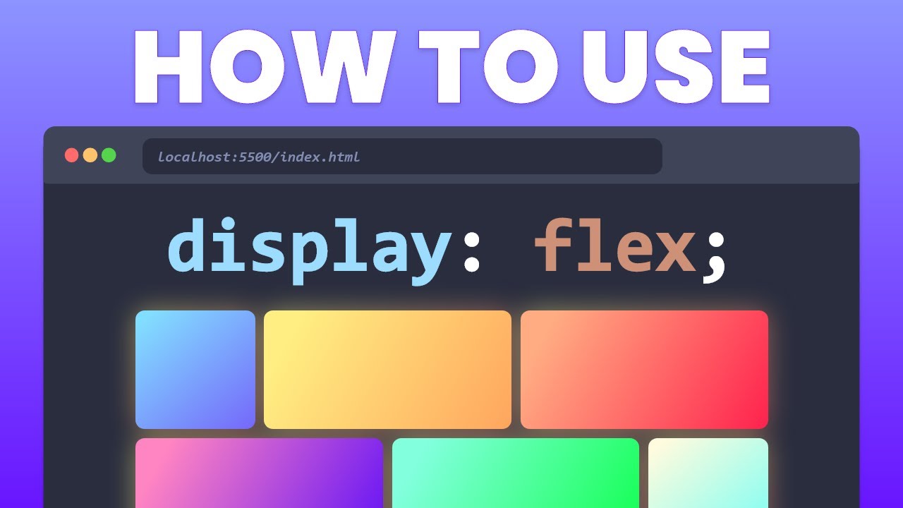
  • πŸ“¦ To use flexbox, a container with a `display: flex` property is needed, along with child items in the HTML structure.
  • πŸ”„ The default main axis is horizontal, but it can be set to vertical with the `flex-direction` property.
  • πŸ•’ The `justify-content` property aligns items along the main axis, with options like `flex-start`, `flex-end`, `center`, `space-between`, `space-around`, and `space-evenly`.
  • πŸ”„ The `align-items` property aligns items along the cross axis, with options such as `flex-start`, `flex-end`, `center`, and `baseline`.
  • πŸ”„ Understanding the main and cross axes is crucial for flexbox; items are laid out along the main axis and the cross axis is perpendicular to it.
  • πŸ”„ The `flex-wrap` property allows items to wrap into multiple lines when there's not enough space, with options like `nowrap`, `wrap`, and `wrap-reverse`.
  • πŸ”„ The `align-content` property aligns a flex container's lines along the cross axis, applicable when `flex-wrap` is set to `wrap`.
  • 🌱 The `flex-grow` property allows items to grow and fill available space, taking a unitless value that represents a proportion.
  • πŸ“‰ The `flex-shrink` property defines how an item shrinks relative to others, also taking a unitless value.
  • πŸ“ The `flex-basis` property sets the initial size of an item before space distribution, which can be overwritten by other flex properties.

Q & A

  • What was the primary method for creating layouts before the introduction of flexbox?

    -Before flexbox, developers primarily used floats and positioning for creating layouts.

  • What is the first step in using flexbox?

    -The first step in using flexbox is to define a container with children in the HTML and then set the container's display property to 'flex' in CSS.

  • What are the two invisible axes created by a flex container?

    -The two invisible axes created by a flex container are the main axis and the cross axis.

  • How can you change the orientation of the main axis with flexbox?

    -You can change the orientation of the main axis with the 'flex-direction' property, setting it to 'column' for a vertical axis or 'row' for a horizontal axis.

  • What is the default value of the 'justify-content' property in flexbox?

    -The default value of the 'justify-content' property is 'flex-start', which aligns items at the start of the main axis.

  • How does the 'align-items' property affect items in a flex container?

    -The 'align-items' property aligns items along the cross axis. It can be set to 'flex-start', 'flex-end', 'center', 'baseline', or 'stretch'.

  • What happens when you set the 'flex-wrap' property to 'wrap'?

    -When 'flex-wrap' is set to 'wrap', items are allowed to wrap onto multiple lines when there's not enough space on the main axis.

  • What is the purpose of the 'align-content' property in flexbox?

    -The 'align-content' property aligns a flex container's lines along the cross axis when 'flex-wrap' is set to 'wrap' and there are multiple lines of items.

  • How does the 'flex-grow' property affect the size of flex items?

    -The 'flex-grow' property determines how much an item can grow relative to the rest of the items in the container when there is extra space on the main axis.

  • What does the 'flex-basis' property do in flexbox?

    -The 'flex-basis' property sets the initial size of a flex item before any remaining space is distributed according to 'flex-grow' and 'flex-shrink'.

  • What is the 'order' property in flexbox used for?

    -The 'order' property changes the order in which flex items appear in the container, regardless of their order in the HTML.

Outlines

00:00

🌟 Introduction to Flexbox and Basic Properties

This paragraph introduces the concept of Flexbox as a layout model in CSS, highlighting its transformative impact on web development. It explains the need for a container and children in HTML to utilize Flexbox, and how setting the container's display to 'flex' creates an invisible main and cross axis for item positioning. The paragraph details the use of 'flex-direction' to control the orientation of the main axis, defaulting to 'row' (horizontal), and how 'justify-content' aligns items along the main axis with options like 'flex-start', 'flex-end', 'center', 'space-between', 'space-around', and 'space-evenly'. It also covers 'align-items' for cross-axis alignment with 'flex-start', 'flex-end', 'center', and 'baseline', emphasizing the importance of understanding the direction of the main and cross axes in Flexbox.

05:01

πŸ”„ Flexbox Wrapping and Advanced Alignment

The second paragraph delves into the 'flex-wrap' property, which controls whether items wrap onto multiple lines when there's insufficient space on a single line. It explains the default 'nowrap' setting and how changing it to 'wrap' allows for multi-line layouts. Introducing the 'align-content' property, the paragraph describes its role in aligning items on the cross-axis when wrapping is enabled, with similar options to 'justify-content'. The discussion continues with the 'gap' property, which adds space between items, and an overview of other flexbox properties that apply to the children of the container, such as 'flex-grow', 'flex-shrink', 'flex-basis', and the shorthand 'flex'. The paragraph concludes with a brief mention of 'align-self' and 'order', which allow for individual control over items' alignment and order of appearance, respectively.

Mindmap

Keywords

πŸ’‘Flexbox

Flexbox is a CSS3 layout module that provides a more efficient way to lay out, align, and distribute space among items in a container, even when their size is unknown or dynamic. In the video, Flexbox is introduced as a revolutionary tool that changed the way developers create layouts, moving away from floats and positioning to a more intuitive and flexible system.

πŸ’‘Container

In the context of Flexbox, a container is an HTML element that has the 'display: flex' or 'display: inline-flex' property applied to it. This transforms the container into a flex container, allowing its direct children to become flex items that can be laid out according to the Flexbox model. The container is fundamental to Flexbox as it defines the flex context within which the items are positioned and aligned.

πŸ’‘Main Axis

The main axis in Flexbox is the primary axis along which flex items are laid out. By default, it is horizontal, running from left to right. The behavior of the main axis is controlled by properties such as 'justify-content' and 'flex-direction', and it determines the direction in which items are placed within the container.

πŸ’‘Cross Axis

The cross axis is the axis perpendicular to the main axis. It defines the direction for the alignment of flex items within the container. Properties like 'align-items' and 'align-self' control the positioning of items along the cross axis. Understanding the cross axis is crucial for achieving vertical alignment and equal distribution of space in a flex layout.

πŸ’‘Justify Content

The 'justify-content' property in Flexbox aligns flex items along the main axis within the container. It has several values, including 'flex-start', 'flex-end', 'center', 'space-between', 'space-around', and 'space-evenly', each providing a different way to distribute space and align items horizontally. This property is essential for controlling the overall alignment and spacing of items in a flex container.

πŸ’‘Align Items

The 'align-items' property in Flexbox controls the alignment of flex items along the cross axis within the container. It takes into account the item's margin box, not just the content box. Common values include 'flex-start', 'flex-end', 'center', 'baseline', and 'stretch'. This property is key for vertical alignment and is similar to 'justify-content' but operates along the cross axis.

πŸ’‘Flex Direction

The 'flex-direction' property in Flexbox defines the direction of the main axis, which in turn affects the flow (horizontal or vertical) of the flex items. By setting 'flex-direction' to 'row' or 'column', developers can control whether items are laid out in a line (horizontally or vertically) and how the main and cross axes are oriented.

πŸ’‘Flex Wrap

The 'flex-wrap' property in Flexbox controls whether the flex items are forced into a single line or allowed to wrap onto multiple lines. With 'nowrap' as the default value, items will try to fit into one line. By setting 'flex-wrap' to 'wrap', items can wrap onto multiple lines when there's not enough space in the container, providing more flexibility in layout design.

πŸ’‘Align Content

The 'align-content' property in Flexbox aligns a flex container's lines along the cross axis when the flex container has multiple lines and 'flex-wrap' is set to 'wrap'. It works similarly to 'align-items', but instead of aligning individual items, it aligns the entire group of items along the cross axis. This property is particularly useful when dealing with multi-line content in a flex container.

πŸ’‘Gap

The 'gap' property in Flexbox specifies the space between flex items along the axis defined by the 'gap' property. It allows for consistent spacing between items without the need for additional markup or custom styles. This simplifies the process of creating even spaces between items in a flex container.

πŸ’‘Flex Grow

The 'flex-grow' property in Flexbox specifies the proportion of the available space in the container that a flex item should grow to fill the extra space. It takes a unitless value that represents the item's share of the remaining space after all items have been laid out according to their flex basis. Items with higher 'flex-grow' values will grow more than those with lower values.

πŸ’‘Flex Shrink

The 'flex-shrink' property in Flexbox controls the amount by which a flex item will shrink relative to the rest of the items in the container when there's not enough space. It takes a unitless value that represents the item's willingness to reduce its size. An item with a 'flex-shrink' value of '1' will shrink more than items with lower values, and setting it to '0' prevents the item from shrinking at all.

Highlights

CSS Stone Age developers used floats and positioning for layouts.

Flexbox introduced a revolutionary way to create layouts.

To use flexbox, you need a container with children in HTML.

Setting the container's display to 'flex' creates two invisible axes: main and cross.

The default main axis is horizontal; use 'flex-direction: row' to maintain this.

The 'justify-content' property aligns items along the main axis.

Items can be aligned on the cross axis using the 'align-items' property.

The 'flex-direction' set to 'column' makes the main axis vertical.

Flex items try to fit into one line by default, but 'flex-wrap: wrap' allows them to wrap.

The 'align-content' property aligns items on the cross axis when 'flex-wrap' is set to 'wrap'.

The 'gap' property adds space between flex items.

The 'flex-grow' property allows an item to grow if there's enough space.

The 'flex-shrink' property defines how fast an item shrinks compared to others.

The 'flex-basis' property defines the size of an item before space distribution.

The shorthand 'flex' combines 'flex-grow', 'flex-shrink', and 'flex-basis'.

The 'align-self' property overrides 'align-items' for individual items.

The 'order' property changes the order of items as they appear.

Using 'order' should be avoided unless absolutely necessary due to its impact on semantics and accessibility.

Transcripts

play00:00

during the CSS Stone Age developers were

play00:03

creating layouts with floats and

play00:05

positioning until one fateful day

play00:06

flexbox would be introduced and the

play00:09

world would never be the same

play00:11

to use flexbox first we need a container

play00:14

and some children in our HTML

play00:16

then in our CSS we can go straight to

play00:19

the bottom of the file ignoring all of

play00:21

the base tiles and give the container

play00:22

the display of flex this created two

play00:25

invisible axes a main axis and a cross

play00:29

axis our items are no longer stacked on

play00:31

top of one another because display Flex

play00:33

is positioning our items on the main

play00:35

axis and by default the main axis is

play00:39

horizontal if we want we can change the

play00:42

main axis to be vertical with the flex

play00:44

Direction property

play00:46

if we set the flex direction to column

play00:48

the main axis will be vertical but if we

play00:51

set it to row the main axis will be

play00:54

horizontal we actually want our main

play00:56

axis to be horizontal so we set Flex

play00:59

direction to row or we could remove it

play01:02

entirely because Flex direction is set

play01:04

to row by default now knowing the

play01:06

direction of our main axis we can align

play01:09

our items along the main axis with the

play01:12

justify content property the default is

play01:15

flex start see nothing happened but if

play01:17

we set it to flex end our items will be

play01:20

pushed to the end of the line

play01:22

Center will Center our items in the

play01:24

middle space between will evenly

play01:26

distribute the items at between the

play01:28

first and the last item space around is

play01:31

similar to space between but now the

play01:33

edges also have some spacing to them and

play01:36

finally space evenly will evenly

play01:38

distribute space in between all the

play01:40

items

play01:41

justify content is for aligning items on

play01:44

the main axis but we can also align

play01:46

items along the cross axis with the

play01:49

Align items properly

play01:51

Flex start places items at the start of

play01:53

the Cross axis flex and places items at

play01:57

the end of the Cross Axis Center will

play01:59

Center our items in the middle of the

play02:01

Cross axis and Baseline will align items

play02:05

so that the Baseline text of each item

play02:07

is aligned you can see this more clearly

play02:10

when I increase the size of some items

play02:13

the font size on the first item is now

play02:16

larger than the second but with a line

play02:18

item set to Baseline the Baseline of

play02:21

both text are aligned now just to

play02:23

clarify because this is important

play02:26

justify content is aligning items on the

play02:29

main axis and align items is aligning

play02:32

items on the cross axis if we don't

play02:34

Define a flex Direction on the container

play02:37

then Flex direction is set to row by

play02:39

default which also means that the main

play02:42

axis is set to horizontal by default

play02:44

left to right and that the cross axis is

play02:47

set to Vertical by default top to bottom

play02:49

we can switch them so that the main axis

play02:52

becomes vertical instead of horizontal

play02:54

by defining a flex direction of column

play02:57

when the flex direction is set to column

play03:00

justify content will still align items

play03:02

on the main axis but now that we defined

play03:05

the flex direction to be column the main

play03:07

axis is now vertical this is the key to

play03:10

understanding flexbox

play03:12

by default Flex items will all try to

play03:15

fit into one line when I add more items

play03:18

to The Container the items will start

play03:20

crushing each other to fix this we can

play03:22

make our items wrap with the flex drop

play03:24

property by default this is set to no

play03:27

wrap but we can set it to wrap and now

play03:30

our items are no longer trying to fit

play03:32

into one line but instead are allowed to

play03:34

wrap when there's no more space

play03:35

available

play03:36

when we have Flex drop set to wrap a new

play03:39

property is unlocked the Align content

play03:42

property not to be confused with align

play03:44

items align content property only works

play03:48

when we have Flex wrap set to wrap and

play03:51

have items wrapping this property allows

play03:54

us to align everything on the cross axis

play03:57

the possible values that go here are

play03:59

pretty much the same as with the

play04:01

Justified content so flex and Center

play04:04

space between space around space evenly

play04:06

and flex start

play04:08

you can also add gaps in between items

play04:10

currently all our items are touching

play04:13

each other we can use the Gap property

play04:15

on the container to add gaps in between

play04:17

each item like this

play04:20

all the flexbox properties I've shown

play04:22

you so far belong inside the container

play04:24

but there's also a few other flexbox

play04:26

properties that belong in the direct

play04:28

Children of the container

play04:30

flexgro is one of them but before I get

play04:33

into it in the HTML I'm going to remove

play04:35

most of the items and leave just the

play04:37

first three then back in our CSS we can

play04:40

remove the flex wrap and the Align

play04:42

content because we don't need them

play04:44

anymore then under our container we can

play04:47

select the third item by its class name

play04:50

item three and give it the flex grow of

play04:53

One Flex grow takes a unitless value

play04:56

that serves as a proportion and what it

play04:59

does is allows the item to grow if

play05:01

there's enough space for it to do so

play05:03

we see our third item grew to fill out

play05:06

the remaining space the same will happen

play05:08

if instead I apply this rule on either

play05:10

the first or second item if they all

play05:13

have Flex growth set to 1 then the

play05:16

remaining space will be distributed

play05:17

equally to all children

play05:19

next is flex shrink Flex shrink also

play05:22

takes a unitless value this property

play05:25

though defines how fast one item shrinks

play05:28

in comparison to the others if I set

play05:31

item 1 to have a flex shrink of 5 for

play05:33

example the item 1 will shrink much

play05:36

faster than the other items if I don't

play05:38

want an item to shrink at all I can set

play05:40

it to flex zero now the item is refusing

play05:43

to shrink

play05:44

Flex bases defines the size of an item

play05:47

before the remaining space is

play05:49

distributed basically if your item

play05:51

already has a size like a width but you

play05:53

want to overwrite that size with

play05:55

something else then you use flex spaces

play05:58

for example my item has a width of 150

play06:01

pixels I can overwrite that by setting

play06:04

the flex basis to something else like

play06:06

300 pixels now my item has a width of

play06:09

200 pixels if you set it to zero you're

play06:12

basically shrinking it to the max

play06:14

personally I almost never accept any few

play06:17

Niche exceptions use either the flex

play06:19

growth Flex shrink and flex bases but

play06:22

instead I use the shorthand called Flex

play06:26

Flex is the shorthand for the flex

play06:28

growth like shrink and flex spaces

play06:30

combined but the second and third

play06:32

parameters are optional

play06:34

when you set Flex to only have one value

play06:37

like Flex 1 the other two optional

play06:40

values are set automatically and

play06:42

intelligently for you

play06:44

another item property is the Align self

play06:46

this one will overwrite the value you

play06:49

set in the Align item on the container

play06:51

but for an individual item so for

play06:54

example if I have a line item set to

play06:56

flex start on the container but want the

play06:59

first item to be aligned Center on the

play07:01

cross axis I can use the Align self

play07:04

property to overwrite what I defined in

play07:06

the container and have this individual

play07:08

item be placed at the center

play07:11

other than Center you can also have Flex

play07:13

start Flex end and Baseline as possible

play07:16

values

play07:18

the last property is the order property

play07:20

by default our items are laid out in the

play07:23

order of our HTML item 1 item 2 and item

play07:26

3. however we can use this property to

play07:29

change the order in which items appear

play07:31

say if I want the last item to appear

play07:34

first I can give it the order property

play07:36

and set it to -1

play07:38

minus 1 because the default value of

play07:41

this property is zero this means that

play07:43

all our items have an order set to 0 by

play07:46

default so for us to have the third item

play07:49

appear first I need to set it to -1

play07:52

if I want the first item to appear last

play07:54

then I give it the order of 1. this

play07:58

property by the way really shouldn't be

play08:00

something you use unless you absolutely

play08:02

have to because it messes with the

play08:04

semantics and the accessibility of your

play08:06

HTML

play08:08

if you enjoyed the video or learned

play08:10

something please consider leaving a like

play08:12

and booping the Subscribe button thanks

play08:14

for watching

Rate This
β˜…
β˜…
β˜…
β˜…
β˜…

5.0 / 5 (0 votes)

Related Tags
Flexbox TutorialWeb DevelopmentCSS TechniquesLayout DesignResponsive WebAlignment & SpacingFlex DirectionItem WrappingGrowth & ShrinkOrdering