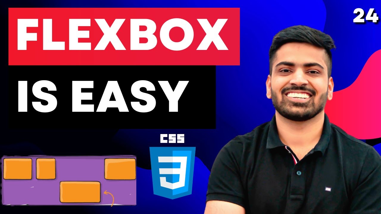
Learn CSS Flexbox in 20 Minutes (Course)
Summary
TLDRThis script offers an in-depth exploration of CSS Flexbox, a powerful tool for creating responsive layouts. It explains the core concepts of flexbox, including the main and cross axes, alignment properties like 'justify-content' and 'align-items', and the use of 'flex-wrap' for responsive design. The tutorial also covers advanced features such as 'flex-grow', 'flex-shrink', and the application of minimum and maximum sizes for elements. It highlights the ease of centering elements and managing overflow with flexbox, providing practical examples and tips for web developers looking to enhance their layouts.
Takeaways
- 😎 Understanding Flexbox can significantly improve one's ability to create responsive layouts in CSS.
- 📐 To align elements within a flex container, it's essential to consider both the main and cross axes.
- 🔄 The 'justify-content' and 'align-items' properties are key for positioning elements along the main and cross axes respectively.
- 📊 The 'display: flex' property transforms the layout system, allowing for side-by-side positioning of elements.
- 🔄 'Flex-start', 'flex-end', and 'center' are basic values for aligning elements horizontally and vertically.
- 🌐 The 'flex-direction' property controls the direction of the main axis, which can be row, row-reverse, or column.
- 🔄 'Flex-wrap' allows for responsive layouts by wrapping items to the next line when necessary.
- 🔄 'Flex-grow' and 'flex-shrink' properties enable elements to grow or shrink responsively within the container.
- 📏 Minimum and maximum sizes can be combined with 'flex-grow' and 'flex-shrink' to define limits for resizing elements.
- 🔄 The 'align-self' property allows for individual alignment of flex items on the cross axis, different from the container's 'align-items'.
- 🌟 CSS Grid can sometimes achieve the same layout results with fewer lines of code, offering an alternative for complex layouts.
Q & A
What is the main benefit of using CSS Flexbox for layout design?
-CSS Flexbox allows for the creation of responsive and flexible layouts with ease, enabling developers to align elements in various positions within a container and handle resizing behavior effectively.
How does understanding Flexbox improve one's approach to CSS coding?
-Understanding Flexbox provides a superior grasp of layout dynamics in CSS, making developers more confident when dealing with common CSS problems such as centering elements or making a website responsive.
What is the initial step in creating a Flexbox layout?
-The initial step is to define a reference point in HTML, which could be the body or a specific container, and then apply 'display: flex' to the parent element to initiate the Flexbox layout.
What are the two main axes in a Flexbox layout and why are they important?
-The two main axes are the main axis and the cross axis. They are important because they control the flow and positioning of items within the Flexbox layout, determining how elements align and distribute space.
How can you horizontally center elements using Flexbox?
-To horizontally center elements, apply 'display: flex' and 'justify-content: center' to the parent container.
What property is used to align elements vertically in a Flexbox layout?
-The 'align-items' property is used to align elements vertically within a Flexbox layout.
What does the 'flex-direction' property do in Flexbox?
-The 'flex-direction' property determines the direction of the main axis, which can be 'row' (default), 'row-reverse', 'column', or 'column-reverse', affecting the layout flow of the flex items.
How can you make a responsive layout that wraps elements to the next line when necessary?
-Use the 'flex-wrap' property set to 'wrap' to create a responsive layout that allows elements to flow to the next line when there is not enough horizontal space.
What is the purpose of the 'flex-grow' property in Flexbox?
-The 'flex-grow' property enables elements to grow and fill out available space within the parent container along the main axis, with higher values allowing elements to grow at a faster rate compared to others.
How can you prevent certain flex items from shrinking when the container size decreases?
-Apply a 'flex-shrink' value of zero to specific flex items to prevent them from shrinking when the container size decreases.
What is the 'align-self' property used for in Flexbox?
-The 'align-self' property is used to align a specific flex item differently from the alignment defined by 'align-items' on the cross axis, allowing for individual alignment control over flex items.
How can you create gaps between flex items?
-The 'gap' property in Flexbox can be used to create consistent gaps between items. It can also be split into 'row-gap' and 'column-gap' for different horizontal and vertical spacing.
What is the recommended approach to center a div using CSS Grid compared to Flexbox?
-In CSS Grid, you can center a div with even fewer lines of code by using 'display: grid' and 'place-content: center', which simplifies the process compared to the three lines required in Flexbox.
Outlines

This section is available to paid users only. Please upgrade to access this part.
Upgrade NowMindmap

This section is available to paid users only. Please upgrade to access this part.
Upgrade NowKeywords

This section is available to paid users only. Please upgrade to access this part.
Upgrade NowHighlights

This section is available to paid users only. Please upgrade to access this part.
Upgrade NowTranscripts

This section is available to paid users only. Please upgrade to access this part.
Upgrade NowBrowse More Related Video

CSS gap is NOT a replacement for margins

CSS Course | Flexbox in CSS in One Video | Easy Tutorial | Complete Web Development Tutorial 24

Responsive Web Design | The Beginner’s Guide

Learn Bootstrap in less than 20 minutes - Responsive Website Tutorial

CSS Display Property | Sigma Web Development Course - Tutorial #23

The Easy Way to Build Responsive Websites
5.0 / 5 (0 votes)