PowerPoints Do's and Don'ts

Bond OLT
30 Nov 201406:47

Summary

TLDRThis video offers essential tips for effective PowerPoint presentations, highlighting the importance of clear, concise slides with high-contrast colors and relevant visuals. It emphasizes the need for large fonts, numbered slides, and audience engagement through activities. Additionally, it provides a list of 'don'ts', including overuse of animations and avoiding cluttered slides, to prevent 'Death by PowerPoint' and ensure impactful communication.

Takeaways

  • πŸ“ Use slides as a summary of key points and ideas, not as an essay.
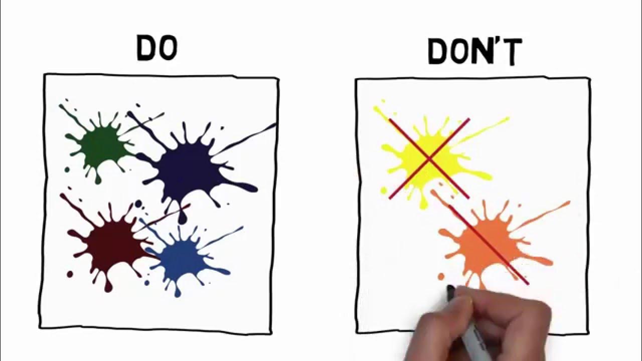
  • 🎨 Ensure high contrast colors for readability and include relevant visuals to engage visual learners.
  • πŸ” Proofread presentations to avoid typos and maintain a professional appearance.
  • πŸ“ Choose a font size of at least 30 to ensure visibility from the back of the room.
  • πŸ”’ Number slides for easy reference and organization, which aids in presenter notes as well.
  • πŸ‘€ Select simple, sans-serif fonts for ease of reading in projected presentations.
  • πŸ‘₯ Involve the audience through activities on slides, such as matching activities, to foster engagement.
  • πŸ—ΊοΈ Utilize presentation plans or outlines to navigate disruptions and stay on track with your points.
  • 🎨 Incorporate visual elements like SmartArt to transform bullet points into more engaging formats.
  • 🚫 Avoid using all caps, acronyms, or overly complex terms that may confuse the audience.
  • πŸ‘₯ Maintain eye contact with the audience; avoid turning your back to read from the screen.
  • πŸ“ Do not script every word of your speech into the slides, as it can bore the audience.
  • πŸ–±οΈ Use the built-in pointer function instead of a laser pointer for highlighting on slides.
  • πŸ“‘ Simplify messages and avoid clutter on slides; use more slides if necessary to keep content clear.
  • 🎨 Stick to one or two fonts and avoid varying sizes excessively to maintain consistency and clarity.
  • 🚫 Use bullet points sparingly to highlight key points and avoid overwhelming the audience.
  • 🌈 Avoid clashing colors and overly distracting backgrounds to keep the focus on content.
  • πŸ”§ Anticipate technical issues by doing a tech check before the presentation to ensure smooth delivery.
  • πŸŽ‰ Remember that flashy effects and animations should not overshadow solid content; use them sparingly.

Q & A

  • What is the main purpose of a PowerPoint slide according to the script?

    -The main purpose of a PowerPoint slide is to serve as a summary of important points and key ideas. It should use keywords, main points, and phrases rather than full sentences or paragraphs.

  • Why is using colors with sharp contrast important in PowerPoint presentations?

    -Using colors with sharp contrast is important because it makes the slides easy for the audience to read, ensuring that the information is clearly visible and accessible.

  • What role do relevant images and visuals play in a PowerPoint presentation?

    -Relevant images and visuals play a crucial role in conveying meaning and content. They can appeal to visual learners and help in making the presentation more engaging and memorable.

  • Why is it essential to use spell check in PowerPoint presentations?

    -Using spell check is essential to avoid typos, spelling, and grammar mistakes, which can make a presentation look unprofessional and distract the audience from the content.

  • What is the minimum font size recommended for projected presentations?

    -The minimum font size recommended for projected presentations is 30 points, ensuring that the audience can read the content even from the back of the lecture hall.

  • Why should numbers be included on slides?

    -Numbers should be included on slides to allow easy reference to a particular slide, which can also assist with presenter notes and help maintain the flow of the presentation.

  • What type of fonts are suggested for PowerPoint presentations, and why?

    -Simple fonts, particularly sans-serif fonts, are suggested because they tend to be the easiest to read, enhancing the readability of the slides for the audience.

  • How can audience involvement be encouraged during a presentation?

    -Audience involvement can be encouraged by using slides to provide activities, such as matching games, or by conducting polls, surveys, or quizzes using specialized hardware or web-based applications.

  • What is the benefit of having a presentation plan or outline for the presenter?

    -A presentation plan or outline helps the presenter stay on track, manage disruptions or digressions, and serves as a reminder of all the points and examples they want to cover.

  • Why is it recommended to add visual elements like SmartArt to PowerPoint slides?

    -Adding visual elements like SmartArt helps transform a boring bullet point and text format into one that shows how concepts are ordered or related, appealing to the visual learner in the audience.

  • What are some common mistakes to avoid when making a PowerPoint presentation, according to the script?

    -Some common mistakes to avoid include using all capital letters, facing the screen while presenting, writing out every word of the presentation, using a laser pointer, overcrowding slides with information, using too many fonts, overusing bullet points, using clashing colors, and relying too much on animations and flashy effects.

Outlines

00:00

πŸ“ˆ Effective PowerPoint Presentation Tips

This paragraph outlines the top 10 tips for using PowerPoint effectively. It emphasizes the importance of summarizing key points on slides, using keywords and phrases over full sentences, and employing high-contrast colors for readability. It also stresses the use of relevant images and visuals to aid understanding, the necessity of proofreading for professionalism, and the need for large, readable fonts. Additionally, it suggests using numbered slides for easy reference, simple fonts for clarity, engaging the audience with activities, and incorporating visual elements like SmartArt to enhance presentation quality.

05:02

🚫 Common PowerPoint Presentation Mistakes

The second paragraph focuses on the top 10 mistakes to avoid in PowerPoint presentations. It advises against using all caps, excessive acronyms, and facing the screen while presenting, which can disrupt audience engagement. It also warns against reading every word from the slides, which can bore the audience, and suggests using the slide pointer function for highlighting instead of a laser pointer. The paragraph further recommends avoiding cluttered slides, sticking to a limited number of fonts and sizes for consistency, using bullet points sparingly, avoiding clashing colors, and conducting a tech check before the presentation. Lastly, it cautions against relying on flashy effects at the expense of solid content.

Mindmap

Keywords

πŸ’‘PowerPoint

PowerPoint is a presentation software application developed by Microsoft, widely used for creating visual aids for presentations. In the video, it is the central theme, as the speaker provides tips on how to effectively use PowerPoint to enhance presentations. The script mentions various PowerPoint features and best practices, such as using slide numbers and incorporating visuals.

πŸ’‘Summary

A summary is a brief statement or account of the main points of something, capturing the essence without going into detail. In the context of the video, the speaker emphasizes that slides should serve as a summary of key ideas, using keywords and main points rather than full sentences or paragraphs.

πŸ’‘Contrast

Contrast refers to the difference in colors, tones, or shades that makes elements stand out against each other. The script advises using colors with sharp contrast to ensure that the slides are easily readable for the audience, which is crucial for effective visual communication.

πŸ’‘Relevant Images

Relevant images are visual elements that correspond to the content being presented and help to convey meaning. The video script suggests using such images to appeal to visual learners and to enhance the understanding of the presentation's content.

πŸ’‘Typos

Typos are small mistakes made in typing, often involving spelling or grammar. The script warns against unprofessionalism caused by typos in presentations and stresses the importance of using the spell check feature in PowerPoint to maintain presentation quality.

πŸ’‘Font Size

Font size refers to the measurement of the characters in a typeface. The video mentions the importance of using a font size of at least 30 points for projected presentations to ensure readability from a distance, which is vital for audience engagement.

πŸ’‘Slide Numbers

Slide numbers are used to indicate the order of slides in a presentation. The script suggests including slide numbers to facilitate easy reference and to assist with presenter notes, which helps in navigating through the presentation smoothly.

πŸ’‘Simple Fonts

Simple fonts, often sans-serif, are easier to read, especially on projection. The video recommends using such fonts for PowerPoint presentations to ensure that the text is legible and not distracting to the audience.

πŸ’‘Audience Involvement

Audience involvement refers to strategies used to engage the audience in the presentation, making it interactive. The script suggests using slides for activities, such as matching games, and other interactive methods like polls or quizzes to increase audience participation.

πŸ’‘Presentation Plan

A presentation plan or outline is a structured guide that helps a presenter to organize and deliver their content effectively. The video mentions the importance of having such a plan to handle disruptions and to ensure all intended points are covered.

πŸ’‘Visual Elements

Visual elements, such as SmartArt in PowerPoint, are used to create diagrams or other graphic representations of information. The script recommends adding these elements to transform plain text slides into more visually appealing and conceptually organized presentations.

πŸ’‘Death by PowerPoint

Death by PowerPoint is a term used to describe the phenomenon where presentations are so dull and poorly executed that they put the audience to sleep or cause disengagement. The video script uses this term to emphasize the importance of avoiding common mistakes in PowerPoint presentations.

πŸ’‘Bullet Points

Bullet points are used to list items or key points in a presentation. The video advises using them sparingly to highlight only the most important points, as overuse can lead to a cluttered and less effective presentation.

πŸ’‘Murphy's Law

Murphy's Law is an adage that states 'anything that can go wrong, will go wrong.' In the context of presentations, the script suggests anticipating potential technological issues by doing a tech check before the presentation to avoid being caught off guard.

πŸ’‘Animations

Animations in PowerPoint are visual effects that can be added to text or objects to make the presentation more dynamic. However, the video warns against overusing them, as they can distract from the content and detract from the message being conveyed.

Highlights

Use slides as a summary of important points and key ideas, avoiding long sentences and paragraphs.

Utilize colors with sharp contrast for easy readability.

Incorporate relevant images and visuals to convey meaning effectively.

Maintain professionalism by using spell check to avoid typos and grammatical errors.

Ensure font size is at least 30 points for clear visibility from the back of the room.

Number slides to facilitate easy reference and organization.

Choose simple, sans-serif fonts for optimal readability.

Engage the audience by using slides for activities, not just content presentation.

Use specialized hardware or web-based applications for interactive audience involvement.

Have a presentation plan or outline to guide the flow and handle disruptions.

Add visual elements like SmartArt to illustrate concept relationships and order.

Avoid 'Death by PowerPoint' by not overloading slides with text and information.

Do not use all capital letters, abbreviations, or acronyms that are not easily understood.

Maintain eye contact with the audience instead of facing the screen while presenting.

Avoid reading every word from the slides; keep the presentation engaging.

Use the built-in slide pointer function instead of a laser pointer for highlighting.

Simplify messages and avoid cluttering slides with too much information.

Stick to one or two fonts and avoid varying sizes too much for consistency.

Use bullet points sparingly to highlight only key or important points.

Avoid clashing colors or overly distracting backgrounds, fonts, and graphics.

Anticipate technical issues by doing a tech check before the presentation.

Ensure content is solid and use animations and flashy effects sparingly to avoid distraction.

Transcripts

play00:05

[Music]

play00:16

today I'd like to talk about some

play00:17

general tips on how to use PowerPoint

play00:20

presentations effectively specifically

play00:23

we'll be looking at the top 10

play00:25

PowerPoint things which you should

play00:27

remember to do

play00:30

number

play00:31

one slides should be a summary of the

play00:35

important points and key ideas a

play00:38

presentation is not an essay so use

play00:40

keywords main points and phrases rather

play00:44

than sentences and

play00:47

paragraphs remember to use colors which

play00:49

give a sharp contrast so the slides are

play00:52

easy for the audience to

play00:54

read number three remember to use

play00:58

relevant images and visuals

play01:00

pictures go a long way to convey meaning

play01:02

and content so don't forget to appeal to

play01:05

the visual

play01:06

Learners number four presentations which

play01:10

have typos or spelling and grammar

play01:13

mistakes look very unprofessional so

play01:16

remember to use spell

play01:18

check number five when it comes to fonts

play01:22

size does matter for projected

play01:25

presentations be sure to use at least a

play01:27

30o font so that your audience will be

play01:30

able to read it even from the back of

play01:32

the lecture

play01:34

hall number six be sure to have numbers

play01:38

on your slides so that you can refer to

play01:40

a particular slide easily this will also

play01:43

assist you with presenter notes if you

play01:45

use

play01:47

them number seven remember to use simple

play01:51

fonts sansera fonts tend to be the

play01:54

easiest to

play01:57

read number eight one of the most

play02:01

important things in any presentation is

play02:03

to involve the audience no one wants to

play02:07

just listen to a presenter drone on and

play02:12

on one easy way to encourage audience

play02:15

involvement is to use slides to provide

play02:19

activities rather than just present

play02:22

content in this example a matching

play02:24

activity is given for the audience to

play02:28

complete other ways to encourage

play02:30

audience participation include using

play02:32

specialized Hardware such as handheld

play02:35

clickers to conduct polls surveys or

play02:39

quizzes alternatively you could use web

play02:42

base polls or similar applications there

play02:46

are plenty to choose

play02:49

from number nine as a presenter it's a

play02:53

good idea to have a presentation plan or

play02:55

outline for you to follow this can help

play02:58

if there are disruptions digressions or

play03:01

distracting questions it can also serve

play03:03

as a reminder of all the points and

play03:05

examples you want to

play03:08

give and finally number 10 add visual

play03:12

elements such as smart art to your

play03:14

slides this will help change a boring

play03:17

bullet point and text format into one

play03:20

which shows how concepts are ordered or

play03:22

related this can appeal to the visual

play03:25

learner in all of

play03:26

us we've all probably seen some pretty

play03:29

pretty bad PowerPoint presentations in

play03:32

our time and may have even experienced

play03:34

the dreaded Death by PowerPoint syndrome

play03:38

with this in mind I've compiled a list

play03:40

of the top 10 things not to do in a

play03:45

presentation so without further Ado here

play03:48

is the top 10 list of things not to do

play03:52

when making a PowerPoint

play03:55

presentation number one don't use all

play03:59

capital

play04:01

a bunch of short forms or a a t n o u

play04:05

annoying acronyms that no one

play04:08

understands two resist the temptation to

play04:12

face the screen so that you can read

play04:14

from it when presenting no one wants to

play04:17

look at the back of your head remember

play04:20

eye contact is key to a good

play04:24

presentation number three don't write

play04:27

every single word you are going to say

play04:29

in your presentation regardless of how

play04:31

long and boring it will be since this is

play04:34

likely to put the audience to sleep

play04:36

before the end of the slide or even

play04:38

sooner you get the

play04:42

idea number four shining a laser pointer

play04:45

at a slide isn't an effective way to

play04:48

highlight something it's typically hard

play04:50

to see and distracting instead use the

play04:54

built-in slide pointer function contrl

play04:57

and P to turn the a cursor Arrow into a

play05:01

red pointer it will show up much better

play05:04

on the screen and you can even save your

play05:06

notations at the end controll and a will

play05:10

return it to an arrow when you're

play05:13

done number five avoid giving out too

play05:16

much information especially on a single

play05:19

slide if things start to get cluttery

play05:22

simplify the message or even use more

play05:25

slides but with fewer

play05:28

points number six stick to one or maybe

play05:32

two fawns rather than more and don't

play05:36

vary the sizes too much either it can

play05:39

get confusing and hard to

play05:42

follow number seven bullet points should

play05:45

be used sparingly to highlight only key

play05:48

or important points some people say to

play05:51

avoid them

play05:54

completely number eight try to avoid

play05:57

clashing colors or an overly distract

play05:59

extracting rainbow of backgrounds fonts

play06:02

and Graphics keep it

play06:05

simple number nine anticipate Murphy's

play06:08

Law when it comes to the necessary

play06:10

technological tools that you'll need

play06:12

such as mics flash drives mice and other

play06:15

things don't forget to do a tech check

play06:17

before the

play06:19

presentation and finally number 10 don't

play06:22

think that whistles and bells can

play06:23

replace good content make sure the

play06:26

content is solid and only use animation

play06:29

flashy effects and the like sparingly or

play06:33

it can distract the audience don't let

play06:36

the delivery detract from the message

play06:39

thanks for watching this video on

play06:42

PowerPoint dos and

play06:46

don'ts

Rate This
β˜…
β˜…
β˜…
β˜…
β˜…

5.0 / 5 (0 votes)

Related Tags
PowerPoint TipsPresentation SkillsVisual LearningAudience EngagementSlide DesignContent ClarityTypographyInteractive SlidesProfessionalismAvoid Pitfalls