Learn Tableau in 15 minutes and create your first report (FREE Sample Files)
Summary
TLDRThis video offers a beginner-friendly introduction to Tableau, guiding viewers through creating their first dashboard using a sample chocolate sales dataset. It covers downloading Tableau Public, connecting data, and constructing visualizations like tables and charts. The tutorial demonstrates sorting data, applying filters to identify top salespeople, and combining multiple sheets into an interactive dashboard. It concludes with tips on saving and sharing the dashboard, making it accessible for further data exploration.
Takeaways
- 🚀 **Introduction to Tableau**: The video is an introductory guide to Tableau, a data visualization tool.
- 📊 **Creating Dashboards**: It teaches how to create a dashboard to visualize sales data of a chocolate business.
- 💾 **Downloading Tableau Public**: The first step is to download and install the free Tableau Public software.
- 🔗 **Connecting Data**: After installation, connect to data sources, using a sample dataset provided in the video description.
- 📈 **Understanding Data View**: The script explains how to preview and understand the data within Tableau.
- 📝 **Worksheets and Visualization**: Worksheets are used to create individual visuals, akin to pivot tables in Excel.
- 🗂️ **Sorting and Filtering**: Learn how to sort data in descending order and apply filters to find top salespeople.
- 📊 **Building Charts**: The video demonstrates creating column charts and adjusting them for better visualization.
- 🔑 **Interactive Dashboards**: It shows how to combine multiple sheets into an interactive dashboard.
- 🔗 **Linking Sheets**: Sheets can be linked so that selecting an item in one updates another, creating a dynamic report.
- 📑 **Saving and Sharing**: The final dashboard can be saved and published on Tableau Public for sharing with others.
Q & A
What is the main focus of the video?
-The video focuses on introducing Tableau, a data visualization tool, and guiding viewers through creating their first dashboard using a sample dataset of chocolate sales.
What is the sample data set used in the video?
-The sample data set used is about 'awesome chocolates' and includes information on salesperson, country, product, date, amount, and box shipping.
What is the first step to start using Tableau as per the video?
-The first step is to download the free Tableau Public software from the provided link in the video description.
How does the video suggest to bring data into Tableau?
-After opening Tableau Public, the video suggests connecting data from a file, specifically by opening the sample data set through the 'Excel' option.
What is a 'sheet' in Tableau according to the video?
-A 'sheet' in Tableau is a single visual within the software, similar to a pivot table in Excel, where you can construct visuals using rows, columns, and values.
How can you visualize the amount generated for each country in Tableau?
-To visualize the amount generated for each country, you can drag 'country' into the rows or columns area and 'amount' into the values area to create a table or chart.
What does the 'Show Me' button do in Tableau?
-The 'Show Me' button in Tableau suggests different types of graphs that can be created based on the data currently placed in the rows, columns, and values areas.
How can you sort the columns in descending order in Tableau?
-To sort the columns in descending order, you can use the sort buttons on the top of the Tableau interface and select the option to sort by the desired field in descending order.
What is a 'dashboard' in Tableau?
-A 'dashboard' in Tableau is an interactive report that can combine multiple sheets (visuals) into a single view, allowing for a comprehensive presentation of data.
How can you filter the top 10 salespeople in Tableau?
-To filter the top 10 salespeople, you can drag 'salesperson' into the filter area, edit the filter to show the top 10 by the sum of 'amount', and then apply the filter.
How does the video suggest saving and sharing the final Tableau dashboard?
-The video suggests saving the dashboard by clicking the 'save' button and naming the report. Since it's Tableau Public, it will also publish the dashboard to the Tableau website for sharing.
Outlines

This section is available to paid users only. Please upgrade to access this part.
Upgrade NowMindmap

This section is available to paid users only. Please upgrade to access this part.
Upgrade NowKeywords

This section is available to paid users only. Please upgrade to access this part.
Upgrade NowHighlights

This section is available to paid users only. Please upgrade to access this part.
Upgrade NowTranscripts

This section is available to paid users only. Please upgrade to access this part.
Upgrade NowBrowse More Related Video

How to Install Tableau and Create First Visualization | Tableau Tutorials for Beginners

Getting Started With Using Maps In Tableau | Tableau Maps For Beginners | Data Deep Dive

Tableau Dashboard Tutorial dalam 12 Menit | Bahasa Indonesia

Tableau Tutorial for Beginners in 20 Minutes | Complete Tableau Training for Beginners | Simplilearn
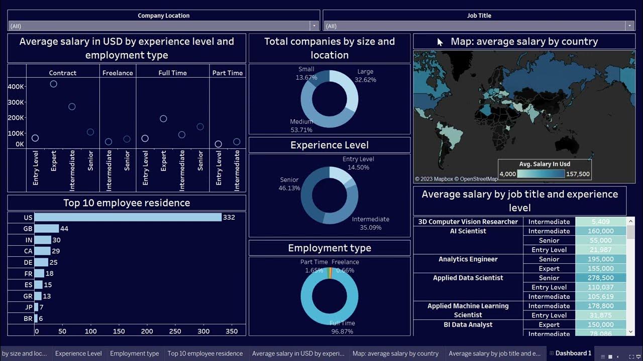
Create Data Science Jobs salaries dashboard with Tableau in 25 minutes
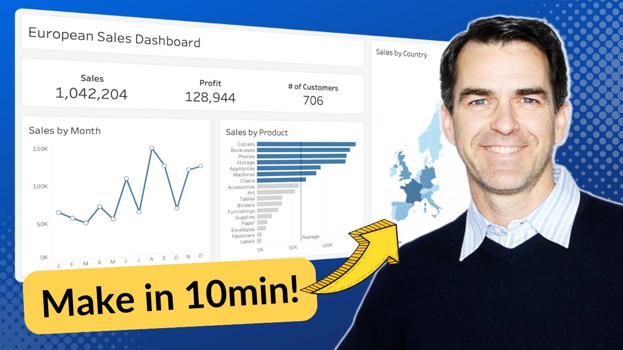
Make an AWESOME Tableau Dashboard in Only 10 Minutes
5.0 / 5 (0 votes)