Statistik : Penyajian Data - Part 5
Summary
TLDRThe transcript discusses the process of presenting data using histograms and polygon graphs. It begins by explaining the creation of histograms, including calculating class intervals, lower and upper bounds, and the use of frequency distribution tables. The process of calculating class boundaries and their midpoints is detailed, with examples of calculating boundaries and plotting histograms. The concept of polygon graphs, which connect midpoints of histogram bars, is also explained. The discussion concludes with a focus on cumulative frequency and its application in creating polygons. Overall, the video covers key concepts in data visualization and statistical analysis.
Takeaways
- 😀 Data presentation can be done using graphs, and histograms are a common method for visualizing data distributions.
- 😀 Histograms are similar to bar charts, but the bars are connected, representing continuous data intervals.
- 😀 To create a histogram, a frequency distribution table is required to determine the class intervals and their frequencies.
- 😀 The lower boundary for each class interval is found by adding the previous interval's value and dividing by two.
- 😀 Similarly, the upper boundary of each class interval is calculated by adding the next interval's value and dividing by two.
- 😀 The frequency of each class interval is plotted on the histogram, and the bars represent the relative frequencies.
- 😀 A polygon graph is similar to a histogram but is formed by connecting the midpoints of each class interval with a line.
- 😀 To create a polygon, you first need to determine the midpoint of each class interval, which is used as the point for plotting.
- 😀 Cumulative frequency distribution is used to create both histograms and polygons for better representation of data trends.
- 😀 The process for creating both histograms and polygons involves determining the lower and upper boundaries, calculating frequencies, and plotting the respective graphs.
Q & A
What is the main purpose of using histograms in data visualization?
-Histograms are used to represent frequency distributions of continuous data. They help visualize how data is distributed across different intervals, showing the frequency of data points in each interval.
How are the 'lower' and 'upper' limits of a histogram class calculated?
-The 'lower limit' of a class is found by adding the lower limit of the current class to the previous class's upper limit and then dividing by 2. Similarly, the 'upper limit' is found by adding the upper limit of the current class to the next class's lower limit and dividing by 2.
What is the role of the frequency distribution table in creating a histogram?
-The frequency distribution table organizes the data into classes and records the frequency of data within each class. This table is essential for creating a histogram, as it provides the data necessary to plot the histogram bars.
What is a polygon, and how is it related to a histogram?
-A polygon is a line graph that connects the midpoints of each histogram bar. It is used to show the cumulative frequency of the data, providing an alternative visualization to histograms.
How do you calculate the midpoint of each class in a histogram?
-The midpoint of a class is calculated by taking the average of the class's lower and upper limits. This value represents the central point of the class and is used to plot the points for the polygon.
What is cumulative frequency, and how does it relate to histograms and polygons?
-Cumulative frequency is the running total of frequencies as you move through the classes. It helps in creating cumulative frequency histograms and polygons, where the data points are connected by a line to show the accumulation of frequencies.
Why are histograms and polygons important in data analysis?
-Histograms and polygons provide clear visual representations of data distributions, making it easier to identify patterns, trends, and anomalies in the data. These tools help summarize large datasets effectively.
What is the difference between a histogram and a bar chart?
-While both histograms and bar charts represent data with bars, histograms are used for continuous data, and the bars are connected. Bar charts are used for categorical data, and the bars are typically spaced apart.
What is the significance of the frequency of each class in a histogram?
-The frequency of each class indicates how many data points fall within that particular range. It helps visualize the concentration of data within specific intervals, providing insight into the data's distribution.
What is meant by the 'class' in a frequency distribution, and how is it used in histogram creation?
-A class in a frequency distribution is a range of values grouped together. These classes help organize continuous data into intervals, and the frequencies within each class are used to create the bars of the histogram.
Outlines

This section is available to paid users only. Please upgrade to access this part.
Upgrade NowMindmap

This section is available to paid users only. Please upgrade to access this part.
Upgrade NowKeywords

This section is available to paid users only. Please upgrade to access this part.
Upgrade NowHighlights

This section is available to paid users only. Please upgrade to access this part.
Upgrade NowTranscripts

This section is available to paid users only. Please upgrade to access this part.
Upgrade Now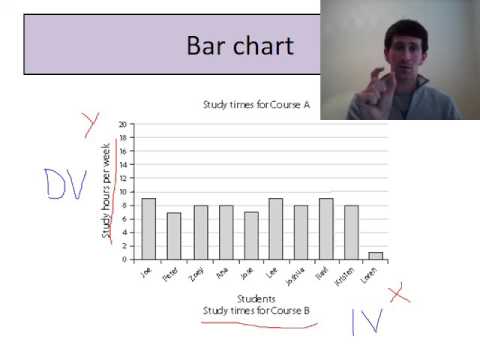

5.0 / 5 (0 votes)