Frequency Tables, Bar Charts, Pie Charts, Histograms, Grouped & Ungrouped Data Distributions
Summary
TLDRThis video explains frequency distributions, focusing on organizing and displaying data to derive meaningful insights. It covers categorical data, relative frequencies, bar and pie charts, and grouped frequency tables. The video also discusses class intervals, class width, midpoints, and histograms, including the use of cumulative frequencies and ogives. Additionally, it highlights how to classify data distributions based on their shape, such as negatively skewed, positively skewed, symmetric, and uniform distributions. This guide provides a comprehensive understanding of how to present and interpret data in a visually effective way.
Takeaways
- 😀 A frequency distribution organizes and displays raw data in a meaningful way to quickly derive useful insights.
- 😀 Frequency distributions are often used for categorical data, where the frequency of each category is counted and presented in a table.
- 😀 Relative frequencies are calculated by dividing each frequency by the total frequency and can be represented as decimals or percentages.
- 😀 Bar charts and pie charts are common graphical representations for categorical data, displaying frequencies or proportions.
- 😀 A Pareto chart is a type of bar chart that organizes categories in descending order of frequency.
- 😀 When data is continuous or has a wide range, grouping it into class intervals is a better approach than listing individual values.
- 😀 Class intervals are divided into lower and upper limits, and the class width is the difference between two consecutive limits.
- 😀 For continuous data, class intervals may use open-ended upper limits, such as '10 to under 20' to capture decimal values.
- 😀 The class midpoint is commonly used as a representative value for each interval, found by averaging the lower and upper limits.
- 😀 A histogram is a bar graph used to present frequency distributions for continuous data, with no gaps between bars unless the frequency is zero.
- 😀 Cumulative frequency tracks the sum of frequencies up to a certain class interval and can be graphed as an ogive to show cumulative distribution.
- 😀 Frequency distributions can be classified based on the shape of their histogram: negatively skewed, positively skewed, symmetric, bell-shaped, or uniform.
Q & A
What is a frequency distribution?
-A frequency distribution is a display of distinct categories of a dataset, along with the number of observations in each category. It helps in organizing and displaying raw data in more meaningful ways.
What is the goal of creating frequency distributions?
-The goal is to present raw data in a more meaningful and organized way, allowing us to quickly derive useful information from it.
What type of data is used in frequency distributions?
-Frequency distributions typically use categorical or qualitative data, which are non-numeric. An example would be blood types.
What are relative frequencies in the context of frequency distributions?
-Relative frequencies are calculated by dividing the frequency of each category by the total frequency. They can be expressed as decimals or percentages, and they should sum up to 1 or 100%.
What is the difference between a bar chart and a pie chart in representing categorical data?
-A bar chart uses bars to display either frequencies or proportions for each category, while a pie chart uses slices of a circle to display the proportions relative to the whole.
What is a Pareto chart?
-A Pareto chart is a type of bar chart where the bars are ordered in descending order of magnitude, often used to highlight the most significant categories.
What is the purpose of class intervals in grouped frequency distributions?
-Class intervals are used to group continuous data into ranges to make the data more manageable and meaningful, especially when the range of data is wide.
How do class midpoints help in frequency distributions?
-Class midpoints represent a representative value for each class interval and are typically calculated as the average of the lower and upper limits of the interval. They help in performing calculations and graphing.
What is a histogram and how is it different from a bar chart?
-A histogram is a bar graph where the horizontal axis represents continuous intervals, and the height of the bars represents the frequency of each interval. Unlike bar charts, the order of bars in a histogram cannot be changed meaningfully.
What is the significance of cumulative frequencies and how are they calculated?
-Cumulative frequencies represent the sum of frequencies up to a certain class interval. To calculate them, start with the frequency of the first class, then progressively add the frequencies of subsequent classes.
What is an ogive and how is it used?
-An ogive is a graphical representation of cumulative frequency distribution. It helps in estimating the proportion of data below a specific value, allowing us to visually understand cumulative data.
How can the shape of a frequency distribution be classified?
-The shape of a frequency distribution can be classified into several types: negatively skewed (tail to the left), positively skewed (tail to the right), symmetric (both sides are identical), bell-shaped, or uniform (equal frequencies across intervals).
Outlines

This section is available to paid users only. Please upgrade to access this part.
Upgrade NowMindmap

This section is available to paid users only. Please upgrade to access this part.
Upgrade NowKeywords

This section is available to paid users only. Please upgrade to access this part.
Upgrade NowHighlights

This section is available to paid users only. Please upgrade to access this part.
Upgrade NowTranscripts

This section is available to paid users only. Please upgrade to access this part.
Upgrade NowBrowse More Related Video
Statistika 05 | Distribusi Frekuensi dalam Statistika | Frequency Distribution | Belajar Statistika

Representações Gráficas I | Estatística Básica 03
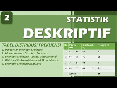
DISTRIBUSI FREKUENSI - STATISTIK DESKRIPTIF | BAB 2
Statistik : Penyajian Data - Part 4

Statistika Distribusi Frequensi
Cara Memasukkan Data Awal Sampai Pengolahan Data dari Excel ke SPSS
5.0 / 5 (0 votes)