Crie um WebSite Moderno Utilizando HTML & CSS (PURO)
Summary
TLDRIn this tutorial, the speaker guides viewers through creating a responsive and visually appealing 'Load More' button using CSS. Key techniques highlighted include button styling with background colors, border-radius, fixed width, and cursor pointer effects. The video delves into advanced CSS positioning and overflow handling, demonstrating how to make the design adaptable to various screen sizes, including tablets. Despite the simplicity of the design, the tutorial showcases important web development principles and encourages viewers to learn more advanced techniques while emphasizing responsiveness in their projects.
Takeaways
- 😀 The script demonstrates how to design a layout with CSS, including managing positioning and overflow properties.
- 😀 It emphasizes the importance of creating responsive designs that work on various screen sizes, even on tablets.
- 😀 The tutorial shows how to create a clean and user-friendly button using CSS, focusing on aspects like background color, border radius, and cursor styles.
- 😀 The speaker highlights the use of 'overflow' and 'positioning' techniques for complex layouts.
- 😀 Border radius, width, height, and button styling are essential steps to achieve a polished look in the design.
- 😀 The script demonstrates how the layout adjusts well with different screen sizes, ensuring it remains responsive and functional.
- 😀 Techniques for handling content overflow and ensuring elements stay in place within the design are covered in detail.
- 😀 The button styling focuses on enhancing user experience with visual cues like 'cursor pointer' to indicate interactivity.
- 😀 The speaker briefly discusses testing different design elements and adjusting properties like radius for aesthetic appeal.
- 😀 Viewers are encouraged to like, share, and engage with the video to help grow the channel and support future content creation.
- 😀 The tutorial concludes with a call to action, inviting viewers to check out more lessons and tutorials on the platform.
Q & A
What layout technique is emphasized in the tutorial?
-The tutorial focuses on positioning techniques and overflow properties, which are crucial for creating complex layouts and ensuring proper alignment on different screen sizes.
How is the 'Load More' button styled in the tutorial?
-The 'Load More' button is styled with a white background color, a border-radius of 8-10 pixels, a width of 80 pixels, and a cursor set to pointer to indicate interactivity. The border-radius is also tested with a value of 30 pixels.
What is the importance of using the `cursor: pointer` property for buttons?
-The `cursor: pointer` property is used to indicate to the user that the button is interactive, encouraging them to click it.
What techniques were demonstrated to manage responsive design?
-The tutorial shows how to create responsive layouts using positioning and overflow techniques, ensuring that the layout adapts correctly across various screen sizes, including tablets.
Why is positioning considered important for complex layouts?
-Positioning is vital for aligning elements precisely within a layout, especially when dealing with more intricate designs that require specific placements of content or controls.
How does the use of overflow properties benefit layout design?
-Overflow properties help manage how content behaves when it exceeds its container's dimensions, allowing for better control over the visibility and scrolling of elements.
What is the significance of setting a fixed width for the 'Load More' button?
-Setting a fixed width for the button ensures consistency in its appearance, regardless of its surrounding content or container size, contributing to a more stable layout.
What does the tutorial suggest about responsiveness when designing layouts?
-The tutorial emphasizes the importance of making layouts responsive, allowing them to adjust smoothly to different screen sizes, ensuring a user-friendly experience across devices like tablets and desktops.
What can be learned from the techniques shared in this tutorial?
-The tutorial provides valuable insights into creating responsive, visually appealing web pages, focusing on positioning, overflow, and button styling to enhance user experience and layout management.
What is the final takeaway from the tutorial?
-The final takeaway is that even simple techniques, such as positioning and overflow management, can significantly improve the quality of web design, making it both functional and aesthetically pleasing on various devices.
Outlines

This section is available to paid users only. Please upgrade to access this part.
Upgrade NowMindmap

This section is available to paid users only. Please upgrade to access this part.
Upgrade NowKeywords

This section is available to paid users only. Please upgrade to access this part.
Upgrade NowHighlights

This section is available to paid users only. Please upgrade to access this part.
Upgrade NowTranscripts

This section is available to paid users only. Please upgrade to access this part.
Upgrade NowBrowse More Related Video
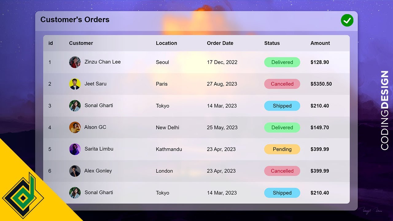
Responsive HTML Table With Pure CSS - Web Design/UI Design
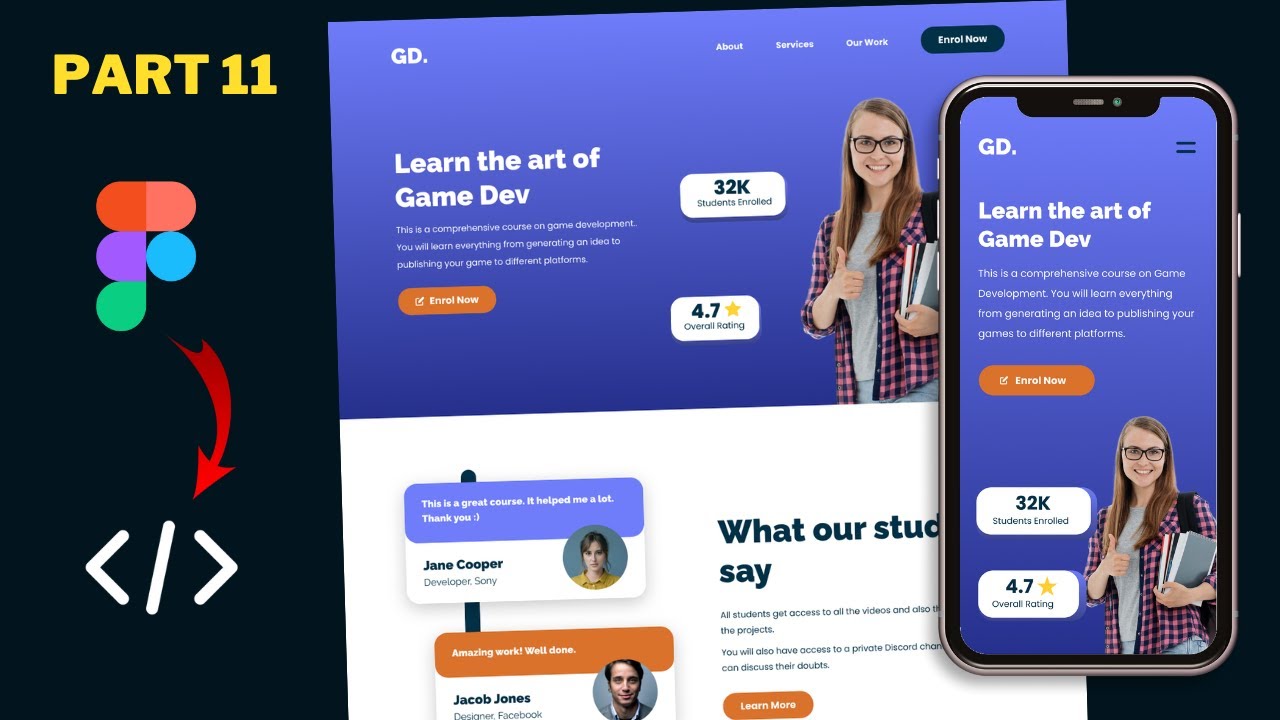
Figma To Real Website | Responsive Homepage | HTML, CSS & JavaScript | Part 11
Animated Dark Mode Toggle With HTML / CSS / JavaScript
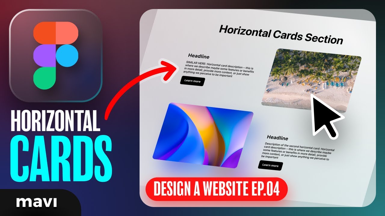
WEB DESIGN IN FIGMA ep.04: Horizontal Text + Image Cards (Free Web Design Course)
I Built JavaScript-Powered Minimap Scroll Animation

Figma To Real Website | Responsive Homepage | HTML, CSS & JavaScript | Part 8
5.0 / 5 (0 votes)