Membuat Grafik (Bar chart & Pie chart) menggunakan SPSS
Summary
TLDRIn this video, the presenter demonstrates how to create various graphs using SPSS. They begin by explaining the steps to open the SPSS application and load pre-prepared data. The video covers creating a simple bar chart based on respondents' education data, followed by a clustered bar chart that includes income groups. Lastly, the presenter shows how to create a pie chart with education data, including how to adjust the colors and display percentages on each chart. Throughout, the presenter emphasizes clarity and ease, offering helpful tips for users new to SPSS.
Takeaways
- 😀 Make sure to have SPSS installed and ready before starting any graph creation process.
- 😀 Start by opening SPSS and load your pre-existing data or prepare new data for graph creation.
- 😀 To create a simple bar graph, go to **Graphs** > **Legacy Dialogs** > **Bar** > **Simple**.
- 😀 Select **Percent of Cases** for the **Bar Represent** in a simple bar graph to show percentage distribution.
- 😀 After defining the graph settings, click **OK** to generate a simple bar graph based on the chosen data.
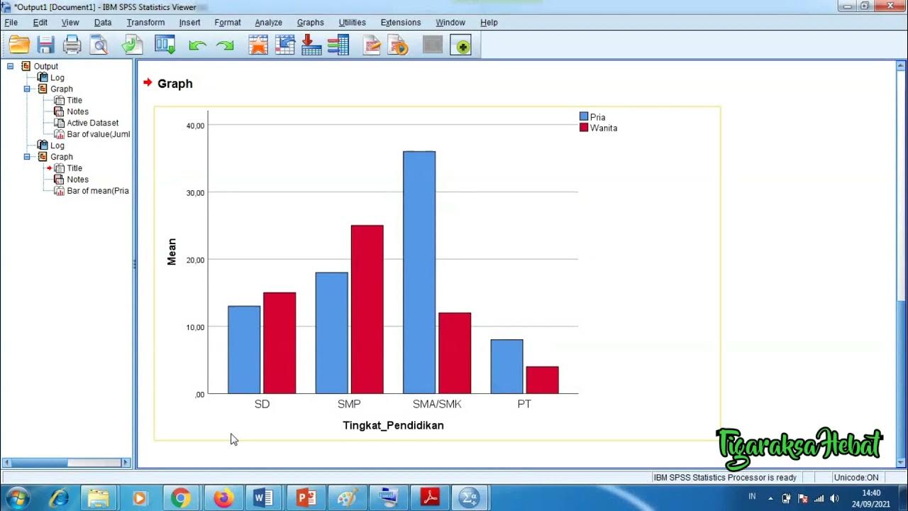
- 😀 For a clustered bar graph, select **Clustered** under **Bar** and choose an additional variable, like income, to compare against education level.
- 😀 The clustered bar graph will show data grouped by categories such as education level and income level.
- 😀 For creating a pie chart, choose **Graphs** > **Legacy Dialogs** > **Pie**, and select **Percent of Cases** for distribution representation.
- 😀 Customize the title of each graph to make it clear what the data represents (e.g., 'Education Levels of Respondents').
- 😀 You can easily change colors of bars or pie segments to suit your preferences, which helps in better data visualization.
- 😀 Adding data labels (percentages) to each bar or pie segment can provide more detailed insights into the data breakdown.
Q & A
What is the first step in creating a graph using SPSS?
-The first step is to open the SPSS application. Make sure that the SPSS software is already downloaded and ready to use.
What data is used for the first graph in the video?
-The first graph uses data related to the education level of the respondents.
Which menu option should be selected to create a simple bar chart in SPSS?
-You should select the 'Graphs' menu, then choose 'Legacy Dialogs', followed by 'Bar', and then select 'Simple'.
How do you represent the data in the bar chart in terms of percentages?
-In the 'Bar Represent' section, choose 'Percent of Cases' to display the data as percentages.
What is the second type of graph created in the video?
-The second graph created is a clustered bar chart, which compares education levels with income groups.
How do you add a second variable, like income, to the clustered bar chart?
-In the 'Cluster on' section, add the income data as the second variable to group the education data by income levels.
What are the income categories displayed in the clustered bar chart?
-The income categories are 'low income', 'middle income', and 'high income'.
What type of graph is created last in the video?
-The last graph created is a pie chart, which also shows the education level of the respondents.
How can you display the percentages on the pie chart?
-To display the percentages, double-click the pie chart and then select 'Data Labels'. From there, you can choose to display the percentages along with the education categories.
Can you change the colors of the segments in the pie chart, and how?
-Yes, you can change the colors of the segments by clicking on the segments and selecting the desired color. The example in the video shows changing the color to purple for one segment.
Outlines

This section is available to paid users only. Please upgrade to access this part.
Upgrade NowMindmap

This section is available to paid users only. Please upgrade to access this part.
Upgrade NowKeywords

This section is available to paid users only. Please upgrade to access this part.
Upgrade NowHighlights

This section is available to paid users only. Please upgrade to access this part.
Upgrade NowTranscripts

This section is available to paid users only. Please upgrade to access this part.
Upgrade NowBrowse More Related Video
Penyajian Data Statistik Menggunakan SPSS

Cara Uji Normalitas dan Homogenitas Menggunakan SPSS dengan Mudah
CARA MEMASUKKAN DATA KUESIONER KE SPSS - Beserta Uji Statistik Deskriptif
Cara Mudah membuat Distribusi Jawaban Responden dengan SPSS
Tutorial Menggunakan Spss untuk data Panel

Pengenalan SPSS bagi Pemula - Pertemuan 5
5.0 / 5 (0 votes)