PRINCÍPIOS de DESIGN GRÁFICO para INICIANTES
Summary
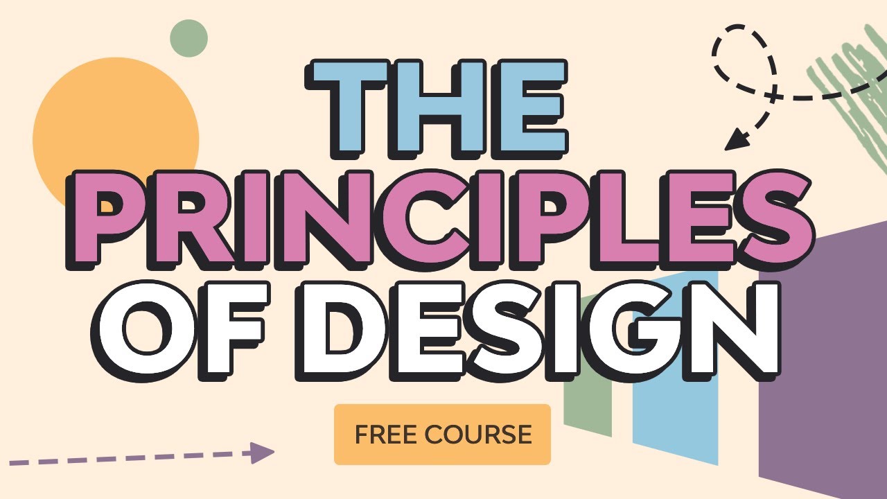
TLDRThis video introduces the seven key principles of graphic design: contrast, repetition, proximity, alignment, hierarchy, harmony, and emphasis. It explains how each principle contributes to creating visually appealing and effective designs. The video covers practical applications, such as using contrast to guide attention, repeating elements for consistency, grouping related items for clarity, aligning objects for organization, establishing a visual hierarchy, harmonizing design elements for cohesion, and emphasizing focal points for better communication. It’s an insightful guide for graphic design beginners, with additional resources for further learning.
Takeaways
- 😀 Contrast is crucial for highlighting elements and creating visual hierarchy in your design. Ensure elements are sufficiently different to avoid visual conflict.
- 😀 Repetition in design creates consistency and helps tie elements together, making your layout feel unified.
- 😀 Proximity groups related elements together, making information easier to read and understand. Avoid separating unrelated elements.
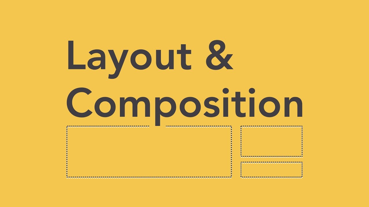
- 😀 Alignment ensures that your design feels organized and cohesive. Use lines to visually connect elements, whether they are aligned left, right, or centered.
- 😀 Visual hierarchy helps to organize information by importance. Adjust size, color, and placement to guide the viewer's attention.
- 😀 Harmony in design ensures that all elements work together cohesively. Make sure your colors, shapes, and icons are consistent for a balanced design.
- 😀 Emphasis directs attention to the most important element in your design. Use size, color, and positioning to highlight key items without overwhelming the viewer.
- 😀 Misalignment or random placement of elements can create confusion and disrupt the visual flow of your layout.
- 😀 Contradictory or similar colors can cause visual tension. Use contrast effectively to create a clean, readable design.
- 😀 Each element in your design should serve a purpose. Avoid adding unnecessary or random elements that could disrupt the harmony of the layout.
Q & A
What is the main focus of this video on graphic design?
-The video introduces the seven key principles of graphic design, explaining how these principles are applied to enhance the effectiveness and aesthetics of design projects.
What is the role of contrast in graphic design?
-Contrast helps to highlight elements and create visual hierarchy within a design. It is achieved by using two significantly different elements, such as colors, sizes, and textures. Proper contrast directs the viewer’s attention and improves legibility.
What happens if contrast is not applied correctly?
-If the contrast is too subtle, such as when colors are only slightly different, it may cause a conflict rather than creating a clear distinction. This can lead to a loss of visual clarity and confusion in the design.
How does repetition contribute to a design?
-Repetition ensures consistency and unity within a design by repeating elements such as shapes, colors, or text. It helps to organize the design, making it more cohesive and visually appealing.
Why is proximity important in graphic design?
-Proximity groups related elements together, making it easier for viewers to understand the relationships between information. By strategically placing related items close to each other, a designer can guide the viewer's eye and enhance comprehension.
What is the difference between aligned and unaligned elements in a design?
-Aligned elements create a sense of order and cohesion, guiding the viewer's eye across the design smoothly. Unaligned elements, on the other hand, may cause discomfort and make the layout appear disorganized or chaotic.
How does visual hierarchy help in a design?
-Visual hierarchy organizes elements in a design according to their importance, guiding the viewer's attention. It can be achieved through variations in size, color, contrast, and positioning, helping to ensure the most important elements stand out.
What is the principle of harmony in graphic design?
-Harmony refers to the balanced and cohesive relationship between elements within a design. It ensures that all parts work together aesthetically, making the design feel unified and well-composed.
How can you emphasize certain elements in a design?
-Emphasis is used to highlight specific elements by making them stand out. This can be done through larger sizes, bold colors, or strategic positioning, helping to capture the viewer’s attention and guide them through the design.
What should designers avoid when applying the principle of emphasis?
-Designers should avoid over-emphasizing too many elements at once, as this can create confusion and diminish the impact of each element. Too much emphasis can break the visual hierarchy and reduce the clarity of the design.
Outlines

This section is available to paid users only. Please upgrade to access this part.
Upgrade NowMindmap

This section is available to paid users only. Please upgrade to access this part.
Upgrade NowKeywords

This section is available to paid users only. Please upgrade to access this part.
Upgrade NowHighlights

This section is available to paid users only. Please upgrade to access this part.
Upgrade NowTranscripts

This section is available to paid users only. Please upgrade to access this part.
Upgrade NowBrowse More Related Video


5.0 / 5 (0 votes)