Which is the best chart: Selecting among 14 types of charts Part II
Summary
TLDRThis video explores various chart types—bar, pie, doughnut, line, area, treemap, bridge, scatter plots, and histograms—detailing when to use each and when to avoid them. It highlights how treemaps visualize hierarchical data, bridge charts show cumulative effects, scatter plots reveal patterns between variables, and histograms display data distributions. The emphasis is on selecting the right chart for clear and intuitive data representation. The video concludes by recommending Tableau for superior data visualization compared to traditional tools like Excel.
Takeaways
- 📊 Treemap charts help to visualize hierarchical data by showing how parts contribute to the whole, particularly useful for comparing divisions and products within a company.
- 🚫 Treemap charts are not ideal for data without clear categories or sub-categories, and they aren't suitable for tracking changes over time.
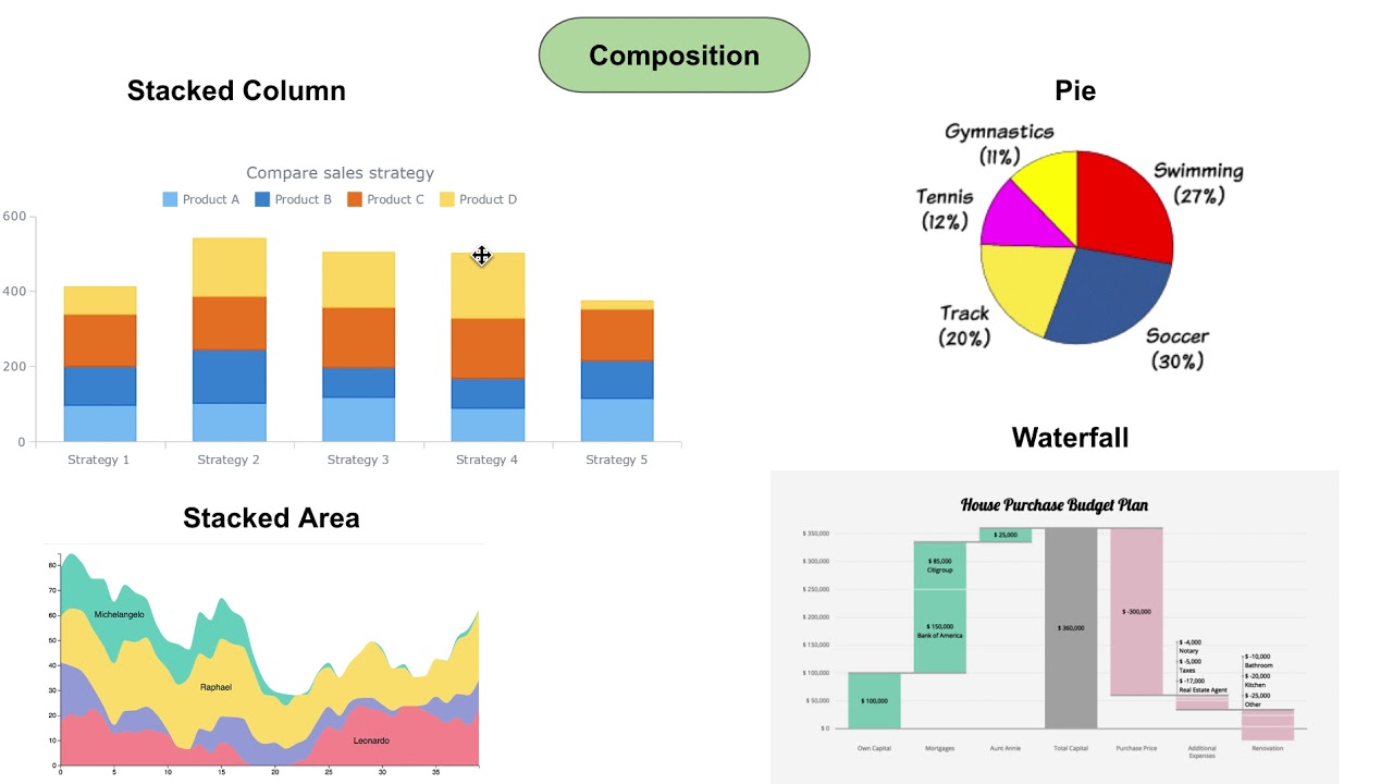
- 📈 Bridge (waterfall) charts are great for showing cumulative changes in value between two periods or stages, often used in finance to visualize the effects of different variables on a final outcome.
- 🚫 Avoid bridge charts if the data doesn't have intermediary steps or segments, as simpler charts might work better.
- 🔵 Scatter plots show relationships between two variables and can indicate patterns, such as positive or negative correlations.
- 🚫 Scatter plots should not be used for non-bi-dimensional data, categorical data, or when tracking changes over time.
- 📉 Histograms show the frequency distribution of data within specific ranges (bins), which is helpful to visualize where observations are concentrated.
- 🚫 Multi-column histograms should be avoided if the data involves multiple categories, as they can be confusing.
- 🛠 The video emphasizes the importance of selecting clear and intuitive chart types over overly complex visualizations.
- 📈 Tableau is highlighted as a leading data visualization tool in the corporate world, surpassing traditional tools like Excel.
Q & A
What is a Treemap chart and when is it used?
-A Treemap chart visually splits the sum of a whole into hierarchies and displays internal breakdowns within those hierarchies. It is used when there are categories and sub-categories, such as divisions within a company and their respective products, to show their relative contributions to a whole, like total revenue.
When should Treemap charts be avoided?
-Treemap charts should be avoided when the data cannot be divided into categories and sub-categories. Additionally, they are not suitable for tracking development over time.
What is a Bridge (Waterfall) chart and what are its primary use cases?
-A Bridge or Waterfall chart shows the cumulative effect of positive and negative values on a starting and ending value. It is used to visualize changes between two periods or to illustrate how several factors contribute to an overall result, such as showing the contributions of various divisions to revenue changes.
When should Bridge charts not be used?
-Bridge charts should not be used when the data lacks intermediary steps or segments between the starting and ending values. In such cases, a different type of chart is more appropriate.
What is a Scatter Plot and when is it useful?
-A Scatter Plot is used to display relationships between two variables by plotting data points on two axes. It is particularly useful for identifying patterns, such as the relationship between house size and house price, or determining if two variables are uncorrelated.
What are the limitations of Scatter Plots?
-Scatter Plots should not be used if the data is not bi-dimensional or if the objective is to track changes over time. They are also not suitable for categorical data and are intended for numerical data.
What is a Histogram and when should it be used?
-A Histogram is a chart that groups continuous data into bins to show the frequency of observations within each bin. It is best used to display the distribution of data, such as the distribution of house prices within certain ranges.
When should Histograms be avoided?
-Histograms should be avoided when the data includes multiple categories or variables. Multi-column histograms can become cluttered and difficult to interpret if the data is too complex.
Why is it important to choose the right chart type for data visualization?
-Choosing the correct chart type ensures that data is presented clearly and intuitively, allowing viewers to easily interpret the information without confusion. Complex charts that require extensive explanations defeat the purpose of data visualization.
What are some common mistakes when creating visualizations?
-Common mistakes include using complex charts for simple data, applying charts to data types they are not suited for (e.g., using Treemaps for non-categorical data), and overloading charts with unnecessary details that confuse the viewer.
Why is Tableau mentioned in the script, and how does it compare to Excel for data visualization?
-Tableau is highlighted as one of the most popular data visualization tools in the corporate world due to its ability to handle complex datasets and create clear, professional visualizations. It is considered superior to traditional tools like Excel for these tasks.
Outlines

This section is available to paid users only. Please upgrade to access this part.
Upgrade NowMindmap

This section is available to paid users only. Please upgrade to access this part.
Upgrade NowKeywords

This section is available to paid users only. Please upgrade to access this part.
Upgrade NowHighlights

This section is available to paid users only. Please upgrade to access this part.
Upgrade NowTranscripts

This section is available to paid users only. Please upgrade to access this part.
Upgrade NowBrowse More Related Video

How to pick the "perfect" chart for your situation in Power BI?

Reading Graphs (Simplifying Math)

4 Question Categories to help choose your chart types for Data Visualization

Must know Visualization in Statistics | Descriptive Statistics | Ultimate Guide !! | Part 10

Statistika - Penyajian Data Eps.2 l Ruang Belajar #StudyWithDiida

Bar Charts, Pie Charts, Histograms, Stemplots, Timeplots (1.2)
5.0 / 5 (0 votes)