Cara menentukan histogram dan poligon data kelompok
Summary
TLDRThis tutorial guides viewers through the process of plotting a histogram and polygon from grouped data. The video explains how to adjust class boundaries, plot the histogram bars based on frequency data, and then connect the midpoints of the histogram's bars to form a polygon. It provides step-by-step instructions on determining the appropriate values, calculating boundaries, and visualizing the data effectively. The tutorial concludes with a clear understanding of how both graphical representations—histograms and polygons—are created, offering valuable insights into data analysis techniques for learners.
Takeaways
- 😀 The video starts with a greeting and encourages viewers to like, subscribe, comment, and share.
- 😀 The topic of the video is about creating histograms and polygons from grouped data.
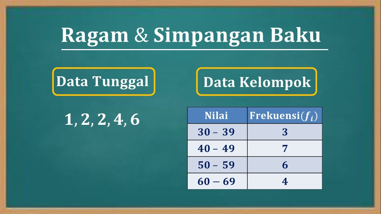
- 😀 Viewers are introduced to a dataset based on cigarette sales, which includes values and frequencies.
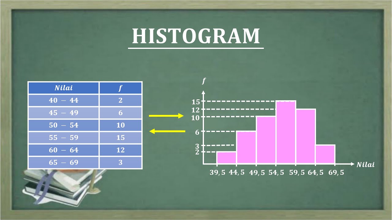
- 😀 The first step in creating a histogram is to plot the values (X-axis) and frequencies (Y-axis).
- 😀 The lower boundary of each class interval is adjusted by subtracting 0.5, except for the uppermost boundary which is increased by 0.5.
- 😀 An example of the adjustment is shown: 41 - 0.5 = 40.5, 51 - 0.5 = 50.5, and 100 + 0.5 = 100.5.
- 😀 Bars for the histogram are drawn based on the adjusted class boundaries and frequencies.
- 😀 The frequency values for each class interval are used to determine the height of each bar in the histogram.
- 😀 The polygon is formed by connecting the midpoints of the top of each histogram bar with a red line.
- 😀 The video concludes by summarizing the histogram (yellow bars) and polygon (red line), and encourages viewers to reflect on the lesson learned.
Q & A
What is the main topic of the video?
-The main topic of the video is how to create histograms and polygons for grouped data, using a dataset related to cigarettes.
What is the first step in creating a histogram?
-The first step is to draw a straight line for the values on the x-axis and a perpendicular line for the frequencies on the y-axis.
How are class boundaries adjusted in the histogram?
-Class boundaries are adjusted by subtracting 0.5 from the lower limit of each class and adding 0.5 to the upper limit of the last class.
Why is 0.5 subtracted from the lower limit and added to the upper limit of the class boundaries?
-This adjustment ensures that the histogram accurately reflects the data distribution, helping to avoid overlaps or gaps between adjacent classes.
How do you determine the frequencies for the histogram?
-Frequencies are given as part of the dataset, and each class's frequency is plotted as the height of the corresponding bar in the histogram.
What is the definition of a polygon in the context of this video?
-A polygon in this context is a line connecting the midpoints of the tops of the bars in the histogram, which visually represents the distribution of the data.
What is the purpose of creating a polygon after the histogram?
-The purpose of the polygon is to visually connect the midpoints of the histogram bars, helping to show the overall pattern or trend in the data.
How is the midpoint of a class in the histogram calculated?
-The midpoint of a class is found by taking the average of its lower and upper class boundaries.
Why is it important to adjust the class boundaries in the histogram?
-Adjusting the class boundaries ensures the data is accurately represented in the histogram, preventing misinterpretation due to overlapping or incorrect class intervals.
What is the final message at the end of the video?
-The video concludes with a greeting 'Assalamualaikum warahmatullahi wabarakatuh' and encourages viewers to like, comment, subscribe, and share the video, hoping it has been useful.
Outlines

This section is available to paid users only. Please upgrade to access this part.
Upgrade NowMindmap

This section is available to paid users only. Please upgrade to access this part.
Upgrade NowKeywords

This section is available to paid users only. Please upgrade to access this part.
Upgrade NowHighlights

This section is available to paid users only. Please upgrade to access this part.
Upgrade NowTranscripts

This section is available to paid users only. Please upgrade to access this part.
Upgrade NowBrowse More Related Video

HISTOGRAM CHART IN MATPLOTLIB - Learn HISTOGRAM PLOT IN MATPLOTLIB | Python Matplotlib Tutorial

Statistik : Penyajian Data - Part 5

O Que é e Como Criar Gráfico de Barras com Matplotlib em Python?
Cara menentukan nilai varian (Ragam) dan Standar deviasi (Simpangan baku) data tunggal dan kelompok
HISTOGRAM
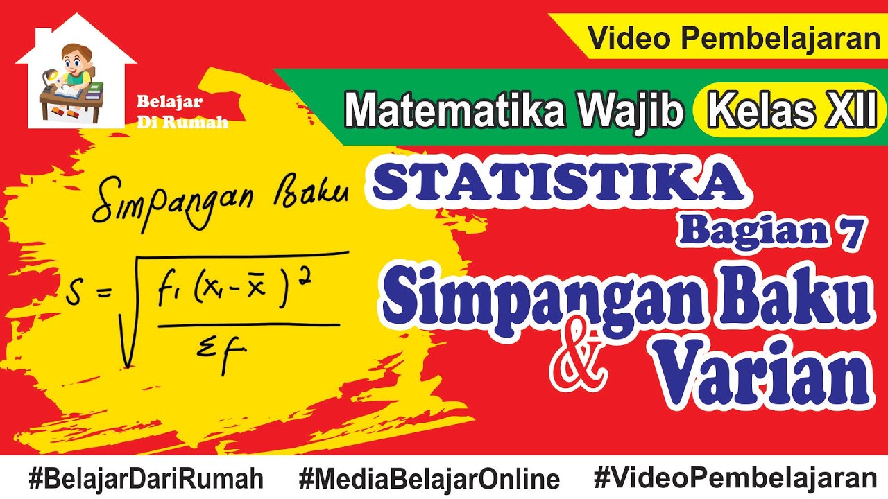
Statistika Bagian 7 - Simpangan Baku dan Varian Data Tunggal dan Data Berkelompok
5.0 / 5 (0 votes)