BD&S Bookcast: Data Visualization in Society. Editors Martin Engebretsen and Helen Kennedy
Summary
TLDRIn this video, Helen Kennedy discusses the significance of data visualizations, particularly in light of the COVID-19 pandemic, and introduces the book *Data Visualization and Society* (edited with Martin Engeretzen). She explores how visualizations not only aid in understanding complex data but also shape perceptions and ideologies. The book examines themes like engagement, meaning, feelings, skills, politics, and aesthetics in the context of data visualization. Kennedy emphasizes the importance of critical literacy in interpreting these visuals, which are increasingly embedded in news and social media. The book aims to push the field towards a deeper philosophical understanding of data visualization.
Takeaways
- 😀 Data visualizations have become increasingly common, especially during global crises like the COVID-19 pandemic, where they communicate vital information to the public.
- 😀 While data visualizations are often seen as transparent and objective, they are shaped by human choices, which means they can hide certain viewpoints and privilege others.
- 😀 The ability to critically interpret data visualizations is crucial, as these visual representations are not neutral and can influence public perception and action.
- 😀 Data visualizations are not only tools for understanding data but also play a role in persuasion and storytelling, influencing social and political agendas.
- 😀 The book 'Data Visualization in Society' explores six themes: engagements and contexts, meanings, feelings, skills and literacy, politics, and aesthetics.
- 😀 Engagements and contexts focus on how citizens engage with data visualizations in different social and cultural contexts, and for various purposes, including highlighting political issues.
- 😀 Data visualizations generate meanings by presenting data in ways that influence public discourse and social understanding, often in subtle or indirect ways.
- 😀 Data visualizations can evoke strong emotional responses, which can influence the way the audience engages with the data and the issues it represents.
- 😀 Enhancing data visualization literacy is important to ensure that individuals can critically analyze and create their own visual representations of data.
- 😀 Data visualizations have political significance and can play a role in democratic systems, fostering greater citizen participation and engagement in political processes.
Q & A
What is the main focus of the book *Data, Visualization, and Society*?
-The main focus of the book is to explore the societal role of data visualizations, particularly in the context of their increasing use in the media and public life. It examines how data visualizations can simplify complex information, but also how they may carry ideological implications and influence public perceptions.
How do data visualizations impact public understanding of complex issues?
-Data visualizations make complex data more accessible and understandable by presenting it in simplified forms such as charts, maps, and graphs. However, while they enhance understanding, they can also manipulate or shape the narrative depending on how they are constructed, leading to potential biases.
What role does ideology play in data visualizations?
-Data visualizations are not neutral. They are the result of human choices and social conventions, meaning they can privilege certain views of the world and suppress others. Visualizations often reflect ideological perspectives, influencing how audiences interpret the data.
What critical skills are necessary for understanding data visualizations?
-Understanding data visualizations requires a combination of critical thinking, data literacy, and visual literacy. These skills enable individuals to interpret the data accurately, understand the choices behind visual representations, and recognize the potential biases or ideologies embedded in them.
How have data visualizations changed since the 2014 research by Helen Kennedy?
-Since 2014, data visualizations have become more ubiquitous, especially in standardized formats, making them a daily part of public discourse. The research found that many people lack confidence in interpreting graphs and charts, but the increased frequency of visualizations has highlighted the need for better data literacy.
What are some examples of the political significance of data visualizations in the book?
-One example from the book is how data visualizations play a role in political participation and democratic systems. Visualizations have been used to expose politically masked risks, such as the unconventional representations of the Southeast Asian haze that highlighted environmental and political issues.
How can data visualizations evoke emotions in audiences?
-Data visualizations can evoke a wide range of emotional responses depending on their design and context. For instance, Jill Simpson's hand-drawn visualization of her own OCD stirred emotional reactions while also drawing attention to the politics surrounding mental health and personal struggles.
What is the role of data visualization literacy, and how can it be enhanced?
-Data visualization literacy refers to the ability to critically analyze and create data visualizations. The book discusses methods, such as feminist approaches, to enhance this literacy in community groups, helping individuals to both understand and produce their own visualizations.
What does Alberto Cairo mean by the need for a philosophy of data visualization?
-Alberto Cairo suggests that the field of data visualization has not yet reached maturity because there is no established philosophy behind it. He proposes that a philosophy of data visualization would help provide a deeper understanding of its role and implications in society, which he believes is starting to emerge with books like *Data, Visualization, and Society*.
How does the book *Data, Visualization, and Society* contribute to the field of data visualization?
-The book contributes to the field by addressing the cultural, political, and emotional dimensions of data visualizations. It explores their impact on public understanding, participation, and discourse, and encourages a more critical and reflective approach to interpreting and creating visual representations of data.
Outlines

This section is available to paid users only. Please upgrade to access this part.
Upgrade NowMindmap

This section is available to paid users only. Please upgrade to access this part.
Upgrade NowKeywords

This section is available to paid users only. Please upgrade to access this part.
Upgrade NowHighlights

This section is available to paid users only. Please upgrade to access this part.
Upgrade NowTranscripts

This section is available to paid users only. Please upgrade to access this part.
Upgrade NowBrowse More Related Video

Storytelling with Data: Infographics and data visualization | Canva for Journalists Episode 5 of 6

DataVis Pod 01

PSD - Data Visualization Part.01/02

Data Visualization Techniques | Data Visualization Techniques and Tools | Data Visualization Trends

Ini Kata Jerinx Soal Konspirasi Corona

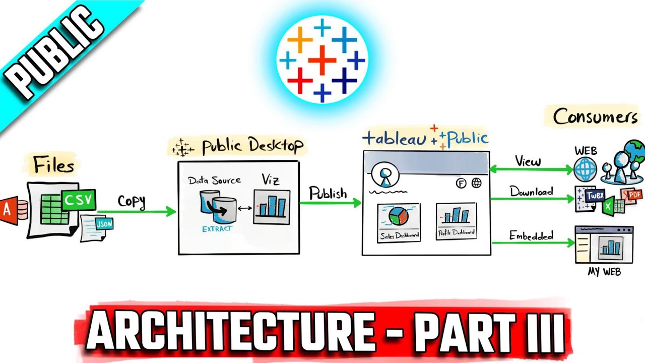
Tableau Architecture: Public Components & Limitations | #Tableau Course #26
5.0 / 5 (0 votes)