DataVis Colour Basics
Summary
TLDRThis video script offers a comprehensive guide on color usage in data visualization, emphasizing the importance of color scales for representing numerical data and categories. It discusses the psychological impact of color, suggesting dark colors for higher values and light for lower ones. The script covers various color scales, including sequential and diverging, and provides tips for choosing categorical colors that are both aesthetically pleasing and functionally distinct. It also addresses accessibility, such as color blindness considerations, and stresses the need for high contrast and intuitive color choices to ensure clarity and comprehension in data visualization.
Takeaways
- π¨ **Use Color Scales Wisely**: When representing numerical data with color, create a scale that maps larger numbers to darker colors and smaller numbers to lighter ones for better visual comprehension.
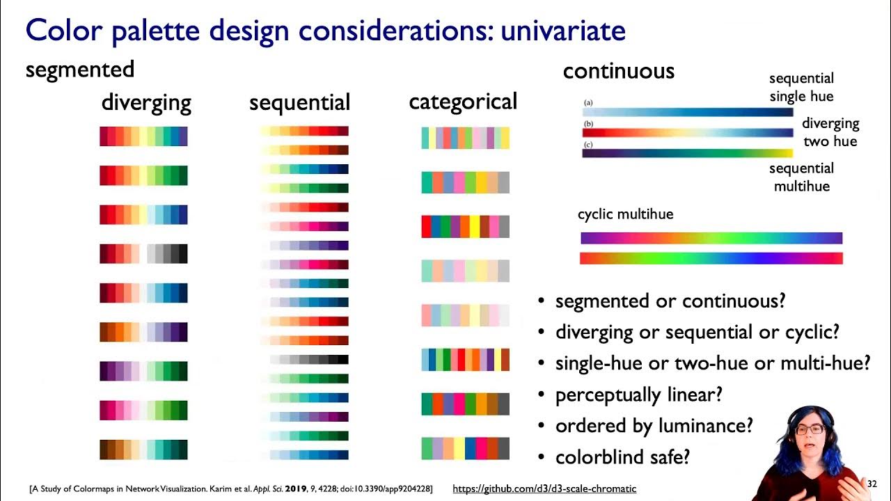
- π **Sequential Color Palettes**: Utilize sequential color palettes that transition from one hue to another, such as a gradient from blue to green, to effectively represent changes in data.
- π **Divergent Color Scales**: For comparing two opposing categories, use divergent color scales that meet at a midpoint, ensuring that hues are distinct to emphasize the difference.
- π **Categorical Color Choices**: When mapping data categories, choose colors that are distinct from each other to ensure readability, especially for audiences with varying visual capabilities.
- π« **Avoid Adjacent Hues**: For categorical data, avoid using colors that are too close on the color wheel; instead, maximize differences by selecting hues with at least 35Β° of separation.
- π’ **Limit Color Palette**: Restrict the use of colors in data visualization to five or six to maintain ease of understanding and memorability for the audience.
- π **Use Colors to Highlight Important Data**: Employ colors to emphasize key data points, using gradients for patterns and bars or positions for specific values to enhance readability.
- π **Consistency in Color Usage**: Maintain consistency by using the same color for the same variables across different charts to avoid confusion.
- π **Ensure High Contrast**: Pay attention to color contrast for accessibility and readability, especially important for text and small elements in a visualization.
- π **Consider Cultural Color Meanings**: Be aware of the cultural significance of colors and use intuitive colors that resonate with the audience's preconceived associations.
- π **Check for Color Blindness Compatibility**: Utilize tools to verify that color choices are distinguishable by individuals with color vision deficiencies to ensure inclusivity.
Q & A
What is the primary purpose of using color in data visualization?
-The primary purpose of using color in data visualization is to make shapes visible, encode data or categories, and enhance the visual representation of numerical data.
Why is it important to create a scale when using color to represent numerical data?
-Creating a scale is important because it helps in mapping numerical data effectively. It uses a gradient that starts with a larger number on one end and a smaller number on the other, leveraging visual psychology to guide color choices.
How does the association of darker colors with density influence color choices in data visualization?
-Darker colors are perceived as having higher value or representing more of something due to their association with density. Therefore, they are typically mapped to the larger end of a scale, while lighter colors represent less or smaller values.
What is a sequential color scale and how is it developed?
-A sequential color scale is a gradient that progresses from one color to another, usually from a darker color representing higher values to a lighter color for lower values. It is developed by selecting hues that are adjacent on the color wheel and maintaining a consistent lightness.
What is the significance of using cool and warm colors in data visualization?
-Using cool colors like blue or purple for high contrast and warm colors for low contrast on the opposite end helps to accentuate the transition from dark to light, making it easier for viewers to understand the data.
How does the choice of colors affect the differentiation between categories in a data visualization?
-The choice of colors should maximize differences between categories to ensure they are easily distinguishable. Colors that are too similar or close on the color wheel can be confusing, especially for those with impaired vision or on low-quality screens.
What is a diverging color scale and how should it be used effectively?
-A diverging color scale uses two different scales to represent two opposing ends of a spectrum, such as comparing Democrats and Republicans. It should be used effectively by ensuring that the hues of each scale are distinct and do not get too close to each other, accentuating the distance from the midpoint.
Why is it recommended to limit the color palette to five or six colors in data visualization?
-Limiting the color palette helps to maintain readability and ease of understanding. More than six colors can overwhelm the viewer, making it difficult to remember the meaning behind each color and potentially confusing the visualization.
What is the role of gray in data visualization and how should it be used?
-Gray is an important color in data visualization as it can be used for less important parts of the chart, allowing color to be used as a highlight for important data points. It's also useful for general context data and less important annotations.
Why is high color contrast important in data visualization, and what are the recommended contrast ratios for text?
-High color contrast is important for accessibility and readability, especially on screens in low light conditions. The recommended contrast ratio is 2.5 for large text and at least 4.5 for small text.
How can color choices be improved when considering the target audience's cultural associations with colors?
-Color choices can be improved by using intuitive colors that the target audience will associate with the data. This includes considering cultural meanings, avoiding stereotypes, and using colors that are naturally or learnedly associated with certain concepts, like red for alert or green for go.
What is the impact of using gradient color palettes for categories instead of values?
-Using gradient color palettes for categories can lead to confusion as viewers may misinterpret the gradient as representing different amounts or values of the categories, rather than distinct categories.
How can color blindness be considered when choosing color palettes for data visualization?
-Color blindness can be considered by using online tools to check color combinations for visibility to those with color vision deficiencies. Ensuring that colors used can be distinguished by all viewers is crucial for inclusive data visualization.
Outlines
π¨ Color Basics in Data Visualization
This paragraph introduces the fundamental role of color in data visualization, emphasizing its use for making shapes visible and encoding data categories. It discusses the importance of color scales, particularly in representing numerical data, and the psychological impact of color intensity and brightness. Dark colors are associated with higher values due to their perceived density. The paragraph also explores the concept of sequential color scales, both single-hue and multi-hue, and their development from a color wheel, highlighting the effectiveness of color differentiation in conveying data insights.
π Choosing Colors for Categorical Data
The second paragraph delves into the challenges of selecting colors for categorical data representation, where color differentiation is crucial for distinguishing between data objects. It warns against the temptation of choosing adjacent hues on the color wheel, which may appear harmonious but can be difficult to differentiate, especially on lower-quality screens or for those with impaired vision. The paragraph suggests maximizing differences between hues and maintaining consistent lightness to improve readability. It also advises limiting the color palette to five or six colors to enhance memorability and usability.
π Gradient Colors and Data Patterns
This paragraph discusses the use of gradient colors to illustrate patterns in data, such as in a choropleth map. It advises against relying solely on gradient colors to convey precise values, suggesting the use of bars or positional indicators for clarity. The paragraph also touches on the importance of using colors to denote categories rather than numerical values and the potential confusion that can arise from using too many colors in a single chart, recommending a maximum of seven colors for ease of interpretation.
ποΈ Enhancing Data Visualization with Color Consistency
The fourth paragraph focuses on the importance of color consistency in data visualization. It stresses the need to use the same color for the same variables across different charts to avoid confusion and maintain clarity. The paragraph also highlights the necessity of explaining what each color represents, providing examples of effective color keys that include both numerical ranges and textual explanations to ensure that readers can easily interpret the data presented.
π Improving Color Choices for Accessibility and Clarity
This paragraph offers guidance on making better color choices to enhance data visualization accessibility and clarity. It suggests using gray for less important parts of a chart to allow color to highlight key data points. The paragraph also emphasizes the importance of high contrast ratios for readability, especially for text, and advises against using complementary hues that can be difficult to distinguish. Tools for testing color contrast compliance are mentioned, along with the suggestion to consider the placement of colors in relation to each other for effective comparison.
π Cultural and Psychological Considerations in Color Selection
The sixth paragraph examines the cultural and psychological aspects of color selection in data visualization. It encourages the use of intuitive colors that align with the expectations and associations of the target audience, such as using natural colors for environmental data or culturally recognized colors for political affiliations. The paragraph also addresses the issue of color blindness, emphasizing the need to ensure that color choices are distinguishable for those with color vision deficiencies, and provides a resource for checking color combinations for accessibility.
Mindmap
Keywords
π‘Data Visualization
π‘Color Scale
π‘Sequential Color Palette
π‘Categorical Data
π‘Diverging Color Scale
π‘Color Contrast
π‘Color Psychology
π‘Categorical Color
π‘Color Accessibility
π‘Intuitive Colors
π‘Color Gradient
Highlights
Color in data visualization is used to make shapes visible and encode data or categories.
A color scale represents numerical data with a gradient from a larger number to a smaller one.
Darker colors are associated with higher values due to visual psychology.
A sequential color palette can be developed using a single hue or multiple hues for better differentiation.
Categorical color choices should be distinct to ensure readability, especially for those with impaired vision or on lower quality screens.
Categorical colors should be chosen from different areas of the color wheel to maximize differences.
Limiting the color palette to five or six colors improves readability and memorability.
Gradient colors can show patterns but may not be ideal for deciphering exact values.
Using bars or position in addition to color can help in distinguishing segments and values.
Consistency in color usage across different charts for the same variables is crucial for clarity.
Gray is an important color in data visualization, used to highlight important data points by contrasting with less important information.
High color contrast is essential for accessibility and readability, especially for text.
The proximity and size of colored areas on a chart affect the ease of comparison.
Cultural and intuitive meanings of colors should be considered when choosing a color palette.
Avoid using gradient color palettes for categorical data to prevent confusion about the quantity or value.
Lightness should be used to build gradients, not just hue, for better readability.
Divergent color gradients can effectively represent comparisons between two opposing categories.
Color blindness should be considered to ensure that all viewers can distinguish colors in a visualization.
Transcripts
hi there and welcome back to data viz
today's short PO is on color Basics and
as we know data Vis is can be defined as
representing numbers with shapes and no
matter I guess how what those shapes
look like whether they're area areas
lines or dots um they need to have a
color sometimes colors just make the
shapes visible sometimes they encode the
data or the categories themselves
um but today we're mainly going to focus
on the latter in this talk you know
defining categories and giving them
colors and how to make some sensible
choices there we'll take a general look
at colors and we'll consider um what to
look at when choosing them okay so let's
keep
going all right so let's just look at
this for a moment when you use color to
represent a number you need to
create some sort of scale um this is
important um don't use a scale for
mapping categorical data and we'll talk
about that a little bit more why later
think of your scale as a gradient with a
larger number on one end and a smaller
number on the other end and we can take
this advantage of the visual psychology
of
this to sort of help us with our color
choices we associate darker colors with
density and density with greater numbers
because of this dark colors are
perceived as being higher in value or
there's more of it than lighter ones so
make sure you map the large end of your
scale or the thing with the biggest
numbers um to a dark color and the small
end to a lighter color and the bigger
difference between these two extremes um
the more effective your use of color so
the difference in the in the numbers but
also um the scale of you know the
intensity of the colors your choosing we
can start with a simple black to white
scale for example by swap swapping black
for another dark color we can make
things a little bit easier to look at um
and instead of white we could make the
other end of the scale yellow for
example and as you shift towards darker
blue your scale slowly changes and
becomes a SE Green in the middle you can
see that I've put that in the multi hu
sequential color palette there um so
this is an example of a multi Hu
sequential scale and you can see from
the color wheel how that's been
developed and it's the one just above my
head here you can see the scale going
from five up to zero but you can also
see the color wheel and how it's mapped
through there to make it a little bit
more um buied in
multicolors um if your charts on a light
background for example it's best to
start with a cool high contrast color
like blue or purple and use a warm low
contrast on the other end um this will
accentuate the dark to light transition
moving in from the opposite direction
fights against this natural Trend and
it'll be more difficult to read and
won't look great um so you can see
they're the two types we've got here of
sequential color scales is the single
Hue so you just go through one color
there it is with the blue and then the
multi- Hue going through the color wheel
a little bit there um multi Hue
sometimes can be much more effective
because for us you can see oh yeah it's
going to Green that's going to be easier
to understand than going just to light
blue sometimes we will have trouble
differentiated between the Hues of blue
but you can see by using that second
green color palette it's kind of helped
there so the main takeaways from this is
that um when using a color scale make
sure you know the dark colors are the
things with the most numbers and the
light obviously going to less so dark
equals more light equals less okay so
let's move on uh diverging color scales
our third one in this group so we had
multicolor we had a single one diverging
ones we use two different scales to um
represent the numbers and we can see
here because they're comparing two
things and in this case um it's between
the Democrats and the Republicans um we
can
see that there's two things and we're
measuring how how much Republican it is
so the darker the more Republican the
lighter red there the less and for the
Democrats the same sort of thing except
with blue but we can see where they
converge in the middle somewhere in a
light tone there um so to be effective
in using this kind of diverging color
scale uh we need to think of our scale
as two sequential scales that share a
low value and that's that white one in
the middle this would be our midpoint
um be sure that the Hues of each scale
don't get too close to one another when
you're using this technique because we
want to accentuate the distance from a
midpoint not hide it so hopefully that
makes sense to most of you there all
right moving on why okay still on our
categorical color and we're using Color
to represent categories when we're
mapping data uh without numerical
meaning so categories or a text name for
category we want readers to be able to
tell um our data objects apart so
whether they're slices on a pie CH the
lines or bars Etc so as designers we
want these colors to look good next to
each other and because of that we often
choose adjacent viewes of things that
are close in color they look nice and
we're tempted to do this um and with our
fancy laptops or with my fantastic
screen here it's very easy for me to
tell the St dates apart because I've got
great color separation you know it's
represented quite nicely but if you look
at the colors like we do sometimes in
the classroom on a projector or in fact
on an old computer screen monitor or
you've got impaired Vision or you you're
older than 30 these colors start to look
very similar and it's a big problem
because the entire reason for using
Color here is to help our readers
understand objects that are different
from one another um not NE their
relationships but they are different
categories so if we see here I've got um
three types of categorical
color and so categorical colors
referring to the categories that we're
using to Define things not how much of a
thing that they are so we can see You'
got alpha bravo charlie Eko and Delta in
that first one they're quite beautiful
together you know they they they don't
look like a candy strip they they're
quite harmonious but I I would say that
they're not the most usable
uh color palette that you could have in
the center we've got ones which are
separated a little bit more on the color
wheel there with the black dots you can
see that uh from the going from the blue
down to the yellow for Delta I think
they're usable usable but kind of starts
to look like you've gone to the Lolly
shop um not so beautiful or harmonious
together and then the last one also
beautiful but still not usable where
we've
got similar tones or like too dark alpha
bravo and Charlie all looks very similar
so categorical colors we're going to
sort of look at that a little bit more
let's keep
going okay so my last one is trying to
show The Best of Both Worlds we can see
that there's a it's still got the candy
effect but we can see that um at least
we can see the separation between the
colors there's no way I could confuse
the orange of echo with the yellow of
delta or the Bravo or Al with each other
um but they look slightly more
harmonious together
um hence the thing so maximizing the
differences from bouncing to and from
opposite ends of the color wheel
um you know is a good thing form or
function is something you always need to
toss up in data VI and we usually go for
function over form
um um but let's always recall the py
psychological phenomenon where we
associate darker colors with more of
something and lighter colors with less
of something and make sure that you're
not unwittingly or unknowingly telling
out your readers that the darker colors
represent higher values and you can see
hence this choices for the colors for
the categories um are trying not to
confuse our brains with that there's no
sort of one size fits all answer to
these these questions it's always going
to be a compromise when you're choosing
um you'll need to always relinquish some
sort of aesthetic um choice for some
readability ones um if you are choosing
adjacent Hues or Hues that are close to
each other on the color wheel um you can
but take bigger steps between them at
least 35Β° so leave a a segment in
between of H change um and maintain a
consistent lightness you can see the
lightness is on the uh second ring out
from the center there and that they're
separated at least by one of the
sections there so more than 35Β° of H
change um the other thing would be to
limit your color palette to five or six
colors um more than that um your readers
or viewers or whatever you want to call
them will have a quite a hard time
remembering the meaning behind any more
than that anyway all right let's move on
um when to use colors in data
Vis
um gradient colors as we've just started
with today uh can be great to show a
pattern you know something like a corle
map that's like a heat map but it's hard
to decipher actual values from them and
to see differences between values
consider showing your most important
values using
bars or position like in a DOT graph or
even area
and use colors to only show the
categories um it mean that your readers
will be able to decipher your values
faster and if we look at this we've got
a gradient value here CH in color change
from poor to rich and Shore we go richer
the darker ones that's fine um but you
can see that the shape by
adding circles makes it easier for for
us to differentiate the segments if I
just gave you that sliding value change
there would be very difficult to sort of
kind of guess at where one segment fits
to another we can see that's not ideal
but if we look at the next section here
you can see that they sort of start
working with the colors but you can see
with the addition of some bars here when
we're comparing people in group a which
are the rich people obviously and b poor
people we can see how they are
differentiated using the bars and it
makes it very easy to see how group A
and B are segmented across these
particular
categories
okay if you need more than seven colors
in a chart I'm going to ask you to
consider using another chart type or to
group the categories together and with
the MyTime data you'll notice that we
have overarching categories and then
we've got activities within them um so I
think that's important uh try to avoid
using more than seven of them that's
kind of a rule of thumb thing the more
colors in the chart rep to represent
your data the hard it becomes to read it
very quickly your readers will often
need to consult back to the legend or
the color key to understand what is
shown in your chart so if that's the
case you might want to choose using
another chart so we can see there we'
got the Candy Camera if I look at just
that stacked bar chart at the top with
the colors it's kind of okay I will
probably put them in order of um how
much they are but you know there's some
segments there I'd need to know what a
was and then I'd look through it would
be quite difficult but you can see in
the second one there the Stacked bar
chart here we can compare them easily
across even though they are
gray okay let's move on to how to make
better color choices again um always
consider using and this is another rule
um the same color for the same
variables you can see here um if you use
one color for all of your charts using
the same color every time is the best
option um for for displaying your data
for example it's okay to show the
unemployment rate uh in blue in the
first chart that's sort of tearly dark
blue color
um but it's not okay to kind of switch
it around or use it for something else
in another chart so we can see the UK
and China here are compared um UK's the
red one going down China's going up and
then underneath there yeah we can see
that
China is now red and Germany's in blue
so it's the same color palette which
you'd go oh yeah that's great I'm a
designer I've got the color palette no
let's make sure that if you've chosen a
color for one thing it always remains on
the next thing so we can see there where
in the next chart Germany and China
Germany now becomes yellow China is
still going to be the teal color so
we've been consistent and added in
another color to show that so again the
rule is use the same color for the same
variables or the same categories if
you'd like to think of them like that
okay next one
[Music]
um make sure that you explain and some
part in your data VI what your colors
actually are encoding don't just put
them there um so we can see there's a
color several versions of how to do a
color key here uh we've got a color key
of Z to 100 so less to more of something
we haven't told them what that scale
refers to it's not to 100 what of we
don't know and again we've got another
one where it's segmented which I think
is a lot easier to read so not 2550 75
100 and then the third one is quite nice
and that it's in a text version so
you've managed to label how the data is
being represented but also to color code
and provide um some indication about
what they mean so China's going to be in
red and Germany's going to be in that
teal color so make sure you explain to
your readers what your colors are
encoding next one
um how to make better color choices I
would always consider gray as the most
important color in data views um using
gray for less important parts in your
chart allows you to use color as a
highlight to draw attention to that as
being the important data point in your
your
visualization um it's helpful for
General context data um it's less or for
less important
annotations um to show what's not
important to the user gray is great
since gray can sometimes seem a bit cold
uh you could consider using with a hint
of color so a warm gray or something
like that um or as a mattive or a super
light yellow could work as well so we
can see here with this chart we don't
even need to know what it is but it
would be very difficult to read um
what's going on there go what's which
what's what's the important one I should
be looking at and it's the teal line so
you can see just by making the others a
thinner line and grayed out we can see
the context of it our teal data but
we're not distracted by having to look
at all of the other colors there all
right let's move on
um make sure your contrasts are high
enough and color contrast is one of
those things that we need to pay
attention to for accessibility but also
just generally as designers it's
something that's
always you always need to pay attention
to um it it means that we need to care
about how our readers can read charts on
a screen even in low light um and it's
especially important for text the
smaller the text the higher the contrast
needs to be the contrast ratio between
the background and foreground needs to
be quite high it's 2.5 for big text and
at least four for small text um in
addition to having high contrast ratios
you should avoid complimentary hues so
things like red and green orange and
blue are no nose or bright colors for
backgrounds you can use tools to test
your color contrast um and make sure
that they're compliant we'll put a list
of those at the bottom of the Pod
today um so we can see some really bad
examples of contrast there the one: one
1.5 is okay in some cases 2.5 is a good
choice 4.5 is a is a safe a choice and
you can see with the colors horrible my
eyes that's bad non ideal red and green
and you can see how gray use again is
being useful to us all right let's move
on consider where your colors appear in
relation to each other so this is an
obvious one but something to think about
the smaller the areas are on your chart
the bigger or and the bigger the
distance between them the harder it is
to compare them so if we look at those
little circles there we can see that you
know we might have a great scale of that
that green color there but because
they're far apart and they're quite
small circles it's it's going to be
really hard we're asking our brain to
remember colors and then try and compare
them it's almost meaningless that first
one but if they are in fact next to each
other or the area of them is bigger we
can see that it's a better one and you
can see the colored in map there is much
better than just the spots it's the same
map that we're using but you can see
using the area color allows us to see oh
yeah More's happening in the wh the top
top right hand left hand corner for you
um there all right so consider where
your colors appear in relation to each
other and then make some
adjustments all right next one use
intuitive colors um when you're choosing
your color palette consider the meaning
or the culture meaning of your target
audience uh if possible use colors that
the readers will associate with your
data anyway so party color colors that
we looked at before like Republicans red
Democrats are blue things like natural
colors for the forest or water Green
Lake blue or learned colors like red is
alert or attention um or
stop is red or green is sort of go um so
when it it comes to uh color and coding
things like gender as well um let's
consider avoiding stereo stereotypical
pink and blue
combinations um but don't confuse your
readers completely you could try you
know a blue for male or teal color uh we
can see the blue for the female red for
the not ideal we can see over here the
females have gone to yellow and the
males have gone to teal so the not ideal
ones
that's oh that's so over there um good
and bad not ideal good is usually green
bad is usually red or you know it's aert
Forest usually green like is the blue
Etc so use intuitive colors where
possible next one um
using using light colors for low values
and dark colors for high values and I've
gone on about this a little bit already
um so when you're using Color gradients
make sure that the bright colors low
values we know this now dark colors High
values or big things um this will make
it inity for most readers and you can
see I flipped it around there in that
first map um low to high low values to
high values not very readable we would
always go that dark area at the top
there means there's a lot of something
but now it's the high Valu and then you
can see it flipped to its proper
Arrangement there so that's a very
intuitive one to take note of okay next
one don't use a gradient color palette
for
categories so we saw it just used a
second ago we use a gradient pal palette
for values or the numbers of things do
not use a gradient color P palette for
categories so we can see Ivan David Anna
and Lisa
here but immediately if I look at that
not ideal chart I would say that this in
some way Ivan has more of something than
everybody else um but you can see by
choosing a different color palette we
can see um we're not going to confuse
our our um readers or viewers so don't
use a gradient color palette so use of
the same color for categories
all right let's go back to some corop
PLS again um use lightness to build
gradients not just the
Hue so you can see there's a hue base
gradient in the first map it looks
lovely I think it looks great to look at
I like the teal and orange it's a great
combination but at some point it becomes
useless to me because I can't really
looking at that tell what the
concentration is I get the red is the
most of
something um but I kind of get fuzzy
somewhere in the middle but you can see
it's better for us just to use a
lightness based gradients as in the
second map there I can quite easily
compare areas or locations across that
map gradients with too much variation
like rain rainbow scale scales will
definitely confuse your viewers or
readers okay cons you could
to help with this consider using two
Hues for a gradient not just one and you
can see the one H it's not so bad we saw
that a moment ago but using two Hues
here going from the green to the dark
blue Works quite nicely as well and
makes it a little less overwhelming to
look at the
map so two or three carefully selected
Hues can work in that
case next uh consider they using
Divergent color diverging color
gradients so here we're going from
Orange to Red so they're not very
Divergent they're quite close to to each
other in the color wheel but you can see
teal and orange they're opposites on the
color wheel and you can see that that is
a better choice um to to
display um the color Center should
always ideally be a light gray rather
than a white as well
you can see both of those they look the
first one looks white second one we've
got a gray happening in
there all right we're almost there
people um next one color blindness it's
something that we all need to pay
attention to and I've put a link there
to data wrapper to check for color blind
combinations um people with color defici
color vision deficiencies will need to
be able to distinguish your colors
there's many types there's many online
tools data wrappers one is a great one
for checking um to make sure they can
consider so you can see that your map
can be read and we can see normal vision
for the first one there on the right
there up there
um you can
see going through how different people
with different blindnesses will go
through that and you can see it becomes
quite muddy in the second and third
versions there on the the left hand side
so always do a do do a quick check
before you commit to your color um
choices for color
blindness um some further reading here
um and I'll put that down below below
today's um meure P all right well that
was it our quick introduction to color
um there's a lot more we could say say
about it but just to wrap up remembering
when you're going to be using gradients
and remembering when you're using scale
remembering some of the rules about
category colors um and hopefully that
was helpful so thanks for listening and
I'll see you in class
Browse More Related Video
PowerPoint Ideas: Color Theory Basics That You Can Use for Better Slides
Using Design Techniques for Clear and Appealing Data Visualization
The Psychology of Color in Design
Lighting, Coloring & Shading : The Holy Trinity Explained
How LED Works - Unravel the Mysteries of How LEDs Work!
How to Use a TCS3200 Color Sensor with Arduino (Lesson #38)
5.0 / 5 (0 votes)