Color (Ch 10) III, Visualization Analysis & Design, 2021
Summary
TLDRThis video explores various color spaces and their impact on visual encoding, emphasizing the challenges of using color for effective data visualization. It covers the limitations of RGB, HSL/HSV, and perceptual color spaces, highlighting the importance of luminance and saturation for legibility. The discussion extends to contrast and color names, addressing how color perception is influenced by surrounding elements and lighting conditions. Additionally, the video touches on other visual channels like angle, size, shape, and motion, stressing their utility in encoding data and how they interact with color in design contexts.
Takeaways
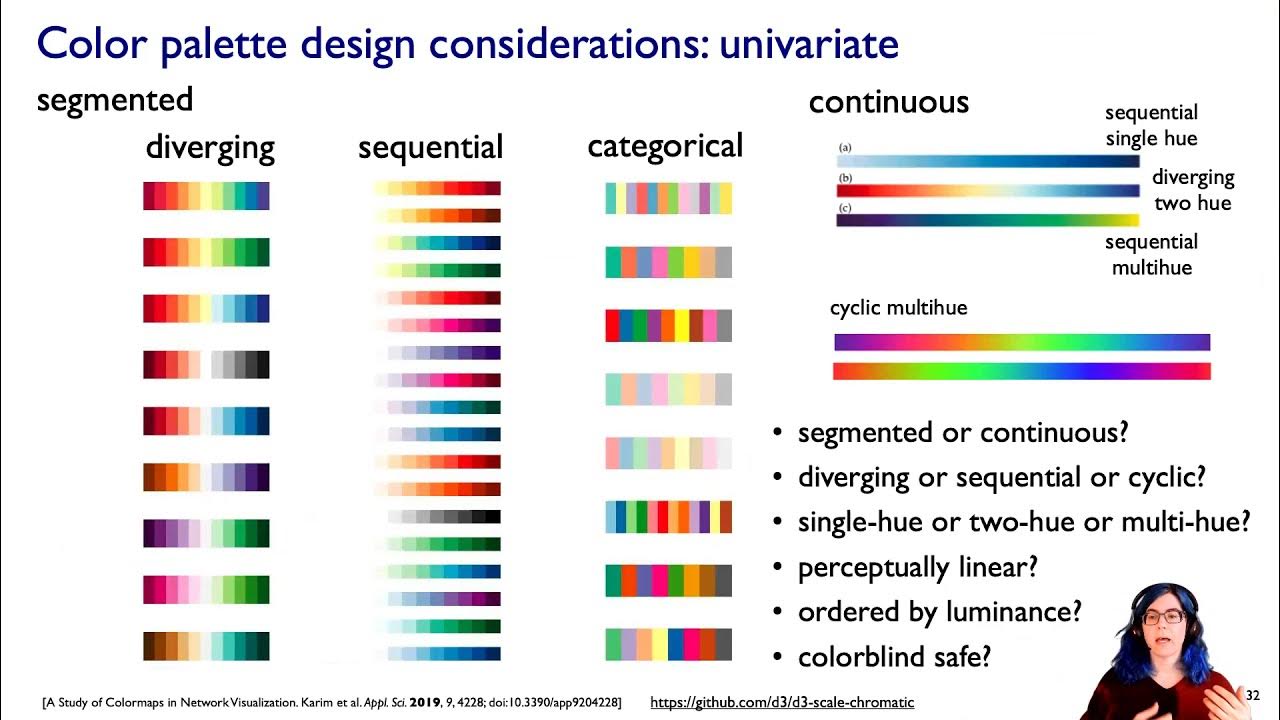
- 😀 Luminance, hue, and saturation are key elements in visual encoding, but few tools allow for manipulation of this color space effectively.
- 😀 RGB is widely used in display hardware but is poor for visual encoding and interpolation, making it less ideal for data visualization.
- 😀 The perceptual color space (L*, a*, b*) is great for color interpolation but is difficult to interpret and doesn't map well to human understanding of color.
- 😀 HSL/HSV models are better for visual encoding than RGB, offering intuitive ways to select colors with a clear hue-saturation model, but still have limitations in terms of lightness or value.
- 😀 Lightness or value in HSL/HSV is not the same as true luminance (L*), which is important to distinguish for accurate color representation in visualizations.
- 😀 Contrast and luminance contrast are crucial for readability in visualizations, especially when labeling elements or combining multiple colors.
- 😀 Background color and surrounding context significantly impact how we perceive color, making color choices tricky for consistent visual encoding.
- 😀 Perception of color can be altered by ambient light and surroundings, as seen in the example with identical swatches under different lighting conditions.
- 😀 The bezel effect demonstrates how surrounding colors affect our perception of a base color, influencing the way colors are seen and interpreted in visualizations.
- 😀 Motion is a highly separable visual channel, making it ideal for highlighting specific elements, but it should be used carefully in non-interactive contexts to avoid irritation.
Q & A
What is the primary issue with the RGB color space in terms of visual encoding?
-The primary issue with RGB is that it is poor for visual encoding because we can't easily interpret variations in red, green, and blue individually. It combines these colors into a single perceived color, making it challenging to use RGB for tasks that require precise, intuitive color distinctions.
Why is the perceptual color space with luminance (L*) and chroma channels (a* and b*) good for interpolation, but difficult for visual encoding?
-The perceptual color space is great for interpolation because it reflects human color perception more closely, making transitions between colors feel natural. However, it's difficult for visual encoding because the chroma channels (a* and b*) do not map easily to how people think about colors, making it hard to reason about or use for practical design tasks.
What does the HSL/HSV color space model represent and how is it structured?
-The HSL/HSV color space is structured with three dimensions: hue (H), saturation (S), and lightness/value (L/V). Hue is represented in a circular wheel, with saturation increasing as you move away from the center, and value or lightness adjusting the brightness. The space is typically visualized as a cone, where pure black is at the tip, and pure white is at the center.
What is the key difference between lightness (L) in the HSL/HSV model and true luminance (L*)?
-Lightness (L) in the HSL/HSV model is not perceptual and does not correspond to true luminance (L*), which is a perceptually accurate measure of brightness. This means colors that appear similar in lightness may actually have very different luminance when measured with L*, affecting how we perceive brightness and contrast.
Why is luminance contrast crucial in visualization design?
-Luminance contrast is crucial because it directly affects legibility and clarity in visualizations. Proper contrast ensures that text and elements stand out from the background, making information easier to read and interpret, especially in situations where labels might overlap or be placed against a complex background.
How does the surrounding context influence color perception, according to the transcript?
-The surrounding context greatly influences how we perceive color due to phenomena like automatic white balancing, where our visual system adjusts for lighting conditions. This can lead to significant perceptual changes, making identical colors appear different depending on the surrounding environment, which can complicate visualization design.
What is the bezel effect, and how does it affect color perception?
-The bezel effect refers to how the outline color surrounding an object can alter the perception of the object's color. This effect demonstrates that our visual system is influenced not just by the color itself but by its context, such as its borders or the background, leading to variations in color perception.
How does motion function as a visual channel in comparison to static channels like color?
-Motion is highly separable and stands out against static visual channels, making it effective for drawing attention to specific elements, especially in interactive contexts. However, if used excessively in non-interactive situations, motion can become overwhelming or distracting, so it should be used carefully.
What challenges arise when visualizing data with color due to the relative perception of colors?
-Relative perception means that the way we perceive color is influenced by surrounding colors and brightness levels, making it difficult to create consistent, interpretable color schemes. This effect can lead to discrepancies in how colors are perceived depending on their context, creating challenges in accurately conveying data through color.
What impact does the variation in angle have in visual encoding, and how does it relate to other visual channels?
-Angle, or orientation, can be used effectively for encoding data with properties like sequential, diverging, or cyclic relationships depending on the range of angles. The human visual system perceives certain angles, like horizontal, vertical, and diagonal, more distinctly than others, making them useful for precise data representation in visualizations.
Outlines

This section is available to paid users only. Please upgrade to access this part.
Upgrade NowMindmap

This section is available to paid users only. Please upgrade to access this part.
Upgrade NowKeywords

This section is available to paid users only. Please upgrade to access this part.
Upgrade NowHighlights

This section is available to paid users only. Please upgrade to access this part.
Upgrade NowTranscripts

This section is available to paid users only. Please upgrade to access this part.
Upgrade NowBrowse More Related Video

Color (Ch 10) II, Visualization Analysis & Design, 2021

DataVis Colour Basics

07 | How to use colors in Graphic Design? | Color Theory 101 for Beginner Graphic Designers

Data Visualization Techniques | Data Visualization Techniques and Tools | Data Visualization Trends

The Value of Data Visualization | The Power of Visual Storytelling
Color (Ch 10) I, Visualization Analysis & Design, 2021
5.0 / 5 (0 votes)