Pivot Table dan Dashboard Sederhana
Summary
TLDRThis video tutorial walks viewers through creating a simple dashboard using Excel's PivotTable functionality. The presenter demonstrates how to connect data, organize it into tables, and generate useful metrics such as total sales, profits, and averages. The tutorial also covers customizing the PivotTable layout, creating visualizations like bar and pie charts, and refining the dashboard for a clean, professional look. Viewers learn how to manipulate data, add filters, and adjust column widths to improve user interaction. The video concludes by showcasing how to finalize the dashboard for client presentation.
Takeaways
- 😀 Organize raw data into a table format before creating a PivotTable.
- 😀 Use the 'Insert' tab to create a PivotTable and select the desired data range.
- 😀 Arrange fields in the PivotTable vertically for a neater display of the data.
- 😀 Add key fields like Total Sales and Profit to the 'Values' section of the PivotTable.
- 😀 Rename fields in the PivotTable for clarity, such as changing 'Total Sales' to 'PowerPoint Sales'.
- 😀 Adjust the column width to automatically fit the text in each cell for better readability.
- 😀 Create a PivotChart to visualize data and make your dashboard more visually appealing.
- 😀 Choose an appropriate chart type (bar, line, pie) based on your data presentation needs.
- 😀 Add additional data to the PivotTable and PivotChart as necessary to enhance analysis.
- 😀 Remove unnecessary gridlines and adjust the chart size to make the dashboard clearer and more professional.
- 😀 Save the final dashboard and share it with others for easy access to summarized data.
Q & A
What is the main focus of the tutorial in this script?
-The main focus of the tutorial is to guide the creation of a simple dashboard display using PivotTables in Excel, showing how to connect data, display total sales, profit, and other related information.
What is the first step in the process of creating the dashboard?
-The first step is converting the list into a table and saving it, followed by ensuring the data is properly structured for use in the PivotTable.
What is the purpose of the PivotTable in this context?
-The PivotTable is used to summarize and analyze data by calculating total sales, profits, and averages, allowing for easy visualization and manipulation of the data.
How does the user add different types of data to the PivotTable?
-The user adds different types of data by dragging fields into the appropriate sections, such as 'Rows,' 'Values,' and 'Columns,' and can customize the data for better presentation.
What customization options are available for the PivotTable?
-The user can customize the PivotTable by changing the names of columns and sections, arranging the layout for a neater display, and adjusting the width of columns to fit the data.
How can the user make the dashboard more visually appealing?
-The user can enhance the dashboard by adding graphs like PivotCharts, adjusting the grid display, and adding labels or titles to improve clarity and presentation.
What is the significance of the 'Freezer' section mentioned in the script?
-The 'Freezer' section is likely referring to a part of the data that allows the user to freeze certain parts of the table or dashboard, making it easier to analyze and manipulate other sections.
How can the user adjust the width of columns to fit their data?
-The user can adjust the width of columns by right-clicking on the header and selecting the option to resize or fit the data automatically.
What role do graphs play in the tutorial's dashboard creation?
-Graphs, particularly PivotCharts, are used to visually represent the data from the PivotTable, making it easier to analyze and present the information in a more engaging way.
What does the user do if they want to add new data to the dashboard?
-To add new data, the user can select the relevant fields and update the PivotTable or PivotChart accordingly. They can also adjust the dataset and reconfigure the layout to include the new information.
Outlines

Этот раздел доступен только подписчикам платных тарифов. Пожалуйста, перейдите на платный тариф для доступа.
Перейти на платный тарифMindmap

Этот раздел доступен только подписчикам платных тарифов. Пожалуйста, перейдите на платный тариф для доступа.
Перейти на платный тарифKeywords

Этот раздел доступен только подписчикам платных тарифов. Пожалуйста, перейдите на платный тариф для доступа.
Перейти на платный тарифHighlights

Этот раздел доступен только подписчикам платных тарифов. Пожалуйста, перейдите на платный тариф для доступа.
Перейти на платный тарифTranscripts

Этот раздел доступен только подписчикам платных тарифов. Пожалуйста, перейдите на платный тариф для доступа.
Перейти на платный тарифПосмотреть больше похожих видео

Cara Menggunakan Pivot Table di Excel | Tutorial Excel Pemula

Google Sheets - Dashboard Tutorial - Part 1

Cara Instalasi WordPress di Localhost | Buat Website Tanpa Coding!

Creating First Java Swing GUI Application with NetBeans IDE

Full Project in Excel | Excel Tutorials for Beginners

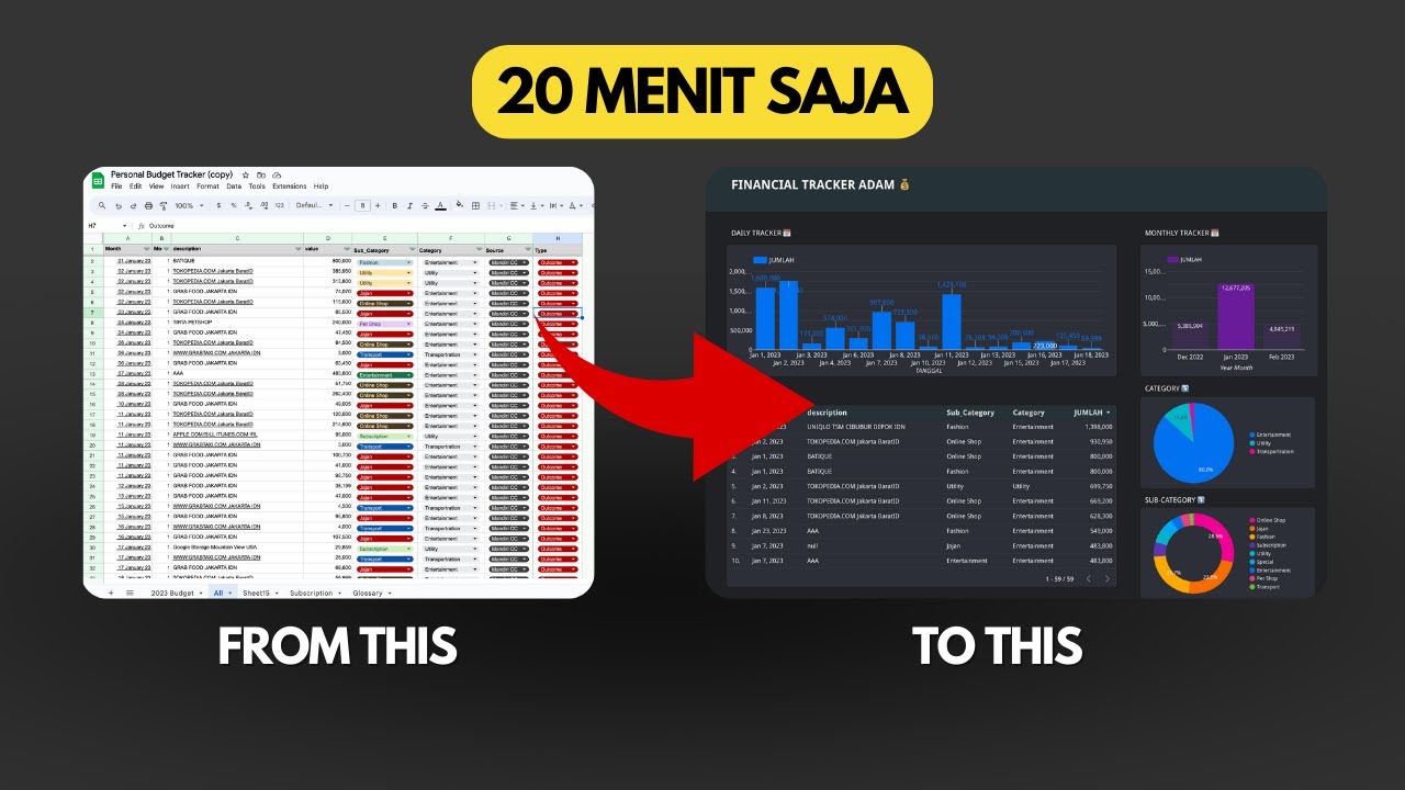
Dashboard Visualisasi Budget Tracker di Looker Studio | Tutorial
5.0 / 5 (0 votes)
