Dashboard Visualisasi Budget Tracker di Looker Studio | Tutorial
Summary
TLDRIn this tutorial, Adam walks viewers through the process of creating a financial tracker dashboard using Google Looker Studio. The dashboard will help users visualize their expenses through daily and monthly trackers, as well as detailed expense breakdowns by category and subcategory. Adam explains how to connect Google Sheets data, design the dashboard with headers and charts, and use interactive features such as drill-downs for deeper insights. The tutorial provides step-by-step instructions, helping users create a comprehensive and user-friendly tool to monitor and analyze their personal finances.
Takeaways
- 😀 Understand how to create a financial tracker dashboard using Google Looker Studio.
- 😀 Learn how to connect Google Sheets as a data source in Looker Studio for visualizing financial data.
- 😀 Get an overview of the final dashboard, which includes daily and monthly expense trackers, category breakdowns, and interactive details.
- 😀 Discover how to set up a clean dashboard layout, including adding headers, titles, and a preferred dark theme for better visual appeal.
- 😀 Learn how to use a bar chart to visualize daily expenses, sorted by date, with interactive elements to explore detailed data.
- 😀 Understand the concept of 'drill-down' in Looker Studio, enabling users to explore data by month, subcategory, or specific date.
- 😀 Find out how to build a monthly tracker that allows users to drill down into the expenses for each month.
- 😀 Learn how to create detailed breakdowns of expenses for each date, including descriptions, categories, and amounts using a table format.
- 😀 Discover how to use pie charts to visualize the distribution of expenses across broad categories and subcategories.
- 😀 Understand how to adjust chart styles (e.g., switching from pie to donut charts) to enhance visual distinction between categories.
- 😀 Get practical tips on using Looker Studio’s interactive features for a deeper understanding of your financial data, such as category-specific drill-downs.
Q & A
What is the purpose of creating a financial tracker dashboard in Google Looker Studio?
-The purpose is to visualize financial data, including daily and monthly expenses, as well as provide a detailed breakdown of spending by category and subcategory, making it easier to track and analyze finances.
How do you connect your data to Google Looker Studio?
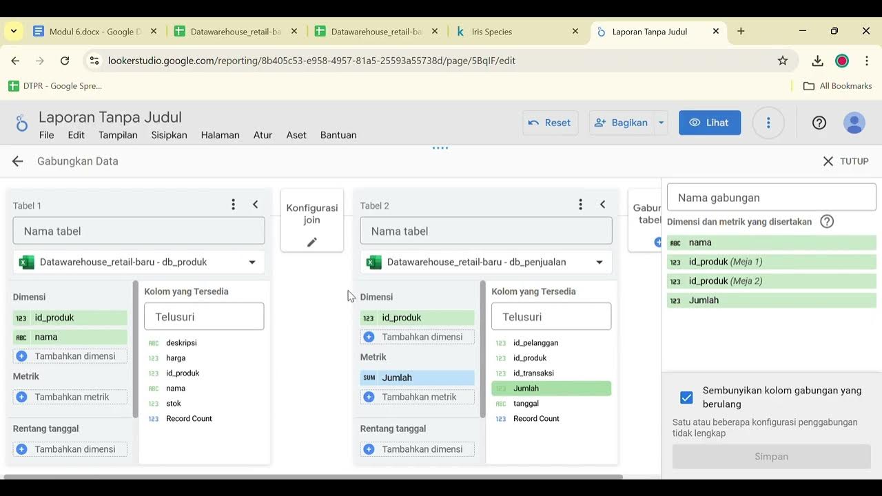
-You connect your data by selecting 'Google Sheets' as the data source in Google Looker Studio, then choosing the relevant spreadsheet and worksheet that contains your financial tracker data.
What is the significance of the 'Drilldown' feature in the dashboard?
-The 'Drilldown' feature allows you to view more detailed levels of data by breaking down expenses further. For example, you can drill down from monthly data to daily data, or by category and subcategory.
Why is sorting the data by date important when creating a daily expense tracker?
-Sorting by date ensures that the expenses are displayed in chronological order, making it easier to track and analyze spending patterns over time.
How do you make the financial tracker interactive?
-The tracker becomes interactive by allowing users to click on specific data points (e.g., a date or category) to reveal more detailed information, such as the exact items or transactions for that day.
What chart types are recommended for visualizing financial data in the dashboard?
-Bar charts are used for daily expense tracking, pie charts are ideal for showing category breakdowns, and donut charts are recommended for better visual distinction between categories.
What does the 'Value' metric represent in the charts?
-The 'Value' metric represents the amount spent, which is used to visualize how much money was spent on a particular day, month, or category.
How do you ensure that the data displayed in the table is readable and aligned properly?
-To ensure readability, you can adjust the column widths to fit the data and use the 'Fit to Data' feature in Google Looker Studio. This automatically resizes the columns to match the data width.
What is the purpose of using pie charts in the dashboard?
-Pie charts are used to provide a visual overview of how expenses are distributed across different categories and subcategories, allowing for easy comparison of spending proportions.
How does the daily expense tracker display the data for each day?
-The daily expense tracker uses a bar chart, where each bar represents expenses for a specific day. The chart is linked to the date range and is sorted by ascending date to display expenses chronologically.
Outlines

This section is available to paid users only. Please upgrade to access this part.
Upgrade NowMindmap

This section is available to paid users only. Please upgrade to access this part.
Upgrade NowKeywords

This section is available to paid users only. Please upgrade to access this part.
Upgrade NowHighlights

This section is available to paid users only. Please upgrade to access this part.
Upgrade NowTranscripts

This section is available to paid users only. Please upgrade to access this part.
Upgrade NowBrowse More Related Video

Looker Studio Tutorial For Beginners 2024

Google Data Studio Tutorial 📊 - How to build a Dashboard with GDS

Praktikum Business Intelligence: Data Warehouse Looker Studio

#1 THIẾT KẾ FORM LOGIN | CHƯƠNG TRÌNH QUẢN LÝ KHÁCH SẠN

Google Sheets - Dashboard Tutorial - Part 1

Pivot Table dan Dashboard Sederhana
5.0 / 5 (0 votes)