Pengertian Diagram Pencar - Matematika Wajib SMA Kelas XI Kurikulum Merdeka
Summary
TLDRThis video explains the concept of scatter plots (diagram pencar) in statistics, particularly for 11th-grade mathematics under the Merdeka curriculum. It introduces key terms such as independent (x) and dependent (y) variables, demonstrating how to create a scatter plot to visualize the relationship between two quantitative variables. The video outlines a step-by-step guide to drawing a scatter plot manually, including determining variables, setting up the axes, scaling, and plotting data points. An example using visitor numbers and book sales is provided, ensuring a practical understanding of the concept.
Takeaways
- 😀 Scatter plots (Diagram Pencar) are used to visualize the relationship between two quantitative variables in bivariate data.
- 😀 A scatter plot helps to identify the correlation between two variables, such as whether one affects the other.
- 😀 The two variables in a scatter plot are typically called the independent variable (X-axis) and the dependent variable (Y-axis).
- 😀 Other terms for the X and Y variables include 'input' and 'output,' 'predictor' and 'criterion,' and 'stimulus' and 'response.'
- 😀 A scatter plot is often plotted on a Cartesian plane with a horizontal X-axis and a vertical Y-axis.
- 😀 A grid (like graph paper) is helpful for drawing scatter plots manually, as it allows for precise placement of data points.
- 😀 The first step in drawing a scatter plot is to determine which variable is independent (X-axis) and which is dependent (Y-axis).
- 😀 After identifying the variables, the next step is to draw the axes and divide them into appropriate scales that accommodate the data range.
- 😀 The scales on both axes should be chosen so that they include the smallest and largest data values to ensure all data points fit within the plot.
- 😀 Once the scales are set, the data points are plotted as pairs of coordinates (X, Y) on the Cartesian plane to visualize the relationship.
Q & A
What is a scatter diagram (diagram Pencar)?
-A scatter diagram, also known as a scatter plot or diagram Pencar, is a graphical representation used to show the relationship between two quantitative variables. It helps visualize how one variable changes in relation to another in a bivariate data set.
What is the purpose of a scatter diagram?
-The purpose of a scatter diagram is to analyze the relationship or correlation between two quantitative variables. It helps determine whether changes in one variable (independent) affect changes in the other variable (dependent).
What are the key terms used in a scatter diagram?
-The key terms include independent variable (X), also known as the free or stimulus variable, and the dependent variable (Y), also known as the bound or response variable. These variables are plotted on the X and Y axes, respectively.
How are variables classified in a scatter diagram?
-Variables in a scatter diagram are classified as independent and dependent variables. The independent variable (X) influences or affects the dependent variable (Y), which is observed or measured based on changes in X.
What is the role of the X and Y axes in a scatter diagram?
-The X-axis (horizontal) represents the independent variable (X), and the Y-axis (vertical) represents the dependent variable (Y). Each pair of values (X, Y) from the data is plotted as a point on the graph.
Can you provide an example of independent and dependent variables in a scatter diagram?
-In an example of a book fair, the number of visitors (X) is the independent variable, and the sales revenue (Y) is the dependent variable. As the number of visitors increases, the sales revenue is expected to increase as well.
What is the first step in drawing a scatter diagram?
-The first step is to identify the independent (X) and dependent (Y) variables. This is crucial as it sets up the axes and determines how the data will be plotted.
What is the significance of choosing the correct scale for the axes?
-Choosing the correct scale for the axes ensures that all the data points fit appropriately on the graph. It helps represent the data clearly and allows accurate analysis of the relationships between variables.
How do you plot the data on a scatter diagram?
-To plot the data, each pair of values (X, Y) is plotted as a point on the graph. For example, if the data point is (22, 82), the point would be placed at X=22 on the X-axis and Y=82 on the Y-axis.
What should be considered when analyzing the plotted scatter diagram?
-When analyzing the plotted scatter diagram, you should look for patterns or trends, such as whether the points show a linear relationship, a cluster, or if they are scattered without any clear correlation.
Outlines

Этот раздел доступен только подписчикам платных тарифов. Пожалуйста, перейдите на платный тариф для доступа.
Перейти на платный тарифMindmap

Этот раздел доступен только подписчикам платных тарифов. Пожалуйста, перейдите на платный тариф для доступа.
Перейти на платный тарифKeywords

Этот раздел доступен только подписчикам платных тарифов. Пожалуйста, перейдите на платный тариф для доступа.
Перейти на платный тарифHighlights

Этот раздел доступен только подписчикам платных тарифов. Пожалуйста, перейдите на платный тариф для доступа.
Перейти на платный тарифTranscripts

Этот раздел доступен только подписчикам платных тарифов. Пожалуйста, перейдите на платный тариф для доступа.
Перейти на платный тарифПосмотреть больше похожих видео

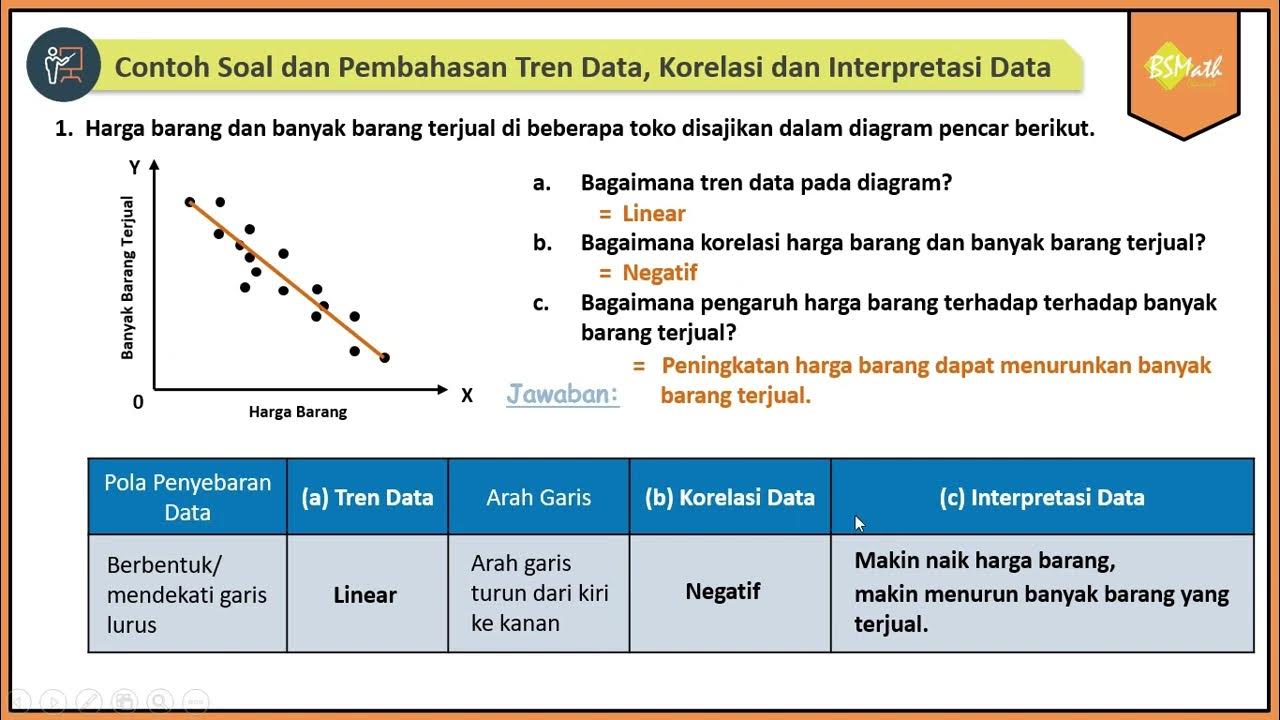
Contoh Soal dan Pembahasan Tren Data, Korelasi dan Interpretasi Data Bivariat Diagram Pencar

Menggambar Diagram Pencar Kelas XI Fase F Kurikulum Merdeka

Menggambar Diagram Pencar Secara Manual - Matematika Wajib SMA Kelas XI Kurikulum Merdeka

Menentukan Variabel Bebas dan Variabel Terikat - Matematika Wajib SMA Kelas XI Kurikulum Merdeka

Materi Matematika Kelas X Kurikulum Merdeka!! (Semester 2)

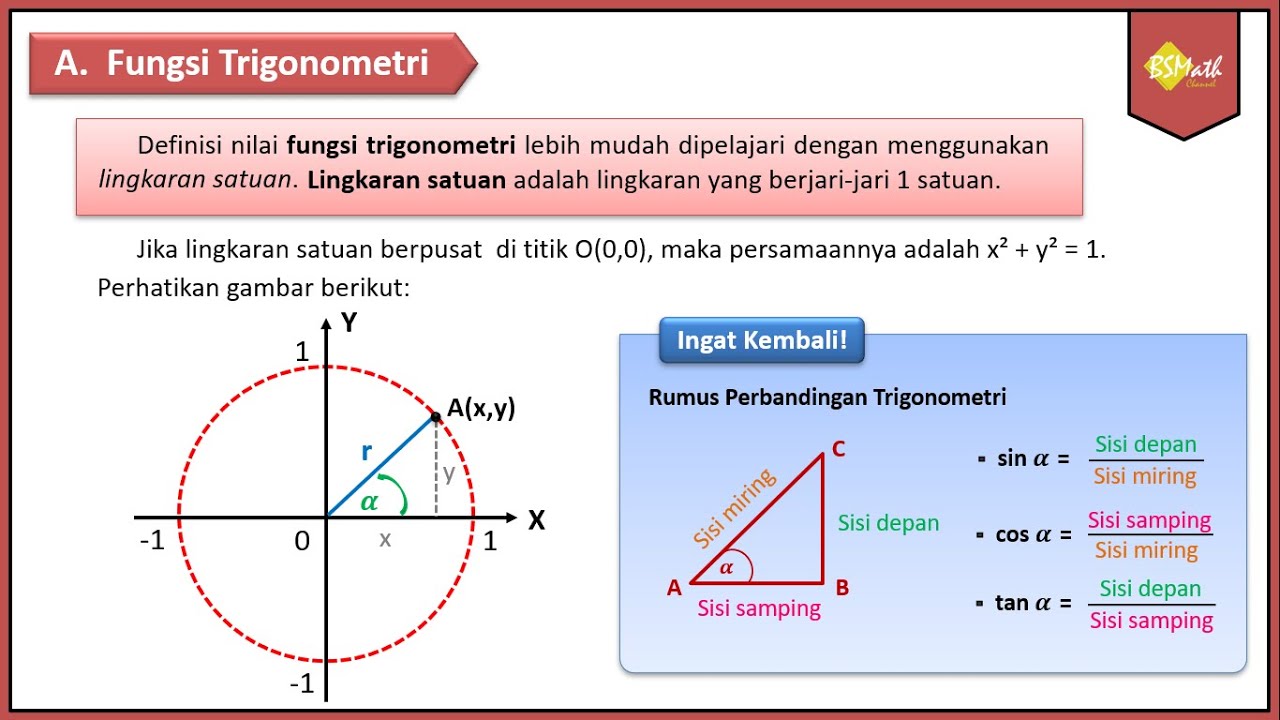
Tanda Fungsi Trigonometri Tiap Kuadran | Matematika Tingkat Lanjut SMA Kelas XI Kurikulum Merdeka
5.0 / 5 (0 votes)
