Menggambar Diagram Pencar Kelas XI Fase F Kurikulum Merdeka
Summary
TLDRIn this tutorial, Arum Islamiati guides viewers through the concept of scatter plots (diagram Pencar) and bivariate data analysis. The video explains key concepts like independent and dependent variables, how to interpret different types of correlations, and identify data trends. The tutorial covers both manual and Microsoft Excel methods for plotting scatter diagrams. Viewers also learn how to visualize the relationship between two variables through examples, including a case study of YouTube data. By the end, the audience will be equipped with the skills to create and analyze scatter plots effectively.
Takeaways
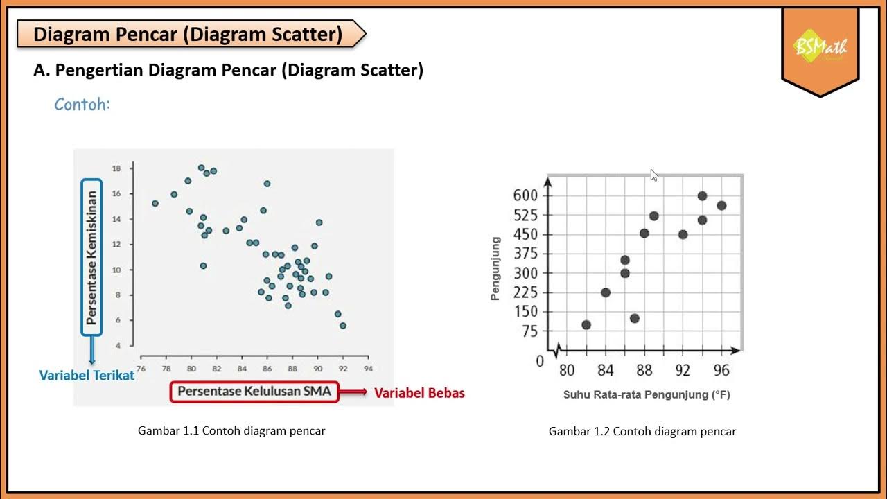
- 😀 Data Bivariate refers to data collected on two variables, where each value in one variable has a corresponding value in the other variable.
- 😀 Scatter Plot (Diagram Pencar) is used to visualize the potential relationship and correlation between two variables.
- 😀 The independent variable (X) influences the dependent variable (Y), and is plotted on the X-axis, while the dependent variable is plotted on the Y-axis.
- 😀 Positive correlation occurs when both variables increase together, as shown by an upward trend in the scatter plot.
- 😀 Negative correlation occurs when one variable increases while the other decreases, as shown by a downward trend in the scatter plot.
- 😀 No correlation occurs when the points in the scatter plot appear randomly without any visible trend.
- 😀 Bivariate data trends can be linear (forming a straight line) or nonlinear (forming a curve).
- 😀 The process of interpreting bivariate data involves stating the relationship between the independent and dependent variables, such as 'As variable X increases, variable Y increases or decreases.'
- 😀 To create a scatter plot manually, you need to determine the independent and dependent variables, draw X and Y axes, and plot corresponding data points based on the values of each variable.
- 😀 Using Microsoft Excel, you can quickly generate a scatter plot by entering the data, selecting the appropriate chart type, and formatting the chart to include titles for both axes.
Q & A
What is a bivariate data set?
-A bivariate data set consists of two variables, where each data point in one variable is associated with a data point in the other variable, allowing the analysis of the relationship between them.
What is a scatter plot, and how is it used?
-A scatter plot (or scatter diagram) visually represents the relationship between two variables. It shows how one variable influences the other by plotting data points on a coordinate plane with one variable on the x-axis (independent) and the other on the y-axis (dependent).
What is the difference between independent and dependent variables?
-The independent variable is the one that influences or causes changes in the dependent variable. The independent variable is typically plotted on the x-axis, while the dependent variable, whose value depends on the independent variable, is plotted on the y-axis.
What are the three types of correlation seen in scatter plots?
-The three types of correlation are positive correlation (both variables increase together), negative correlation (one variable increases while the other decreases), and no correlation (no discernible pattern between the variables).
How do we determine if the relationship between two variables is linear or non-linear?
-A linear relationship is identified when the data points on the scatter plot form a straight line, either increasing or decreasing. A non-linear relationship occurs when the data points form a curve, either rising or falling.
What is the general rule for interpreting bivariate data relationships?
-The general rule for interpreting bivariate data is that as the independent variable (x) increases or decreases, the corresponding effect on the dependent variable (y) can be measured and described. The trend can be observed as increasing, decreasing, or showing no change.
What steps are involved in manually creating a scatter plot?
-To manually create a scatter plot, first, determine the independent and dependent variables. Then, draw the x and y axes, divide them into equal scales, and plot each pair of data points on the coordinate plane. Finally, interpret the data relationship.
How can we use Microsoft Excel to create a scatter plot?
-In Microsoft Excel, input the data for both variables, select the data, and use the 'Insert' menu to choose the scatter plot option. You can then customize the axes and titles for clarity and presentation.
Why is it important to correctly assign the independent and dependent variables when creating a scatter plot?
-Correctly assigning the independent and dependent variables is crucial because it ensures the data is represented correctly. The independent variable should be plotted on the x-axis and the dependent variable on the y-axis to maintain the correct relationship between them.
What does the trend in a scatter plot tell us about the relationship between two variables?
-The trend in a scatter plot reveals the type of relationship between the two variables. A positive trend indicates that both variables increase together, a negative trend indicates that one increases while the other decreases, and no clear trend suggests no relationship between the variables.
Outlines

This section is available to paid users only. Please upgrade to access this part.
Upgrade NowMindmap

This section is available to paid users only. Please upgrade to access this part.
Upgrade NowKeywords

This section is available to paid users only. Please upgrade to access this part.
Upgrade NowHighlights

This section is available to paid users only. Please upgrade to access this part.
Upgrade NowTranscripts

This section is available to paid users only. Please upgrade to access this part.
Upgrade NowBrowse More Related Video

Menggambar Diagram Pencar Secara Manual - Matematika Wajib SMA Kelas XI Kurikulum Merdeka

Statistika Bivariat: Mengungkap Hubungan Dua Variabel!

STATISTIKA Part 5 - DIAGRAM PENCAR
Pengertian Diagram Pencar - Matematika Wajib SMA Kelas XI Kurikulum Merdeka

STATISTIKA BIVARIAT ( DIAGRAM PENCAR ) - PART 1
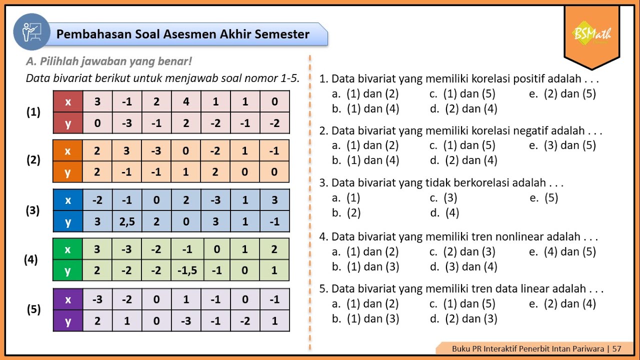
Pembahasan Soal Asesmen Akhir Semester Materi Diagram Pencar Nomor 1-5 | Matematika Wajib Kelas XI
5.0 / 5 (0 votes)