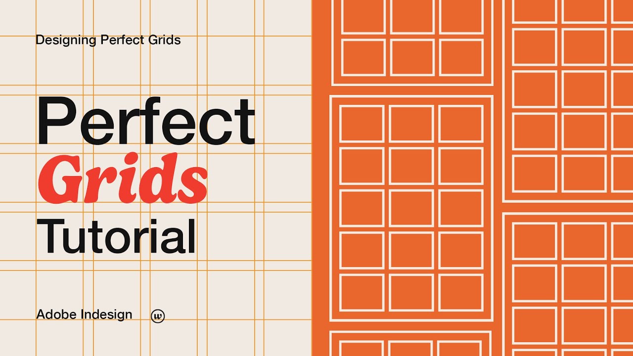
The Secret to Perfect Design Layouts
Summary
TLDRThis video tutorial explores the transformative impact of grid systems in graphic design, emphasizing their historical significance and practical applications. The host, a design expert, shares personal experiences and a step-by-step guide to setting up and utilizing modular grids in InDesign. The video covers various grid types, from one-column grids for simple layouts to complex multicolumn grids for dynamic designs. Real-world examples and a detailed walkthrough of creating a brochure layout highlight the efficiency and professionalism grids bring to design projects.
Takeaways
- 🔄 **Transformative Impact of Grid Systems**: The speaker's initial struggle with layouts was resolved by adopting grid systems, which initially seemed restrictive but ultimately provided more creative freedom.
- 📏 **Definition of Grid Systems**: A grid is defined as a framework of intersecting lines that structure content, ensuring a cohesive, balanced, and visually appealing layout.
- 🎨 **Importance of Grids in Design**: Grids are crucial for maintaining consistent layouts, aligning elements neatly, speeding up the design process, and enhancing readability and user experience.
- 🏛️ **Historical Significance**: Grid systems have a rich history, dating back to the Renaissance, where they were used by artists like Leonardo da Vinci to create balanced compositions.
- 📚 **Types of Grids**: The script outlines different types of grids including one-column, two-column, multicolumn, and modular grids, each serving different design needs.
- 💡 **Practical Applications**: The speaker shares personal projects where grid systems played a key role, demonstrating their utility in real-world design scenarios.
- 🛠️ **Setting Up a Modular Grid in InDesign**: A step-by-step guide is provided for setting up a modular grid in Adobe InDesign, emphasizing the flexibility and professional results achievable with this method.
- 🖌️ **Design Flexibility**: The modular grid's flexibility is showcased, showing how it can be adapted to create various content block arrangements within the predefined structure.
- ✍️ **Text and Image Integration**: The process of integrating text and images within the grid system in InDesign is detailed, highlighting how to maintain design coherence.
- 📈 **Efficiency and Creativity**: The use of grid systems is shown to make the design process more efficient and enjoyable, leading to professional and polished designs.
- 📘 **Recommended Resource**: The speaker recommends 'Grid Systems in Graphic Design' by Josef Müller-Brockmann as a valuable resource for further understanding and application of grid systems.
Q & A
What are grid systems, and why are they important in design?
-Grid systems are frameworks of intersecting vertical and horizontal lines used to structure content. They help organize text, images, and other elements in a cohesive, balanced, and visually appealing manner. Grids ensure consistent layouts, enhance readability, speed up the design process, and make designs look more polished and professional.
How did the speaker's perception of grid systems change over time?
-Initially, the speaker thought grids were too restrictive but later realized they provided more creative freedom. Without grids, their designs felt chaotic and unbalanced, but by properly integrating grids into their workflow, their designs became more cohesive and professional.
What types of grids are commonly used in graphic design?
-The common types of grids in graphic design are: 1) One-column grid (ideal for straightforward layouts like books), 2) Two-column grid (useful for more complex layouts like magazines), 3) Multi-column grid (good for newspapers or websites), and 4) Modular grid (a matrix of cells perfect for dynamic layouts like brochures and posters).
How have grid systems evolved historically?
-Grid systems have been around since the Renaissance when artists like Leonardo Da Vinci used them to create balance in their works. Early grids helped shape modern design, allowing for neat and clean organization of elements.
What are the key components of a grid?
-A grid typically consists of columns, gutters (spaces between columns), margins, and rows. These elements provide a predefined structure that organizes content and helps create a unified and visually appealing design.
Can you give examples of how the speaker used grids in their own design projects?
-The speaker used grids in several design projects, including a 4-column grid for a brand style sheet, a 6-column and 48-field grid for brand guidelines and posters, and a 12-column 60-field grid for detailed brand guidelines. These grids helped create balanced, engaging designs for clients.
What are the advantages of using a modular grid?
-A modular grid provides both vertical and horizontal divisions, allowing for a more dynamic and varied layout. It is highly flexible and helps designers create a balanced and professional look by offering numerous options for arranging content.
How does sketching out ideas before using InDesign help in the design process?
-Sketching ideas first helps visualize the final layout and ensures that the design follows the grid system. Accurate sketches guide the digital design process, making it faster and ensuring that the layout is well-organized and balanced.
What tool and settings did the speaker use to create a modular grid in InDesign?
-The speaker used Adobe InDesign to create a modular grid. They set the document to A4 with a 3mm bleed and adjusted margins and columns through the master page. The speaker also created guides for a modular grid with four columns and eight rows, setting the gutter to 5mm.
What book does the speaker recommend for learning more about grid systems in design?
-The speaker recommends the book 'Grid Systems in Graphic Design' by Josef Müller-Brockmann, which they found highly valuable in improving their designs and understanding of grid systems.
Outlines
🎨 Discovering the Power of Grid Systems
The speaker initially struggled with creating clean and organized layouts until they discovered grid systems. Initially skeptical, they found that grids actually increased their creative freedom by providing structure. Without grids, their designs felt chaotic. After learning to set up and integrate grids into their workflow, their designs became more cohesive, professional, and visually appealing, impressing clients and speeding up their workflow. The speaker introduces themselves and their channel, which focuses on helping logo and brand identity designers. They promise to teach the essentials of grid systems in graphic design, including their importance, types, practical applications, and a step-by-step guide to setting up and designing with a modular grid in InDesign.
📐 Setting Up a Modular Grid in InDesign
The speaker demonstrates how to set up a modular grid in Adobe InDesign. They guide viewers through creating a new document, setting page intent, dimensions, margins, and columns. They explain the importance of setting up the master page correctly, as changes made here affect all pages. The process involves adjusting margins, creating guides for rows, and ensuring the grid is flexible for various content arrangements. The speaker shows how to create a balanced and professional layout using the grid system in InDesign.
🖌️ Working with Text and Images in the Grid
The speaker discusses how to work with text and images within the grid system in InDesign. They explain the process of setting typefaces, font sizes for headers, body copy, and captions. The speaker also demonstrates how to add page numbers and footnotes to the master page, ensuring consistency across all pages. They highlight the flexibility of the grid system, showing how it can be adapted to create different content blocks and layouts. The speaker emphasizes the importance of planning and sketching before designing digitally to ensure a well-organized and visually appealing final product.
📘 Sketching and Converting Ideas into Digital Layouts
The speaker shares their process of sketching out design ideas in a sketchbook before converting them into digital layouts in InDesign. They emphasize the importance of following the modular grid system in sketches to visualize the final design effectively. The speaker demonstrates how they recreated the designs from their sketches, focusing on the placement of headlines, images, and body copy. They discuss the trial and error process of finding the right balance of images and text, ultimately deciding that larger images worked better for the project. The speaker concludes by showing the final designs, highlighting the importance of grids in organizing and enhancing the overall look and feel of a project.
📖 Final Thoughts on Grid Systems in Design
In the concluding paragraph, the speaker reflects on the value of grid systems in design, emphasizing how they help create well-balanced and visually appealing layouts that effectively communicate the message. They encourage viewers to subscribe for more content and recommend a book on grid systems for further learning. The speaker summarizes the benefits of using grid systems, such as improved organization and design quality, and shares their personal experience of how it positively impacted their work.
Mindmap
Keywords
💡Grid Systems
💡Creative Freedom
💡Cohesive
💡Professional
💡Workflow
💡Modular Grid
💡InDesign
💡Brand Identity
💡Readability
💡Historical Background
💡Types of Grids
Highlights
The speaker used to struggle with making layouts look clean and organized until discovering grid systems.
Initially, the speaker thought grids were too restrictive, but later realized they provided more creative freedom.
Without a grid, designs felt chaotic and unbalanced despite efforts to arrange elements perfectly.
The speaker's designs became more cohesive, professional, and visually appealing after integrating grids.
Clients noticed the difference in the quality of designs when the speaker started using grid systems.
Grids ensure a consistent layout across different pages and elements, creating a unified look.
Grids help align elements neatly, bringing order and clarity to the design.
Properly structured grids enhance the readability of text and the overall user experience.
Grids allow for creative flexibility within a defined framework, often resulting in polished and professional designs.
Grid systems have been used since the Renaissance to create balance in art and architecture.
The types of grids in graphic design include one column, two column, multicolumn, and modular grids.
The speaker shares examples of how different grid systems were used in their own design projects.
A modular grid creates a matrix of cells that can hold different types of content, suitable for dynamic layouts.
The speaker demonstrates how to set up a modular grid in InDesign for creating brochure pages.
Margins and gutters are set within the master page to affect all pages in the document.
Guides are created for the modular grid to provide a structure for designing within InDesign.
The speaker shows how flexible the grid is by demonstrating different content block arrangements.
The speaker explains how to work with a modular grid in InDesign, including adding text, images, and setting page numbers.
Sketching out ideas following the modular grid helps in visualizing the final design before digital implementation.
The speaker shares the final designs, emphasizing how the grid system helped create balanced and visually appealing layouts.
The speaker recommends the book 'Grid Systems in Graphic Design' by Josef Müller-Brockmann for further learning on grid systems.
Transcripts
ever feel like your designs are missing
that professional touch in my career I
used to struggle with making layouts
look clean and organized until I
discovered the power of grit systems at
first I thought grits were too
restrictive but then I realized they
actually gave me more creative freedom
without a grit my designs felt chaotic
and unbalanced no matter how hard I
tried to arrange the elements perfectly
I spent hours streaking my layouts only
to end up first Tred with the final
result I felt like I was never getting
it right so then I decided to give grits
a real try I learned how to set them up
properly and integrate them into my
workflow and the results my designs came
more cohesive professional and Visually
appealing clients noticed the difference
and my workflow became faster and more
efficient now I'm excited to share these
gr system techniques with you by the end
of this video you will see how grads can
transform your designs and make your
creative process smoother and more
enjoyable hey my name is and from tyu on
this channel I help logo and brand
identity designers to make their design
life easier by sharing my experiences
and knowledge in this video you will
learn the essentials of grid systems in
graphic design including their
importance types practical applications
and a stepbystep guide on setting up and
designing with a modular grid in in
design so first I want to cover the
definition and importance of grid
systems what is a grid a grid is a
framework of intersecting vertical and
horizontal lines used to structure
content it helps organized text images
and other elements in a cohesive
balanced and Visually appealing manner a
grd typically consists of columns
gutters the spaces between the columns
margins and r
so why are grids important grids ensure
a consistent layout across different
pages and elements creating a unified
look they help align elements neatly
bringing order and Clarity to the design
by providing a predefined structure
grids speed up the design process and
make it easier to place elements
systematically properly structured grids
enhance the readability of text and the
overall user experience despite their
structured nature grits allow for
Creative flexibility within the defined
framework use of grits often result in
designs that look more polished and
professional making a positive
impression on the audience so when we
are looking at the historical background
of git systems grid systems have been
around since the
Renaissance when artists and Architects
wanted to create balance in their Works
Pioneers like Leonardi Da Vinci used
grids to plan their designs ensuring
everything looked just right these early
grids helped shape the way we organize
and structure designs today ensuring
they are neat and clean so now I want to
cover the types of grids and graphic
design so the types of grids and graphic
design are we have the one column grid
this is the simplest type perfect for
straightforward layouts like books or
essays everything is arranged in one
single column making it easy to read
then we have the two column grd this
type defines the pages into two columns
grade for more complex layouts like
magazines or newsletters and it allows
more flexibility and variation in design
then we have the multicolumn grid this
grid splits the page into three or more
columns it's ideal for newspapers or
websites providing lots of options for
arranging text and images and then we
have the modular grid this grid is a bit
more complex with both horizontal and
vertical divisions it creates a matrix
of cells that can hold different types
of content it's perfect for more Dynamic
and varied layouts like brochures and
posters so I wanted to share some real
examples of how I've used different grd
systems in my own design projects these
grids help keep everything organized
balanced and Visually appealing I want
to share with you seven projects where
GRS played a crucial role so we have the
brand star sheet I used a simple four
column grd for a clean and straight
forward brand Styles sheet we have the
Offa brand guidelines which utilized a
more detailed four column 32 field grid
allowing flexibility and precision we
have the brand guidelines for M and
where I use six columns and a 48 field
grid to present M and half's extensive
guidelines clearly and engagingly we
have the m and half posters which also
consist out of six columns and a 48
field grid we have the posers for MAA
where I use four columns and a 32 field
grid it allowed me to create a balanced
and engaging design the Mila brand
guidelines I use a 12 columns sexy field
grid for this detailed brand guidelines
to ensure everything fits perfectly the
post source for hyper hiive is a square
grid I created a square grid for hyper
High posters to create modern and
dynamic layouts now we have seen these
examples I want to show you guys how to
set up a modular Grid in InDesign we are
in my InDesign now and let's set up a
modular grid here first thing we want to
do is we want to go to file click on new
document uh for this we want to set the
intent to print because we are going to
create a brochure or brochure Pages for
the Miler modern furniture brochure
click on A4 that's all right um for now
we set facing pages
off and we set the bleed to three mm 3
mm is kind of a default um uh have for
print when working with print so for the
margins and columns we are going to uh
leave it at the default right now and we
are going to um set these apply these in
and design itself so press on create so
now we have the um A4 page in in design
we are going to add some more pages
because we are going to create different
layouts in the
end uh what we can what we are going to
do now we are going to set the margins
in the master page
so if you don't have the pages panel
open you can click on window and click
on pages and on the top over here we
have the a parent and this is the a
master page and you can see all the
pages are connected to this to this a
master page because it has this little a
on the top of the page so to adjust the
a master page the a parent we want to
double click onto this page and now we
are in the master page um and everything
we do in this master page will have
effect
on the um on all pages so if you create
a box which is
green you can see it applies to all
pages so we are going to delete this
right now first of all yeah we want to
uh set the margins so what we are going
to do is press on layout margins and
columns um and here we want uh the
margins to be 15 mm
we want to we want them to be 15 m m
everywhere only at the bottom part we
want 25 mm because we want to have some
room to add a footnote or page uh
numbers so for the columns we are going
to set uh four
columns with a gutter of 5
mm and press an
okay so what we want to do now is we
want want to create the
guides for the modular grid so what we
want to do is we go to layout again uh
create
guides and for the number uh we want to
make sure this the preview is
on and for the number of rows we want to
have eight
rows as you can see it creates these
nice uh rectangular uh boxes within the
monolog red
this is a nice uh shape to work with so
the gutter I will set it to five as well
and you want to make sure the option fit
to guides fed guides to is on margins
and not on page because it will create
when you set it to Page these little
weird boxes on the top and on the bottom
so we want to make sure this is on
margins uh columns we already have set
and press on okay so now you can see we
have a modular grid with four columns
and a 30 field uh grid and this grid is
highly flexible as well so for example
we can now make sure click out of the
master
page and press on the first p double
click on the first page and now you can
see all pages have the same layout
because we have set the margins and the
rows to the a parent so now we can uh um
start now I want to show you how
flexible this grid is I'm just going to
pick a
color and we
can create like split the grid into four
boxes blocks content blocks but we can
also split it
into the grid into two content blocks
and also uh
in column blocks content blocks with um
uh double height with two boxes and we
can also like make one big box out of it
so here you can see the uh Varity you
can create with this uh within this grid
so this model grid provides plenty of
options to create a balanced and
professional
layout designing with a modo grid and
end design now I'll show you how to work
with a modo grid and IND design so I
will add in some text uh images and I
will set page numbers and a footnote
before I start designing so I have a
document over here with some text in it
I'm just going to copy
it into my in design file
so this is uh header
one this is the header
two this is header
three we have some body
copy this Tex is all in default right
now and I'm going to um oh this is also
body copy going to
apply a style to it when it's all copied
so this is text for the
caption so this is some fake text where
I'm going to work with and uh for the
header um I'm going to set the type face
which I
use the type face I use for uh the Mila
brand identity is um not has
grotesque so I'm going
to set the header in medium I'm going
for a big headline for the header which
will be on the cover of of the
page for something like 87 78
okay for the second header which will be
a little bit
smaller I will
set also the type face to
medium and then let's go
with something like 48 for the second
header
and then
for the third had
a has TK also to a
medium and we'll just leave this in the
same size as the body
copy so the body copy will be the same
miss the head of
tree um so what I can do is select the
text press on the uh ink drop tool and
then click on the head of tree so it
copies the same uh preferences as a
header but the difference with this one
is I want to set the text to
light so we have a nice small header
which can be used together with the text
and then for the caption I will use the
same uh size as a body copy but I will
make it a little bit smaller something
like eight
points and probably 10 points in height
okay this looks quite
good so this is something we can work
with so now we have set the text and I
have uh an folder with images ready to
use on my
computer what I want to do now is I want
to uh set page numbers to the master
page and this will be the
same text size as the uh the caption so
what we want to do is we want to move on
to the double click in the master page
on the a parent press on W to see the
grid
and then uh we are going to place it
Down
Below on the bottom of the page so first
we want to make sure we know this size
the top
margin can draw a box and then drop it
to the bottom part so we know where to
place the
text
okay so over here I want to add a
footnote uh let's make it
brochure
Mila Mila mod
Furniture
okay place it on top of the box this is
will be a nice size and then the same
for the page
numbers select this text box
and drag it with holding option and
shift to the right
side we are going to create page numbers
of these um for now we're just going to
set an
A and we want to align the text to the
right zoom in a little
bit and make sure it aligns to
the right side of the page
okay I'm not sure why I don't see any
guides any smart guides at the
moment um gr and guides smart guyses are
on
okay okay let's just draw
a guide then and apply it to it okay so
to set page
numbers in the M parent you want to
select the head text where you want to
add the page numbers go to type insert
special character go to markers and
current page number and because we have
set this text to the master
page this this text is applied to all
pages in The
Brochure so for example if we go to page
three
we also have page number three over here
on page six we have page number six
before starting designing an in design I
sketch out as many ideas as possible in
my Sketchbook I make these sketches
small and ensure they follow the modular
grid the goal here is to quickly
visualize how the final designs will
look accurate sketches make it easier to
imagine the final result here are the
sketches for the Mila modern furniture
brochure based on a four column 30 field
grid this grid allows me to split the
page nicely into sections I focused on
where the headline will go where images
can be placed and where the body copy
should be by planning and sketching
first I ensure my designs are well
organized and make the best use of the
grid system now let's see how to work
with grids and in design by converting
my sketches into a digital layout we'll
cover Dimensions scaling topography and
images with these sketches next to me I
will be starting recreating the designs
I think have the most potential I sped
up this process because it can get
lengthy in real
time you can see I try a few options
here for the cover
I use one of the saved images and test
different background colors to make the
cover stand out
next I move on to the content
Pages here I appli the topography system
I set up the titles intro text
body copy and
captions sometimes a design that looks
good on paper doesn't work well as well
digitally this can happen if there is a
lag of balance in the
design I've worked out several layout
options both on paper and digitally and
I tried using small images with more
text and large images with less text
ultimately I found that pages with
larger images work better for Mila this
might be because the images are
beautiful and work well in a larger
format
in the end I spent about 20 minutes
sketching out layouts and working them
out digitally it really speeds up this
design process and it takes out the
guessing work these are the final
designs I came up
with in the end using a grid system
helps create well balanced visually
appealing layouts that effectively
communicate the message this process
highlights the importance of grids and
Design showing how they help organize
and improve the overall look and feel of
a project if you found value in this
video please consider subscribing and
maybe check out one of my other valuable
videos and by the way if you like gr
systems and you want to work with them I
really recommend this book grit systems
and graphic design by Yosef Müller
Brockman it's a real good read this
really improved my designs peace
Посмотреть больше похожих видео
5.0 / 5 (0 votes)