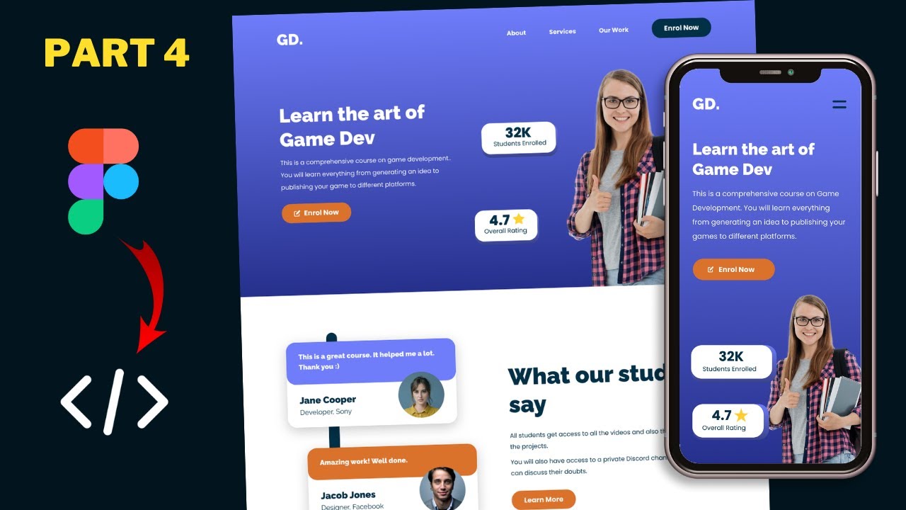
Figma To Real Website | Responsive Homepage | HTML, CSS & JavaScript | Part 9
Summary
TLDRThis tutorial series focuses on converting a sigma design into a responsive website using HTML, CSS, and JavaScript. The instructor demonstrates the process of adapting the desktop version for tablet screens, starting with styling the hero section and moving on to the testimonial, courses, get our app, and footer sections. Techniques like flexbox, media queries, and CSS selectors are used to ensure the design is mobile-friendly, with detailed steps provided for adjusting layout, font sizes, and spacing.
Takeaways
- 🌐 The tutorial series is focused on converting a sigma design into a responsive website using HTML, CSS, and JavaScript.
- 🖥️ The desktop version of the website has already been designed, and the current focus is on coding for the tablet version.
- 🎨 The hero section of the tablet version has been designed, and the video will cover the design of the remaining sections.
- 🔍 The process involves using Figma to inspect design elements and then applying corresponding styles in CSS.
- 📝 CSS properties such as font size, flex direction, and margins are adjusted to fit the tablet layout.
- 🔄 Flexbox is utilized to rearrange elements for the tablet version, changing from a row to a column layout where necessary.
- 🖼️ Image sizes and object fit properties are set to ensure that images display correctly within their containers.
- 🔢 Specific measurements, such as font sizes and margins, are taken from the Figma design and implemented in the CSS.
- 🔄 The order of elements in the HTML structure is adjusted to match the tablet design layout.
- 🔗 The visibility of desktop and mobile buttons is controlled with CSS to ensure the correct button is displayed for the tablet version.
- 📚 The tutorial concludes with the completion of the tablet version design, including sections like hero, testimonials, courses, get our app, and footer.
Q & A
What is the main focus of this tutorial series?
-The main focus of this tutorial series is to convert a sigma design into a real website using HTML, CSS, and JavaScript, with the current stage being the development of the tablet version of the website.
What section of the website is being styled in the script?
-The script discusses styling the hero section, testimonial section, courses section, get our app section, and the footer for the tablet version of the website.
What changes are made to the testimonial section for the tablet version compared to the desktop version?
-For the tablet version, the testimonial section changes from a flex display with left and right sections side by side to a column flex direction with all elements stacked vertically. The testimonial cards are also adjusted to have full width and a margin bottom of 40 pixels.
How is the 'h2' heading styled in the tablet version according to the script?
-The 'h2' heading is styled with a font size of 40 pixels, as taken from the Figma design file for the tablet version.
What adjustments are made to the course cards in the 'Our Courses' section for the tablet version?
-The course cards are adjusted to have a flex direction of column, with each course on separate lines. The image within the course card is set to a height of 260 pixels and object fit is set to 'cover' to ensure the image covers the area without distortion.
What is the purpose of changing the 'flex-direction' property in the CSS for the tablet version?
-Changing the 'flex-direction' property to 'column' is necessary to stack elements vertically on the tablet version, as opposed to the horizontal layout used in the desktop version.
How does the script address the issue of aligning the background element in the testimonial section?
-The script addresses the alignment issue by adjusting the 'top' value of the ':before' pseudo-element to '-40 pixels' and changing the 'left' value to '60 pixels' to match the movement of the testimonial card.
What is the strategy for handling the button display in the testimonial section for the tablet version?
-The strategy involves hiding the desktop button by setting its display to 'none' and showing the mobile button by setting its display to 'block'. The mobile button's width is set to 100%, and its order in the layout is adjusted.
How is the footer layout adjusted for the tablet version in the script?
-The footer layout is adjusted from a three-column grid to a two-column grid by setting 'grid-template-columns' to '1fr 1fr'. The last 'links' division is set to span two columns to take up the full width for the third section.
What is the final step mentioned in the script for adjusting the 'Get Our App' section?
-The final step mentioned in the script for adjusting the 'Get Our App' section is to ensure that the button is moved to the left with a gap of 100 pixels from the footer, which involves adjusting the 'write' (likely a typo for 'left') CSS property.
Outlines

このセクションは有料ユーザー限定です。 アクセスするには、アップグレードをお願いします。
今すぐアップグレードMindmap

このセクションは有料ユーザー限定です。 アクセスするには、アップグレードをお願いします。
今すぐアップグレードKeywords

このセクションは有料ユーザー限定です。 アクセスするには、アップグレードをお願いします。
今すぐアップグレードHighlights

このセクションは有料ユーザー限定です。 アクセスするには、アップグレードをお願いします。
今すぐアップグレードTranscripts

このセクションは有料ユーザー限定です。 アクセスするには、アップグレードをお願いします。
今すぐアップグレード関連動画をさらに表示

Figma To Real Website | Responsive Homepage | HTML, CSS & JavaScript | Part 12

Figma To Real Website | Responsive Homepage | HTML, CSS & JavaScript | Part 3

Figma To Real Website | Responsive Homepage | HTML, CSS & JavaScript | Part 4

Figma To Real Website | Responsive Homepage | HTML, CSS & JavaScript | Part 10

Figma To Real Website | Responsive Homepage | HTML, CSS & JavaScript | Part 11

Figma To Real Website | Responsive Homepage | HTML, CSS & JavaScript | Part 2
5.0 / 5 (0 votes)
