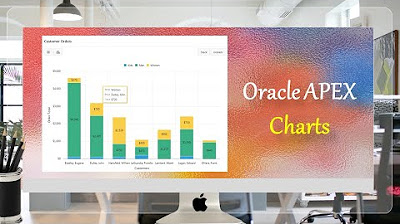
Single + Multiple Series Box Plot Charts Oracle APEX - Part 31
Summary
TLDRTech mining's tutorial introduces viewers to the creation of box plot charts for summarizing large datasets, particularly useful for comparing annual sales figures over a decade. The script guides through the process of setting up a table with relevant data, utilizing a provided source code. It demonstrates creating a single-series box plot chart for School A and then extends the tutorial to include a multi-series chart for comparing marks across three schools, enhancing data visualization with interactive features and legends.
Takeaways
- 📊 The video introduces how to create a box plot chart to compare annual sales figures of products over the past 10 years.
- 📈 A box plot is an efficient chart type for summarizing large amounts of data, showing the range and distribution along a number line.
- 🛠️ The process involves creating a table and populating it with relevant data, with the source code provided in the video description.
- 🔗 To create the table, one must click the 'load data' button and ensure the table is created with 15 rows as a success message.
- 📝 View the table by clicking the 'view table' button to browse the columns and existing data.
- 📊 For creating a single-series box plot, open the sales web application and select the box plot option from the chart menu.
- 🔍 Choose 'SQL query' as the source type and enter the provided query to fetch data for the chart.
- 📊 Set the label column to 'course' and the value column to 'school a' to correctly categorize the data for the chart.
- 🏗️ After creating the page, customize the box plot chart region by setting its title and modifying the series name.
- 👀 Test the chart by running the application and hovering the mouse pointer over each box to see the values.
- 📈 To compare marks of multiple schools, create a multi-series box plot using a SQL query that fetches data for all schools.
- 📊 The multi-series box plot enables comparison across different schools, with the legend property turned on for interactive data exploration.
Q & A
What is the purpose of a box plot chart in the context of the Tech mining video?
-A box plot chart is used to efficiently summarize large amounts of data, displaying the range and distribution of data along a number line, which is particularly useful for comparing annual sales figures over a period of time.
How can one create a table for the box plot setup in the video?
-To create a table for the box plot setup, one needs to execute the steps provided in the video, which includes populating the table with relevant data. The source code for this process is linked in the description of the video.
What is the outcome after clicking the 'load data' button in the video?
-If the data loading process is successful, a message indicating that the 'table box plot' has been created with 15 rows will be displayed.
How can viewers browse the created table in the video?
-Viewers can browse the created table by clicking the 'view table' button, which allows them to see all the columns and the existing data in the table.
What is the first step to create a page for a single series box plot chart?
-The first step is to open the sales web application and then click on the 'chart' option followed by selecting the 'box plot' option.
Why is the SQL query important in creating a box plot chart?
-The SQL query is crucial as it fetches and displays the necessary data for the box plot chart. It specifies the data source and ensures that the correct information is visualized.
What is the default orientation of the box plot chart in the video?
-The default orientation of the box plot chart in the video is vertical.
How is the label column set in the box plot chart creation process?
-In the box plot chart creation process, the label column is set to 'course', which categorizes the data on the chart.
What is the significance of changing the series name from 'series 1' to 'school a'?
-Changing the series name from 'series 1' to 'school a' personalizes the chart, making it clear that the data displayed is specifically for school a.
How can one test the created box plot chart in the video?
-To test the created box plot chart, one should run the application, navigate to the reports page, and click on the box plot card. Hovering the mouse pointer over each box will reveal the values.
What changes are made to create a multi-series box plot chart in the video?
-To create a multi-series box plot chart, the SQL query is adjusted to fetch and show all data in the table, and the data of schools B and C are included. The legend property is also turned on to enable the hide and show behavior for each series.
Outlines

このセクションは有料ユーザー限定です。 アクセスするには、アップグレードをお願いします。
今すぐアップグレードMindmap

このセクションは有料ユーザー限定です。 アクセスするには、アップグレードをお願いします。
今すぐアップグレードKeywords

このセクションは有料ユーザー限定です。 アクセスするには、アップグレードをお願いします。
今すぐアップグレードHighlights

このセクションは有料ユーザー限定です。 アクセスするには、アップグレードをお願いします。
今すぐアップグレードTranscripts

このセクションは有料ユーザー限定です。 アクセスするには、アップグレードをお願いします。
今すぐアップグレード関連動画をさらに表示

Cara Membuat Grafik di Microsoft Excel (2021)
Oracle APEX Chart | Stack Unstack | Horizontal Vertical Orientation - Part 25

Create Gantt Chart | Oracle APEX - Part 30

Customize Interactive Report With Actions Menu - Part 11
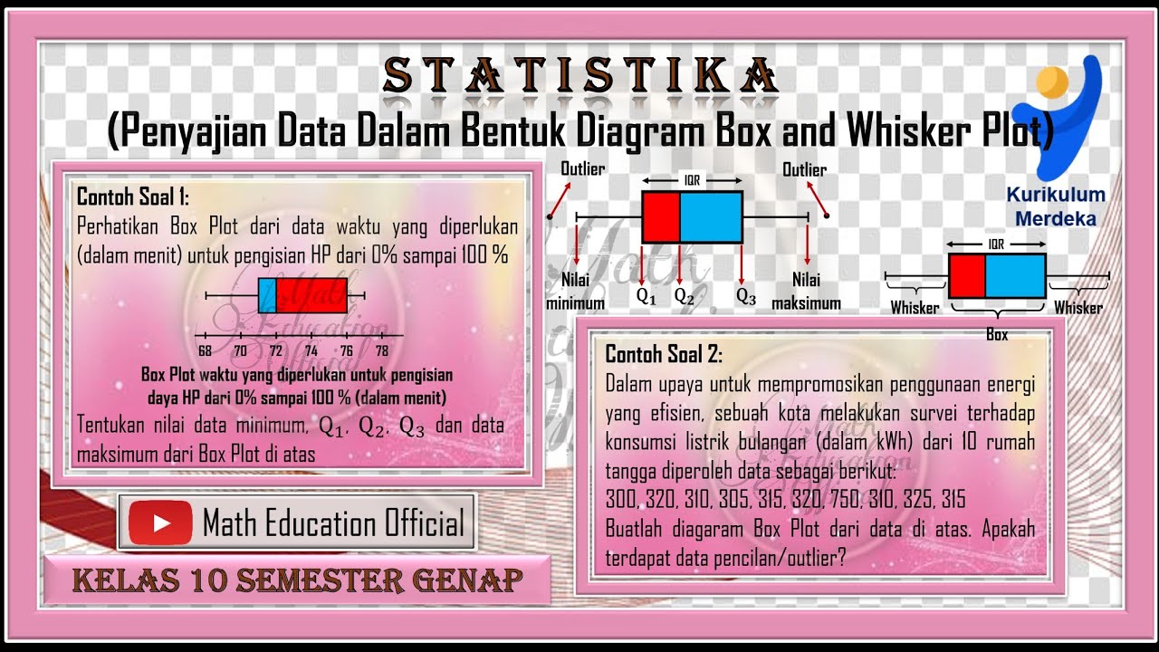
Penyajian Data Dalam Bentuk Box and Whisker Plot Box Plot

Cara Mudah Memahami Perbedaan Artificial Intelligence, Machine Learning, dan Deep Learning
5.0 / 5 (0 votes)
