Donut & Range Charts | Minimum & Maximum Quantities | with Legends Oracle APEX - Part 26
Summary
TLDRIn this Tech mining video, viewers are introduced to the visualization of sales data through interactive charting options. The presentation includes a donut chart that highlights sales figures upon hovering and allows for data series hiding through legend item selection. Additionally, a range chart is featured, which displays ordered quantities and links to a detailed product page. The tutorial guides through the setup of these charts, emphasizing their dynamic nature and the ability to drill down into specific product details, ultimately enhancing user engagement with the data.
Takeaways
- 📊 The video presents a tutorial on creating donut and range charts to display sales data for different products in two separate regions.
- 🖱️ Viewers can interact with the charts by hovering the mouse cursor to see sales figures and clicking on legend items to hide or show data series.
- 🔗 The second chart, a range chart, includes a link to access a detailed product page (Page 6) when a specific product bar is clicked.
- 🛠️ The video guides viewers through creating a segment with a step-by-step approach, similar to previous tutorials.
- 💰 The donut chart highlights sales figures in US dollars when a data item is hovered over.
- 📈 The range chart displays the maximum and minimum ordered quantities for each product, helping to visualize sales ranges.
- 🔑 The tutorial explains how to set up the chart properties, including defining labels for the x-axis and specifying low and high column names.
- 📝 Source code for creating the charts is provided in the video description, allowing viewers to replicate the process.
- 📚 The video script mentions a 'part 8 folder' which contains the file necessary for creating the charts, indicating a series of tutorials.
- 🔍 The charts are designed to allow for easy comparison of sales data across different categories and products.
- 📘 The final takeaway is the ability to drill down into product details by interacting with the charts, enhancing data exploration and analysis.
Q & A
What is the main focus of the Tech mining video?
-The main focus of the Tech mining video is to present category and product sales data in two separate regions using different charting options.
What is a donut chart and how does it work in the video?
-A donut chart is a type of circular chart that is used to display data in a way that allows for easy comparison. In the video, moving the mouse cursor over each segment of the donut chart displays the respective sales figures, and deselecting a legend item hides its associated data series.
How can viewers interact with the range chart in the video?
-Viewers can interact with the range chart by moving the mouse cursor over the chart to see the respective sales figures. The chart also has a drill-down feature where clicking on a bar representing a product will take the viewer to Page 6 to view product details.
What is the purpose of the 'on Hover' feature in the donut chart?
-The 'on Hover' feature in the donut chart allows all data items to be dimmed when not currently hovered over, and highlights only the current data item with its respective order figures in US dollars.
How does the 'hide and show' behavior work in the donut chart?
-The 'hide and show' behavior is performed by clicking a legend item, which causes the chart to rescale as you select or deselect a legend item. This is useful for series with largely varying values.
What is the source code for the charts mentioned in the video?
-The source code for the charts is provided in the video description, accessible by opening the part 8 folder, which contains the file used for the charts.
What is the second chart in the video used for?
-The second chart is a range chart used to display the maximum and minimum ordered quantities for each product.
How are the labels of the x-axis on the range chart defined?
-The labels of the x-axis on the range chart are defined using the product name column specified in the chart settings.
What is the purpose of the link created in the last six properties of the range chart?
-The link created in the last six properties of the range chart is used to access Page 6 to browse details of the selected product when a bar on the chart is clicked.
How can viewers access the page with the charts?
-Viewers can access the page with the charts by running the application, opening the reports page, and clicking on the 'Sales by Category and Product' card.
What happens when a viewer clicks on a bar representing a product in the range chart?
-When a viewer clicks on a bar representing a product in the range chart, the system will drill down to Page 6 to show the details of that specific product.
Outlines

このセクションは有料ユーザー限定です。 アクセスするには、アップグレードをお願いします。
今すぐアップグレードMindmap

このセクションは有料ユーザー限定です。 アクセスするには、アップグレードをお願いします。
今すぐアップグレードKeywords

このセクションは有料ユーザー限定です。 アクセスするには、アップグレードをお願いします。
今すぐアップグレードHighlights

このセクションは有料ユーザー限定です。 アクセスするには、アップグレードをお願いします。
今すぐアップグレードTranscripts

このセクションは有料ユーザー限定です。 アクセスするには、アップグレードをお願いします。
今すぐアップグレード関連動画をさらに表示
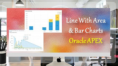
Line With Area & Bar Charts with Region Display Selector Oracle APEX - Part 27
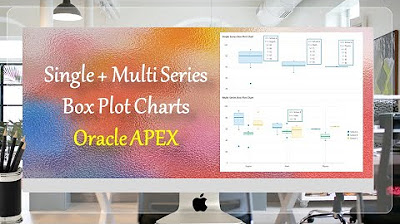
Single + Multiple Series Box Plot Charts Oracle APEX - Part 31
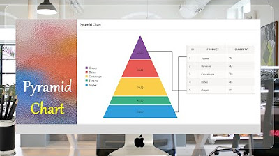
Pyramid Chart | Oracle APEX - Part 32

Hate Speech Detection Using Machine Learning | ML Projects Using Python | Simplilearn
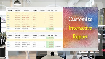
Customize Interactive Report using Actions Menu (Sort, Control Break, Highlight) - Part 12
Give a New Look to Interactive Report & Input Form - Part 15(B)
5.0 / 5 (0 votes)
