Data - Materi Matematika Kelas 5 Kurikulum Merdeka
Summary
TLDRThis video explains the concept of data, its collection methods, and how to read, interpret, and present it effectively. It covers data collection techniques such as observation, interviews, and questionnaires, and emphasizes their purpose in providing insights for decision-making. The video demonstrates how to read and interpret data through lists, tables, and various diagrams including pictograms, bar charts, line charts, and pie charts. It also provides step-by-step guidance on presenting data visually. Using examples like student weights, favorite foods, drinks, colors, and sports, viewers learn to analyze trends, identify highest and lowest values, and convey information clearly and accurately.
Takeaways
- 📊 Data is information that provides an overview of a situation and can be used for decision-making.
- 📝 Data collection can be conducted through observation, interviews, or questionnaires.
- 👀 Observation involves systematically recording elements in the research object.
- 💬 Interviews collect data by directly asking sources, while questionnaires gather data indirectly.
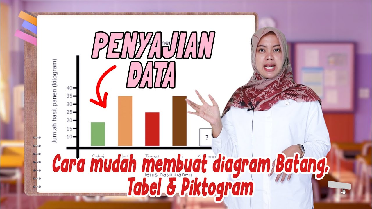
- 📈 Collected data can be presented as lists, tables, or diagrams to make it easier to read and interpret.
- 📋 Reading data means stating the information directly, while interpreting data involves analyzing patterns like highest, lowest, and differences.
- 🍽 Data can be displayed in tables, bar charts, line charts, picture diagrams, or pie charts depending on the type of information.
- 📐 Steps for creating charts include determining categories, calculating frequencies, and visually representing data using appropriate diagrams.
- 📏 Line diagrams are useful for showing data changes over time, while pie charts illustrate proportions of a whole.
- 🏆 Interpreting diagrams involves identifying the most and least common data points, total counts, and significant differences.
Q & A
What is data and why is it important?
-Data is all information that provides an overview of a situation. It is important because it helps in understanding situations and serves as a basis for decision-making.
What are the main methods of data collection?
-The main methods of data collection are observation, interview, and questionnaire.
How does an observation differ from an interview?
-Observation involves systematically observing and recording elements in a research object, while an interview involves directly asking the source for information.
What is the purpose of using a questionnaire in data collection?
-A questionnaire is an indirect way of collecting data, allowing respondents to provide answers to a set of written questions.
What is the difference between reading and interpreting data?
-Reading data means stating information directly from the data presentation, whereas interpreting data involves analyzing the data to find trends, differences, or other insights not explicitly written.
What are the common forms of presenting data?
-Data can be presented in lists, tables, pictograms, bar diagrams, line diagrams, and circle (pie) diagrams.
How is a bar diagram created and interpreted?
-A bar diagram uses vertical or horizontal bars to represent data. The vertical axis shows the frequency, the horizontal axis shows categories, and the height or length of each bar corresponds to the number of data points in each category.
What is the main advantage of using a line diagram?
-Line diagrams are useful for showing data trends over time or sequences, as data points are connected by lines to illustrate changes.
How do you calculate the angle or percentage for a pie chart?
-The angle is calculated by multiplying the number of data points in a category by 360° divided by the total number of data points. The percentage is calculated by dividing the number of data points in the category by the total number of data points and multiplying by 100%.
What steps are involved in presenting data in a pictogram?
-1. Choose an image to represent the data. 2. Determine how many data points each image represents. 3. Convert the data numbers into images accordingly.
How can reading data in a list format help in understanding information?
-Reading data in a list helps identify individual values, frequency counts, the highest and lowest values, and differences among data points.
Why is presenting data visually often preferred over text alone?
-Visual presentations like charts and diagrams make data easier to read, compare, and interpret quickly, highlighting trends, patterns, and key insights that might be missed in text alone.
Outlines

このセクションは有料ユーザー限定です。 アクセスするには、アップグレードをお願いします。
今すぐアップグレードMindmap

このセクションは有料ユーザー限定です。 アクセスするには、アップグレードをお願いします。
今すぐアップグレードKeywords

このセクションは有料ユーザー限定です。 アクセスするには、アップグレードをお願いします。
今すぐアップグレードHighlights

このセクションは有料ユーザー限定です。 アクセスするには、アップグレードをお願いします。
今すぐアップグレードTranscripts

このセクションは有料ユーザー限定です。 アクセスするには、アップグレードをお願いします。
今すぐアップグレード関連動画をさらに表示

Video Pembelajaran Matematika Kelas 7 SMP ( Pengolahan Data )
Cara Membuat dan Membaca PENYAJIAN DATA - DIAGRAM BATANG, TABEL dan PIKTOGRAM

Pengantar Statistika Kelas 7 SMP

Analisis Data (Materi Informatika) Kelas X Fase E
Penyajian Data Kelas 7 - Menyajikan Data Dalam Tabel dan Diagram | Jenis Diagram | Statistika

Penyajian Data | Matematika SMP Kelas 7
5.0 / 5 (0 votes)
