Pengantar Statistika Kelas 7 SMP
Summary
TLDRThis video introduces the basics of statistics for 7th-grade students, focusing on data collection and presentation. It explains various methods for gathering data, such as interviews, surveys, and observations. The video also highlights how to organize and present data in clearer forms, such as tables and different types of charts, including bar, line, and pie charts. The emphasis is on making data easier to understand, drawing conclusions, and providing simple yet effective ways to visualize data, thus helping students better interpret and analyze information.
Takeaways
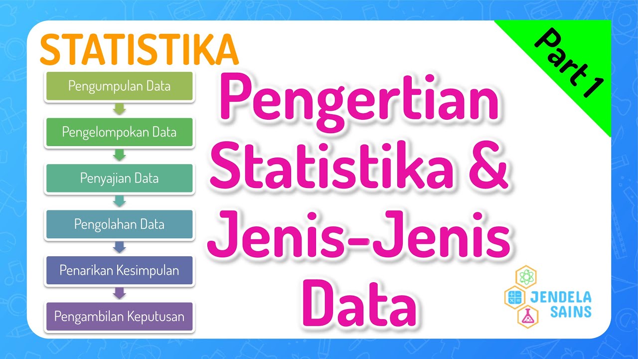
- 😀 Statistics is the study of data collection, presentation, and processing.
- 😀 For Grade 7, the focus is on data collection and basic data presentation.
- 😀 There are three primary methods for data collection: interviews, questionnaires, and observations.
- 😀 Data presentation simplifies information for the reader to help draw conclusions.
- 😀 Raw data can be difficult to interpret without proper presentation, such as using tables.
- 😀 Data can be presented in tables, which organize information into categories like values and frequencies.
- 😀 Bar charts are an effective way to visually present data, with values on the X-axis and frequencies on the Y-axis.
- 😀 Line charts connect data points with lines, making it easy to observe trends over time.
- 😀 Pie charts use angles to represent data, with each section proportional to the frequency of data.
- 😀 Pie charts can also be drawn using percentages or degree measures, offering flexibility in visual representation.
Q & A
What is statistics, as explained in the video?
-Statistics is the science that deals with data collection, presentation, and processing. In this lesson, the focus is on data collection and basic presentation methods.
What are the different techniques for data collection mentioned in the video?
-The video mentions three main techniques for data collection: interviews, questionnaires (or surveys), and observations.
How is data presented in a table format?
-Data is presented in a table with columns representing values and their frequencies. For example, the number of students who achieved certain test scores is shown alongside the frequency of those scores.
Why is it necessary to present data in a better format than raw data?
-Presenting data in a better format, such as a table or diagram, makes it easier to extract useful information, such as identifying the highest or lowest values and understanding trends.
What are the key features of a bar chart used for data presentation?
-A bar chart displays data with bars representing frequencies of values. The x-axis represents the values, and the y-axis represents the frequencies, making it easier to visualize the data.
What is the principle behind a line graph, and how does it differ from a bar chart?
-A line graph uses lines to connect data points, showing changes in values over time or categories. Unlike a bar chart, which uses bars, the line graph emphasizes trends and patterns.
How is data represented in a pie chart, and how are the angles calculated?
-In a pie chart, data is represented as sections of a circle, where each section corresponds to a specific value. Angles for each section are calculated by multiplying the frequency of a value by 360° and dividing by the total frequency.
What is the method for calculating the angle in a pie chart?
-To calculate the angle for each section in a pie chart, the formula is: (Frequency of the value / Total frequency) * 360°. This gives the angle for each section.
Can percentages be used in a pie chart instead of angles? How?
-Yes, percentages can be used in a pie chart instead of angles. The percentage for each value is calculated by dividing its frequency by the total frequency and then multiplying by 100%. These percentages are visually represented in the pie chart sections.
What is the advantage of using visual aids like diagrams and charts in presenting data?
-Visual aids like diagrams and charts simplify the understanding of data by presenting it in a more accessible way. They make it easier for readers to identify patterns, trends, and specific values without dealing with raw numbers.
Outlines

This section is available to paid users only. Please upgrade to access this part.
Upgrade NowMindmap

This section is available to paid users only. Please upgrade to access this part.
Upgrade NowKeywords

This section is available to paid users only. Please upgrade to access this part.
Upgrade NowHighlights

This section is available to paid users only. Please upgrade to access this part.
Upgrade NowTranscripts

This section is available to paid users only. Please upgrade to access this part.
Upgrade NowBrowse More Related Video

penyajian data kelas 7 semester 2 "mudah" (1 BAB Lengkap) matematika SMP K13 - Abi Muis Math
Statistika Matematika Kelas 12 • Part 1: Pengertian Statistika dan Jenis-Jenis Data

Konsep Dasar Statistik Pendidikan

SEB1 Pengantar Statistika / Konsep Dasar Statistika - Statistika Ekonomi dan Bisnis bab 1 (Part 1)

pengantar statistika

STATISTIKA dengan penjelasan suara
5.0 / 5 (0 votes)