Penyajian Data | Matematika SMP Kelas 7
Summary
TLDRIn this educational video, Kamila explains the concept of data presentation through various forms, including tables, bar charts, line charts, and pie charts. The video covers methods of data collection such as interviews, questionnaires, and observations, and demonstrates how to organize data effectively. Kamila walks through the creation of each type of diagram, with step-by-step instructions on how to visualize data. The session concludes with practice exercises and solutions to help students solidify their understanding of data representation techniques.
Takeaways
- 😀 Data can be obtained through research or measurements and can be classified as simple, individual, or grouped data.
- 😀 Data can be presented in different forms, including tables and diagrams, to make it easier to understand and analyze.
- 😀 Data collection methods include interviews, questionnaires, and direct observations.
- 😀 Tables are used to organize data into rows and columns, and can be structured in various ways like contingency tables or frequency distribution tables.
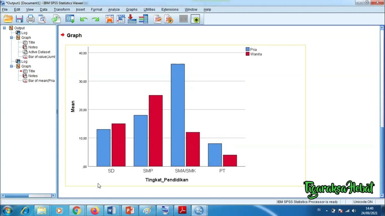
- 😀 A bar chart is a type of diagram that uses vertical or horizontal bars to represent data values.
- 😀 To create a bar chart, first convert the data into a table, then plot the data on a vertical or horizontal axis and choose an appropriate scale.
- 😀 A line graph is a diagram that uses straight lines to show data trends over time or other ordered variables.
- 😀 When creating a line graph, you need to arrange the axes, label the data points, and connect the points with straight lines.
- 😀 A pie chart is a circular diagram divided into sections, where each section represents a percentage or angle of the total data.
- 😀 The script emphasizes practicing through multiple-choice questions and reflections based on data visualizations like bar charts, line graphs, and pie charts.
Q & A
What is the main purpose of data presentation?
-The main purpose of data presentation is to make data easier to understand and interpret by the audience. It helps in transforming raw data into a more accessible and visually understandable format.
How can data be collected according to the video?
-Data can be collected through interviews, questionnaires, and direct observations. These methods allow for gathering data from primary sources, either through direct interaction or written responses.
What is a table in the context of data presentation?
-A table is a way to present data in rows and columns, which can be simple or more complex depending on the structure. It helps in organizing and displaying data systematically.
What are the different types of tables mentioned?
-The different types of tables mentioned are row-column tables, contingency tables (for multi-column data), and frequency distribution tables (which group data into several categories).
What is a bar chart and how is it used?
-A bar chart is a visual representation of data using vertical or horizontal bars. It is used to display and compare quantities across different categories. The height or length of the bar represents the frequency or value of the data.
What steps are involved in creating a bar chart?
-To create a bar chart, first convert the data into a table, then draw a vertical axis representing the frequency and a horizontal axis representing the data categories. After that, assign a scale to both axes and plot the bars accordingly.
What is a line graph and when is it used?
-A line graph is a diagram that uses a line to represent data trends over time. It is particularly useful for showing changes in data points over a sequence, allowing for easy tracking of fluctuations or trends.
What is a circle chart (pie chart), and how is it structured?
-A pie chart is a circular diagram divided into sectors, each representing a proportion of the whole. The sectors can be expressed as percentages or angles (degrees), with one full circle representing 100% or 360 degrees.
How do you calculate the number of students based on a pie chart?
-To calculate the number of students based on a pie chart, you can use the formula: (angle or percentage for the group) / 360 (total angle for the circle) * total number of students. This will give you the number of students in that category.
What is the correct answer to the first multiple-choice question based on the script?
-The correct answer to the first multiple-choice question is 'A. 20 students,' as shown in the graph that represents the number of students who chose Nadiva.
Outlines

This section is available to paid users only. Please upgrade to access this part.
Upgrade NowMindmap

This section is available to paid users only. Please upgrade to access this part.
Upgrade NowKeywords

This section is available to paid users only. Please upgrade to access this part.
Upgrade NowHighlights

This section is available to paid users only. Please upgrade to access this part.
Upgrade NowTranscripts

This section is available to paid users only. Please upgrade to access this part.
Upgrade NowBrowse More Related Video
Penyajian Data Statistik Menggunakan SPSS

Penyajian Data Kelas 7 - Menyajikan Data Dalam Tabel dan Diagram | Jenis Diagram | Statistika

Penyajian Data (Part-1) ~ Tabel dan Diagram (Materi PJJ Kelas VII / 7 SMP)

Video Pembelajaran Matematika Kelas 7 SMP ( Pengolahan Data )

[1] Penyajian Data (Tabel)
Statistika - Penyajian Data Eps.2 l Ruang Belajar #StudyWithDiida
5.0 / 5 (0 votes)