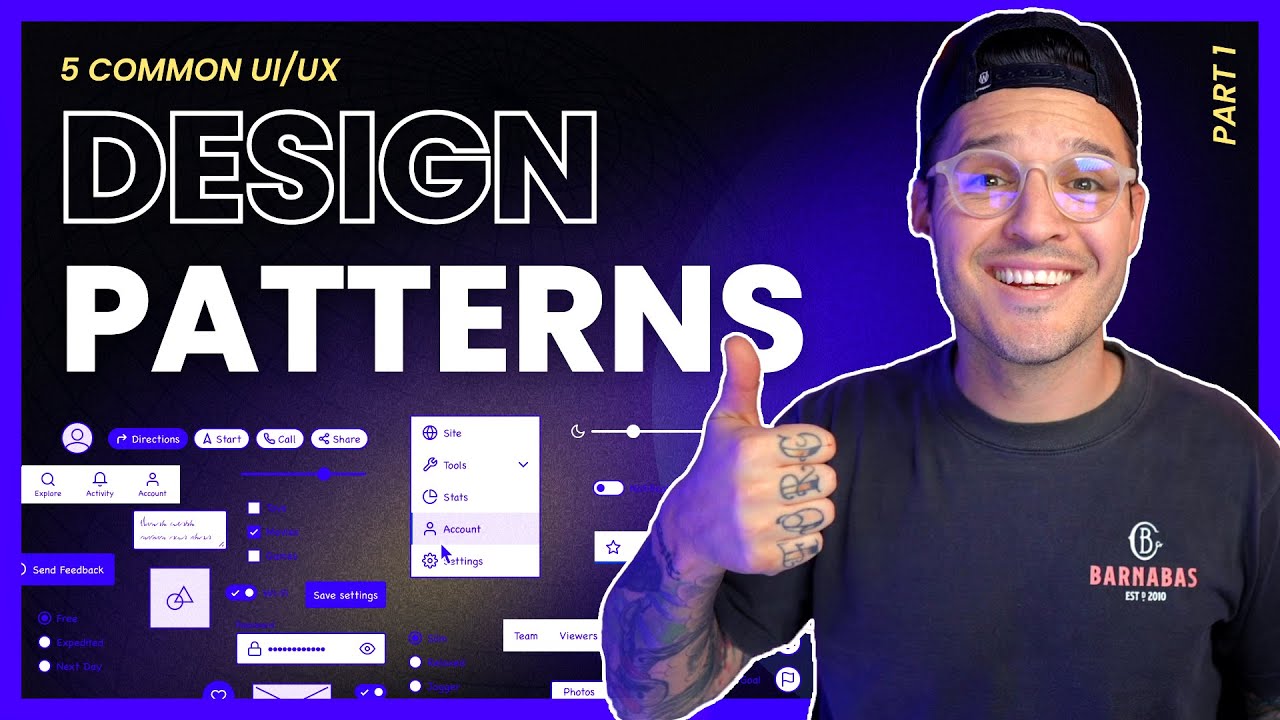
5 Common UI Design Patterns | Part 2
Summary
TLDRIn this video, the presenter introduces five essential design patterns every UI/UX designer should know. These include the carousel, pagination, input fields, chips (tags), and toggle switches. Each pattern is explained with its use cases, providing valuable insights for designing intuitive interfaces. From carousels that allow content navigation to toggle switches for user preferences, the video offers practical tips for improving user experience across both mobile and web applications. It's a must-watch for designers looking to enhance their design toolbox with time-tested techniques.
Takeaways
- 😀 Carousels are used to display multiple pieces of content (e.g., images or cards) and allow users to browse horizontally. They can be used in both mobile and web applications.
- 😀 In mobile interfaces, carousels are often made to overlap or be off-canvas to indicate that there's more content to swipe through.
- 😀 Pagination is a design pattern that organizes content into pages and allows users to navigate between them. Pagination is usually found at the bottom of interfaces and can include page numbers or navigation arrows.
- 😀 On mobile devices, pagination is often represented by dots that indicate the current page and active state as the user swipes through content.
- 😀 Input fields are a fundamental UI element used to collect user information, such as in sign-up forms, surveys, or checkout pages. They come with various states like active, inactive, error, and confirmation.
- 😀 Good design for input fields includes clear states for user interaction, such as highlighting active states or showing error messages when necessary.
- 😀 Chips (or tags) are used to label and categorize information, often to help users filter or find specific content. They can have different styles, including active, inactive, filled, or outlined states.
- 😀 Chips are commonly used in search or filtering interfaces, allowing users to refine results by selecting or deselecting options, such as in rental searches or product categories.
- 😀 Toggle switches provide an easy way to turn a setting on or off, commonly used in profile settings or modifying preferences within applications.
- 😀 Toggle switches can be customized with various designs and animations, but even simple on/off switches are effective for user interaction. They can vary in shape, color, and the addition of icons.
Q & A
What is a UI carousel, and how is it used in web or mobile design?
-A UI carousel is a design pattern that allows users to browse through multiple pieces of content, such as images or cards, typically linked to other content within a website or app. On mobile, carousels are often implemented as overlapping or off-canvas elements to signal that there’s additional content to swipe through. On websites, carousels display multiple images that can be clicked or tapped on to reveal more content.
How does pagination function in UI/UX design?
-Pagination organizes content into separate pages, making it easier for users to navigate through large sets of information. It is often found at the bottom of an interface with clickable page numbers, arrows for navigation, and sometimes shortcuts like 'first' and 'last' to jump between pages. In mobile designs, pagination can be represented by dots, where the active dot shows the user’s current position within the content.
What are input fields, and where are they commonly used?
-Input fields are areas in a UI where users can enter data or information to complete a process. Common use cases include contact forms, checkout pages, and surveys. Input fields can have various states, such as active, inactive, error, and confirmation states, and they are typically styled to match the design of the website or app.
What are chips (or tags) in UI design, and how are they used?
-Chips, also called tags, are small elements used to categorize or filter information. They often contain keywords or labels that help users narrow down search results or select specific options. Chips can have different states, such as active, inactive, outlined, or filled, and are commonly used in applications for filtering content based on criteria, like location or price.
What is the purpose of a toggle switch in UI/UX design?
-A toggle switch allows users to turn something on or off, similar to a physical light switch. It’s commonly used in profile settings or to modify preferences within an app or website. Toggle switches can be customized with different shapes, icons, and animations, although a simple design is often sufficient for most cases.
How can carousel designs be adapted for mobile devices?
-For mobile devices, carousels are often designed to be overlapping or off-canvas, allowing users to swipe horizontally to view additional content. This ensures that users understand there is more to interact with and creates a more fluid, mobile-friendly experience.
In what contexts are pagination designs most useful?
-Pagination is most useful in situations where content is spread across multiple pages, such as search results, product listings, or article series. It helps break down large chunks of information into manageable segments, allowing users to navigate efficiently through the content.
What are some visual states that input fields can have?
-Input fields can have several visual states, including active (when the user is typing), inactive (when the field is not selected), error (indicating an issue with the input), and confirmation (showing that the input is correct). These states help guide users by providing feedback on their actions.
How do chips enhance the user experience in filtering content?
-Chips enhance the user experience by providing an intuitive way to filter and categorize content. They are visually distinct, which makes them easy to interact with, and they can help users refine their choices, such as selecting a specific location or price range. Chips improve efficiency by allowing users to quickly find and select relevant options.
Why are toggle switches considered an essential design pattern in UI/UX?
-Toggle switches are essential because they provide a simple, visual way for users to modify settings or preferences. Their on/off functionality is easy to understand, and their versatility makes them useful for a variety of applications, from settings menus to turning features on or off in a website or app.
Outlines

このセクションは有料ユーザー限定です。 アクセスするには、アップグレードをお願いします。
今すぐアップグレードMindmap

このセクションは有料ユーザー限定です。 アクセスするには、アップグレードをお願いします。
今すぐアップグレードKeywords

このセクションは有料ユーザー限定です。 アクセスするには、アップグレードをお願いします。
今すぐアップグレードHighlights

このセクションは有料ユーザー限定です。 アクセスするには、アップグレードをお願いします。
今すぐアップグレードTranscripts

このセクションは有料ユーザー限定です。 アクセスするには、アップグレードをお願いします。
今すぐアップグレード5.0 / 5 (0 votes)


