How To Make Box and Whisker Plots
Summary
TLDRThis instructional video explains how to create box and whisker plots by identifying five key data points: minimum, maximum, and the three quartiles. It demonstrates the process of arranging data, calculating quartiles, determining the median, and plotting the data on a number line. The video also covers how to identify and handle outliers, ensuring they are represented correctly in the final plot. The tutorial includes step-by-step examples to guide viewers through the process, making it accessible for those learning statistical data visualization.
Takeaways
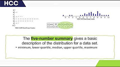
- 📊 To create a box and whisker plot, you need to identify five key data points: the minimum, maximum, and the first, second, and third quartiles.
- 🔢 The first step is to arrange the data set in ascending order to facilitate the calculation of quartiles.
- 🏁 The median, or the second quartile (Q2), is the middle value of the data set when it is ordered.
- 📈 To find the first quartile (Q1), calculate the median of the lower half of the data set, excluding the overall median.
- 📉 Similarly, the third quartile (Q3) is the median of the upper half of the data set, excluding the overall median.
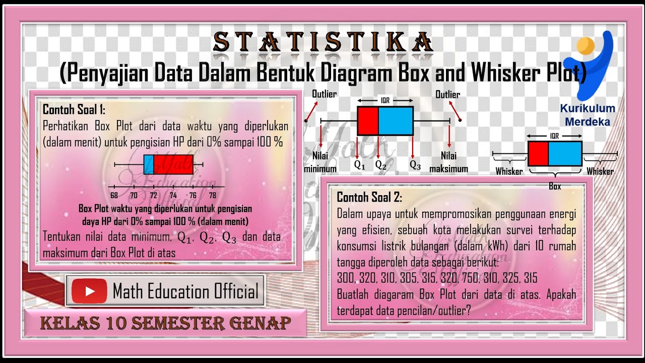
- 🚫 Outliers are values that fall outside the range of Q1 - 1.5*IQR to Q3 + 1.5*IQR, where IQR is the Interquartile Range (Q3 - Q1).
- 📉 The process of identifying outliers ensures that extreme values do not skew the representation of the data in the box and whisker plot.
- 📝 The box in the box and whisker plot represents the interquartile range, with a line at the median (Q2).
- 📊 Whiskers in the plot extend from the box to the minimum and maximum values that are not considered outliers.
- 📈 The box and whisker plot provides a visual summary of the data's distribution, including its spread and skewness.
- ⚠️ Outliers are plotted separately on the box and whisker plot to highlight their deviation from the rest of the data.
Q & A
What are the five key data points needed to create a box and whisker plot?
-The five key data points needed are the minimum value, the maximum value, and the three quartiles: the first quartile (Q1), the second quartile (Q2, also known as the median), and the third quartile (Q3).
How do you arrange the data set before finding the quartiles?
-You arrange the data set in ascending order before finding the quartiles.
What is the second quartile (Q2) in the context of a box and whisker plot?
-The second quartile (Q2) is the median of the entire data set, which divides the data into two equal halves.
How do you calculate the first quartile (Q1)?
-To calculate Q1, you find the median of the lower half of the data set after removing the overall median (Q2).
How do you calculate the third quartile (Q3)?
-To calculate Q3, you find the median of the upper half of the data set after removing the overall median (Q2).
What is the interquartile range (IQR) and how is it calculated?
-The interquartile range (IQR) is the difference between the third quartile (Q3) and the first quartile (Q1), calculated as Q3 - Q1.
How do you determine the range for identifying outliers in a box and whisker plot?
-The range for identifying outliers is determined by Q1 - 1.5 * IQR and Q3 + 1.5 * IQR. Any data point outside this range is considered an outlier.
What is the purpose of identifying outliers in the data set when creating a box and whisker plot?
-Identifying outliers is important because they are typically not included within the box of the box and whisker plot and are plotted separately to avoid distorting the visualization of the main data distribution.
How do you plot the minimum and maximum values in a box and whisker plot?
-The minimum value (not an outlier) is plotted at the bottom of the whisker, and the maximum value (not an outlier) is plotted at the top of the whisker.
What does the box in a box and whisker plot represent?
-The box represents the interquartile range (IQR) of the data, with the bottom of the box at Q1, the top at Q3, and a line at the median (Q2).
How do you show an outlier on a box and whisker plot?
-An outlier is shown as a separate point or points outside the whiskers of the box plot, typically plotted as individual dots or markers.
Outlines

このセクションは有料ユーザー限定です。 アクセスするには、アップグレードをお願いします。
今すぐアップグレードMindmap

このセクションは有料ユーザー限定です。 アクセスするには、アップグレードをお願いします。
今すぐアップグレードKeywords

このセクションは有料ユーザー限定です。 アクセスするには、アップグレードをお願いします。
今すぐアップグレードHighlights

このセクションは有料ユーザー限定です。 アクセスするには、アップグレードをお願いします。
今すぐアップグレードTranscripts

このセクションは有料ユーザー限定です。 アクセスするには、アップグレードをお願いします。
今すぐアップグレード5.0 / 5 (0 votes)


