Beginning Graphic Design: Fundamentals
Summary
TLDRLes bases du design sont essentielles pour créer des visuels percutants, qu'il s'agisse de l'art, du design web ou de la typographie. Elles comprennent des éléments clés comme la ligne, la forme, la texture et l'équilibre, qui, combinés, donnent vie à des compositions visuelles. En comprenant ces principes, même les débutants peuvent créer des compositions harmonieuses. L'équilibre visuel, les formes en 3D, et l'ajout de texture permettent de donner profondeur et réalisme. Ce guide explore comment ces éléments fondamentaux peuvent transformer des conceptions simples en œuvres engageantes.
Takeaways
- 😀 Les bases du design, telles que la ligne, la forme, la texture et l'équilibre, sont des éléments fondamentaux qui se retrouvent dans presque tous les médias visuels.
- 😀 Une ligne est une forme qui relie deux points ou plus, et ses caractéristiques (épaisseur, couleur, texture, style) influencent la perception du design.
- 😀 Les formes peuvent être géométriques ou organiques, et sont essentielles pour donner de la reconnaissance visuelle aux idées et aider à organiser les éléments d'un design.
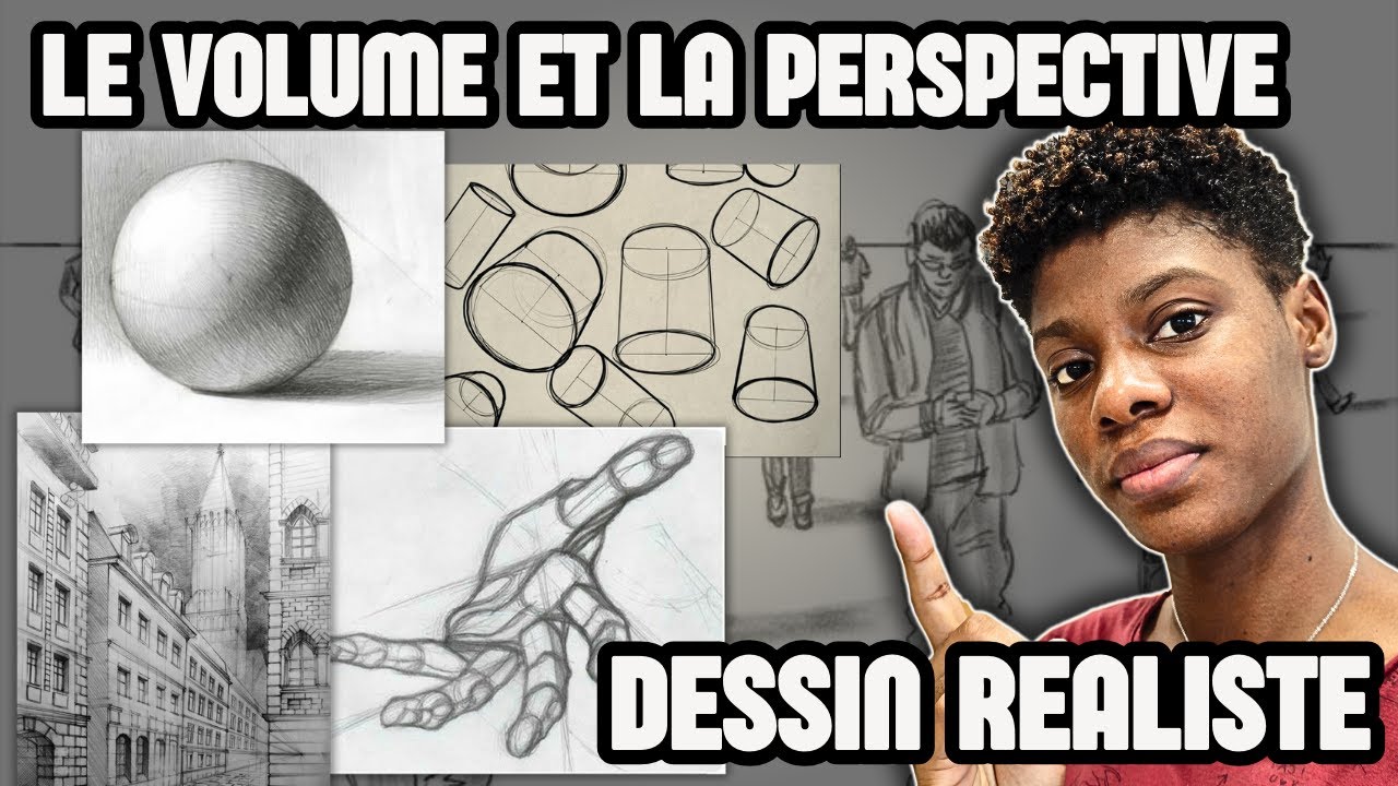
- 😀 Une forme devient un volume lorsqu'elle est tridimensionnelle. Les formes 3D peuvent être réelles ou créées par des techniques comme l'ombre et la perspective.
- 😀 La texture ajoute de la profondeur et de la tactilité à un design, et bien qu'elle puisse être réaliste ou suggérée, il faut éviter d'en abuser pour ne pas surcharger la composition.
- 😀 L'équilibre visuel est l'égalisation du poids visuel dans une composition. Il est influencé par des éléments comme la taille, la couleur et l'espace négatif.
- 😀 L'équilibre symétrique se caractérise par des éléments identiques de part et d'autre d'un axe, tandis que l'équilibre asymétrique repose sur des éléments différents mais bien répartis.
- 😀 La règle des tiers est une technique de composition où l'image est divisée en une grille 3x3 et les éléments clés sont placés près des lignes de la grille pour créer un équilibre naturel.
- 😀 Les bases du design sont essentielles non seulement pour créer des visuels attrayants, mais aussi pour mieux comprendre et apprécier les designs des autres.
- 😀 L'application de ces principes fondamentaux dans différents projets, qu'il s'agisse de graphiques ou d'améliorations simples, peut grandement améliorer la qualité du design.
Q & A
Quels sont les éléments fondamentaux du design mentionnés dans le script ?
-Les éléments fondamentaux du design comprennent la ligne, la forme, la texture, et l'équilibre. Ces éléments sont essentiels dans presque toutes les compositions visuelles.
Pourquoi les éléments de design de base peuvent-ils être intimidants pour certains ?
-Les éléments de design de base peuvent sembler intimidants, surtout pour ceux qui ne se considèrent pas comme des artistes, mais ils offrent des enseignements précieux sur la création de visuels simples à partir de rien.
Qu'est-ce qu'une ligne en design et quels sont ses effets dans une composition ?
-Une ligne est une forme qui relie deux ou plusieurs points. Elle peut avoir différentes épaisseurs, textures et styles, et peut être utilisée pour ajouter de l'accent, diviser ou organiser du contenu, ou encore guider l'œil du spectateur.
Quels sont les deux types de formes en design et comment sont-ils utilisés ?
-Les formes se divisent en deux catégories : géométriques (ou régulières) et organiques (plus libres). Elles sont utilisées pour communiquer des idées visuellement, créer des illustrations simples, ou organiser du contenu.
Qu'est-ce qu'une forme en design 3D et comment la percevons-nous dans un design 2D ?
-Une forme est une figure tridimensionnelle. Dans un design 2D, la forme peut être suggérée par des techniques comme l'ombre, la lumière et la perspective, créant l'illusion de profondeur et de réalisme.
Comment la texture améliore-t-elle un design ?
-La texture ajoute de la profondeur et de la tactilité aux images autrement plates. Elle peut être réelle ou simplement suggérée, et elle permet d'apporter de l'intérêt visuel en modifiant la perception des surfaces.
Pourquoi faut-il faire attention à l'utilisation de la texture dans un design ?
-Il est important de ne pas en abuser, car trop de texture dans un seul design peut devenir accablant et nuire à la lisibilité ou à l'équilibre visuel.
Comment l'équilibre est-il défini en design et quels éléments l'influencent ?
-L'équilibre en design fait référence à la distribution égale du poids visuel dans une composition. Il peut être influencé par la taille, la couleur, le nombre d'éléments, et l'espace négatif.
Qu'est-ce que la symétrie et comment contribue-t-elle à l'équilibre visuel ?
-La symétrie consiste en une composition où les deux côtés sont identiques ou très similaires. Elle crée un sentiment d'équilibre en raison de la répartition égale des éléments de chaque côté.
Quelle est la règle des tiers et pourquoi est-elle efficace en design ?
-La règle des tiers consiste à diviser une image en une grille 3x3 et à placer les points focaux près des lignes ou intersections de cette grille. Elle est efficace car elle suit le parcours naturel de l'œil humain, ce qui rend la composition plus agréable.
Quel est l'objectif général des fondamentaux du design ?
-L'objectif des fondamentaux du design est d'enseigner à apprécier les petites mais importantes étapes de la création visuelle, afin d'améliorer les projets graphiques, qu'il s'agisse de création ou d'amélioration d'éléments existants.
Outlines

Cette section est réservée aux utilisateurs payants. Améliorez votre compte pour accéder à cette section.
Améliorer maintenantMindmap

Cette section est réservée aux utilisateurs payants. Améliorez votre compte pour accéder à cette section.
Améliorer maintenantKeywords

Cette section est réservée aux utilisateurs payants. Améliorez votre compte pour accéder à cette section.
Améliorer maintenantHighlights

Cette section est réservée aux utilisateurs payants. Améliorez votre compte pour accéder à cette section.
Améliorer maintenantTranscripts

Cette section est réservée aux utilisateurs payants. Améliorez votre compte pour accéder à cette section.
Améliorer maintenantVoir Plus de Vidéos Connexes

"Giải bí" ý tưởng khi thiết kế với 01 Typeface | Nền Tảng Graphic Design Tập 15

3-4 Technologies Web

I Wish I Knew These Graphic Design Rules SOONER!!

Employer Perspective on Resumes
Le volume et la perspective | Les bases du dessin réaliste

The ONLY Video On Visual Hierarchy ANY Graphic Designer Needs

Déclarer un festival - L'instant Pro (spécial Avignon) #18
5.0 / 5 (0 votes)