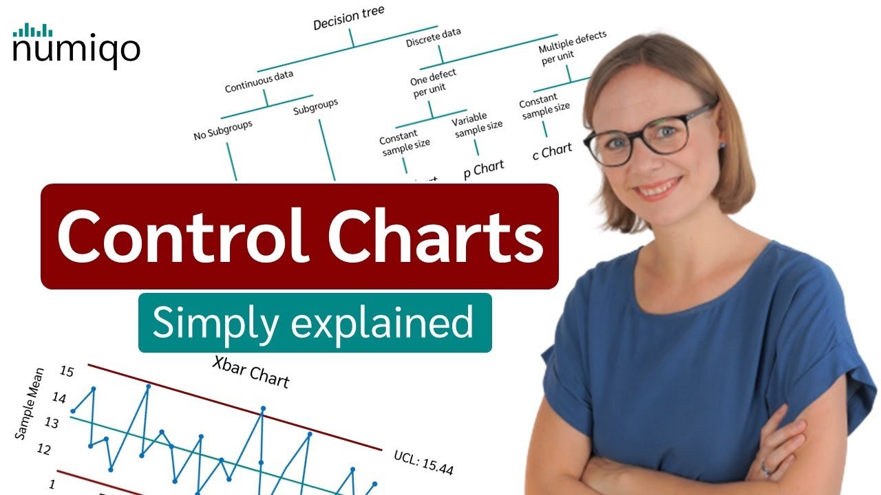
Statistical Process Control (SPC) in Quality Management + How to create Control Charts
Summary
TLDRThis video provides an insightful overview of quality control metrics and charts used in statistical process control. It highlights the significance of understanding continuous and discrete metrics, focusing on tools like X-bar charts and R charts for tracking mean shifts and dispersion. Additionally, it discusses P charts and C charts for monitoring defect rates and counts, respectively. Through practical examples, the video emphasizes the importance of these charts in detecting process variations, ensuring consistent quality, and facilitating data-driven decision-making in various fields. Overall, it serves as a valuable resource for those looking to enhance their understanding of process control techniques.
Takeaways
- 😀 Quality Management focuses on consistently meeting customer requirements and improving processes.
- 📊 Statistical Process Control (SPC) helps monitor and manage quality through data collection and analysis.
- 🔍 Control charts are essential tools for tracking process performance and identifying variations.
- 📈 Continuous metrics like X-bar charts detect shifts in the mean of a process over time.
- 📉 Range charts assess the dispersion of data, helping to understand variability in processes.
- 🔢 Discrete metrics use P charts for monitoring the proportion of defectives and C charts for counting defects.
- 👥 Employee involvement in quality management is crucial for early detection and resolution of errors.
- 🔗 Supplier management plays a vital role in ensuring that incoming materials meet quality standards.
- ⚙️ Effective quality control reduces costs by identifying errors early, aligning with the '1-10-100 Rule.'
- 🛠️ Future videos will delve into practical applications of control charts for continuous and discrete metrics.
Q & A
What is the primary focus of the video series?
-The primary focus is on understanding different types of charts used for monitoring metrics in a process, specifically continuous and discrete metrics.
What is a mean chart or X-bar chart used for?
-A mean chart or X-bar chart is used to detect shifts in the mean of a process, indicating whether the average performance is improving or deteriorating.
How does the speaker illustrate the concept of a shift in the mean?
-The speaker illustrates the concept by comparing scores from two exams, noting that the average scores decline from Exam Number One to Exam Number Two, indicating a shift in the mean.
What does a range chart measure?
-A range chart measures the dispersion of data points, helping to determine if values are becoming more variable, whether they are increasing or decreasing.
What are discrete metrics, and how do they differ from continuous metrics?
-Discrete metrics are counts of items, such as the number of defects or defectives, whereas continuous metrics measure data that can take any value within a range, like averages and ranges.
What is a P chart, and when is it used?
-A P chart is used for monitoring the fraction of defective items in a process and is applicable when dealing with discrete metrics.
What type of data does a C chart track?
-A C chart tracks the count of defects in a process, providing insights into the number of nonconformities per unit.
What will the next video in the series cover?
-The next video will cover continuous metrics, specifically how to create an X-bar chart and an R chart.
Why is it important to analyze shifts in means and dispersion?
-Analyzing shifts in means and dispersion is crucial for maintaining quality control in processes, as it helps identify potential issues early and allows for corrective actions to be taken.
How can the insights gained from these charts improve a process?
-The insights from these charts can lead to better understanding of process variations, enable data-driven decisions, and ultimately enhance the overall quality and efficiency of the process.
Outlines

Cette section est réservée aux utilisateurs payants. Améliorez votre compte pour accéder à cette section.
Améliorer maintenantMindmap

Cette section est réservée aux utilisateurs payants. Améliorez votre compte pour accéder à cette section.
Améliorer maintenantKeywords

Cette section est réservée aux utilisateurs payants. Améliorez votre compte pour accéder à cette section.
Améliorer maintenantHighlights

Cette section est réservée aux utilisateurs payants. Améliorez votre compte pour accéder à cette section.
Améliorer maintenantTranscripts

Cette section est réservée aux utilisateurs payants. Améliorez votre compte pour accéder à cette section.
Améliorer maintenantVoir Plus de Vidéos Connexes

Cartas de Controle (Aula 01) - Introdução ao Gráfico X-Barra / R

Controle Estatístico de Processo – Aula 03 – Controle Estatístico da Qualidade

Control Charts simply explained - Statistical process control - Xbar-R Chart, I-MR Chart,...

Audit Snapshot: Quality Management Standards

Pertemuan 7. Pengendalian Kualitas _ Control Chart (Peta Kendali)

CEP Controle Estatístico de Processo, conceitos de controles aula 1
5.0 / 5 (0 votes)
