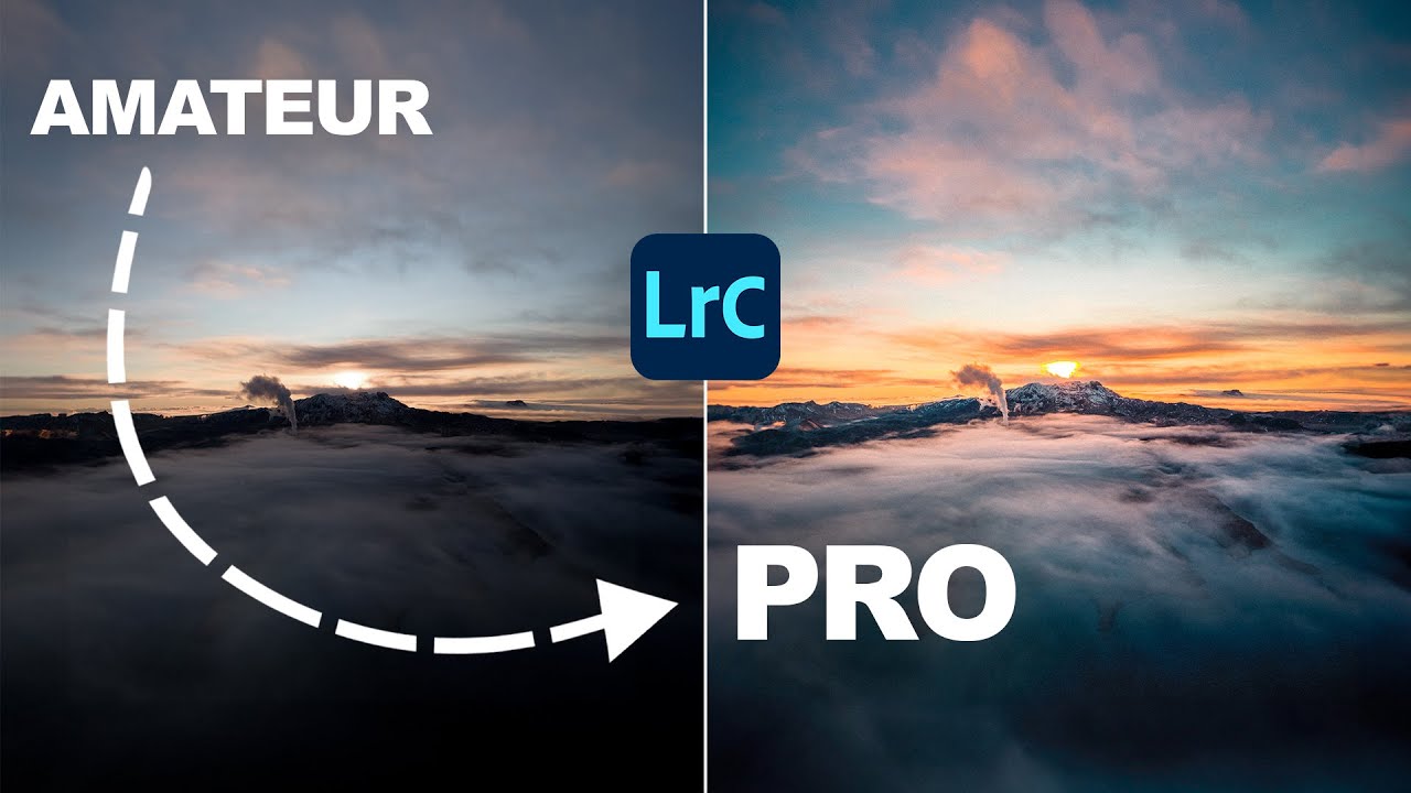
EDIT PHOTOS Like a Pro // Complete LIGHTROOM Tutorial
Summary
TLDRIn this video, the host guides viewers through a comprehensive Lightroom photo editing tutorial, emphasizing the importance of starting with a well-lit photo. They discuss the significance of the golden hour and demonstrate initial adjustments like exposure and white balance. The tutorial then delves into more advanced techniques, including the use of masks, curves, HSL adjustments, and color grading. The host shares personal workflow tips, like adjusting curves last for color accuracy, and offers insights on sharpening and lens corrections. The video concludes with a call to action for a potential group photography meet-up, inviting viewers to engage further with the community.
Takeaways
- đž **Start with a Good Photo**: Every good edit begins with a high-quality photo, emphasizing the importance of good lighting and composition.
- đŒïž **Library Tab**: The Library tab in Lightroom is where you browse and select photos for editing, acting as the starting point for the workflow.
- â±ïž **Efficiency Improvements**: The video discusses changes in the editing workflow aimed at making the process faster and more efficient.
- đ **Golden Hour**: The video uses a photo taken during the golden hour after sunrise to demonstrate editing techniques, highlighting the quality of light during this time.
- đš **Exposure and White Balance**: Initial adjustments in editing involve exposure and white balance to correct the photo and set the tone for further edits.
- đ€ **Subject Selection**: The video shows how to use the 'Select Subject' feature to quickly isolate and adjust the subject within a photo.
- đïž **Masking and Adjustments**: Masking is emphasized as a crucial step to control lighting and tones, with detailed instructions on how to use brushes and gradients for local adjustments.
- đ **Color Grading**: The script covers color grading techniques, including the use of tone curves and HSL adjustments to enhance and creatively interpret the photo's colors.
- đ **Detail Enhancement**: Clarity, texture, and dehaze adjustments are discussed as a way to fine-tune the photo's details and overall look.
- đ **Histogram Utilization**: The video explains how to use the histogram as a guide for making exposure and white balance adjustments to achieve a balanced image.
Q & A
What is the main focus of the video?
-The main focus of the video is to provide a step-by-step guide on photo editing in Lightroom, emphasizing a more efficient workflow and sharing tips for editing photos more effectively.
Why does the video suggest starting with exposure and white balance adjustments?
-The video suggests starting with exposure and white balance adjustments because these are fundamental steps that set the tone for the rest of the edit, ensuring the photo has a proper balance of light and color before moving on to more detailed adjustments.
What is the significance of the golden hour in photography as mentioned in the video?
-The golden hour is significant in photography because it refers to the soft, warm light that occurs shortly after sunrise or before sunset, which can enhance the colors and textures in a photo, making it ideal for capturing stunning images.
How does the video suggest using the 'Select Subject' feature in Lightroom?
-The video suggests using the 'Select Subject' feature in Lightroom to quickly select a subject in the photo, which can then be refined with a brush tool to accurately mask the subject for localized adjustments without affecting other areas of the photo.
What is the purpose of adjusting shadows and highlights in the video's editing process?
-Adjusting shadows and highlights in the editing process is to bring out more detail in the darker and lighter areas of the photo, respectively, creating a more balanced and dynamic image with a better range of tones.
Why does the video recommend testing presets even if they're not going to be used?
-Testing presets, even if not used, is recommended to give the editor an idea of the different styles and looks that can be achieved, which can inspire or guide their own manual adjustments.
How does the video approach the use of texture and dehaze sliders in Lightroom?
-The video suggests using the texture slider to enhance fine-grained details and the dehaze slider to either remove haze for a clearer look or to add a flat look to the photo, depending on the desired outcome.
What is the significance of the Curves adjustment in the video's editing workflow?
-Curves adjustment is significant as it allows for fine-tuning of the tonal range and contrast in the photo. The video suggests doing this at the end after other adjustments to ensure the most accurate and impactful changes.
Why does the video advise against using white balance for overall color cast adjustments?
-The video advises against using white balance for overall color cast adjustments because white balance is designed to ensure accurate and neutral color representation. Instead, for color grading, the video recommends using the color grading tools in Lightroom, which allow for more creative control over the color temperature and tint.
How does the video suggest using the HSL panel in Lightroom?
-The video suggests using the HSL panel to make specific color adjustments, such as making blues more prominent or adjusting the hue of specific colors in the photo, which allows for a more nuanced and targeted color grading process.
Outlines
đž Lightroom Editing Basics and Workflow
The paragraph introduces a video tutorial focused on the fundamentals of photo editing in Lightroom, emphasizing a streamlined workflow for efficient editing. The speaker shares personal experiences and tips for enhancing photos, starting from selecting a good photo to making initial adjustments like exposure and white balance. The importance of good lighting and the composition elements in the photo are discussed, along with the speaker's preference for making exposure and white balance adjustments first. The video also hints at the use of presets for a quicker editing process and the speaker's personal presets for achieving specific looks.
đš Advanced Lightroom Techniques and Personal Touches
This section delves into more advanced editing techniques in Lightroom, starting with the speaker's recent shift to masking before levels and HSL adjustments. The focus is on perfecting lighting and tones to ensure colors blend well in subsequent steps. The use of 'select subject' and 'subtract' tools for precise masking is highlighted, along with the speaker's approach to adjusting shadows, highlights, and the use of brushes for localized edits. The paragraph also covers personal taste adjustments like clarity, texture, dehaze, vibrance, and saturation, with the speaker sharing their preferences and the rationale behind them.
đ Creative Color Grading and Curves Adjustments
The speaker discusses the creative aspect of color grading in Lightroom, starting with the use of tone curves for adding warmth or contrast. The paragraph explains the hierarchy of adjustments in Lightroom and the impact of curves on color and brightness. The speaker demonstrates how to use the picker tool for precise color adjustments and the importance of being cautious with luminance to avoid banding. The focus is on enhancing specific colors and creating a harmonious look that fits the overall theme of the photo, with tips on how to adjust color casts and achieve a desired mood.
đïž Fine-Tuning and Final Touches in Lightroom
The final paragraph covers the last stages of photo editing, including sharpening, lens corrections, and creative mask adjustments. The speaker explains the use of the detail tab for sharpening specific areas of the photo and the lens correction profile for removing distortion and vignetting. The paragraph also touches on the creative use of gradients and brushes to adjust specific parts of the photo, such as darkening the foreground or enhancing the sun's effect. The speaker concludes with a personal anecdote about enhancing the color of their signature sunglasses and invites viewers to participate in a potential group meet-up for photography enthusiasts.
Mindmap
Keywords
đĄLightroom
đĄEditing Workflow
đĄHistogram
đĄPresets
đĄMasks
đĄClarity and Dehaze
đĄVibrance and Saturation
đĄCurves
đĄHSL
đĄColor Grading
đĄDetail
Highlights
Introduction to start-to-finish editing in Lightroom, highlighting changes in workflow to make editing faster and more efficient.
The importance of starting with a good photo; explaining the benefits of shooting during the golden hour, especially during sunrise for dramatic lighting effects.
Basic editing workflow: Begin with exposure and white balance adjustments, emphasizing how to use the histogram to maintain correct skin tones.
Discussion of Auto White Balance and tips on adjusting temperature settings, such as warming up to match daylight conditions.
The role of Lightroom presets in editing; testing presets even if not used to get ideas for the edit, and mentioning custom presets available for purchase.
New approach to masking: Performing masking first to adjust lighting and tones before color adjustments, using AI tools and manual adjustments for intricate areas.
Using tools like texture, clarity, and dehaze creatively to fine-tune photo details and overall look, including the impact of reducing clarity to soften photos.
Detailed color grading steps: Adjusting individual color channels using tone curves, starting with red and blue channels to add warmth and contrast.
Utilizing HSL sliders to make specific adjustments to hue, saturation, and luminance, and the effect of these changes on fine details like jackets or backgrounds.
The importance of performing curves adjustments last due to Lightroomâs hierarchy, ensuring fine-grained tweaks in HSL are preserved.
Tips on using masking techniques such as linear and radial gradients to creatively enhance light and focus in specific areas of the photo.
In-depth explanation of sharpening techniques, using masking tools to control what areas are sharpened, highlighting how to visualize and adjust these effects.
Recommendations for lens corrections and the impacts of chromatic aberration and vignetting, particularly advising against some corrections in low-light conditions.
Final touch-ups: Adding color casts creatively with color grading instead of adjusting white balance, ensuring the photo maintains balanced colors.
Discussing the practical aspects of cropping, using virtual copies for different platform-specific crops without altering the original edits.
Invitation to followers for potential group meetups with other photographers, highlighting the idea of community learning and collaboration during photo trips.
Transcripts
forget everything you know about editing
in Lightroom because in this video we're
going back to the basics of start to
finish editing inside of Lightroom even
if you've seen some of my past videos
there are some things that have changed
in my workflow that have made it a
little bit faster to edit and there are
little bits of tidbits of iteration that
I want to share with you to help you
edit more efficiently now every good
edit begins with a good photo jumping
into Lightroom this is the library tab
this is typically where you're going to
browse through all of your photos now
I've made this quick collection of the
already edited photo that you've
probably seen in the thumbnail but if I
grab this red version which is the
unedited version and I open it up you'll
remember last month I was in Utah and
Arizona and if you check out this video
here you can actually see the story
behind us capturing this photo we were
with our friend Mike we actually stayed
up all night to do some astrophotography
and this was right after Sunrise so we
had that awesome golden is it Sunrise I
guess Sunrise is golden hour typically
we think of golden hour at Sunset but
essentially we got that good light which
you can see is hitting the sides of the
Rock from the left so the sunrise is on
the left hand side of the frame it's
kind of giving me this Edge and allowing
me to pop off the background now there
are some other things inside this photo
that makes it great one we have this
foreground element we have this rock
there we have a mid-ground element this
other Rock and then of course myself
standing in as the subject and then we
have this out of focus background this
Canyon wall of Zion National Park and
actually I think we have a we have a
impersonator a photo bomber down at the
corner which I didn't notice but we'll
fix that as well with all my photos I
like to jump in and do exposure and
white balance adjustments right away now
if you look at the histogram a lot of
the tone a lot of the info information
is in the shadows or on the left hand
side of the histogram now you can adjust
this really easily you can see my mouse
is changing just by dragging over the
histogram if I drag the middle portion
it actually adjusts the exposure now one
thing you want to be careful of is skin
tone so if I was to drag this and say oh
let's just bump it all the way that's
going to make the photo looked washed
out in the skin tone so if I hold my
mouse over you can see in the histogram
it's saying it's basically 100 there's
there's no information there it's fully
clipped it's fully white I'm going to
bring that back just a little bit I'm
pretty sure I shot most of this in Auto
white balance actually will shot this
photo of me I first shot one of him and
then we traded places I gave him my
camera and I'm actually holding his
camera in this photo which is typically
what we do so that when we're done
shooting we each have our own photos of
ourselves I'm actually gonna warm it up
I think probably closer to Daylight like
50 500 Kelvin I think I'm actually going
to drag the exposure back down a little
bit and actually bump the Shadows it
really just depends whether you want
your photo to be kind of like a like a
high key really bright photo or like a
low-key Moody photo at this point if you
have presets this is usually where I
like to test them even if you're not
going to use them it's just good to give
you an idea of what's available and
Lightroom of course has built-in presets
I also have my division one presets
which I'll typically in this case go for
something that's a little bit warmer
like Amber road is a good option Cold
Island is one that pulls out a lot of
Blues in the shadow Dark Earth gives you
that kind of like flat matte black look
but really any of these will give you a
good idea of what's possible with your
edit now in this case we're going to do
it completely from scratch but if you
are someone who wants to save a little
bit of time you can find my presets
linked down in the description below in
the past last my next step would have
been to jump into levels and hsl
adjustment but recently I've been doing
my masking first now the reason for that
is because we really want to nail all of
our lighting and all of our tones so
that when we move into that next step
all the colors are going to blend
exactly where we want them to so if
something's a little bit too bright we
want to bring that down like in the case
of where my face is a little bit bright
so I'm actually going to say select
subject and it's kind of over selected
which I do find the AI is is not the
greatest at but then we can go in and
say subtract and use something like a
brush to brush out all those extra areas
when you get to areas that are a little
bit more intricate you can turn on auto
masking and that will help you find the
edges of objects so you don't
accidentally brush out something that
you meant to keep what I'm going to do
is raise the shadows and you can see
that starts to pull more detail out of
the darker areas of my jacket but then
also drop the highlights and it does a
pretty good job but I still have a hot
spot on my face so I'm going to add one
more brush where I'm just going to brush
my face and then I'm going to lower the
highlights just on that area
foreign
my mouse over that and look back at the
histogram you can see it's sitting in
the 70 to 80 percent brightness range
which is going to work better for
editing these skin tones texture Clarity
and dehaze is going to be a little bit
of a personal taste in my case I do find
digital photos tend to be a little bit
sharper than they need to be so I'll
usually drop the clarity and you can
kind of see it just has this effect of
softening the photos if you go the other
way it starts to give the photo this
like fake HDR looks I'm actually going
to drop the clarity texture is one of
those adjustments that depends on your
photo if you have a lot of fine-grained
details sometimes you might want to bump
it up by raising the texture in this
case one way or the other doesn't really
affect my photo so I'm gonna leave it at
zero now dehaze is one of those things
if you have Haze in your photo it can
help cut it out or if you want to add
some in like if I drop the dehaze it
kind of gives the photo this flat look
but if you want a more detailed
breakdown of how these three functions
these tools work you can check out this
video here Vibrance and saturation is a
personal taste Vibrance tends to leave
skin tones alone and just adjusts the
blues and the greens like in this case
when I drag the Vibrance you can see how
my jacket starts to get saturated
whereas saturation will saturate
everything now Raw photos tend to be a
little bit desaturated straight out of
camera so while I don't go crazy with
the saturation usually I'm anywhere
between 10 and 15 positive on my
saturation if you're enjoying this so
far go ahead let me know down below
what's a Lightroom tool that you want to
know a little bit more about like what
Lightroom tool should I do a deep dive
into and if you see someone's already
commented go ahead and thumbs it up and
whatever comment gets the most thumbs up
I'll go ahead and make a dedicated video
on tip this is where I would jump to
Curves now one thing I've started doing
differently is actually doing curves
adjustments at the very end now the way
lightroom's hierarchy works if you
remember in a previous video I talked
about the calibration panel which is all
the way down at the bottom but even
though it's all the way down at the
bottom it's actually the first thing
that gets applied to your photo and if
you want to know more about that check
out this video here now curves is
similar in the sense that even though
it's in the middle of the panel you
would think you know follow the panel
down and everything's applied in that
order but as far as my understanding
goes curves is actually applied after
your hsl your color adjustments which
can make it a little bit tricky if you
do your curves adjustments first because
it can really throw off those hsl those
like really fine grain tweaks that you
want to make in The Next Step but for
the sake of moving this tutorial along
I'm actually going to grab this little
picker here which allows you to select
areas on your image and make fine
detailed adjustments so I'm actually
going to pin the area of my skin tones
because I don't want those being
adjusted so I'm going to click and then
some of these areas in the background
where maybe I want them to be a little
bit darker I'm going to click and drag
down that's maybe a bit too dark so I'm
going to grab some of these mid tones
manually and just raise them up and then
I'm actually going to flatten out my
highlights now the way you do that is by
grabbing this top point and what you'll
notice it's it's really really minor but
some of those areas like in the Rocks
here where we have those really bright
areas it will just flatten them out a
bit and you can even do the same thing
to the Shadows like if you wanted that
flat black matte look if you grab this
point and drag it up and you start to
create this like little shelf here
you'll get that flat black matte look
but I'm going to do that because I think
it's a little bit too much for this
photo I'm gonna skip the RGB tone curves
and come back to that later for now
we're going to jump down to the hsl
color q and saturation adjustments same
thing as before if you're not sure where
to start with your adjustments you can
pick this little picker tool and then
click on an area of your photo like say
for example I wanted my bluish greenish
jacket to be more blue I could click on
it and drag down and it makes it look a
little bit more cyan or if I was to drag
it up it makes it look a little bit more
purple with that tool still selected I'm
going to go over to the left side of my
photo and take these yellows and maybe
make them a little bit more orange so if
I drag down you can see I'm actually
going even more into red but what I have
to be careful of is that's also
affecting my skin tones if it's getting
a little bit too crazy what you can do
is you can double click on any setting
and it will reset it so if I double
click on orange it will Zero that
property out or if I'm not happy with
any of those settings if I hold Alt on
my keyboard you can see it allows me to
reset things so if I just hold alt and I
say reset Hue it will Zero out all of
those settings lately with my edits one
of the things I've been doing is
desaturating kind of like the green and
the cool tones just because it tends to
fit in a little bit more with my
Instagram grid to have these like warmer
Earth Tones now if we hold the backslash
on the keyboard
it will show us the before
and the after luminance is one of those
settings that you want to be really
careful of if you push it too far you
can start to get banding in between like
really high contrast color areas so if
you have like blue next to Red and then
you boost the luminance sometimes it can
create a little bit of a of a Halo now
in this case because this is pretty much
a warm photo like even if we push it
really hard like you can see in my
sunglasses like maybe there's a little
bit of an edge there I do think I'm
going to boost the blues just a little
bit because it will help the or maybe
like the greens and the Aquas because
it'll help my sunglasses pop off but
other than that we don't need to go too
far now we're going to start to have a
little bit more fun with the colors and
give this photo our creative
interpretation of how it should look so
I'm actually going to go back to the
tone curves and start with the red tone
curve and just make a few tweaks to the
mid-tones to pull a little bit more
warmth out of that area and I'm going
gonna do the same thing over on the blue
Channel except what I want to do now is
actually create a little bit more
contrast where I'm going to lift these
Shadows to make them look more blue and
of course this will depend on your photo
like you can see how with this
adjustment just by pulling it down I'm
adding a ton of yellow to that sun
that's hitting like my jacket like you
can really warm it up and Target that
specific area to make it look more
yellow or more blue so once you're happy
with it instead of having to go back to
Curves adjustments or hsls and try to
figure out what the heck you need to
adjust let's say you're looking at this
photo and you go you know what I want
the Shadows to be more blue the Shadows
are those darker tones and simply by
dragging the wheel into that you know
blue territory now all of a sudden
you've got way more blue in those dark
areas and you can actually see that
reflected in the histogram at the top so
if I go back to where it was and I start
to drag the blue out a little bit you
can see those channels separating and
now all of a sudden you can see more of
the blue being revealed I'm actually
going to go with green in this case kind
of like a greenish yellow just to
complement those kind of like morning
warm tones and then in my mid-tones drag
out the oranges because I do want this
to look like a sunrise still I wouldn't
want to go to like something that's
super cool and now now it looks like I'm
on a I don't know like a martian planet
now if you want finer grain control you
can click over to these individual
settings and you actually have like
numbers like if you want just you know
five as a saturation or if you want you
can go all the way to 100 100 as a
saturation looks a little bit too red
maybe like we're in Blade Runner or
something and of course you can also
adjust the brightness of that so if you
want to bring the mid tones down to
darken them you can do that that will
darken the skin tones if I go to
Highlights now this is where I want to
get that muted look so if I drag the
luminance all the way to the left you
can notice in the highlights of the left
hand side of the screen where this where
the sun is kind of hitting that rock
that they start to take on that more
muted appearance you can do whatever you
want here there are there are no rules
when it comes to color grading maybe
maybe a few rules if you want to know
more about color grading more in depth
you can check out this video here if you
want to give your photo like an overall
Color cast a lot of people will tend to
do that with white balance that is not
the way to do that like let's say we
were finished with this edit or at least
somewhat happy with it and we go up and
say oh I want it to be a little bit
warmer well if I drag the white balance
that is not what you want to do that
will obliterate all the colors in your
photo white balance is specifically
there so that all of your colors are
well balanced so instead if you want to
make that type of like orangey warm Hue
adjustment the best way to do that is
under color grading you go to This
Global tab which is actually this little
circle over here and now you can drag in
as much orange as you want or as much
green as you want now if you're not
happy with the overall balance of those
colors that's when you can come down to
well blending and balance so blending is
the smoothness between each of those
colors typically I leave that at the
default but let's say you wanted a
little bit more green because that's
what we've put in the shadows well if I
drag that all the way to the left now
the greens start to dominate this photo
it might be hard to see but if I drag it
up you can see the greens are definitely
dominating if I go back to neutral you
know we can see that the yellows or that
orange tone is starting to take over and
if I go all the way up that's when that
kind of blue tone starts to take over
now there's one setting that you can
adjust pretty much at any point which is
the detail or what I like to call the
sharpening because that's really what
you're doing inside of this tab the best
way to visualize this if you hold alt on
your keyboard and you drag the masking
it will show you what exactly it's
sharpening so if you want to sharpen
everything you go all the way to the
left but if you have specific details
then you can hold until you see that and
then let go so now when I zoom into 300
which is probably way too much but if I
drag the sharpening you can see it will
just start to sharpen like the edges of
my glasses and maybe like my Silhouette
there's also lens Corrections which
typically just get added by default now
if I undo it and I say remove profile
Corrections you can see it's basically
just unwarping it so every lens has a
bit of optical Distortion in this case
it tries to get rid of it also same
thing with the vignetting and chromatic
aberration it's kind of hard to
demonstrate on this photo but if you're
looking for a clinically perfect and
clean photo you can use it for certain
types of photography I would recommend
not using it like if you're doing
astrophotography or anything that's low
light photography applying the profile
correction can get you this really weird
noise pattern now what I'm gonna do is
go into my masking and make creative
mask adjustments in this case I'm going
to darken the foreground by grabbing a
linear gradient I'm just going to drag
it over the area that I want to adjust
and you'll see again it kind of like
Fades out so if I start to drop the
exposure and maybe
de-emphasizing some of those foreground
elements then I'm going to do the
opposite on the left hand side of this
photo I'm going to grab a radial
gradient and actually drag and drop it
over here this is a good way you to also
like highlight a specific element within
your photo what I'm going to do is I'm
actually going to drop the dehaze it
kind of makes it look like there's more
sun coming from that area I can also do
the plus exposure drop the clarity drop
the texture and now all of a sudden it
looks like there's more sun coming from
the left side of your photo one more
thing that I'm going to do if you take a
look at my sunglasses they've lost a
little bit of their like oomph so I'm
actually gonna use a brush and I'm gonna
paint a mask onto my sunglasses now
because these are my signature green
sunglasses they should look green so I'm
gonna do a few things to fix that I'm
going to drag my temperature tint all
the way into the green I'm going to drag
my temperature all the way into the
orange and then we're just going to take
that saturation and boost the heck out
of it I think I might even just boost
the exposure and maybe like the Shadows
just a little bit there we go now you
know that it's actually a photo of me
one thing you'll notice that I didn't
cover is cropping this photo that's
because I don't usually crop my photos
when I'm editing them I'll crop it after
for wherever I'm going to post it
typically I'm doing virtual copies which
is what you saw at the beginning of the
video so if I go back to my library what
I've got here is just all of the virtual
copies with different crops so I don't
have to be committed to just cropping it
in One Direction I've got all these
variations that I can use for wherever
I'm going to post this photo so I've got
a question for you seeing this photo and
the videos that came out of this trip
would doing a group meet up with other
content creators and photographers like
like maybe I'll bring my photographer
friends and you can bring one of your
photographer friends and we can decide
on a location plan it over the course of
a week to shoot some sunrise and some
sunsets is that something that would be
of interest to you because it's
something that I've been thinking about
doing I don't have all the details but
I'm probably gonna do a poll over on my
Instagram stories to see what you think
so if you're not already falling over
there make sure you're following and if
you're not subscribed here and you enjoy
this video and you want to see more like
it make sure you leave that comment down
in the comment section below and until
the next one
go shoot photos
[Music]
[Applause]
[Music]
Voir Plus de Vidéos Connexes
These LIGHTROOM SETTINGS will make Your Photos POP!
Premiere Pro Tutorial for Beginners 2023 - Everything You NEED to KNOW! (UPDATED)
WPN team members photo editing
FORGET metering modes, do this instead for perfect exposure!
FOTO STRAORDINARIE con iPhone. SCATTA come un PRO! (Guida Completa)
Darktable 4.6 Beginners's Guide: Mastering Photo Editing for Beginners đž
5.0 / 5 (0 votes)