Figma To Real Website | Responsive Homepage | HTML, CSS & JavaScript | Part 6
Summary
TLDRThis tutorial video guides viewers through the process of transforming a design into a functional website, focusing on the 'courses section'. The instructor demonstrates how to use HTML, CSS, and JavaScript to style the section, including adding a background color, padding, and centering the heading. Viewers learn to align course cards side by side with a specified gap, apply flexbox for layout, and style individual elements like images, course cards, headings, and duration with appropriate margins, padding, and colors. The tutorial concludes with positioning a button and adjusting the overall padding for a polished look.
Takeaways
- 🎨 The tutorial series focuses on converting a design into a functional website using HTML, CSS, and JavaScript.
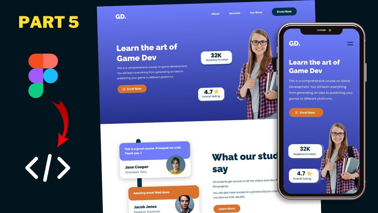
- 🔄 The previous video covered the design of the testimonial section, while the current video discusses the design of the courses section.
- 📝 The courses section is styled with a specific class in the HTML file, and the styling is applied in the style.css file.
- 🌈 A background color is applied to the courses section by copying the CSS from the Figma design file.
- 📏 Padding is added to the top and bottom of the courses section to create space, with 70 pixels specified for both.
- 🔄 The heading within the courses section is centered using CSS text alignment properties.
- 🔗 Course cards are arranged side by side using flex display and a gap of 70 pixels between them.
- 🖼️ Images within the course cards are set to 100% width of their container for proper scaling.
- 📐 Rounded corners and a drop shadow are applied to the images by copying the border-radius and box-shadow CSS properties from Figma.
- 🏷️ Each course card is styled with a white background, padding, and a margin to ensure visual separation and alignment.
- 📝 The course card's heading and duration are styled and positioned using flex properties to align them appropriately within the card.
- ⏰ A clock icon is added to the duration element using a CSS pseudo-element and positioned with absolute properties relative to the duration container.
- 🔲 A rectangle is added at the bottom of the course card using an after pseudo-element with specific dimensions and color.
- 📍 The button is positioned to the right of the wrapper within the courses section using absolute positioning.
Q & A
What is the main focus of this tutorial series?
-The main focus of this tutorial series is to convert a sigma design into a real website using HTML, CSS, and JavaScript.
What sections of the website have been designed in the previous video?
-In the previous video, the hero section and the testimonials section of the website were designed.
What section of the website is the focus of the current video?
-The focus of the current video is the design of the courses section of the website.
How is the courses section styled in the video?
-The courses section is styled with a background color, padding, and text alignment for the heading to the center.
What CSS property is used to align the course cards side by side?
-The CSS property 'display: flex' is used to align the course cards side by side.
What is the purpose of setting the image width to 100% of the container?
-Setting the image width to 100% of the container ensures that the image takes up the full width of its container, maintaining the design's aspect ratio.
How are the course cards styled to have rounded corners and a drop shadow?
-The course cards are styled with a 'border-radius' of 24 pixels and a 'box-shadow' to achieve rounded corners and a drop shadow effect.
What is the significance of using the 'flex' display for the 'info' class in the course card?
-Using 'display: flex' for the 'info' class allows the heading and duration to be positioned next to each other, with space between and centered vertically.
How is the clock symbol added to the duration in the course card?
-The clock symbol is added using a ':before' pseudo-element with the 'content' property set to the URL of the clock image.
What CSS property is used to position the button to the right of the courses section?
-The 'position: absolute' property is used, with the 'right' value set to 0, to position the button to the right of the courses section.
What is the final step in styling the courses section in the video?
-The final step is to add padding to the bottom of the courses section, with a padding of 120 pixels applied to ensure there is enough space at the bottom.
Outlines

Esta sección está disponible solo para usuarios con suscripción. Por favor, mejora tu plan para acceder a esta parte.
Mejorar ahoraMindmap

Esta sección está disponible solo para usuarios con suscripción. Por favor, mejora tu plan para acceder a esta parte.
Mejorar ahoraKeywords

Esta sección está disponible solo para usuarios con suscripción. Por favor, mejora tu plan para acceder a esta parte.
Mejorar ahoraHighlights

Esta sección está disponible solo para usuarios con suscripción. Por favor, mejora tu plan para acceder a esta parte.
Mejorar ahoraTranscripts

Esta sección está disponible solo para usuarios con suscripción. Por favor, mejora tu plan para acceder a esta parte.
Mejorar ahoraVer Más Videos Relacionados

Figma To Real Website | Responsive Homepage | HTML, CSS & JavaScript | Part 5

Figma To Real Website | Responsive Homepage | HTML, CSS & JavaScript | Part 7

Figma To Real Website | Responsive Homepage | HTML, CSS & JavaScript | Part 3

Figma To Real Website | Responsive Homepage | HTML, CSS & JavaScript | Part 4

Figma To Real Website | Responsive Homepage | HTML, CSS & JavaScript | Part 12

Figma To Real Website | Responsive Homepage | HTML, CSS & JavaScript | Part 11
5.0 / 5 (0 votes)
