Windows 10 vs 11 | Features & Changes
Summary
TLDRThis video script offers a detailed comparison between Windows 10 and Windows 11, highlighting major UI changes such as the redesigned Start Menu, centered taskbar icons, and new rounded corners. It explores updated built-in apps, the simplification of multitasking features, and the overhaul of the Action Center into Quick Settings and Notifications. The script also covers the removal of 32-bit support and the annual feature updates in Windows 11, providing a comprehensive look at the new OS's enhancements and adjustments.
Takeaways
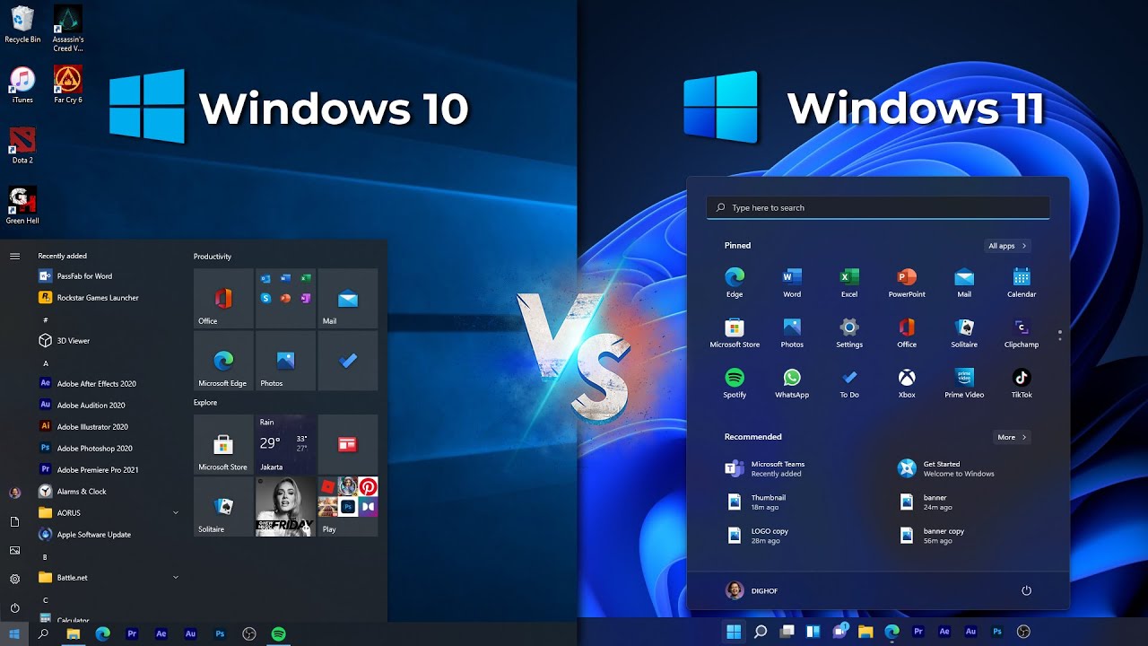
- 🔄 Windows 11 features a redesigned Start Menu with pinned apps at the top, static icons replacing live tiles, and a new recommended section for recently used programs and files.
- 🔍 The search bar in Windows 11 has been integrated into the Start Menu, and the side panel shortcuts have moved to the bottom.
- 📁 The 'All Apps' list in Windows 11 is now a separate menu, and older programs like Windows Explorer and Notepad are more accessible.
- 📊 Taskbar icons in Windows 11 are centered and slightly taller, with new UI indicators for active and idle programs and redesigned animations.
- 🚫 Windows 11 has removed certain taskbar features, such as docking on any side of the screen, small taskbar buttons, and the 'never combine' setting.
- ✨ Windows 11 introduces rounded corners and new animations for opening, minimizing, and maximizing windows, along with redesigned icons for a modern look.
- 🌌 A new wallpaper and themes are available in Windows 11, with Light mode as the default theme, differing from Windows 10's hybrid approach.
- 🔉 Windows 11 has updated system sounds that change depending on the light or dark mode, offering a distinct auditory experience.
- 🛠️ The Action Center in Windows 11 has been split into Quick Settings and Notifications, with Quick Settings now including volume and brightness controls.
- 📚 Built-in applications in Windows 11 have been updated with a new design language, including File Explorer and the Settings App, which have seen significant UI overhauls.
- 📲 Windows 11 introduces new gestures and touch keyboard improvements for tablet mode, making touch interactions smoother and more intuitive.
Q & A
What is the most notable change to the Start Menu in Windows 11 compared to Windows 10?
-The Start Menu in Windows 11 has been completely redesigned with pinned apps moving to the top half, removal of live tiles, and the addition of a new recommended section that shows recently used programs and files synced with OneDrive.
How has the search bar's position changed from Windows 10 to Windows 11?
-In Windows 11, the search bar is now integrated into the Start Menu itself, unlike in Windows 10 where it was part of the taskbar.
What are some of the visual changes to the taskbar in Windows 11?
-The taskbar icons in Windows 11 are centered and slightly taller, with new UI indicators for active and idle programs and redesigned animations for apps performing actions. Also, the taskbar is now only dockable to the bottom of the screen.
What is the new feature introduced in Windows 11 that shows recently used programs and files?
-The new feature is a recommended section in the Start Menu that displays recently used programs and files, which are synced with OneDrive.
How has the appearance of Windows 11's UI elements changed compared to Windows 10?
-Windows 11 has rounded corners for all UI elements, new animations for window actions, and redesigned icons to maintain a consistent modern design language.
What is the new blur effect introduced in Windows 11 called, and how does it differ from the one in Windows 10?
-The new blur effect in Windows 11 is called 'mica' and it shows the desktop wallpaper even when a window is on top, unlike the white blur in Windows 10.
What are the differences in the Action Center between Windows 10 and Windows 11?
-In Windows 11, the Action Center has been split into two separate menus: Quick Settings and Notifications. Quick Settings now includes volume, brightness, and Wi-Fi controls, while Notifications are part of the calendar.
How has the Snap assist feature evolved from Windows 10 to Windows 11?
-Snap assist in Windows 11 is smarter and offers more functionality, such as assisting in finding other windows when snapping to a quadrant and automatically sorting windows into groups that can be previewed and opened from the taskbar.
What is the new preloaded application in Windows 11 that aims to unify command lines?
-Windows Terminal is the new preloaded application in Windows 11, which unifies Command Prompt, PowerShell, and other command lines into a single app.
How has the touch keyboard in Windows 11 been improved compared to Windows 10?
-The touch keyboard in Windows 11 has been redesigned with rounded keys, more keys, easier navigation to settings, and the ability to change the keyboard theme.
What is the change in the setup experience for Windows 11 compared to Windows 10?
-The setup screen in Windows 11 has been completely redone with vibrant colors, new animations, icons, and loading screens. Cortana is no longer part of the setup experience, and there is an added step to name the computer.
Outlines
🖥️ Start Menu and Taskbar Redesigns in Windows 11
The script begins by comparing the Start Menu and taskbar of Windows 10 and Windows 11. The Start Menu in Windows 11 has been completely redesigned with pinned apps moving to the top, live tiles being replaced by static icons, and the search bar now integrated into the menu itself. A new 'recommended' section syncs with OneDrive to show recently used files and programs. The 'all apps' list has been revamped and older programs like Windows Explorer and Notepad are more accessible. The taskbar in Windows 11 sees icons centered and slightly taller, with new UI for active programs and redesigned animations. Features like docking the taskbar on any side and text previews have been removed, and the Start Button no longer changes color based on accent color. The script also mentions general UI changes, such as rounded corners and new animations for window actions, as well as redesigned icons and wallpapers.
🔧 System and Multitasking Enhancements in Windows 11
The second paragraph focuses on system-wide changes and enhancements to multitasking in Windows 11. It discusses the separation of the Action Center into Quick Settings and Notifications, with Quick Settings now including volume and brightness controls. The Notifications menu is now part of the calendar, and the calendar itself has been simplified. The script also covers the updated widgets panel, which is compared to the news feed in Windows 10. Changes to Snap assist and multitasking features are highlighted, including the removal of the Timeline feature and the introduction of new wallpaper options for virtual desktops. The Settings App and Microsoft Store have been overhauled for easier navigation and a more modern look. Preloaded applications have been updated or removed, with some like Skype being replaced by Microsoft Teams, and Internet Explorer is disabled in Windows 11. The paragraph concludes with a list of preloaded apps exclusive to each OS and notes on the consistency brought by the updated design language across all built-in apps.
📱 Tablet and Touch Features Improvements in Windows 11
The final paragraph discusses the tablet features and touch enhancements in Windows 11. When in tablet mode, the taskbar icons are spaced out, and touch controls are made easier to use with 'stickier' resizing targets. New and modified gestures for navigating between apps and desktops are introduced, and the touch keyboard has been redesigned with a nicer look and additional keys. The setup process for Windows 11 is described as having vibrant colors, new animations, and icons, with Cortana no longer being part of the experience. The ability to name the computer is a new step in the setup process. After setup, the start menu automatically pops up, reminiscent of the Windows XP setup experience. The paragraph ends with notes on the changes to Windows Update, including new language during restarts and the shift to one feature update per year for Windows 11, as opposed to two for Windows 10.
Mindmap
Keywords
💡Start Menu
💡Taskbar
💡UI (User Interface)
💡Action Center
💡Widgets
💡Snap Assist
💡Microsoft Store
💡File Explorer
💡Settings App
💡Multitasking
💡Tablet Mode
Highlights
Start Menu redesign with pinned apps moving to the top and live tiles being replaced by static icons.
Search bar relocated to the Start Menu and new recommended section for recently used programs and files.
All apps list now its own menu with older programs like Windows Explorer and Notepad included.
Taskbar icons centered with new UI for active and idle programs and redesigned animations.
Removal of certain taskbar features like top, left, or right docking and 'never combine' setting.
General UI changes including rounded corners and new animations for window actions.
Icon redesign for consistency with Windows 11's modern design language.
New default themes and redesigned Windows logo.
Lock screen changes and introduction of blur effects like mica and acrylic.
New font Segoe UI Variable for improved readability.
Updated context menus and alert boxes for a modern look.
Action Center overhaul into Quick Settings and Notifications menus.
Widgets panel as a replacement for the news feed with a different look and location.
Snap assist and multitasking improvements with smarter window snapping and grouping.
Updated built-in programs and apps with new UI and features.
Removal of 32-bit version support and changes to Windows Update frequency.
Tablet features enhancements with touch elements and new gestures.
Complete overhaul of the touch keyboard with a new look and additional keys.
Setup screen redesign with new animations, icons, and visual effects.
Transcripts
Today, we’ll be comparing Windows 10 to Windows 11. What’s different in both versions of Windows?
Well let’s go ahead and find out. Starting off with the Start Menu, Microsoft did a complete
redesign. Pinned apps moved from the right side to the top half and live tiles are now gone and
are replaced with static icons in a grid. The search bar is now located in the start menu
rather than being part of the taskbar. And those little side panel shortcuts that were on the left
side are now at the bottom. And here’s something not present in the Windows 10 start menu at all,
the new recommended section that shows recently used programs and files, which by the way are also
synced with OneDrive. Think of this like a much more simplified version of the Timeline feature
found in Windows 10’s Task Viewer. The all apps list, which was on the left side of the start menu
in Windows 10, is now its own menu in Windows 11, using a button. And within the all apps list, some
older programs like Windows Explorer and Notepad are now part of the list rather than being part of
the Windows System or Windows Accessories folder within the list. In fact, those folders are now
removed and replaced with a shortcut to Control Panel called Windows Tools, that list many legacy
built-in Windows programs that were previously in those folders. Moving on to changes in taskbar,
we see a lot of differences. The icons went from being left aligned to centered, although there is
a setting to revert this, and if you look closely the taskbar is also slightly taller in Windows 11,
hard to notice but it is there. The UI for active and idle programs has been changed,
it’s now indicated by the color and length of a little line in the taskbar icon with a transparent
rounded square around a program when active. The animation in the taskbar for apps that are doing
certain actions have been redesigned, for example, here are both animations for downloading or
installing something and here are both animations for apps that need your attention, like the User
Account Control prompt. There are now bouncy icon animations when you open or close programs.
Badges on apps have gotten a little redesign. If you hover over the Search or Task View icon,
you’ll get little quick actions you can do without needing to click the icon. The Start
Button no longer changes color based on your accent color, as you can see. And now here are
some features that got removed from the taskbar in Windows 11, firstly, you can only dock the
taskbar to the bottom now, no more top, left, or right docked taskbars. Sizing options like small
taskbar buttons are now gone, as well as the “never combine” setting that allows you to see
text previews of the programs from the taskbar. Oh yeah, you also can’t drag and drop files in the
taskbar anymore for some reason which is pretty bizarre and right clicking on the taskbar doesn’t
give all those little settings and shortcuts, just a shortcut to taskbar settings. Now here’s just
general UI changes, so starting off, say goodbye to the sharp corners in Windows 10 and say hello
to the rounded corners in Windows 11 and this is no understatement, every single element in
Windows 11 is now round, even the very very old stuff. There are now new animations for opening,
minimizing, and maximizing a window. Windows 10 went for more of a fade approach while in
Windows 11, the animation has a lot more resizing and fluidity action going on. Almost every single
icon in Windows 11 has been redesigned to stay consistent with its modern design language.
Some elements of this were present in Windows 10, however now it is everywhere, even in legacy areas
like the control panel. As with every modern version of Windows, there’s a new wallpaper.
Previously there was the old Hero wallpaper, which was light shining out of a Windows logo,
and now the background is much like a blue bloom, if that makes any sense. Microsoft
also introduced new themes. Previously in Windows 10, there were 4 themes to choose from by default,
now there are six. Light mode is also now the new default theme for Windows 11, rather than the
hybrid of a dark taskbar and light apps in Windows 10. The Windows logo has gone through a redesign,
it now resembles the Microsoft logo a lot more. The Lock screen has gone through some changes, but
it’s pretty underwhelming. To sum it up, elements of the Lock screen have now been centered and the
quick status is now removed, you can only show one app that shows detailed status. Windows 11
now introduces a new blur effect called mica and acrylic. The blur will always show your desktop
wallpaper even if the window is on top of a window with a different color, look at how calculator’s
blur shows the desktop wallpaper as opposed to the white blur in the calculator in Windows 10 despite
both being in front of Notepad. Windows 11 now has a new font called, and I’m definitely going
to mispronounce this, Segoe UI Variable, which is Microsoft’s modified version of the previous Segoe
UI font found in Windows 10. To paraphrase, Microsoft basically says that this is a more
pleasing and easier font to read. The screen with the spinning logo when signing in or out,
doing updates, restarting, and stuff like that now only shows a black background, unlike Windows 10
where it takes your accent color and sets that as the color of the background. Similarly, depending
on whether you’re using the dark or light mode, opening apps with splash screens will only show
a black or white background in Windows 11, rather than conforming the color of the background with
the accent color in Windows 10. Context menus throughout Windows 11 have now been updated to
look more modern, however there is still an option within the context menu called “Show more options”
that allows you to see the old one that is seen in Windows 10 if you need it for some reason. Alert
boxes for things like changing display settings and low battery alerts now have a complete
redesign in Windows 11. Unlike Windows 10, Windows 11 now has a colored line at the bottom of some
text boxes. Finally, in Windows 11’s Sign-in screen, the text box is now dark instead of white
in Windows 10, and the enter arrow looks like it’s part of the text box rather than being on its own
in Windows 10. In terms of System sounds, Windows 11 actually has different sounds between its dark
mode and light mode. In dark mode, the sounds are a lot more echoed and muted whereas in light mode,
they are more clear and less echoed. It’s actually very interesting. Here’s a direct
comparison of the sounds in Windows 10, Windows 11, and Windows 11’s dark mode.
Next let’s talk about the Action Center overhaul in Windows 11, which actually isn’t even called
Action Center anymore, it’s separated in two menus called Quick Settings and Notifications.
Quick Settings is not only an area that shows the toggles found at the bottom of the Action
Center in Windows 10, but it now also shows the new place for your volume, brightness, and even
your Wi-Fi controls. In Windows 10, all three of those were in separate menus. Now if you click
lets say the network icon in the system tray, it won’t take you to a separate network flyout,
it’ll now take you to the entire quick settings menu instead. This menu can also be accessed using
the Windows + A shortcut on your keyboard, which is the same shortcut that opens the Action Center
in Windows 10. The other menu is the notifications menu, which is now part of the calendar. Now, the
notifications are found above the calendar instead of within Action Center, and not only are the
notifications round, but they’re also no longer inside a bar, like it was in Windows 10. You also
have a shortcut to Focus assist settings in the settings apps. This menu can also be accessed
using the Windows + N shortcut on your keyboard. And if you’re curious about what’s changed about
the calendar, you’ll be pretty disappointed. It has absolutely no integration with anything and
the detailed clock that showed seconds is also gone. All it shows is the date, and that’s about
it. Luckily, you can minimize the calendar within the notification menu if you don’t want to see it.
And here’s a little comparison of the news feed in Windows 10 and the widgets panel in Windows 11.
Now, don’t be fooled, these are pretty much almost the exact same thing, they just look different
and are found in different areas of Windows. The news feed is found near the system tray and the
widgets panel is accessed via a taskbar icon or by using the Windows + W shortcut on your keyboard.
Last thing to note is that the news feed is customized using Microsoft Edge while the
widgets panel is partially customized within the panel, partially through Microsoft Edge as well.
Microsoft has also made a number of changes to Snap assist and multitasking features.
Starting off, the task viewer has now been simplified in Windows 11 and the Timeline
feature that is found in Windows 10 has now been removed. You can now choose a different wallpaper
for each virtual desktop in Windows 11 rather than only one for every single one in Windows 10. The
Snap assist preview now has a frosted glass look rather than the transparent glass in Windows 10.
The animation when you actually preview and snap a window has also been changed. Funnily enough,
Windows 10 doesn’t even have an animation when you snap the window. And generally speaking,
Snap assist is just much smarter now and is able to do more than it used to in Windows 10,
so for example, when snapping a window in a quadrant, Windows 11 will assist you in finding
other windows while in Windows 10, snapping to a quadrant does nothing. When using snap assist
to snap different windows on different parts of the screen, Windows will now automatically
sort those windows into a group, and those groups can now be previewed and opened in the taskbar.
Windows 10 doesn’t have this feature, so groups don’t show up when hovering on a taskbar icon.
The line seen when resizing apps side-by-side now has a new look. When you’re actually using it, it
disappears in Windows 11 while still being present in Windows 10. And here’s a look at differences in
built-in programs and apps. Now, many of the applications in Windows 11 have been updated
and more updates are to come even after its release. However, because there are just so many
to cover in one video, here are just the biggest highlights. Starting with File Explorer, there
have been some various UI changes. There's now a replacement to the Ribbon UI found at the top
of File Explorer which tries to simplify and get rid of all the clutter that was the old Ribbon UI.
It’ll also have less spaced-out icons by default, which can be reverted if you don’t like that, and
3D Objects is no longer its own dedicated folder. The Settings App has gotten a complete overhaul,
it’s now supposed to be easier to navigate, more organized, and overall just look better. You’ll
see more enlarged icons and pictures that make the UI easier to use, and even some new animations.
And just like the Settings App, the Microsoft store is also getting a huge revamp with a new
UI and various improvements. However, one of the best parts is that the store is now open to
accepting more app types such as PWA which are web apps, Win32 which are like the .exe installers,
even android apps, though support for that will be delayed. This app is also coming to Windows 10,
which is a huge bonus. Skype, which was preloaded in Windows 10, has been removed in favor of the
Microsoft Teams integration system built in to Windows 11. However, you can still install Skype
again if you really need it. Internet Explorer is finally disabled from Windows 11. You can try,
it is nowhere to be found, so your only option is Microsoft Edge. It’s still there in Windows 10,
but not on Windows 11. Microsoft has also done a lot to make sure Windows 11 is consistent and
removing duplicate Windows accessories that were present in Windows 10. So,
what they’re basically doing is they’re updating a legacy Windows accessory and removing the
duplicate version. For example, Snip & Sketch has been removed and a newly updated Snipping
Tool is now here with a more modern UI and various features from Snip & Sketch. This is also going to
be done with paint in the future, where Paint3D is removed by default and the old mspaint is going to
be updated not only with a new look, but with new features as well. Windows Terminal is now
a preloaded application in Windows 11 and aims to unify Command Prompt, PowerShell, and other
command lines into just one app. Alarms and Clock is now just called Clock and has a new feature
called Focus sessions aimed to help people pace themselves to reach their goals. And aside from
other little updates to apps, pretty much all the built-in Windows applications have been and will
be updated with Windows 11’s new design language, including rounded corners and new blur effects.
Here’s a quick rundown of preloaded apps on one OS that are not there by default on the other,
and these are apps that I haven’t mentioned yet. 3D Viewer, Math Input Panel, Mixed Reality Portal,
OneNote for Windows 10, and the People App are all the preloaded exclusives on Windows 10 while
Get Started, Microsoft News, and Microsoft To Do are the preloaded exclusives in Windows 11. All of
these can still be installed through the Microsoft Store on both OSes except for the Math Input
Panel, The People App, and Get Started. Now let’s change perspective and move on to some tablet
features. When you turn a device into a tablet in Windows 11, icons in the taskbar will just be
spaced out. However, Windows 10 has two options. You can either space out the icons just like in
Windows 11, or you can have it enable tablet mode which is a completely different mode that is not
available in Windows 11. Touch enabled controls are now easier to use in Windows 11 because touch
elements are stickier. For example, look at how my finger can resize notepad in Windows 11 easier
than I am able to in Windows 10. This is because the resizing targets are now easier to touch
and feel stickier. Now here’s a rundown of the new and modified gestures between both OSes. Swiping
form left to right from the edge in Windows 11 shows the widgets panel while in Windows 10,
it shows task viewer. Swiping from right to left from the edge starts the Action Center in Windows
10 and Notifications & Calendar in Windows 11. Swiping from the top does nothing, but if you’re
on tablet mode in Windows 10, you can close apps if you swipe from top to bottom. In Windows 11,
If you touch the screen with four fingers and move them horizontally, you can now switch
between virtual desktops, and if you do the same thing with three, you’ll switch between different
windows. If you swipe up with three or four fingers, you’ll activate task viewer. All these
three and four fingered gestures just talked about are just not a thing in Windows 10. The animation
for rotating your screen has been changed between both versions. Windows 10 zooms out and orientates
while Windows 11 flips everything like it does in iOS. And adding on to rotating the screen,
both versions of Windows behave differently when scaling windows while rotating the screen,
look what’s happening. In Windows 10, the windows scale to whatever orientation you
switch to while in Windows 11, the windows stay in the same position the entire time despite rotating
the screen. The touch keyboard in Windows 11 has had a complete overhaul. The keyboard looks nicer
and keys are now rounded compared to the square ones in Windows 10, there are now more keys,
navigating to certain settings are supposed to be easier, and now you can change the theme of
your keyboard and not be stuck with just white or black. Now let’s talk about the different
experiences you’ll get setting up both versions of Windows. The setup screen on Windows 11 has been
completely redone. In Windows 10, the setup screen was dark blue and black with fade animations when
navigating throughout the setup. In Windows 11, there are now more vibrant colors and blurs,
new animations, new icons, new loading screens, and other various improvements. Cortana used to be
a big part of the Windows 10 setup experience, however say goodbye to her because she is no
longer part of the setup experience in Windows 11. The steps you go through to set up Windows
hasn’t changed much between both versions. The only new step added in Windows 11 is the ability
to name the computer, which was actually not a thing in Windows 10. After finishing setup,
you’ll be greeted with some text and animation on both OSes while Windows is getting your desktop
ready. Not only is the text different during this process, but the background has also had a
visual overhaul. In Windows 10, the background was constantly changing between different colors while
in Windows 11, a blurry, blueish-purple, round light constantly moves around the background. And
an interesting little find, when the entire setup process is complete and you get to your desktop,
the start menu will now automatically pop up, which is just not what happens in Windows 10.
If you know Windows history, you’ll know that this is exactly what happens after you’re done
setting up Windows XP as well. Final important thing to note is that you’ll no longer be able
to install Windows as a 32-bit option in Windows 11. If you need a 32-bit version of Windows,
the final version to support that will now be Windows 10. And here’s just a few things to note
about Windows Update. Firstly, the text that is shown when updating the operating system during
a restart has been changed. Windows 10 basically tells you exactly what is going on while Windows
11 just uses more natural language. Secondly, Windows Update will now show the estimated amount
of time needed to complete updates. And finally, let’s talk about feature updates. In Windows 10,
Microsoft was committed to releasing a feature update twice a year. That is now changing because
in Windows 11, you’ll only get one feature update a year instead of two. So hopefully
you can now decide whether to upgrade to Windows 11. Like, subscribe, and thanks for watching.
Ver Más Videos Relacionados
Windows 11 Moment 5 Update is Released - Major Update with New Features + How to Install
Windows 10 (Beginners Guide)
É ora di CAMBIARE Sistema Operativo?
New 2024 Hyundai Alcazar Walkaround | Gagan Choudhary
A History of Windows 95 Development
New Windows 11 23H2 + 24H2 September 2024 Update – New Features in the Main Release
5.0 / 5 (0 votes)