7 Aturan Layout Desain | Desainer Wajib Tahu
Summary
TLDRArus Lan from Rude Studio presents seven essential layout design rules every designer should master: white space (breathing room), proximity, repetition, contrast, alignment, emphasis, and hierarchy. Through practical examples—adjusting text tracking for readability, grouping icons, repeating colors and graphic motifs, using bold vs. thin type and color contrast, maintaining consistent alignment, enlarging focal images, and ordering text by importance—he demonstrates how each principle improves clarity and visual flow. The video emphasizes avoiding clutter, guiding viewers’ attention, and using minimalist, intentional layouts so messages are communicated more effectively and designs look polished and professional.
Takeaways
- 🎨 A good layout design must include white space or breathing space to keep the design clean, readable, and aesthetically pleasing.
- 🧘♂️ White space helps avoid clutter, improves readability, and ensures the message is conveyed effectively to the viewer.
- 👯♀️ The principle of proximity emphasizes grouping related elements together to make the design easier to understand and more organized.
- 🔁 Repetition is important for visual consistency, reinforcing design themes through repeated colors, shapes, and elements.
- 🌈 Contrast helps highlight important information by using variations in color, size, and text weight to guide the viewer’s focus.
- 📏 Alignment ensures all design elements are visually connected and structured, creating balance and professionalism.
- 💡 Consistent alignment, whether left, right, or centered, contributes to the overall harmony and flow of the design.
- 🔍 Emphasis ensures that key elements such as titles or images stand out through size, color, or placement to attract attention.
- 📚 Hierarchy organizes content by importance, allowing viewers to easily identify primary and secondary information.
- 🙌 Understanding and applying these seven design principles—white space, proximity, repetition, contrast, alignment, emphasis, and hierarchy—enables designers to create clearer, more impactful, and visually appealing layouts.
Q & A
What is the main topic discussed in the video?
-The video discusses seven essential layout design rules that every designer should know to create clear, effective, and visually appealing designs.
What is the first layout design rule mentioned in the video?
-The first rule is 'White Space' or 'Breathing Space,' which emphasizes leaving empty areas in a design to make it easier to read, more minimalist, and more aesthetically pleasing.
Why is white space important in layout design?
-White space helps prevent clutter, improves readability, and allows the viewer to focus on key elements, making the design more balanced and professional.
What does 'proximity' mean in design principles?
-Proximity refers to grouping related elements close together so that viewers can easily understand their relationship and interpret information efficiently.
How does repetition contribute to a good design?
-Repetition creates consistency and unity within a design by reusing elements such as colors, shapes, or patterns, making the overall layout cohesive and recognizable.
What is 'contrast' and why is it important in design?
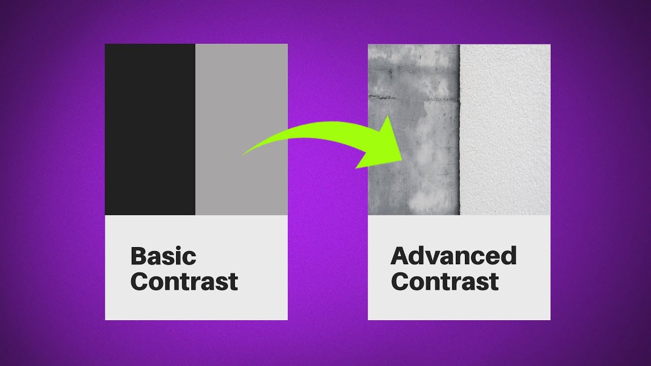
-Contrast highlights differences between elements such as color, size, or weight, helping important information stand out and improving readability and visual interest.
What does 'alignment' mean in layout design?
-Alignment ensures that elements are visually connected and orderly. For example, using left alignment consistently across text and images creates a clean, organized layout.
What is the purpose of 'emphasis' in a design?
-Emphasis directs attention to the most important parts of a design—such as a title, main image, or key message—by using size, color, or placement to make them stand out.
How does 'hierarchy' affect how a viewer interprets a design?
-Hierarchy organizes design elements by importance, guiding the viewer's eyes from the most significant information to the least important, ensuring clear communication of the message.
What common mistake do beginners often make when applying design principles?
-Beginners often overcrowd designs with too many elements, neglecting white space, or fail to establish hierarchy, making the design confusing and less effective.
How can designers improve their ability to apply these layout principles effectively?
-Designers can improve through practice and experience—known as 'flying hours'—by analyzing well-made designs, experimenting with layouts, and continuously refining their visual judgment.
What overall advice does the speaker give to designers at the end of the video?
-The speaker encourages designers to understand and apply all seven layout design principles—white space, proximity, repetition, contrast, alignment, emphasis, and hierarchy—to create designs that communicate messages effectively and beautifully.
Outlines

Esta sección está disponible solo para usuarios con suscripción. Por favor, mejora tu plan para acceder a esta parte.
Mejorar ahoraMindmap

Esta sección está disponible solo para usuarios con suscripción. Por favor, mejora tu plan para acceder a esta parte.
Mejorar ahoraKeywords

Esta sección está disponible solo para usuarios con suscripción. Por favor, mejora tu plan para acceder a esta parte.
Mejorar ahoraHighlights

Esta sección está disponible solo para usuarios con suscripción. Por favor, mejora tu plan para acceder a esta parte.
Mejorar ahoraTranscripts

Esta sección está disponible solo para usuarios con suscripción. Por favor, mejora tu plan para acceder a esta parte.
Mejorar ahoraVer Más Videos Relacionados

Beginning Graphic Design: Layout & Composition

PRINCÍPIOS de DESIGN GRÁFICO para INICIANTES

What makes a great design? The 7 principles you need to know

4 Foundational UI Design Principles | C.R.A.P.

How to use Principles of Design | Graphic Design Basic

Master 5 Design Principles With This Course! (MUST WATCH)
5.0 / 5 (0 votes)
