Make a Power BI Dashboard in 15 Minutes!
Summary
TLDRIn this tutorial, we learn how to create an interactive Power BI dashboard for Coca-Cola using Excel data. The video covers data import, design layout, and advanced features like Q&A for querying data, key influencers for profit analysis, and a sales-by-state map. It also demonstrates how to use a matrix for financial breakdowns, apply conditional formatting, and set up date filters. The goal is to create a dynamic and user-friendly dashboard with various data visualizations to aid decision-making, along with a brief introduction to Power BI’s core tools and functions.
Takeaways
- 😀 Takeaway 1: Learn how to create an interactive Power BI dashboard for Coca-Cola by importing data and adding visuals for effective analysis.
- 😀 Takeaway 2: Import your data from Excel into Power BI using the 'Load' or 'Transform' options in Power Query, depending on the data's need for cleaning.
- 😀 Takeaway 3: Use header shapes and custom titles to structure the dashboard layout, enhancing visual organization.
- 😀 Takeaway 4: Add interactive elements like Power BI's Q&A visual, allowing users to ask questions and get instant insights from the dataset.
- 😀 Takeaway 5: Personalize the Q&A suggestions by changing the color scheme (e.g., orange) to make it more visually appealing.
- 😀 Takeaway 6: Use the 'Key Influencers' visual to analyze factors affecting key metrics like operating profit, allowing users to uncover trends and correlations.
- 😀 Takeaway 7: Implement a map visual to display sales by state, providing geographical insights and enabling zoom functionalities for detailed analysis.
- 😀 Takeaway 8: Customize matrix visualizations by displaying financial metrics like total sales, operating profit, and unit sales, with options to adjust aggregations and decimal places.
- 😀 Takeaway 9: Use conditional formatting to highlight key metrics like total sales with data bars for better visual emphasis on performance.
- 😀 Takeaway 10: Add a date slicer to enable users to filter data by specific time periods, ensuring the dashboard updates dynamically based on the selected date range.
Q & A
What is the purpose of the Q&A visual in Power BI?
-The Q&A visual in Power BI allows users to ask questions about the data in natural language, providing quick and easy insights, such as the number of regions or states in the dataset.
How can you customize the appearance of the Q&A suggestions in Power BI?
-You can customize the appearance of the Q&A suggestions by changing the card color in the visual formatting options, such as selecting a vibrant color like orange (e.g., #FF8A00).
Why is Power Query used in Power BI?
-Power Query is used to transform and clean data before it is loaded into Power BI for reporting. It helps modify the dataset according to specific needs, such as changing data types or removing unnecessary columns.
What is the function of the Key Influencers visual in Power BI?
-The Key Influencers visual helps to analyze factors influencing specific metrics, such as operating profit. It identifies which variables, like beverage brands, contribute positively or negatively to the target measure.
How do you add a map chart to display sales by state?
-To add a map chart, you use the 'Map' visual in Power BI, assigning the 'State' field to the 'Location' area and the 'Total Sales' field to 'Values'. You can also adjust bubble size and enable zoom controls.
What should you do if the map bubbles are too small in Power BI?
-You can adjust the size of the map bubbles by going to the 'Format' settings under 'Bubbles' and increasing the size (e.g., to 15) for better visibility.
How can you improve the visibility of the financial data breakdown?
-To improve visibility, you can use a Matrix visual to display detailed financial data, like total sales, unit sold, and operating profit by beverage brand. You can also adjust the formatting to show averages instead of sums where necessary.
What is conditional formatting, and how can it be applied in Power BI?
-Conditional formatting in Power BI allows you to visually emphasize specific data, such as coloring bars based on the sales value. For instance, you can change the color of the 'Total Sales' bar to orange using the 'Data Bars' option under conditional formatting.
Why is it important to set the slicer for filtering by date in Power BI?
-Setting a date slicer enables users to filter the data based on specific time periods. This allows for more dynamic and focused analysis, especially when working with time-sensitive metrics like sales over different dates.
What are the key steps to creating a professional Power BI dashboard as shown in the video?
-Key steps include importing the data, creating visuals such as Q&A, maps, and matrices, formatting them for clarity, adding interactivity like date filters and slicers, and using Power BI's AI features like the Key Influencers visual to derive insights.
Outlines

Esta sección está disponible solo para usuarios con suscripción. Por favor, mejora tu plan para acceder a esta parte.
Mejorar ahoraMindmap

Esta sección está disponible solo para usuarios con suscripción. Por favor, mejora tu plan para acceder a esta parte.
Mejorar ahoraKeywords

Esta sección está disponible solo para usuarios con suscripción. Por favor, mejora tu plan para acceder a esta parte.
Mejorar ahoraHighlights

Esta sección está disponible solo para usuarios con suscripción. Por favor, mejora tu plan para acceder a esta parte.
Mejorar ahoraTranscripts

Esta sección está disponible solo para usuarios con suscripción. Por favor, mejora tu plan para acceder a esta parte.
Mejorar ahoraVer Más Videos Relacionados
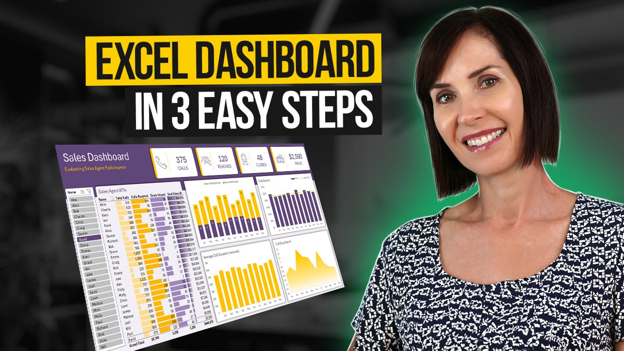
Interactive Excel Dashboard Tutorial in 3 Steps (+ FREE Template)

Power BI Desktop for Beginners | Step-by-Step Guide

Power BI Tutorial For Beginners | Create Your First Dashboard Now (Practice Files included)
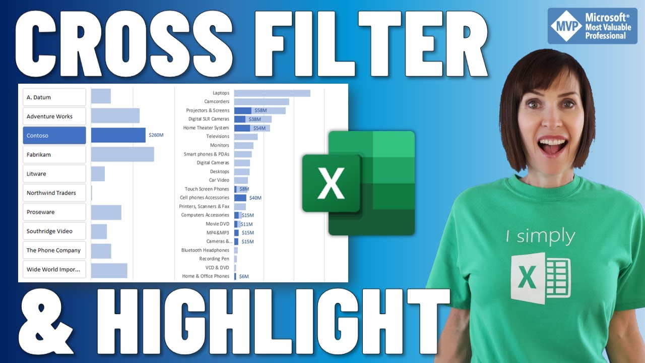
Cross Filter and Highlight Excel Charts like Power BI
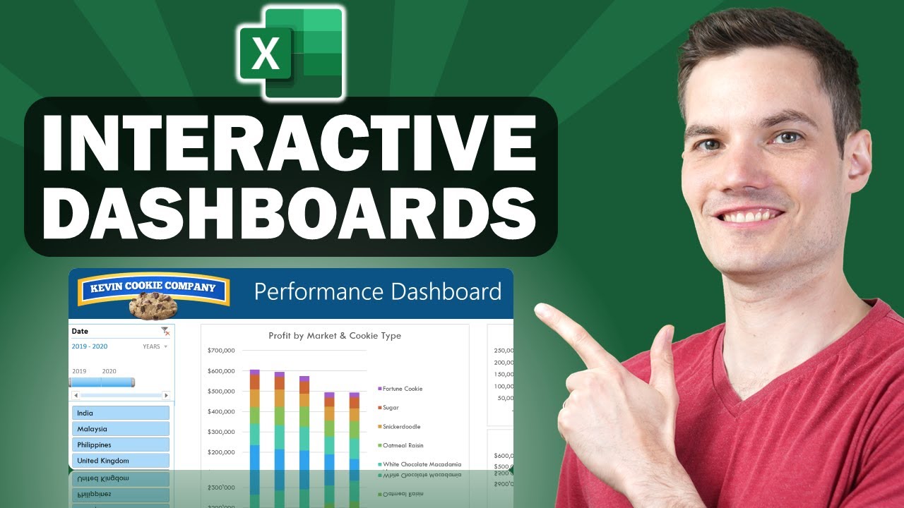
📊 How to Build Excel Interactive Dashboards

Data Analyst Project For Beginners (HR Analytics): 1 - Problem Statement
5.0 / 5 (0 votes)
