PENYAJIAN DATA DALAM BENTUK TABEL & DIAGRAM || PENGOLAHAN DATA
Summary
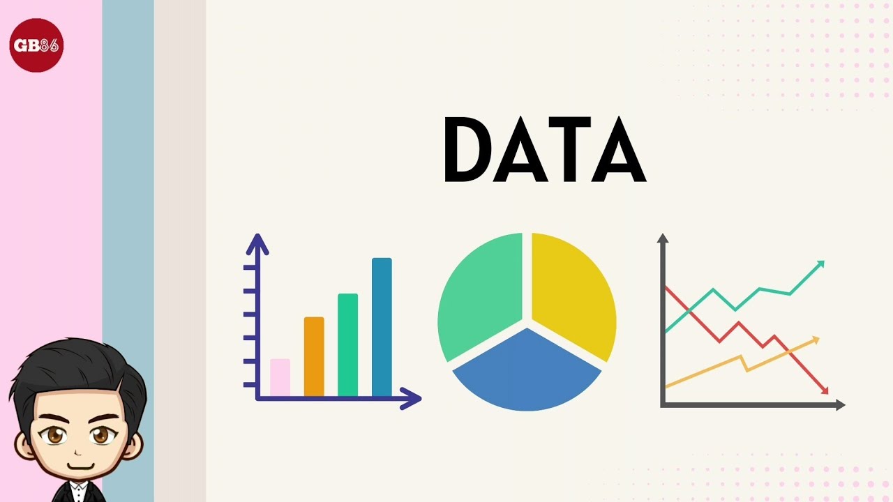
TLDRThis educational video introduces various methods of data presentation, including tables, bar diagrams, line diagrams, pie charts, and pictograms. It explains each method's purpose, how data is organized, and provides clear examples to help viewers understand their practical use. Whether it's organizing data in a table, representing trends with line graphs, or using images in pictograms, this video offers a comprehensive guide for effectively presenting data in multiple visual formats. The lesson is designed to make data analysis and representation easier for students.
Takeaways
- 😀 Data can be presented in various formats to make it easier to understand and analyze.
- 😀 The first method of data presentation is in the form of a table, which organizes data into rows and columns for easy reading.
- 😀 A table can present both individual data (e.g., student grades) and grouped data (e.g., weight categories).
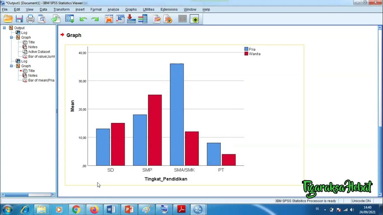
- 😀 Bar charts (Diagram Batang) use rectangular bars to represent data and can be oriented vertically or horizontally.
- 😀 Bar charts help compare different categories or quantities visually, making trends and differences easy to identify.
- 😀 Line charts (Diagram Garis) represent data points connected by lines, showing trends over time or continuous data.
- 😀 Line charts are ideal for illustrating data changes, such as visitor trends or measurements over a period.
- 😀 Pie charts (Diagram Lingkaran) represent data in a circular format divided into slices, each representing a portion of the whole.
- 😀 Pie charts are useful for showing proportions, such as the distribution of sales among different book types.
- 😀 Pictograms (Diagram Gambar) use images to represent data, making it visually engaging and easier to understand for younger audiences or simple data.
- 😀 Pictograms can represent quantities by showing images (e.g., pictures of children reading books to represent borrowing rates).
- 😀 The video aims to teach students how to present data in different formats, emphasizing visual understanding and simplicity.
Q & A
What are the different types of data presentation methods discussed in the video?
-The video discusses five types of data presentation: tables, bar charts, line graphs, pie charts, and pictograms.
Why is data presented in tables?
-Data is presented in tables to simplify the process of reading and analyzing data by grouping it according to certain criteria.
What is the difference between a table of individual data and a grouped data table?
-An individual data table shows specific data points, such as student scores, while a grouped data table organizes data into intervals, like weight ranges, and includes frequencies.
How is data represented in a bar chart?
-In a bar chart, data is represented using rectangular bars where the length or height of each bar corresponds to the data value. The chart can be vertical (bars standing) or horizontal (bars lying down).
What is the key feature of a line graph?
-A line graph presents data points as dots, which are then connected by a straight line to show trends or changes over time.
What does a pie chart represent?
-A pie chart displays data as a circle divided into sections, or 'slices', where each slice represents a specific category or part of the whole.
How does a pictogram present data?
-A pictogram uses pictures or symbols to represent data, where each image corresponds to a specific quantity or number.
In the example of a pictogram shown in the video, how is the data represented?
-In the pictogram example, pictures of children reading books are used to represent the number of book borrowers, where each blue figure represents 10 people and each yellow figure represents 5 people.
What is the purpose of using different types of data presentation?
-Different types of data presentation are used to make data easier to understand, compare, and interpret, depending on the context and the type of data being presented.
Can a bar chart be both vertical and horizontal? If so, what is the difference?
-Yes, a bar chart can be both vertical and horizontal. The difference lies in the orientation of the bars: vertical bars are arranged upright, while horizontal bars lie flat.
Outlines

Esta sección está disponible solo para usuarios con suscripción. Por favor, mejora tu plan para acceder a esta parte.
Mejorar ahoraMindmap

Esta sección está disponible solo para usuarios con suscripción. Por favor, mejora tu plan para acceder a esta parte.
Mejorar ahoraKeywords

Esta sección está disponible solo para usuarios con suscripción. Por favor, mejora tu plan para acceder a esta parte.
Mejorar ahoraHighlights

Esta sección está disponible solo para usuarios con suscripción. Por favor, mejora tu plan para acceder a esta parte.
Mejorar ahoraTranscripts

Esta sección está disponible solo para usuarios con suscripción. Por favor, mejora tu plan para acceder a esta parte.
Mejorar ahoraVer Más Videos Relacionados
Penyajian Data (Part-1) ~ Tabel dan Diagram (Materi PJJ Kelas VII / 7 SMP)

1 PENYAJIAN DATA - STATISTIKA - KELAS 7 SMP
Penyajian Data Kelas 7 - Menyajikan Data Dalam Tabel dan Diagram | Jenis Diagram | Statistika
Penyajian Data Statistik Menggunakan SPSS

[1] Penyajian Data (Tabel)
Data - Materi Matematika Kelas 5 Kurikulum Merdeka
5.0 / 5 (0 votes)
