1 PENYAJIAN DATA - STATISTIKA - KELAS 7 SMP
Summary
TLDRIn this educational video, Miss Vera from SMP Tarakanita 2 Jakarta teaches students about statistical data presentation. The video covers various methods like pictograms, bar diagrams, line graphs, and pie charts, with practical examples using data from school canteen preferences and doctors in hospitals. Miss Vera explains how to represent data visually, including step-by-step instructions on calculating angles for pie charts in both degrees and percentages. The video is designed to help students understand how to effectively organize and present statistical information using different graphical methods.
Takeaways
- 😀 Statistical data presentation involves methods like pictograms, bar charts, line graphs, and pie charts.
- 😀 A pictogram represents data with symbols where each symbol stands for a specific number of items or people.
- 😀 In the example of favorite snacks, 8 students like chicken noodles, 10 like meatballs, 7 like iced tea, and 5 like ice cream.
- 😀 In a pictogram, one symbol could represent two students, so 8 students are represented by four images, and so on.
- 😀 Bar charts visually display data using bars of varying heights to represent different quantities.
- 😀 Line graphs plot data points along a continuous scale and are often used to show trends over time or comparisons between different groups.
- 😀 Pie charts divide data into sectors representing percentages or angles, with the total always adding up to 100%.
- 😀 The angle for each segment in a pie chart can be calculated by multiplying the fraction of the data by 360 degrees.
- 😀 When using percentages, a pie chart’s segments are drawn according to the proportion each category holds of the total.
- 😀 The script also explains how to calculate the angles for a pie chart using both degrees and percentages, using simple formulas.
- 😀 The examples provided for both food preferences and doctors at different hospitals help in understanding how to apply each of these statistical data visualization methods.
Q & A
What is the main focus of the video?
-The video focuses on teaching statistical data presentation methods, specifically through diagrams like pictograms, bar charts, line graphs, and pie charts.
What is the definition of statistics as presented in the video?
-Statistics is the science of collecting, organizing, presenting, analyzing, and interpreting data.
What type of data presentation method does the video introduce first?
-The video introduces the pictogram, which is a method of presenting data using symbols or pictures to represent quantities.
How does the video explain the creation of a pictogram using an example of favorite school snacks?
-The video shows that one student represents two individuals, and then illustrates how to create a pictogram with symbols representing different quantities of students liking various snacks, such as mie ayam, bakso, es teh, and es krim.
What is the second data presentation method discussed in the video?
-The second method discussed is the bar chart, which visually represents data using rectangular bars proportional to the values they represent.
How does the video demonstrate a bar chart using the same data from the snack example?
-The video explains that for each snack type, the length of the bar corresponds to the number of students who like it, visually showing comparisons between the different snack preferences.
What is the third data presentation method covered in the video?
-The third method is the line graph, which uses points connected by lines to show trends or changes over time.
How does the line graph method work with the snack preference data?
-The video demonstrates placing points on the graph for each snack type, like mie ayam, bakso, es teh, and es krim, and then connecting those points with lines to visualize the data trends.
What is the final data presentation method discussed in the video?
-The final method is the pie chart, where data is represented in a circular chart divided into segments, each representing a part of the whole.
How does the video explain how to calculate angles for a pie chart?
-The video shows that to calculate the angle for each segment, you divide the number of students who prefer a certain item by the total number of students, and multiply by 360° to get the angle for that segment.
Outlines

This section is available to paid users only. Please upgrade to access this part.
Upgrade NowMindmap

This section is available to paid users only. Please upgrade to access this part.
Upgrade NowKeywords

This section is available to paid users only. Please upgrade to access this part.
Upgrade NowHighlights

This section is available to paid users only. Please upgrade to access this part.
Upgrade NowTranscripts

This section is available to paid users only. Please upgrade to access this part.
Upgrade NowBrowse More Related Video
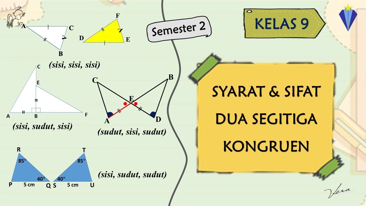
2 SYARAT DAN SIFAT DUA SEGITIGA KONGRUEN - KESEBANGUNAN DAN KONGRUENSI - KELAS 9 SMP
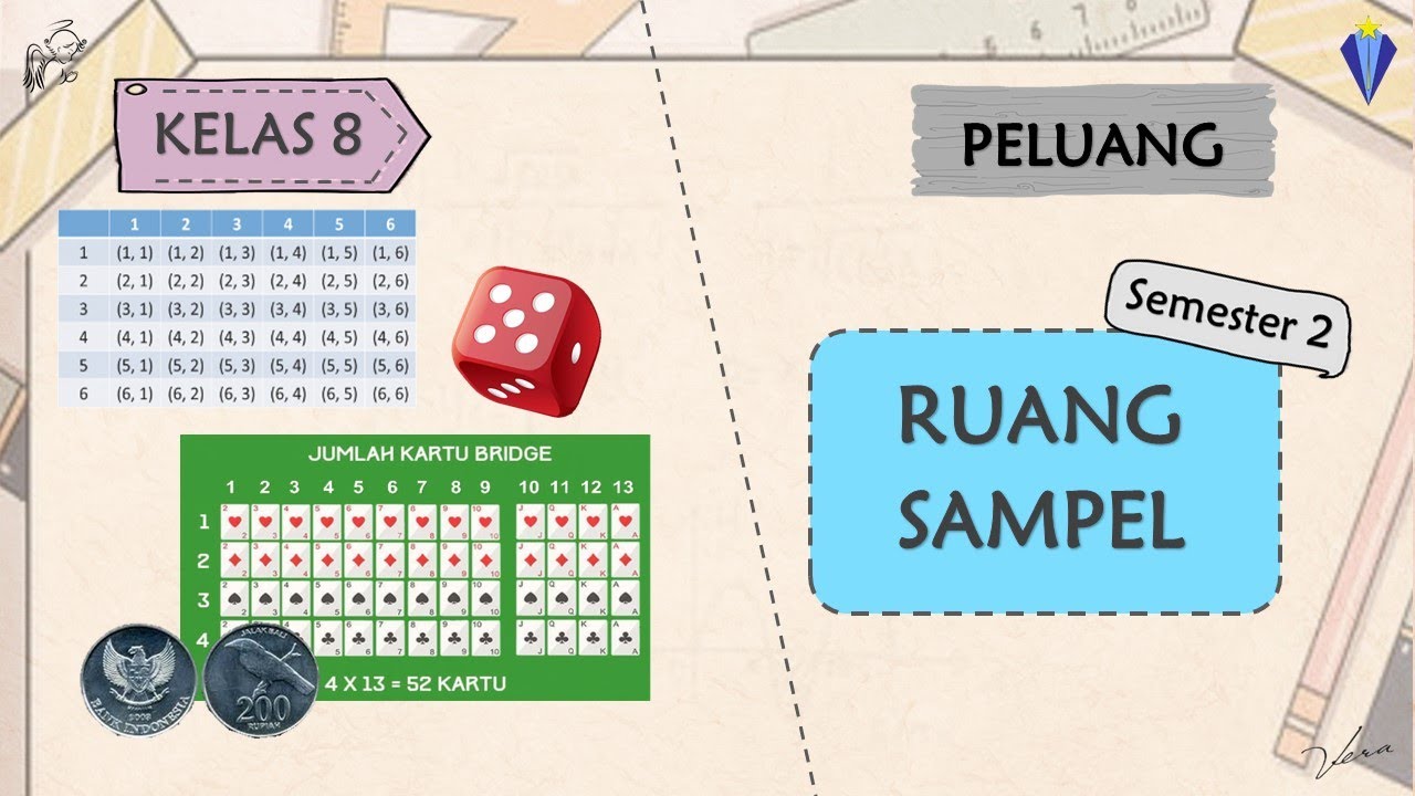
1. RUANG SAMPEL - PELUANG - KELAS 8 SMP

1 PENGERTIAN POLA BILANGAN - KELAS 8 SMP - POLA BILANGAN DAN BARISAN BILANGAN

Asesmen dan Planning Matrix Pendidikan Inklusif
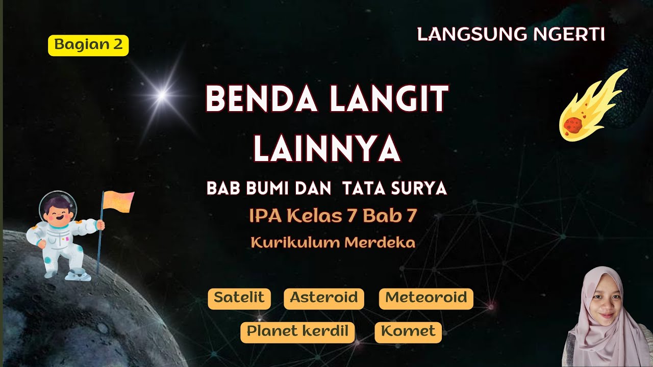
Benda Langit Lainnya Kelas 7 - Bumi dan Tata Surya | IPA Bab 7 Kurikulum Merdeka - Lengkap

KULTUM | Buka Puasa: Momen Bahagia yang Dijanjikan Allah oleh Miss Irma Fitriani
5.0 / 5 (0 votes)